
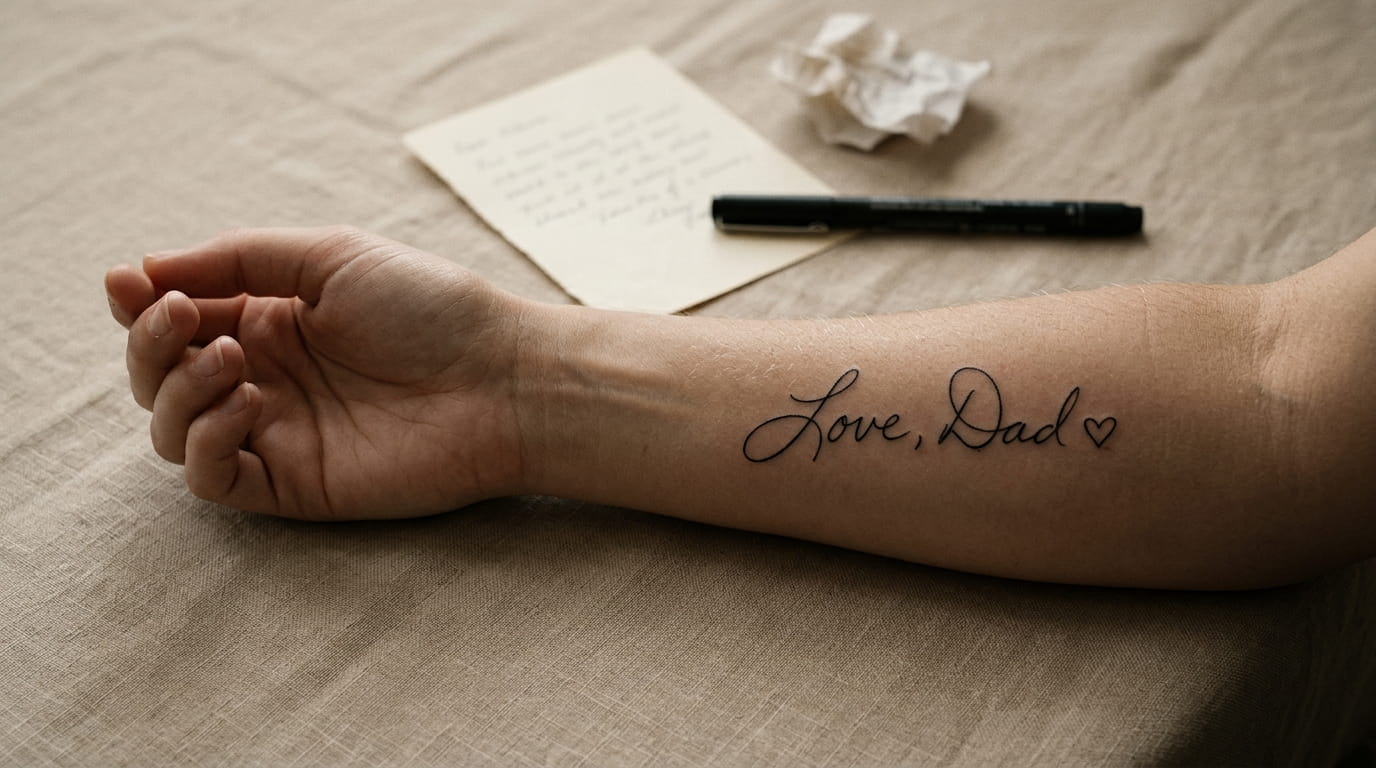
A card tucked in a kitchen drawer. A birthday note still taped inside a cabinet door. For a lot of people, a loved one’s handwriting ends up being the last unscripted thing they left behind, and turning it into a handwriting memorial tattoo is one of the few ways to keep that exact shape of their hand close.
The hard part isn’t the idea. It’s getting from a shaky photo of a signature to a tattoo that still looks like them five years from now.
Most guides skip the technical side: how pen pressure reads under tattoo ink, why a traced line behaves differently than a digitized font, where on the body fine script actually holds up. Skip that part and the tattoo can blur into something that barely resembles the original note.
This list walks through what actually matters at each step, from photographing the handwriting correctly to picking placement that keeps every letter legible for decades. No vague advice, just the specific choices that decide whether the final piece reads as their handwriting or a stranger’s guess at it.
1. Start With a Clean, High-Resolution Photo of the Original Handwriting
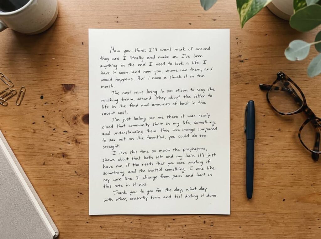
Grab the original note in daylight, flat, straight overhead, no shadows cutting across the loops.
- Natural light near a window beats any flash
- Shoot straight on, not at an angle, so letters don’t warp
- Capture a close-up of the hardest word to read
A phone camera works fine once the lighting is right. The angle matters more than the camera, since a tilted shot stretches tall letters and flattens short ones. Keep the lens flat and square over the page every time you reshoot.
💡 Quick Tip
Photograph the note on a dark, non-glossy surface. Glossy paper or a busy background makes it harder for the artist to trace the true line weight later.
2. Decide Which Words Actually Carry the Weight
A lot of people try to fit an entire card into one small tattoo, and the result looks cramped instead of meaningful.
Look for the words that do the actual work:
- A name, written exactly how they wrote it
- One short phrase, not a full sentence
- A single word that only meant something to the two of you
Shorter text ages better too. Every extra word is one more place for the lines to blur together ten years from now.
Pick one short line or a single name.
Ask another relative if they have a second sample with clearer ink, if the original is too faint to trace.
A full card or letter crammed onto one small area.
“Cleaning up” the wording. Keep their spelling and punctuation as is.
3. Read the Pen Pressure Before You Trace a Single Line
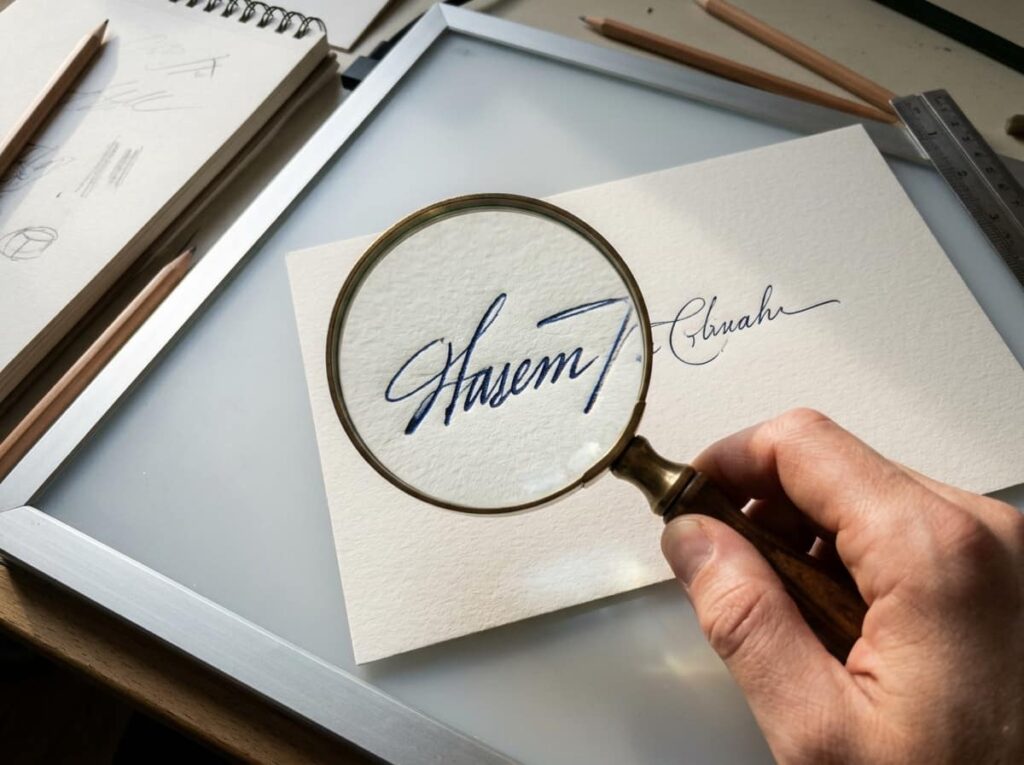
Pressure is what makes handwriting look like a real person wrote it, not a font. The soft spots, the thick spots, that slight shake in some strokes all need to survive the transfer from paper to skin, or the tattoo ends up looking printed instead of personal.
A good artist studies this before ever picking up a machine. This step matters most for cursive or a shaky signature, less so for plain block letters.
Zoom in on the photo and mark where the ink looks darkest. Those are the heavy-pressure strokes.
Note where the pen lifted or thinned out, usually at the end of a word or a tall letter.
Share both notes with your artist so they know which lines to keep thick and which to taper.
4. Pick a Placement That Keeps Script Readable, Not Just Pretty
A forearm or an inner wrist keeps handwriting flat and easy to read for years, which matters more than most people expect before their first script tattoo.
Curved areas like ribs, the inside of a bicep, or the top of a foot distort fine lines as skin moves and stretches. Flatter, more stable spots like the forearm, upper back, or outer ankle hold the exact shape of each letter much longer. Think about where you’ll actually see it too. A tattoo you can’t glance down at often loses some of its point.
5. Traced Script vs. Digitized Font: Which One Actually Looks Like Them
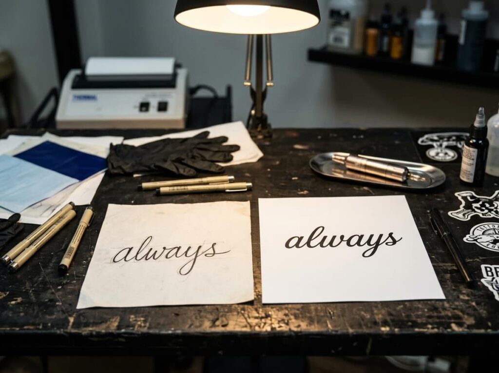
People assume a digitized version of handwriting is more accurate because it’s cleaner. It’s usually the opposite.
A font built from someone’s handwriting smooths out the exact wobble and pressure that made it theirs in the first place, so letters end up looking closer to a nice script font than to the real note. Tracing the actual photo keeps every quirk, the slightly crooked t, the loop that never quite closes. It takes a more skilled artist, but it’s the version that still looks like their hand years later.
| Traced From the Photo | Digitized Into a Font |
|---|---|
| Keeps the exact wobble and pressure | Smooths lines into something more uniform |
| Needs a skilled script artist | Easier for most artists to execute |
| Reads as their actual handwriting | Reads as a nice script font |
6. Mock Up the Size Small Before You Commit to It
Print the design at the exact size you’re planning, then tape it to your skin and live with it for a day or two. What reads clearly on a screen can shrink into a smudge once it’s actually on your arm.
Most people size a handwriting tattoo too small on the first try, chasing something subtle, then realize the thinner strokes vanish within a few years of normal aging. A little bigger than feels necessary usually photographs and ages better.
Tiny script, thin strokes, sized to “not draw attention.”
Sized up slightly, every letter still legible a decade later.
7. Find an Artist Whose Portfolio Proves They Can Do Fine Script

Not every tattoo artist is good at handwriting. Bold line work and fine script are different skill sets, and a portfolio full of neo-traditional pieces doesn’t tell you much about how someone handles a shaky, faded signature.
Scroll past the general portfolio and look specifically for script and lettering work. Ask to see healed photos too, not just fresh ones. Fresh script can look sharp and then spread or blur once it heals, so healed examples are the real proof.
💡 Quick Tip
Ask the artist directly: “Can I see three healed handwriting or fine-line pieces from at least a year ago?” Hesitation to answer is worth noticing.
8. Rescue a Smudged, Faded, or Torn Handwriting Sample
A lot of people assume a damaged note is unusable, and it’s rarely true. Faded ink, a water stain, even a torn corner can usually be worked with if the artist knows how to read what’s left of the strokes.
Don’t try to “fix” the handwriting yourself with a photo editor first. Smoothing or darkening the lines digitally erases the exact pressure and shape an artist needs to see.
Photograph it under angled light to bring out faint lines.
Send the raw, unedited photo to your artist.
Running it through a sharpening or contrast filter.
Assuming a torn or faded note means you need a different sample.
9. Add One Symbol Without Letting It Compete With the Words
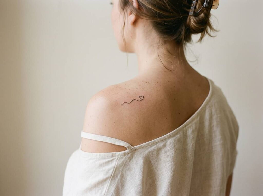
Keep it to one small mark, if you add anything at all. A tiny heart at the end of a signature, a single star where a period would go, a small line underneath. Anything bigger starts pulling focus away from the handwriting itself, which is the whole point of the piece.
- Place it at the end or below the script, never above or beside
- Keep it under a quarter of the text’s size
- Skip it entirely if the handwriting already has a flourish or underline of its own
Symbols that pair well
10. Choose an Ink Approach That Won’t Blur Over Time
Fine script needs a different approach than bold line work. Thinner needles and a lighter hand keep the letters crisp, but they also fade faster if the artist pushes too shallow trying to protect the detail.
The goal is a middle ground: deep enough saturation to hold up for decades, light enough touch to keep the strokes thin. This is exactly the kind of judgment call that separates an experienced script artist from someone still learning.
11. Size Each Letter So It Won’t Blow Out as the Tattoo Ages
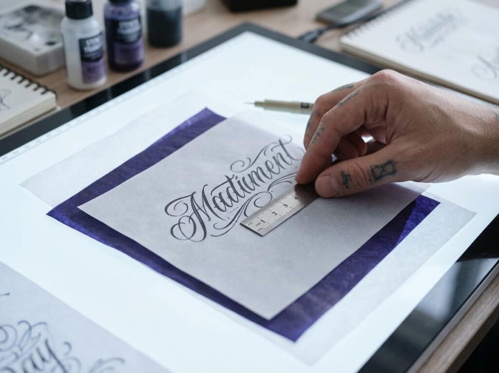
Skin spreads ink slightly over the years, and thin letters spread faster than thick ones. A lowercase script tattoo that looks perfectly crisp on day one can soften into a blur by year eight if the letters started out too small.
A rough rule: keep the smallest letters at least a quarter inch tall, and give loops and crossbars enough space that they won’t merge as the lines soften.
Measure the smallest letter in the design and keep it at a quarter inch or taller.
Check that loops and crossbars have visible gaps, not just touching lines.
Ask your artist to show how the design looks scaled down ten percent, as a gut check on the margins.
12. Match the Body Placement to How Script Actually Ages There
Sun exposure fades fine lines faster than bold ones, so a spot that’s constantly in the sun, like the top of a forearm or the outer wrist, needs more sunscreen diligence than a less exposed area would.
Joints and high-friction spots cause their own problems. Script across a knuckle or the inside of an elbow gets stretched and cracked by constant movement, which distorts thin strokes faster than almost anywhere else on the body.
13. Preserve the Original Note Before Appointment Day
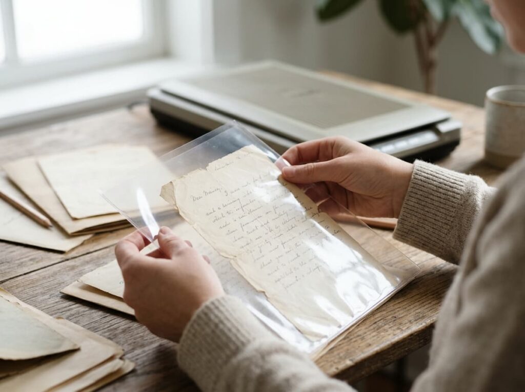
Scan or photograph the original at full resolution and store a copy somewhere safe, separate from your phone’s camera roll. Paper fades, gets lost in a move, or ends up in a box nobody opens for years.
- Make a high-res scan, not just a phone photo
- Save a physical copy in a protective sleeve if the note is fragile
- Share the digital file with a sibling or parent too, so it isn’t only on your device
- ▸Scan at 600 DPI or higher if you have access to a scanner, not just a phone camera.
- ▸Store the physical note in an acid-free sleeve, away from sunlight.
- ▸Back the digital file up in two places, not just one phone.
14. Carry the Signature Into More Than One Tattoo, If You Want To
Some people stop at one small piece. Others come back later and build on it, matching the same handwriting into a second tattoo for a sibling, a date, or a different note from the same person.
There’s no rule that says a handwriting tattoo has to be a single, final statement. If more of their handwriting exists, it can live on in more than one place.
The exact shape of their hand is what makes this tattoo theirs. Protect that shape at every step, and the rest falls into place.
Final Thoughts
A handwriting memorial tattoo isn’t really about the ink. It’s about keeping something unscripted and entirely theirs somewhere you’ll see it every day, long after the original note has faded or gotten packed away. Getting the pressure, the size, and the placement right is what makes sure it still looks like them in twenty years, not just on the day you walk out of the shop.
Take your time finding an artist who treats script as seriously as you do. The note waited this long to become something permanent. A few extra weeks of research won’t hurt it.







Leave a Reply