
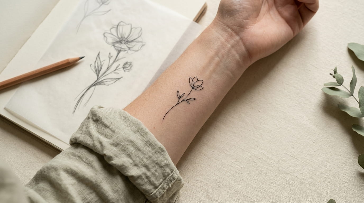
A meaningful tattoo design does not need every tiny detail to tell its story. In fact, removing a few lines can make the symbol easier to recognize, cleaner on the skin, and more personal.
The tricky part is knowing what to keep. A flower might need only its outer petals and stem. A bird could be recognized by its curved body and beak, while a family symbol may depend on one small feature that would be easy to remove by mistake.
Learning how to simplify a tattoo design starts with spotting the few shapes that make the original image recognizable. You do not need to be an artist to begin. A printed reference, tracing paper, and a pencil are enough to test a few versions before settling on a favorite.
The five ideas below help you move from a detailed reference toward a simpler tattoo concept. You will learn what to remove, where to leave open space, and how to prepare a clear sketch to discuss with your tattoo artist.
1. Start With a Symbol That Still Makes Sense Without Its Details
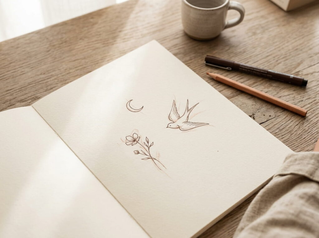
Begin with an image you can recognize even when it is small. A rose, crescent moon, bird, or simple family emblem can work well because its main shape is easy to spot.
Before drawing anything, ask yourself which parts carry the meaning. For a flower, that might be the petals and stem. For a bird, it could be the beak, rounded body, and tail.
A simple starting test:
- Cover the smallest details with your finger.
- Look at the remaining outline.
- Check whether the symbol is still recognizable.
If the answer is yes, you have a useful base for simplifying the design. Keep a copy of the original nearby so you do not remove a feature that matters to you.
2. Trace the Main Outline Before Removing Anything Else
The outside shape usually gives you the clearest place to start. Instead of redrawing the entire symbol, trace its main contour on a fresh sheet of paper.
Look at the sketch from a little distance. Does it still resemble the original? If so, leave that outline alone for now and focus on the smaller marks inside it.
Quick tip: Use tracing paper to make two or three versions. Keep one close to the original, then make each new version simpler. Comparing them side by side makes it easier to spot which lines are useful and which ones add little.
Avoid making every curve perfectly smooth at this stage. The goal is to preserve the character of the symbol, not make it look like a generic icon.
💡 Quick Tip
Trace the outer contour first. If the symbol is still easy to identify without its interior marks, you have found a strong starting point for a minimalist version.
3. Turn a Detailed Symbol Into a Four-Panel Simplification
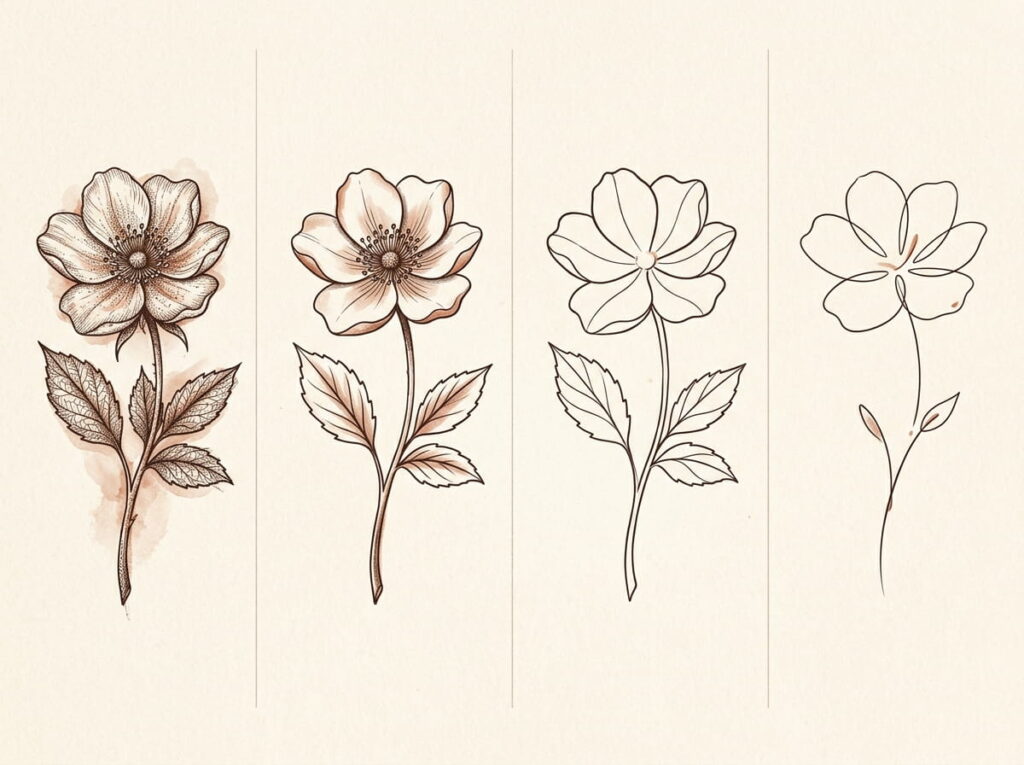
A four-panel sketch lets you see how each edit changes the design. A flower is a useful example because its petals, center, stem, and leaves can be reduced one step at a time.
Work through the panels in order:
- Original: Start with the full reference, including its small details.
- Reduced: Remove tiny marks, texture, and extra decoration.
- Outlined: Keep the main contour and only the inner lines that help identify the flower.
- Minimal: Refine the remaining marks into a clean, balanced tattoo concept.
Do not remove details just to reach the final panel. If a small feature carries personal meaning, keep it. The best result is the simplest version that still feels like your symbol.
Full petals, center details, leaves, and stem.
Remove texture and extra decorative marks.
Keep the defining petal shape and a few key lines.
Keep only the lines needed to express the original idea.
Design note: These symbols illustrate the progression. For your own tattoo, draw each panel from the same reference so the changes are easy to compare.
4. Remove Tiny Details That Make the Design Feel Crowded
Small designs can become hard to read when too many lines sit close together. Tiny scales, rows of feathers, narrow leaf veins, and intricate patterns may look clear on a large screen but lose their separation in a small sketch.
Review the drawing and mark details that can go without changing its meaning.
Check these areas first:
- Repeated marks that serve the same purpose.
- Decorative dots that do not help define the shape.
- Short lines tucked tightly against the outer contour.
Keep the marks that make the symbol yours. A single distinctive leaf or a small notch in a meaningful emblem may matter more than a dozen decorative lines.
✔ Minimalist design check
5. Replace Complex Shading With Clear, Open Lines
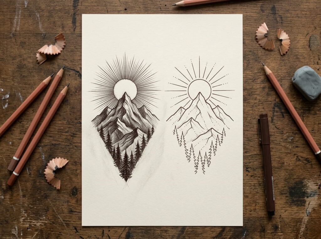
Shading can make an illustration feel rich, but it is not always needed in a minimalist tattoo. Large areas of dark shading, tiny hatch marks, and soft gradients can distract from the symbol’s basic shape.
Instead, test a version made with outlines and a few carefully placed inner marks. For a mountain, the outer peaks may be enough. For a sun, a clean circle and a few short rays can carry the idea without a shaded center.
Keep in mind: Removing shading does not mean every tattoo must use one thin line. Your artist can help choose a line weight and level of detail that suit the design and its intended size.
6. Simplify Repeated Shapes Into Just a Few Strong Marks
Repeating details can make a symbol look busy, especially when the design needs to fit on a wrist or ankle. You do not need to draw every feather on a bird, every scale on a snake, or every vein in a leaf.
Instead, choose a few marks that suggest the texture without spelling out every part.
For example, when simplifying a feather, keep its long central line and two or three short strokes along the edge. For a leaf, the outer shape and one vein may be enough.
A simple rule: Show the idea of the detail instead of drawing the whole detail. Leave enough space around each mark so the design stays readable.
Find the repeated pattern. Look for rows of scales, feathers, petals, or leaf veins.
Keep a few examples. Select only the marks that help the viewer recognize the texture.
Check the spacing. Remove any short strokes that make nearby lines look crowded.
7. Keep the Small Imperfections That Give the Symbol Character
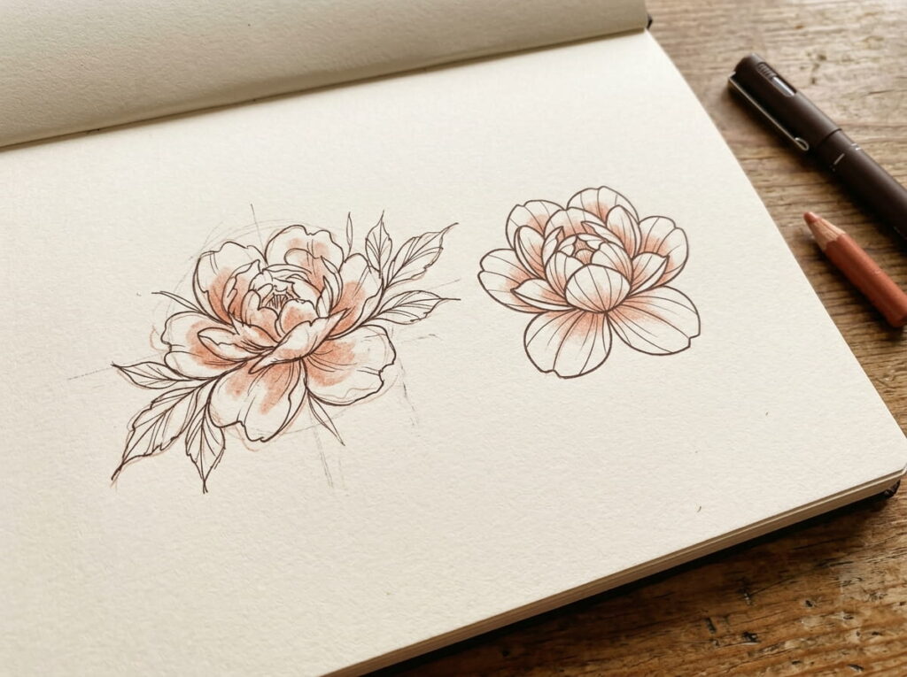
A minimalist tattoo does not have to look like a perfectly measured logo. Slightly uneven petals, a curved stem, or an asymmetrical moon can help the design retain the character of its original reference.
The trick is knowing which irregularities matter. Keep the ones that make the symbol feel natural or personal, but remove accidental bumps that distract from its main shape.
✓ Keep
- A flower with naturally uneven petals
- A hand-drawn curve that gives a symbol movement
× Rework
- A stray bump that changes the outline unintentionally
- Uneven spacing that makes two separate shapes appear joined
Before smoothing every line, compare your sketch with the original. If a small quirk is part of what drew you to the image, it may deserve to stay.
Preserve natural curves and meaningful asymmetry.
Let the outline retain some of its hand-drawn feel.
Smooth accidental bumps in the contour.
Separate lines that nearly touch without a reason.
8. Use One Continuous Line Only When It Helps the Shape
Connecting a symbol into one unbroken stroke can create a lovely sense of movement, but it is not always the clearest solution. Some designs need separate lines to stay recognizable.
A bird, a simple heart, or a flowing flower stem may work well as a continuous-line drawing. A detailed emblem with several separate parts might become confusing if you force every feature into one path.
Watch out: Do not add awkward loops just to connect two distant parts. Sketch the design both ways, with one continuous line and with a few separate strokes, then compare which version reads more clearly.
The line should serve the symbol, not the other way around.
⚠️ Watch Out
If connecting the lines creates extra loops or makes the original symbol hard to identify, use two or three clean strokes instead. Minimalist does not have to mean one line only.
9. Leave Enough Open Space Between Lines
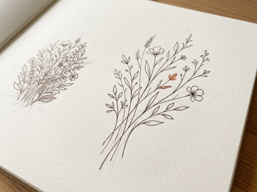
Open space is part of the design. Without it, even a simple symbol can look crowded once it is reduced to tattoo size.
Look closely at places where lines meet or run beside each other. A leaf vein that sits too close to the edge, for example, may look like a dark patch rather than a separate line. Small gaps can help each feature remain distinct.
When reviewing your sketch, ask yourself:
- Can I tell where one shape ends and another begins?
- Are any lines so close that they seem to merge?
- Does the symbol still read clearly when viewed from a short distance?
The key takeaway: Removing a line can sometimes improve a design more than adding another one.
Every line needs room to be seen. Keep enough open space for the important shapes to stay distinct, especially in a small tattoo.
10. Compare a Fine-Line Version With a Bolder Minimalist Version
A simplified design can still feel different depending on the weight of its lines. A fine-line version often feels light and delicate, while a slightly bolder outline can make the main shape stand out more strongly.
Neither approach is automatically better. The right choice depends on the symbol, the size you have in mind, and the way the lines work together.
Bring both versions to your tattoo artist if you are unsure. They can advise on line weight, spacing, placement, and the level of detail that makes sense for your chosen design.
11. Test the Design at the Size You Actually Want
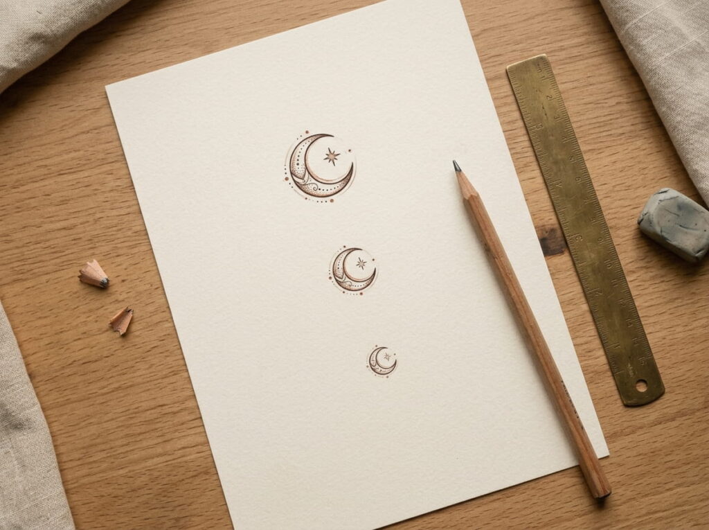
A symbol can look clear on a full sheet of paper but feel crowded when reduced to a small tattoo. Before choosing your final version, print or sketch it at roughly the size you want on your wrist, ankle, finger, or shoulder.
Check whether the main outline still reads clearly and whether small gaps remain visible. If details blur together, remove another mark or open up the spacing. You can also compare two sizes side by side. Your tattoo artist can help assess which details and line weights are practical for your chosen placement.
12. Prepare a Clean Reference to Share With Your Tattoo Artist
Once your simplified symbol feels right, create a clean reference that shows what you want to keep. Include the original image for context and your preferred minimalist version, with any important details clearly marked. If you are choosing between two sketches, label them so your artist can compare them easily.
Note your preferred placement and approximate size, but stay open to professional advice about line weight, spacing, and how the design may work on skin. A reference is a starting point for collaboration, not a demand for an exact copy. The goal is to communicate the meaning and overall look you want.
□ Simplified version easy to see
□ Meaningful details identified
□ Preferred placement and size noted
□ Alternative version added, if needed







Leave a Reply