
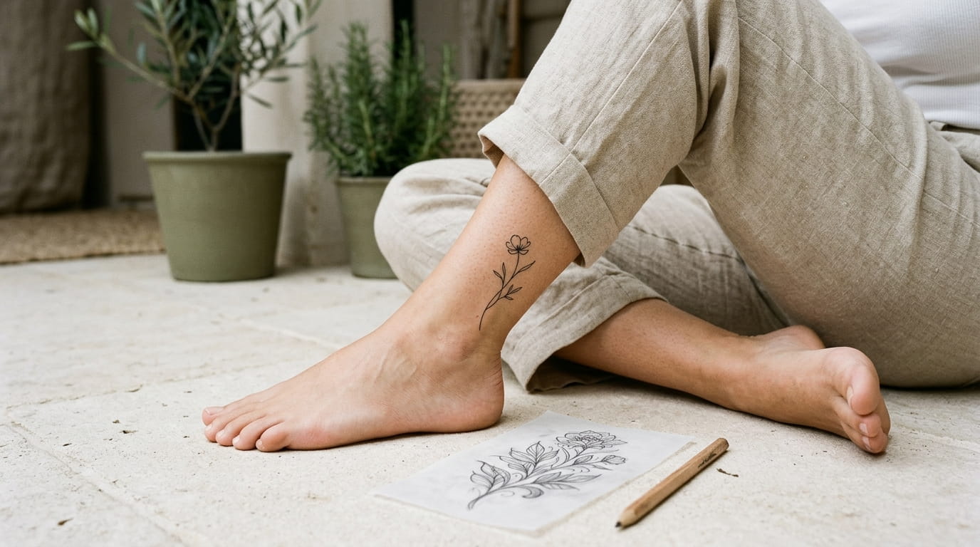
A tattoo reference can look beautiful on your phone and still feel too crowded once you picture it on your skin. Tiny leaves, thin lettering, layered symbols, and delicate shading may all compete for attention. The trick is knowing what to keep, what to remove, and how to explain those choices to your tattoo artist.
Learning how to simplify a tattoo design does not mean losing the meaning behind it. It means giving the most important detail room to stand out. A small flower can still feel personal without every petal vein. A meaningful symbol can remain recognizable without extra decorations around it.
Before your consultation, collect a few clear references and make notes about the lines, size, and placement you prefer. You do not need to know professional tattoo terms. Simple descriptions, marked-up photos, and honest feedback can help your artist understand your vision.
These 14 practical notes will help you prepare a clearer brief, discuss fine line details, and feel more confident reviewing your design before the tattoo session.
1. Gather Reference Photos That Show the Details You Actually Like

Start with a small collection of references instead of sending your artist dozens of saved pictures. One photo might have the flower shape you like, while another shows the delicate outline or placement you prefer.
Choose images that explain a specific part of your idea. A screenshot of a tattoo on the wrist can help with placement, but a close-up may be better for showing line details.
Before your appointment:
- Save two or three strong references.
- Circle the exact detail you want to borrow.
- Label anything you do not want copied.
Your references are a starting point, not a request to reproduce another artist’s work exactly. Tell your artist which features matter most so they can create an original design around your preferences.
📌 Build Your Reference Collection
Shape
Choose the outline or main subject you prefer.
Line Style
Mark the thin outlines or bold accents you like.
Placement
Find a reference on a similar body area.
2. Explain What You Like About Each Reference, Not Just the Overall Look
Saying “I like this tattoo” leaves your artist guessing. You might love its open spacing, the curve of the stem, or the way the design follows the wrist rather than the exact subject.
Write one short note beside each reference. Keep the wording natural and specific.
Try descriptions like these:
- “I like the clean outline, but I want fewer small details.”
- “Keep the curved shape and remove the extra dots.”
- “I prefer the flower from this photo and the placement from the other one.”
A quick note in your phone is enough. You do not need a complicated design brief to explain your preferences clearly.
💡 Quick Tip
For every reference, finish this sentence: “The main thing I want to keep from this image is…” It helps separate your actual preferences from details you simply happen to notice.
3. Simplify a Busy Tattoo by Choosing One Main Focal Point
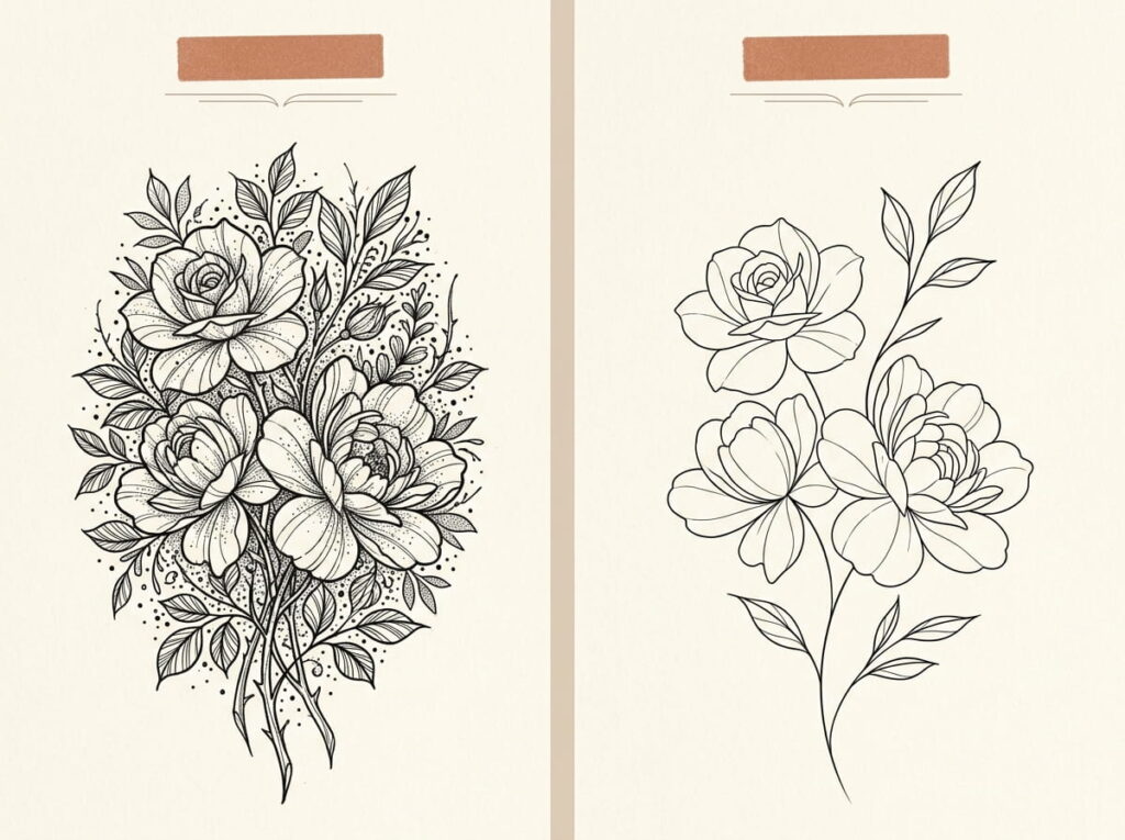
When a design contains several flowers, stars, curves, and tiny symbols, your eye may not know where to settle. Choosing one main focal point gives the tattoo a clearer visual order.
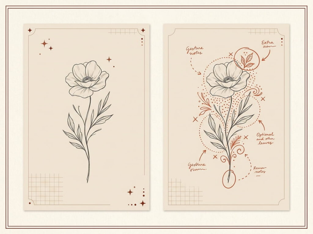
For example, a botanical design could keep one open flower as its main feature, with a single curved stem and two leaves. Extra buds, decorative dots, and surrounding shapes can be removed or reduced if they distract from the flower.
Ask yourself which part you would still want if the design had to become smaller. That answer is a useful starting point for your artist.
Visual: What to keep and what to simplify
KEEP THE CORE
🌸 One clear flower
A recognizable outline and a simple stem.
Enough open space to separate the main shapes.
CONSIDER REMOVING
✂️ Extra decoration
Repeated tiny buds or stars that compete with the flower.
Small marks that are not important to the meaning.
4. Mark the Lines and Details You Want to Keep
A marked-up reference can explain your idea faster than a long message. Use a phone drawing tool or simple arrows to show which parts matter most.
Keep your annotations easy to read. Too many circles and notes can make the reference just as confusing as the original design.
- Circle: Mark the main outline or symbol.
- Underline: Point out a curve, petal, or line detail you want to preserve.
- Cross out: Identify decorative parts you would like the artist to reconsider.
Send the original image alongside your marked version. This lets your artist compare the design with your suggestions without mistaking your notes for the actual tattoo artwork.
✍️ Annotate Your Reference in 3 Steps
Mark the essential feature
Circle the subject or outline that gives the tattoo its meaning.
Label your line preferences
Write notes such as “keep thin” or “remove this detail.”
Send both versions
Include the untouched reference so your artist can see the full context.
5. Choose a Line Weight That Fits the Design’s Smallest Details
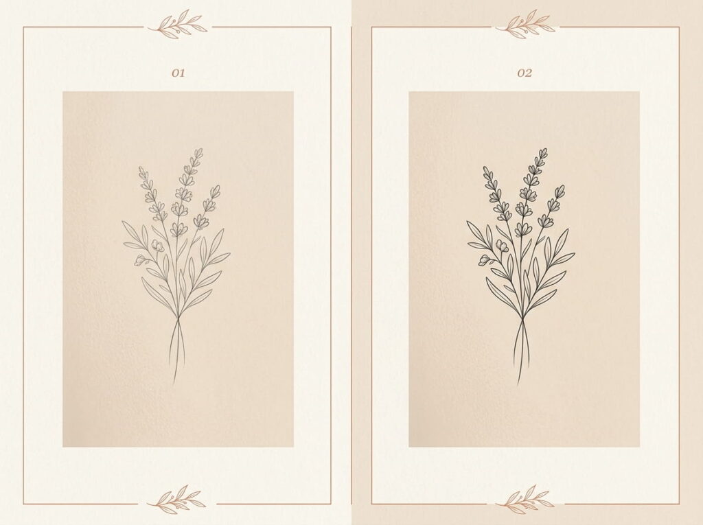
Fine line tattoos rely on careful line choices, but the thinnest possible line is not automatically the best choice for every design. Tiny lettering, closely spaced petals, and intricate shapes may need adjustments to remain readable at the intended size.
Discuss the final dimensions with your artist before deciding on line weight. A design intended for the side of a finger may need a different approach from a larger botanical piece on the forearm.
Ask your artist to review:
- Which lines should stay delicate.
- Which outlines may need a little more visual strength.
- Whether tiny gaps or details need to be simplified.
The goal is a design that suits your chosen size, not a drawing crowded into too little space.
SMALL DESIGN
Fewer, clearer details
Simplify crowded areas and discuss whether tiny gaps can remain distinct at the planned size.
LARGER DESIGN
More room for line variation
Your artist can assess where delicate interior lines and stronger outer contours make sense.
6. Show Your Artist Which Lines Should Feel Light or Bold
6. Show Your Artist Which Lines Should Feel Light or Bold
A fine line design can still use different line weights. A slightly stronger outer contour may help define a small flower, while lighter interior lines can suggest petals or leaves without making the tattoo feel crowded.
You do not need to choose exact needle sizes or technical settings. Describe the visual effect you want and let your artist advise you on what will work.
Use simple notes such as:
- “Keep the outside shape clear.”
- “Make the inside details lighter.”
- “Avoid making every line equally dark.”
The contrast should have a purpose. When every mark competes for attention, the design can lose the delicate quality you liked in the reference.
✍️ Line Weight Notes for Your Artist
Outer outline
Clear enough to define the main shape.
Interior detail
Light marks that support the subject.
Optional accents
Small details only where they add meaning.
Illustrative line samples only. Your tattoo artist should recommend the appropriate technique for your design and skin.
7. Decide Which Tiny Details Can Be Removed Without Losing Meaning
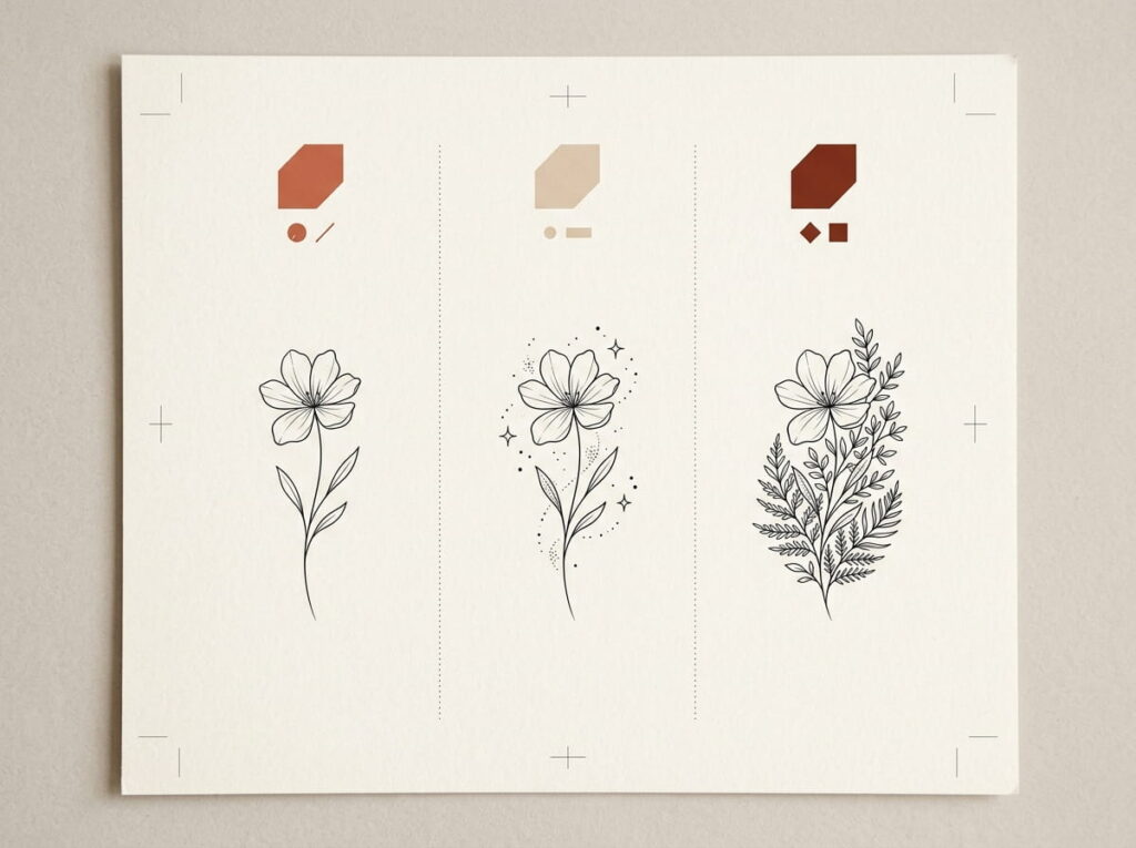
A small tattoo does not need to contain every part of the original illustration. The best details to remove are usually the ones that do not change the subject’s identity or personal meaning.
For example, a butterfly may still read clearly without individual markings on every wing. A botanical sprig may need only a few leaves rather than a detailed vein on each one.
Use this quick review before your consultation.
| Detail | Question to ask |
|---|---|
| Tiny dots | Do they add meaning or just decoration? |
| Fine texture | Is the main subject clear without it? |
| Extra symbols | Does each symbol matter to the story? |
8. Bring Placement References That Match the Body Area
A design can look different on a flat screen than it does on a curved part of the body. A wrist bends, a shoulder rounds, and the side of a finger offers limited space.
Bring at least one reference showing the type of placement you have in mind. It does not have to be the exact tattoo you want. The goal is to show the direction, scale, and way the design sits on the body.
Compare these placement choices:
| Placement | What to discuss |
|---|---|
| Inner forearm | Length, direction, and visibility |
| Wrist | Available space and how the design follows the arm |
| Shoulder | Curvature and how the design sits from different angles |
| Ankle | Scale, orientation, and how it looks with the foot at rest |
A useful phrase for your consultation is: “I like this design, but I want to see how it would sit naturally on my body.” Your artist can help adjust the composition to suit the chosen area.
9. Check the Design at Actual Size Before Approving It
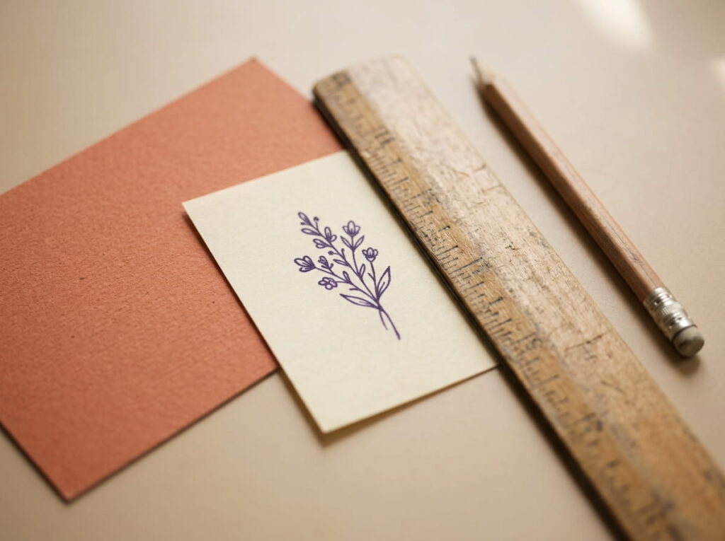
A tattoo displayed large on a phone can hide problems that become obvious when the design is reduced. Closely packed petals, tiny lettering, and small gaps may be harder to distinguish at the intended size.
Ask to see the proposed design at approximately the size you plan to wear. If possible, review the stencil or placement mock-up before the session begins.
Check these three things:
- Can you recognize the main shape without zooming in?
- Are the important gaps still visible?
- Do any details look crowded or unnecessary?
If something feels cramped, ask whether the artist recommends simplifying it or changing the size. Make sure you understand and approve the final design before tattooing begins.
THE FINAL SIZE CHECK
If the design only looks clear when enlarged on your screen, ask your artist to review the detail, spacing, and size before you approve it.
10. Share How You Want the Tattoo to Flow With Your Body
The direction of a tattoo can change its overall feel. A long botanical stem might follow the length of the forearm, while a small crescent could sit naturally along the curve of the shoulder.
Explain whether you picture the design running vertically, horizontally, or at a slight angle. You can show this with a simple arrow on a placement photo.
Useful placement notes:
- “I would like the stem to follow my arm.”
- “Please show me how this looks when my wrist is relaxed.”
- “I prefer the design to face inward rather than outward.”
Your artist may suggest small changes after seeing the design on your body. Discuss those adjustments together rather than relying on the angle of a reference photo alone.
11. Shading and Fill Preferences







Leave a Reply