
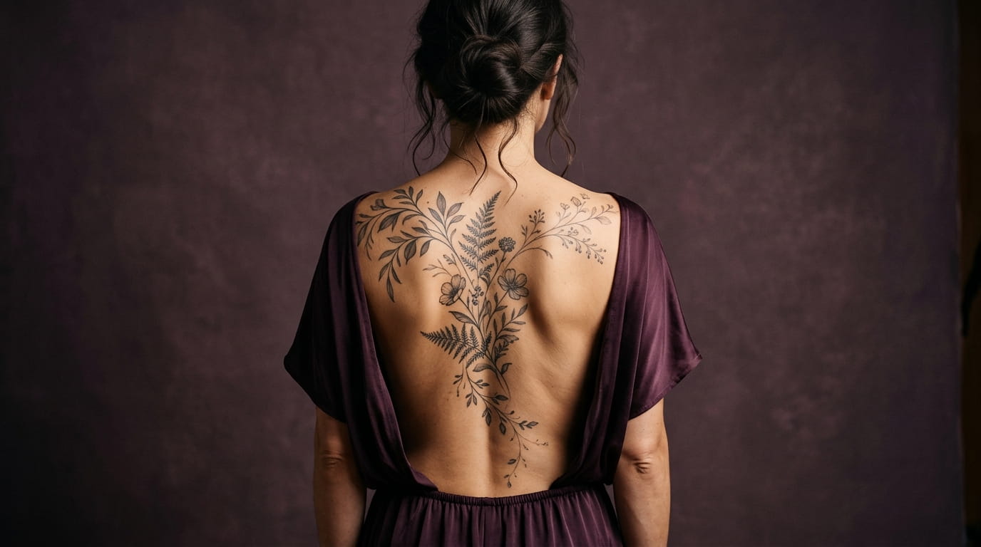
A back is the biggest canvas most of us will ever hand a tattoo artist, and it is the one canvas we can’t see. That is why so many back pieces get drawn flat on paper, approved in a quiet minute, and then land on a body that curves, dips and moves in ways the sketch never did.
A spine is not a straight ruler. Shoulder blades push outward. The waist pulls everything inward. A design that looks balanced on a screen can look crooked once it sits on real skin.
If you are working out how to plan a back tattoo, the fix is to plan the layout before you fall for the design. Decide where the center line runs, how the shapes will travel, and where the skin needs to stay empty. Here are twelve steps, from drawing your spine line to handing your artist a clear brief. Grab a mirror, a friend with a phone, and a washable skin pen.
1. Draw Your Spine Line First and Treat It as the Center Axis
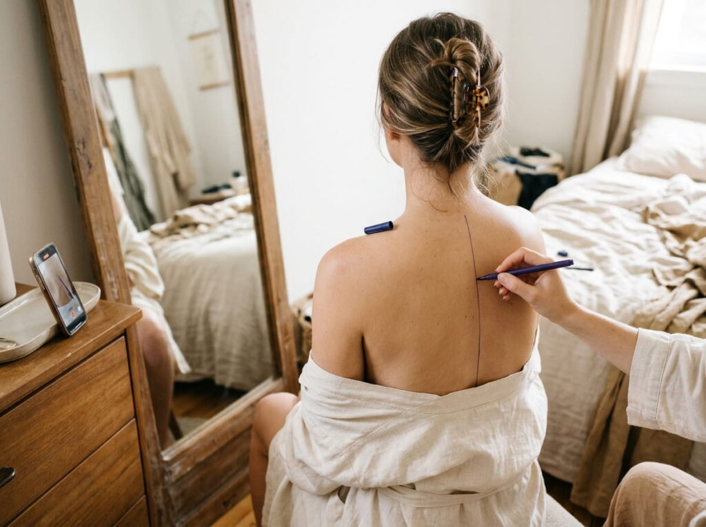
Before any flower, wing or script gets a vote, mark the line it will all answer to.
Stand in front of a mirror with a second mirror or phone camera behind you. Ask a friend to draw a soft line with a washable skin pen from the base of your neck to your tailbone. Then check three things:
- Does the line run straight, or does it curve slightly at the lower back?
- Where is the deepest dip between the shoulder blades?
- Do your shoulders sit level on the line, or does one side ride higher?
Most spines have a gentle S shape, and that small curve is why a perfectly straight design can look off. Write down what you notice. You will use it in every step after this.
💡 Quick Tip
Take your reference photo from straight behind you with your arms relaxed at your sides. A tilted camera exaggerates the spine curve and throws off every measurement that follows.
2. Map Your Back Into Four Zones Before You Pick a Single Motif
Four zones turn one giant blank space into small decisions you can actually make.
Think of your back as stacked sections: the nape and upper neck, the shoulder blades, the mid back along the ribs, and the lower back above the hips. Each zone moves differently and holds detail differently, so each one gets its own job.
Write one word beside each zone on your photo:
- Anchor for the part that carries the most visual weight
- Connector for the part that links two areas
- Quiet for the part you keep simple or empty
You do not need to fill every zone. Two quiet zones often make the whole piece look intentional.
3. Pick One Flow Direction: Vertical, Diagonal or S-Curve
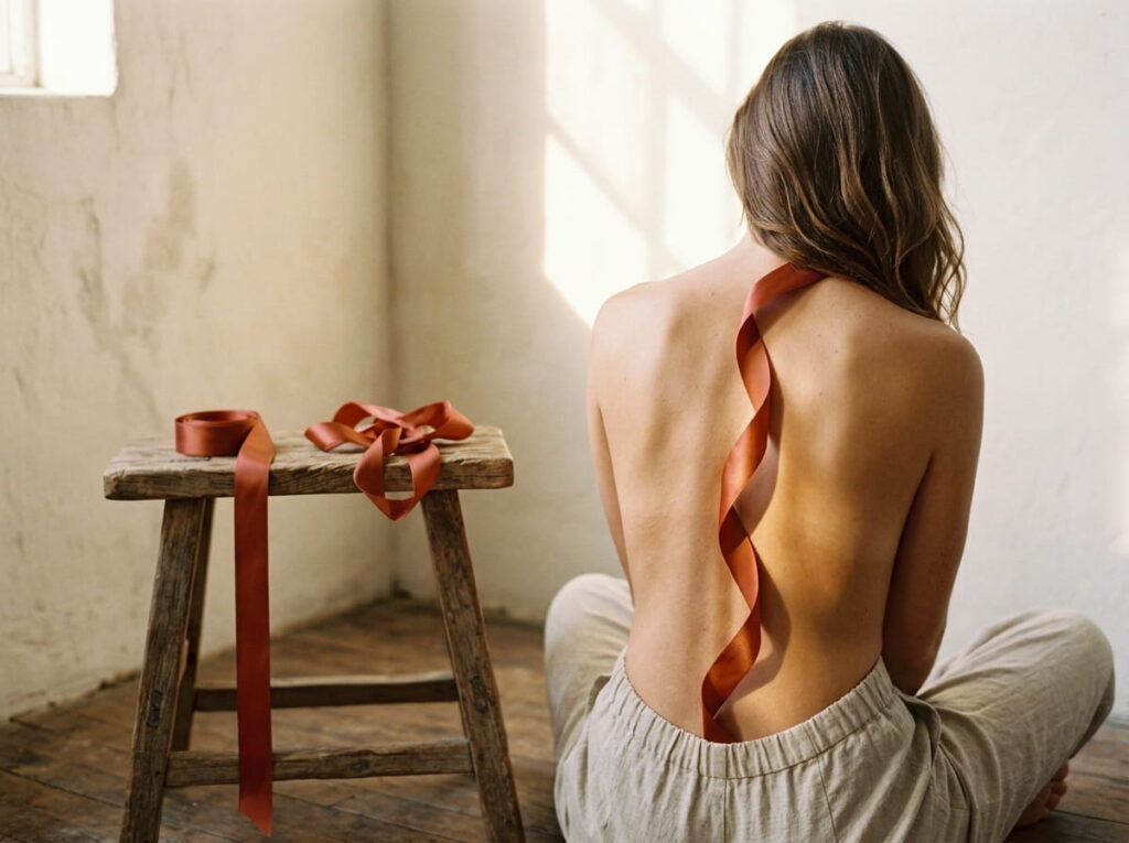
A back piece reads best when the eye knows which way to travel.
A vertical flow runs along the spine, a diagonal sweeps from one shoulder toward the opposite hip, and an S-curve echoes the natural curve of your spine. Pick one before you choose any motifs, because a tattoo with three competing directions looks restless from across a room.
Not sure which fits? Check the table below, then lay your skin pen line over each path in the mirror and see which one feels like it belongs to your body.
| Vertical | Diagonal | S-Curve |
|---|---|---|
| Follows: the spine line itself | Follows: one shoulder blade down toward the opposite hip | Follows: the natural curve of the spine |
| Suits: branches, script, daggers, flowers on a stem | Suits: sweeping vines, trailing blooms, a single large flower | Suits: snakes, ribbons, winding florals |
| Watch for: looking stiff if your spine curves | Watch for: feeling lopsided without a small counterweight | Watch for: a curve that fights your natural dip if drawn backwards |
4. Decide Where Symmetry Works and Where the Spine Dip Says Break It
Exact symmetry is not as safe as it sounds.
Your back is rarely a true mirror. One shoulder usually sits a little higher, and the spine tilts or curves just enough that two identical wings can look uneven in photos. Mirrored designs still work, especially when they are small and sit tight to the spine. The trouble starts when the design is wide enough to reach both shoulder blades.
Tiny rule: if the piece crosses the shoulder blades, loosen the symmetry on purpose.
Place each side at your own shoulder height, not a ruler height.
Let one side run a little longer or looser than the other.
Keep strict mirroring for small pieces tight to the spine.
Flipping a sketch and assuming it will line up on your skin.
Stretching identical shapes out to both outer shoulder edges.
Ignoring a tilt you can already see in your reference photo.
5. Follow the Shoulder Blade Curve Instead of Fighting It
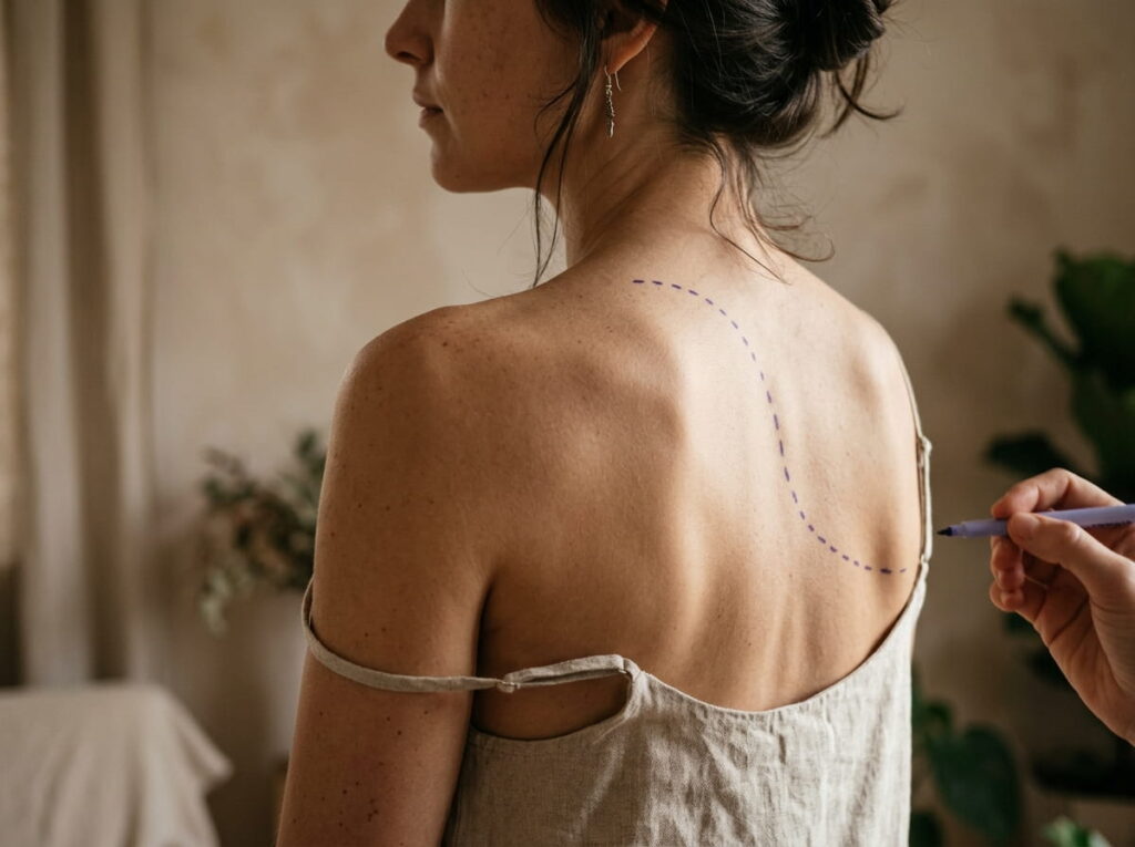
Roll your shoulders back and watch the blades. Each one is a small hill with a ridge along the top.
Designs that follow that ridge, like a feather that curls with it or a vine that wraps the edge, look like they grew there. Designs that cut straight across it can look pasted on, because the lines stretch and squeeze as the muscle moves.
Find where the curve peaks, then set your widest, busiest element just below it. Keep thin stems and fine lines off the peak itself, where the skin moves the most.
Trace the curve before you design it
Lift your arms slightly and have a friend mark the top edge of each shoulder blade with a skin pen.
Relax your arms and trace the outer edge of each blade so you can see how far the curve runs.
Hold your sketch against the marks and bend any straight edge that crosses the ridge so it follows it.
6. Anchor the Heaviest Detail on the Flattest Part of Your Back
Fine detail needs steady skin.
The middle of your back, between the shoulder blades and the waist, has the fewest bends and creases. That makes it the best home for a focal flower, small lettering, or dense shading. Skin that moves all day, like the tops of the shoulders, tends to be harder on thin lines and tiny gaps.
- Put on the flat zone: the focal bloom, any words, the shaded centers.
- Move to the curved zones: long stems, leaves, trailing tips.
Sketch the focal point first, then build the rest outward from it.
7. Leave Skin Between the Shoulder Blades So the Design Can Breathe
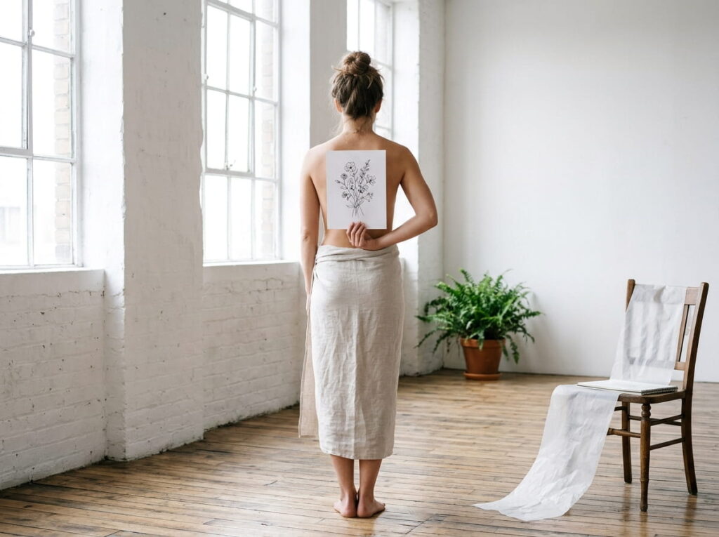
The most common back tattoo mistake is filling every inch because the space is there.
Bare skin works like the pause in a sentence. It tells the eye where one element ends and the next begins, and it keeps a large piece from reading as one dark block from across the room. Two or three clear gaps usually do more for the layout than another flower would.
Run these checks in front of the mirror before you finalize anything. They work best for pieces that cover more than half your back.
Breathing room checklist
8. Taper Toward the Waist So the Piece Doesn’t Stop Like a Cut-Off Sentence
Back designs often look great across the shoulders and then simply end.
Your back narrows toward the waist, so a design that keeps the same width and weight all the way down hits the ribs like a wall. Tapering fixes that. Make elements smaller as they travel down, thin out the stems, and widen the gaps between motifs.
The last element matters most. A single small leaf or one thin curl reads as a finish. A full-size bloom chopped off at the waist reads as an accident.
Big blooms and thick leaves keep going at the same size until they hit a flat, heavy edge just above the waist.
Blooms shrink as they travel down, stems thin out, gaps widen, and one small leaf fades into bare skin.
9. Check How the Layout Moves When You Twist, Bend and Reach

In one ordinary day you will sit in a car seat, reach for a high shelf, and hug someone with your arms wrapped around their shoulders.
A stencil is usually placed while you stand still, but a back is rarely still. The lower back folds when you sit, and the shoulder blades slide apart when you reach forward. A line that looks straight at rest can bend or bunch in motion.
Test these three movements with your skin pen sketch on:
- Sit on a chair and slouch slightly.
- Reach both arms forward as if hugging someone.
- Lift one arm overhead.
Look for any line that kinks, bunches, or lands on a crease.
⚠️ Watch Out
Ask your artist to check the stencil while you stand, sit and reach, before any ink goes in. Lower back lines near the natural fold are the ones most likely to look different when you move.
10. How to Plan a Back Tattoo With a Silhouette Mockup Before the Stencil
A mockup lets you judge the whole layout in one glance, and you can change it ten times for free.
Use a plain back outline or your own straight-on reference photo. Place your design at its real size, then check it against the zones, the spine line and the flow direction you picked. Screenshot each version so you can compare them side by side.
Look for three things in every mockup:
- Does the design sit on the spine line or drift off it?
- Does the heaviest part land in the mid back?
- Is there empty skin around it?
Print your best version at actual size and hold it against your back before you book.
Read the mockup
Nape: keep it small and simple, since it shows with hair up.
Shoulder blades: let curves follow the dotted ovals.
Mid back: place the focal detail here, close to the spine line.
Lower back: taper and simplify as the back narrows.
Dashed line is your spine. Dotted ovals are your shoulder blades. The shaded shape is your design placeholder.
11. Test the Layout Against Bra Straps, Swimsuit Lines and Open Backs
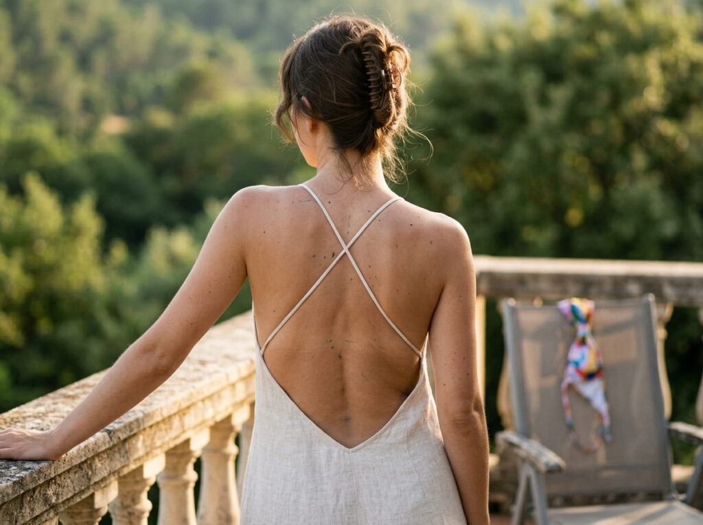
A back tattoo spends most of its life around fabric. Straps cross it, ties sit on it, and necklines frame it.
Hold your mockup up and see where your everyday clothes land. The goal is not to hide the piece. It is to decide which parts you want framed and which parts you are fine covering.
- Put on your usual bra and a tank top, then mark where each strap sits.
- Add a swimsuit top or a backless dress if you own one.
- Take a photo from behind in each outfit.
If a strap slices through your focal flower in every photo, move the flower. Straps are easier to dodge than to change.
| Clothing line | What it means for your layout |
|---|---|
| Bra band | Cuts across the mid back, so keep the focal detail above or below it. |
| Shoulder straps | Run down the shoulder blades, so thin stems and leaves handle them better than faces or words. |
| Swimsuit ties | Sit at the neck and mid back, so leave a little room around those two spots. |
| Open back dress | Frames the lower edge of the design, so the taper toward the waist becomes the finishing line. |
12. Build a One-Page Placement Brief to Hand Your Artist
Artists do their best work when the plan is short, clear and visual.
Put everything you have learned on one page. Print it, and keep a copy on your phone too, so it travels with you to the consult. A page like this shows an artist that you have thought about the body, not just the picture.
Include these:
- Your reference photo from behind, with the spine line and shoulder blade marks still showing
- The flow direction you picked and the one you ruled out
- The job of each zone: anchor, connector or quiet
- The size you want for the focal piece and for the full layout, in inches
- Clothing lines you want to frame or avoid
- Any movement issues you spotted when you twisted, sat and reached
Your artist will still adjust things once the stencil goes on. The brief just makes sure they start from your back and not from a guess.
Your spine line, your flow direction and your quiet zones tell an artist more about your back than any finished sketch can.
Conclusion
A back tattoo that flows is rarely an accident. It starts with a spine line, a few zones, one clear direction and some empty skin, long before the first line of ink goes in.
If you are still working out how to plan a back tattoo, start small tonight. Take the straight-on photo, mark your spine, and try one mockup. An hour of that will teach you more about your back than a month of scrolling.
Take your time with it. A layout planned around your shoulders, your dips and the way you move will still look right years from now.
html
Before you book your consult







Leave a Reply