
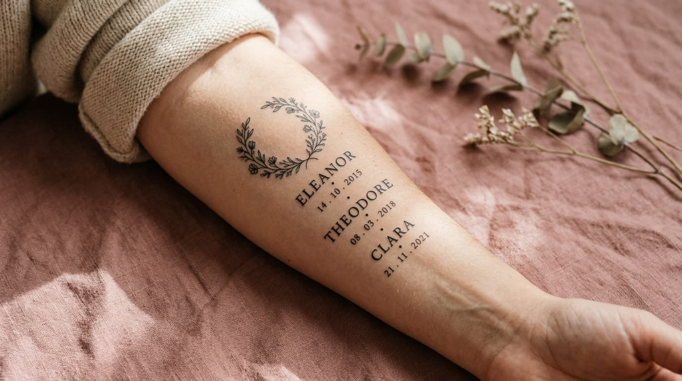
The first draft usually goes like this. Five names, three dates, and two sets of initials, all squeezed onto one wrist. The letters touch, the numbers shrink, and the whole thing starts to look like a tiny crowded sign.
Here is the same family on the same wrist, done well. One steady lettering style, a clear space between each name, and a single date tucked underneath. Nothing is missing, and nothing is fighting for room.
The difference is rarely talent. It comes down to a few planning choices made before the stencil goes on. How many names fit? Which style stays readable? Where do the dates go?
The steps below cover 14 name tattoo ideas and layout moves, from counting your names to testing the stencil. Font samples and layouts appear side by side, so you can compare them as you read. Take the steps in order, or jump to the one that matches your problem.
Paste each code block below into a WordPress Custom HTML block.
1. Count Your Names First, Then Match Them to a Spot That Can Hold Them

Start with a plain count.
Write every name, date, and set of initials on a sheet of paper, then circle the longest name. That one sets the minimum length of your line. A short space like the wrist suits one or two short names, while longer spots hold more.
- Too many names for the spot? Pick a bigger spot, or switch a few to initials
- Too much empty space? Make the letters larger, not the list longer
2. Choose One Lettering Style and Stay With It
Mixing three fonts is the fastest way to a cluttered tattoo.
Each name can mean something different, but the lettering should stay the same. Same style, same slant, same weight. When the letters match, even a long list reads as one calm line. Switching styles from name to name makes the eye jump around, and the tattoo starts to look like a ransom note.
A good rule is one style for the names, and a lighter version of it for the dates.
💡 Quick Tip
Ask your artist to write all your names in the chosen style on one sheet before drawing the stencil. Seeing them together shows spacing problems early, while they are still easy to fix.
3. Compare Four Lettering Styles Side by Side
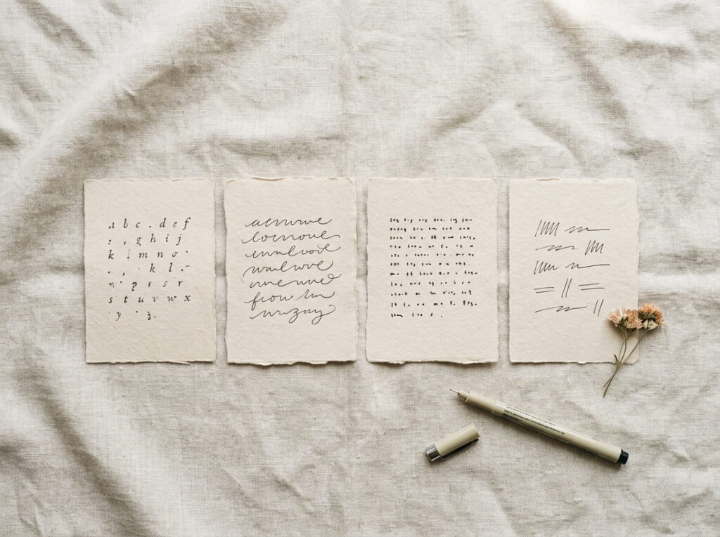
Here are four common styles, set side by side with the same name.
The samples use basic web fonts, so they only hint at the look. Your artist’s real lettering will have its own shape and spacing, but the differences in mood and readability carry over.
Choose the one that stays clear at the smallest size you plan to use.
4. Size the Letters by Readability, Not by Name Length
Shrinking the letters to fit one more name is the quickest way to spoil a name tattoo.
Small letters tend to lose their gaps over the years, and tight spacing can close up as the skin ages. It is better to cut a name or switch it to initials than to shrink everyone.
Ask your artist for the smallest size that stays readable in the style you chose.
Print each name at the size you think you want, in the style you picked.
Tape the paper to your skin and look at it from arm’s length.
If you have to squint, go up a size, or drop a name.
5. Stack Names in a Centered Column Under a Small Symbol
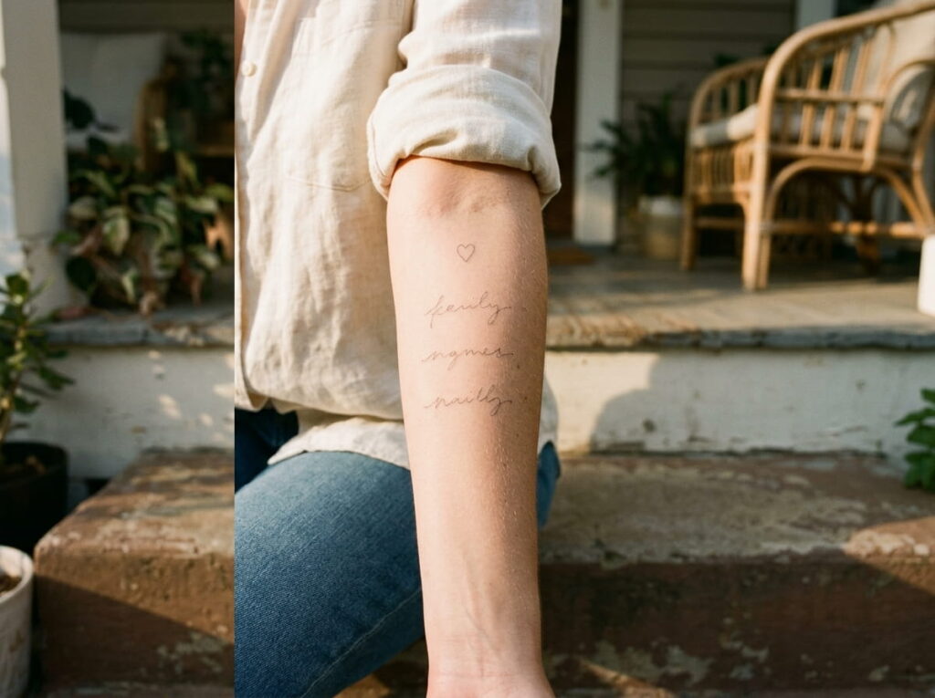
A centered column looks tidy because every line shares the same anchor.
Place a small symbol on top, like a heart, a flower, or a tiny star, and set the names below it in a narrow column. The symbol gives the eye a starting point, and the column keeps the layout calm. Center each line, so short and long names balance on both sides.
- Leave wider line spacing than you think you need
- Order the names by birth date, oldest first
Leave a clear gap between each line.
Make the symbol about as wide as the longest name.
Squeezing the lines tight to save space.
Mixing left aligned and centered lines in one column.
6. Run Names in One Line Along the Collarbone
Treat the collarbone like a ruler, and set every name on it.
Start the first name near the neck and let the last one end near the shoulder. The bone gives you a natural baseline, so the letters stay level without any help. Keep every name at the same letter height, even when the names are different lengths. A short name simply leaves a little more space around it.
Many people find the collarbone sensitive, since the skin sits close over the bone, so plan on a short session.
Check the line before you approve it
7. Curve Names Around the Bottom of a Wreath or Moon
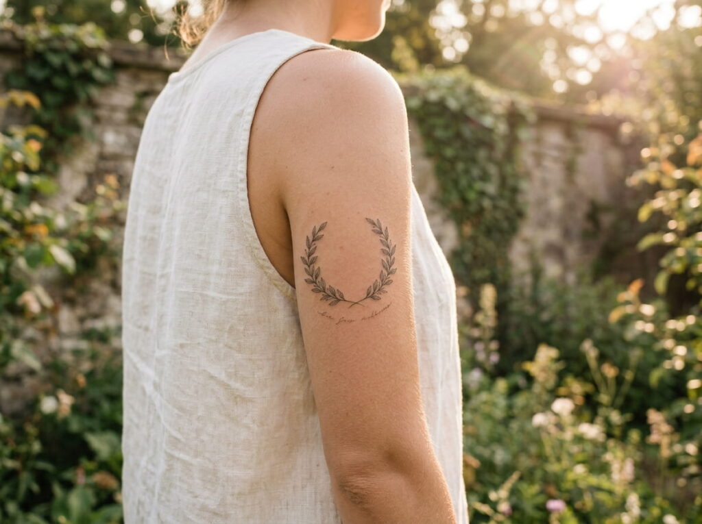
Look at the lower edge of a wreath, or the belly of a crescent moon. It is already shaped like a line of text.
Names that follow an arc look less like a list and more like part of the picture. Tilt the letters slightly outward at the ends, and keep the middle of the arc level. A curve is harder to read than a straight line, so choose a plain style like serif or clean sans, and keep the names few.
Leave a small gap between the letters and the shape above them.
Names in a straight, tight line under the wreath, with the ends of the letters running into the leaves.
The same names following the curve of the wreath, with a small gap between the letters and the leaves.
8. Use Initials Instead of Full Names When Space Is Tight
Initials solve a space problem, then they create a new one when two people share the same letters.
Two children named after the same grandparent can end up with matching initials, and then a row of letters stops telling you who is who. Add a tiny mark beside each set, like a dot, a small flower, or a star, so each one is easy to tell apart.
- Use first and middle initials when two kids share a first letter
- Keep the mark the same size for everyone
⚠️ Watch Out
Initials can feel cryptic years later, especially several of the same letter. Write down who each set stands for, and ask your artist if one or two full names would still fit.
9. Hide Each Name Inside a Leaf Vein or Feather Line

Some of the cleanest family tattoos look like pictures at first glance.
Write each name in tiny script along the center vein of a leaf, or along the spine of a feather. From a distance you see a branch or a wing, and the names appear when someone leans in. A leaf needs to be large enough to hold the letters, so let each one be a little bigger than you think it should be.
It also solves the crowding problem, since every name gets its own little space.
Hidden should not mean unreadable. If you need a magnifying glass to read a name, the leaf is too small.
10. Add Birth Dates Without Crowding the Names
Dates are usually the part that makes a name tattoo look busy.
Pick one date style and use it for every date. Then choose one home for them. You can set each date under its name in a lighter, smaller version of the same lettering, or gather all of them into a single line at the bottom. Mixing the two styles on one tattoo brings the clutter right back.
Ask your artist to keep the dates quieter than the names, so the names stay the focus.
| Date style | What it does |
|---|---|
| Roman numerals | Looks classic, but runs wide, so it needs a longer spot. |
| Numbers with dots | Compact and quick to read, suits small spaces. |
| Year only | The shortest option, but it leaves out the month and day. |
11. Use Spacing to Separate Groups of Names
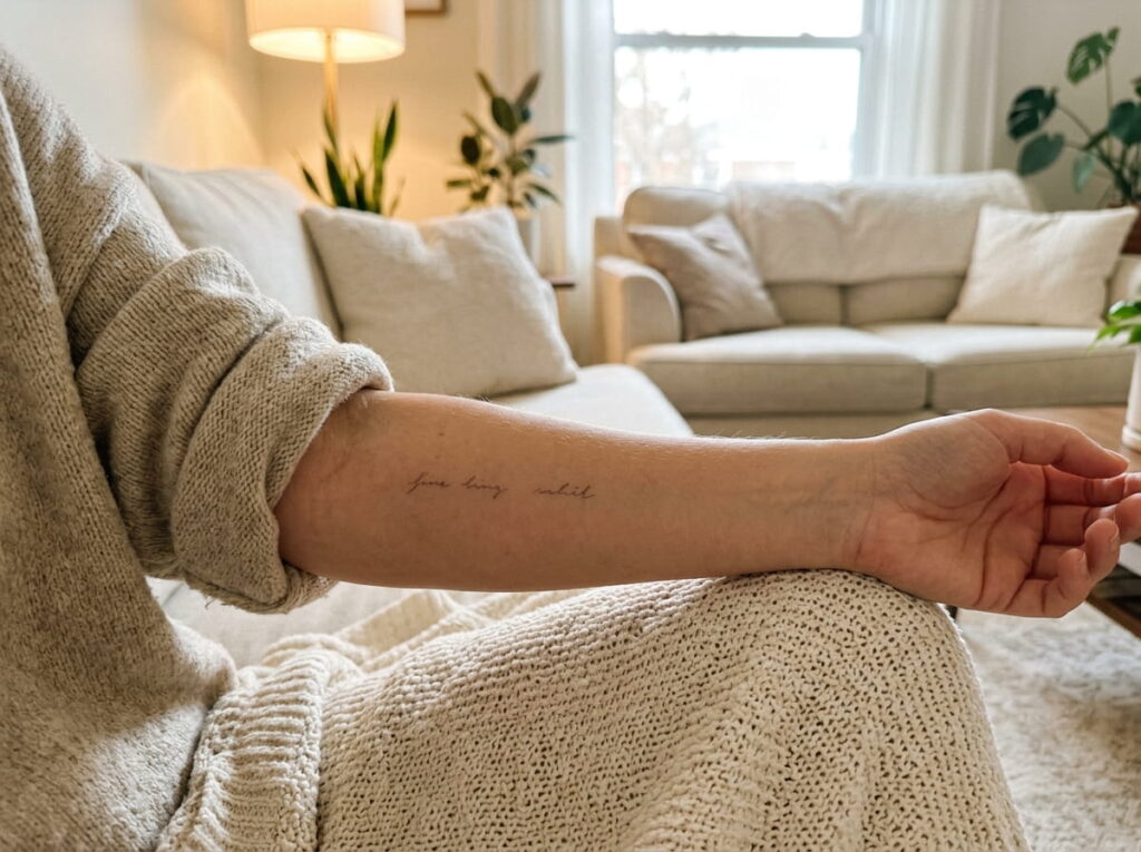
White space does the work of a divider, and it costs no ink.
If your family has two groups, like your kids on one side and your siblings on the other, leave a wider gap between the groups than between the names inside each one. The eye reads the gap as a pause and sorts the names into sets without any extra lines or symbols. Two or three groups is the most a small tattoo can hold before it starts to feel like a chart.
Keep the gap noticeably wider, not just a little.
12. Leave Room for Names You Might Add Later
A family is not always finished when the tattoo is.
A new baby, a marriage, or a name you decide to honor later can all call for another line. Plan for it now. Stop the tattoo short of the end of the spot, and ask your artist to draw the layout so that a new name can slide in without moving the rest. A tattoo that has no room left forces a patch job later.
- End a line short of the edge of the spot, and leave the space blank
- Choose a symbol, like a branch or a wreath, that can grow
- ▸Lines: stop each one short of the edge of the spot
- ▸Columns: leave a blank row at the bottom for the next name
- ▸Arcs: keep one open stretch of the curve free
- ▸Trees and wreaths: leave a bare branch or an empty gap in the ring
13. Combine Names and Dates in One Layout Using a Divider Symbol
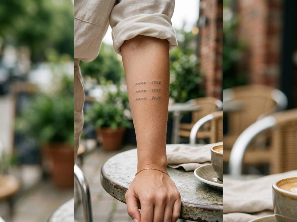
A tiny symbol can replace a whole line of extra spacing.
A small dot, a short dash, a star, or a heart between the name and the date tells the eye where one ends and the other begins. It saves room, and it makes each name and date read as one pair. Keep the symbol the same size on every line, and make it smaller than the letters.
Here are three layouts side by side.
Noah · 2018
Ruby · 2021
Noah
Ruby
14. Test the Layout on Your Skin With a Stencil Before You Commit
A drawing on paper cannot show you how a layout sits on your body.
Ask your artist to put the stencil on, then check it in a mirror from several angles. Move your arm, turn your wrist, and lift your shoulder. A line that looks straight on paper can bend with the curve of your arm. If anything looks off, say so before the first line of ink goes in.
Take a photo of the stencil, so you can look at it again after you sleep on it.
Final stencil check
Conclusion
A clean family tattoo comes from planning, not squeezing. Count the names, pick one lettering style, and give every line room to breathe. Whichever name tattoo ideas you end up choosing, the same rules apply: readable letters, even gaps, and a little space left for what comes next.
Bring your list, your photos, and your questions to the consult, and ask to see the stencil on your own skin before anything is permanent.
Save this guide for the day you start planning, and come back to it with your artist beside you.
Readable beats complete. If a name or date will not fit cleanly, switch it to initials or leave it out.







Leave a Reply