
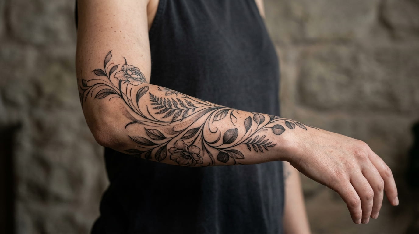
A flat sketch almost never survives the trip onto a curved arm. The proportions that look balanced on paper suddenly pinch at the elbow, stretch too thin near the wrist, or shift out of line the moment you bend your elbow. That gap between the drawing and the skin is the real challenge behind any wrap around arm tattoo, and it’s rarely explained before someone books the appointment.
Most of the distortion comes from one simple mismatch: a design planned for a flat page gets applied to a cylinder that moves. Artists who handle wraps well plan for the curve from the very first pencil line, not after the stencil is already cut.
This list breaks down the decisions that actually change how a wrap sits and ages well: where the flow should bend, how much skin to leave open, which line weights hold up under a taper, and the questions worth asking an artist before the needle ever touches your arm.
1. Why Flat Sketches Distort the Second They Wrap Around Your Arm
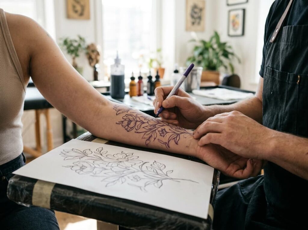
Most reference designs are drawn flat, then shrunk or stretched to fit the arm later. That’s backwards. The moment a flat image wraps around a cylinder, straight lines curve, circles turn into ovals, and anything symmetrical starts to lean. A rose that looked centered on paper can end up tilted once it follows the forearm’s natural taper.
The fix starts before you ever pick up a reference. Ask your artist to sketch directly on your arm, or to build the design on a 3D mockup, so the curve is part of the plan from day one, not a correction applied at the end.
Sketch or test the design directly on your arm’s actual curve.
Ask for a 3D mockup before any linework is finalized.
Approving a flat reference without checking how it bends on skin.
Assuming symmetry on paper means symmetry once it wraps.
2. Trace Your Arm’s Actual Curve Before You Draw Anything
Start with a plain strip of paper or medical tape and wrap it around the exact placement, from where the design begins to where it ends. Mark the front, the inside, and the back separately, since each section stretches differently when your arm moves.
Flatten that strip out and you’ll see the real shape you’re designing for: wider in some spots, narrower in others, with soft curves instead of straight edges. Hand that flattened template to your artist before any sketching starts. It turns guesswork into something you can both measure.
Wrap tape or paper around the exact tattoo zone, marking where it starts and ends.
Divide it into front, inside, and back sections since each one bends differently.
Flatten the strip and trace it onto paper as your real design template.
3. Pick a Flow Direction First: Spiral, Straight Band, or Diagonal Sweep
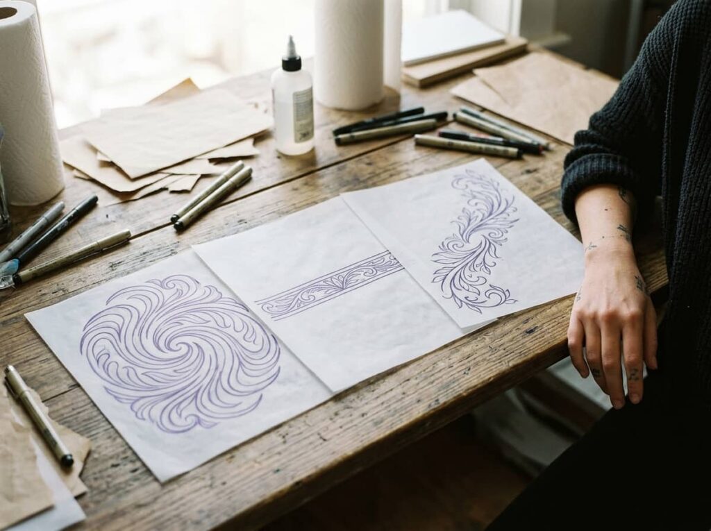
Every wrap tattoo follows one of three basic paths. A spiral winds continuously around the arm. A straight band stays level, like a cuff. A diagonal sweep angles across the limb, following the muscle line instead of fighting it.
Pick the direction before you choose a single motif. A diagonal sweep tends to look the most natural on a forearm because it follows how the arm actually tapers from elbow to wrist. A straight band reads cleaner on the upper arm, where the surface is more even.
4. Why Asymmetrical Layouts Read Better Than Mirrored Ones
A lot of people assume a wrap tattoo needs to be perfectly even on both sides, like a mirror image. In practice, true mirroring rarely survives the arm’s curve, since your arm isn’t symmetrical either. One side carries more muscle, the other sits flatter.
Asymmetrical layouts hide that mismatch instead of fighting it. Letting a vine thicken on one side, or a cluster of flowers sit slightly higher on the inside of the arm, reads as intentional rather than uneven. It also gives the design somewhere to breathe instead of forcing every element into a strict grid.
📌 Good To Know
Ask your artist to sketch both sides of your arm separately, then compare them side by side. It usually settles the symmetry question fast.
5. Full Wrap vs. 3/4 Wrap: Which One Actually Suits Your Arm
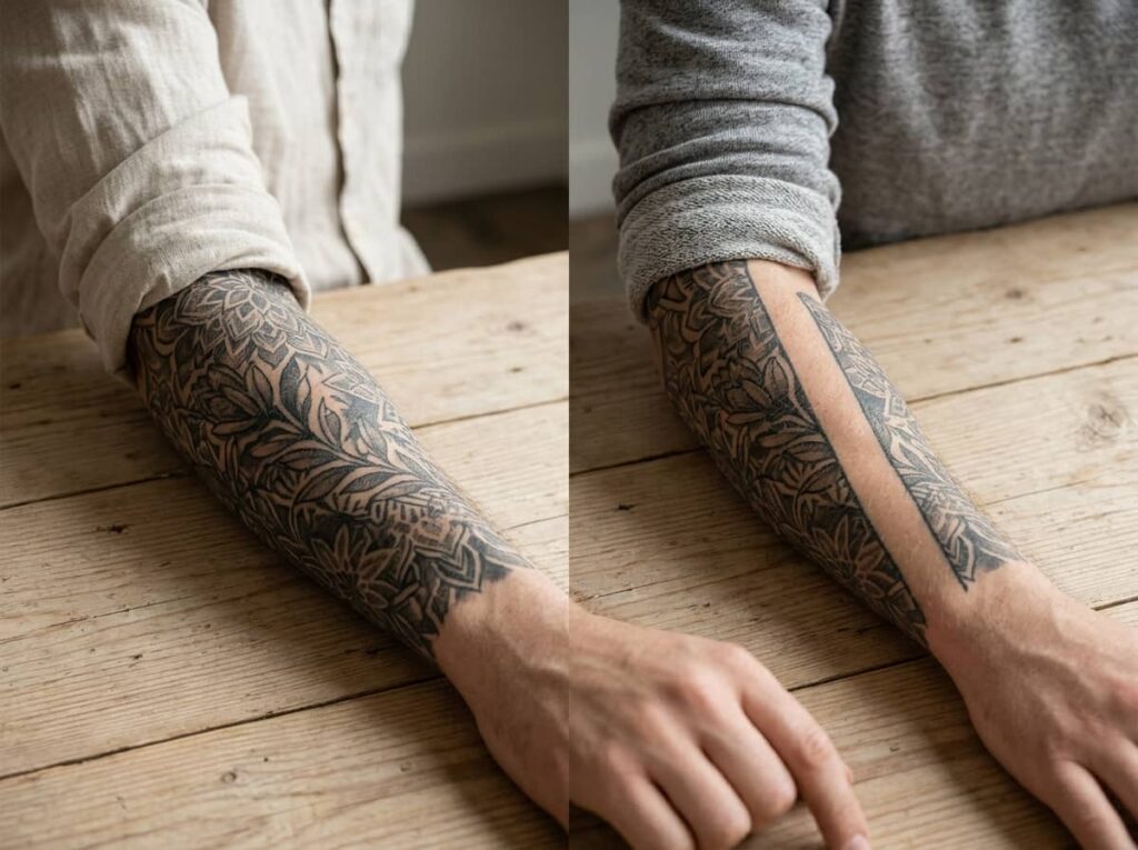
A full wrap closes the loop completely, with the design meeting itself on the inside of the arm. A 3/4 wrap leaves a visible gap, usually on the inside, so the design reads more like a band than a sleeve.
Full wraps suit bolder, continuous imagery like vines or waves, since there’s no visible seam to plan around. A 3/4 wrap works well for smaller arms or first tattoos, since it leaves skin for future additions and tends to look lighter instead of heavy. Neither is more correct. It depends on how much coverage you actually want.
| Full Wrap | 3/4 Wrap |
|---|---|
| No visible seam, closes fully around the arm | Leaves a gap, usually on the inside of the arm |
| Best for bold, continuous imagery | Best for smaller arms or first tattoos |
6. Motifs That Bend With the Curve vs. Ones That Fight It
Vines, waves, feathers, and smoke all follow a curve naturally, since their shape already has movement built in. Geometric motifs like perfect circles, grids, or straight-edged mandalas fight the arm instead, because any bend in the skin distorts their hard angles.
That doesn’t rule geometric designs out. It just means they need to be broken into segments that follow the arm’s natural lines rather than stretched as one solid shape. A single honeycomb pattern wrapped whole will warp at the elbow. The same pattern split into panels along the curve holds its shape.
7. The Flex Test: How Muscle Movement Changes a Wrapped Design
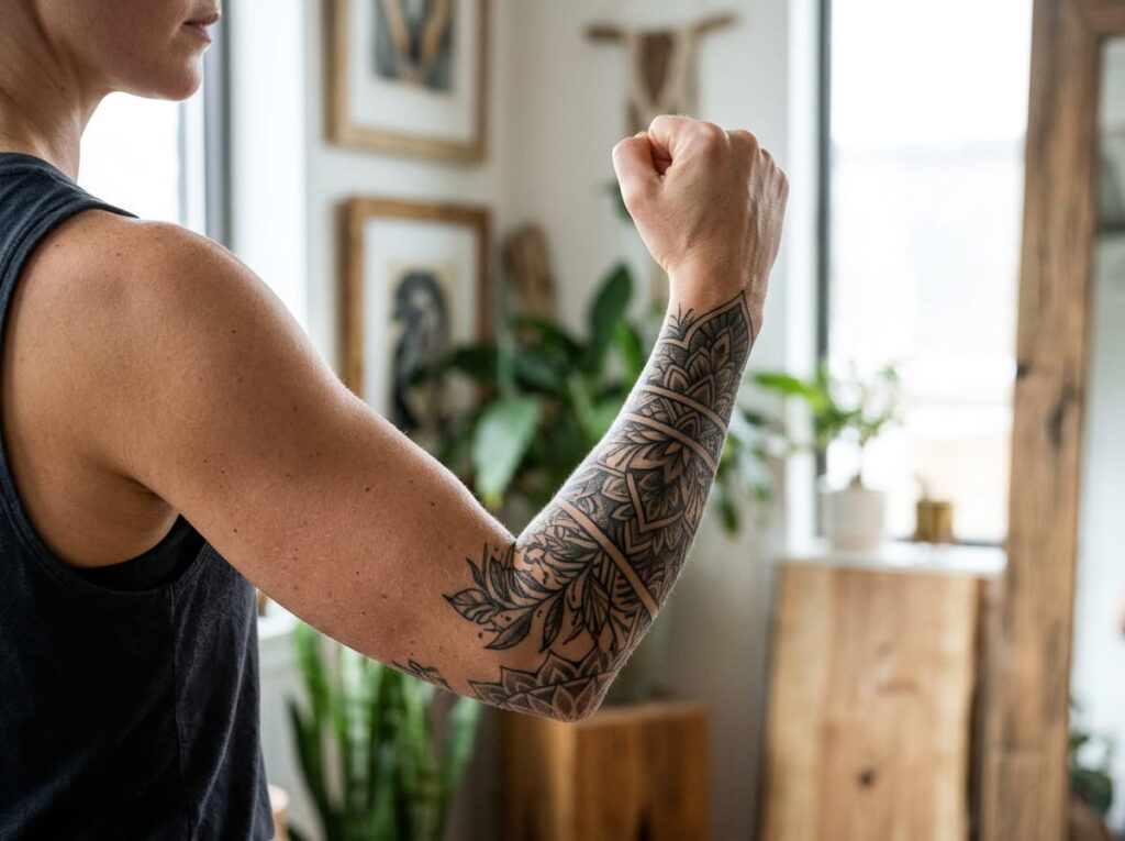
A design that looks balanced with your arm relaxed can shift noticeably once you bend your elbow or make a fist. Muscle flexing stretches the skin unevenly, especially on the forearm, which can pull a motif out of alignment or widen gaps that looked even at rest.
Before your session, ask your artist to check the stencil in both a relaxed and flexed position. It takes two minutes and catches problems no amount of flat-paper planning will show you.
Check the stencil at rest.
Flex your arm and check it again.
Compare how much the spacing shifts between the two.
Flag anything that visibly stretches or compresses before the needle starts.
8. Get a 3D Mockup or Wrap Stencil Before You Sit Down
A standard paper stencil only shows you the design flat. A wrap stencil, applied directly to your skin and photographed from multiple angles, shows you what the artist will actually be working from. Some studios also offer digital 3D mockups that simulate the curve before you ever book the appointment.
Either option costs you a short extra step, but it’s the difference between approving a guess and approving the real thing.
9. The #1 Distortion Mistake: Stretching a Flat Reference Onto a Curved Arm
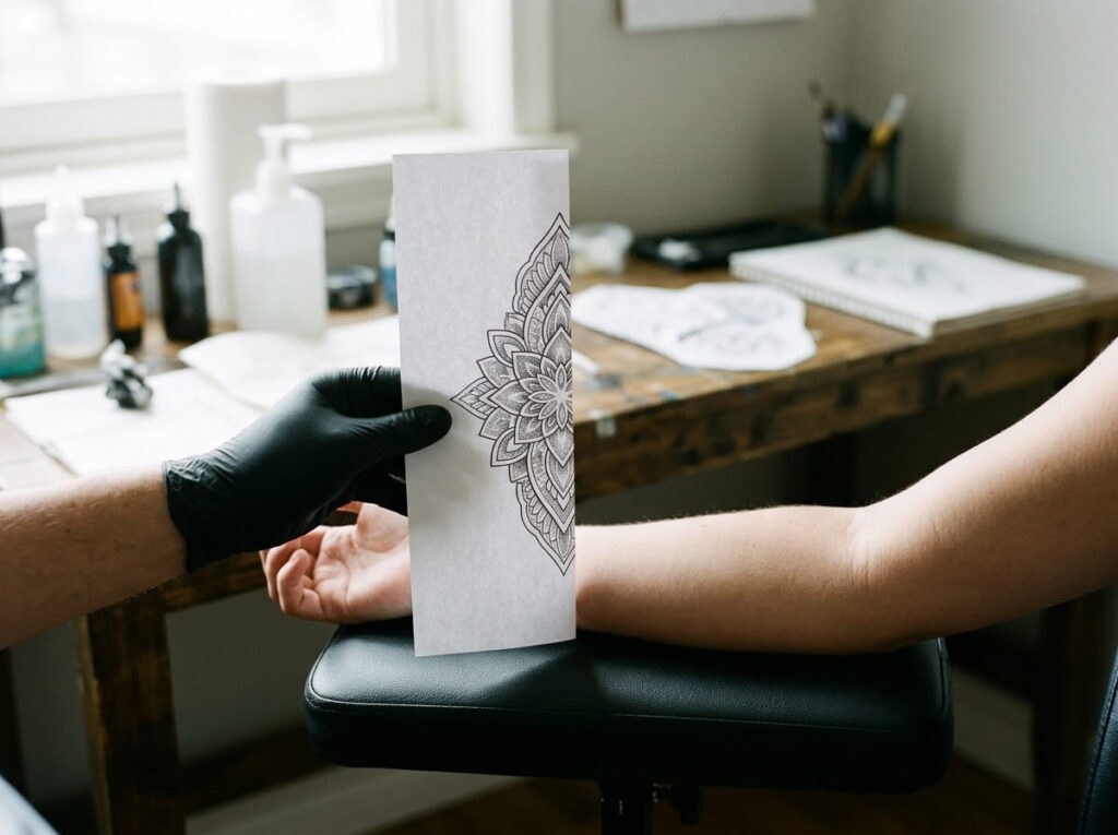
Pinterest references are almost always drawn or photographed flat. The most common mistake is bringing one of these images in and asking for it exactly as shown, without adjusting for how it will behave once it curves around your actual arm.
What looked proportional on a screen can end up cramped on the inside of your elbow or oddly stretched near your wrist. A good artist will redraw the reference to fit your specific arm rather than resizing the original image to fit the space.
⚠️ Watch Out
If an artist offers to just stretch your reference image to fit, ask instead for a redraw built around your arm’s real measurements.
10. Use Negative Space So the Design Doesn’t Look Stuffed
Leaving untouched skin between elements does more work than people expect. It gives the eye a place to rest, keeps the design from reading as one dense block, and actually makes the curve of your arm easier to follow at a glance.
Crowding every inch with linework tends to backfire once it wraps, since overlapping details compress and blur together at the point where the arm bends most.
Empty skin isn’t wasted space. It’s what keeps a wrap tattoo readable instead of cluttered.
11. Forearm Taper: Why Wider-at-Elbow, Narrower-at-Wrist Changes Your Scale
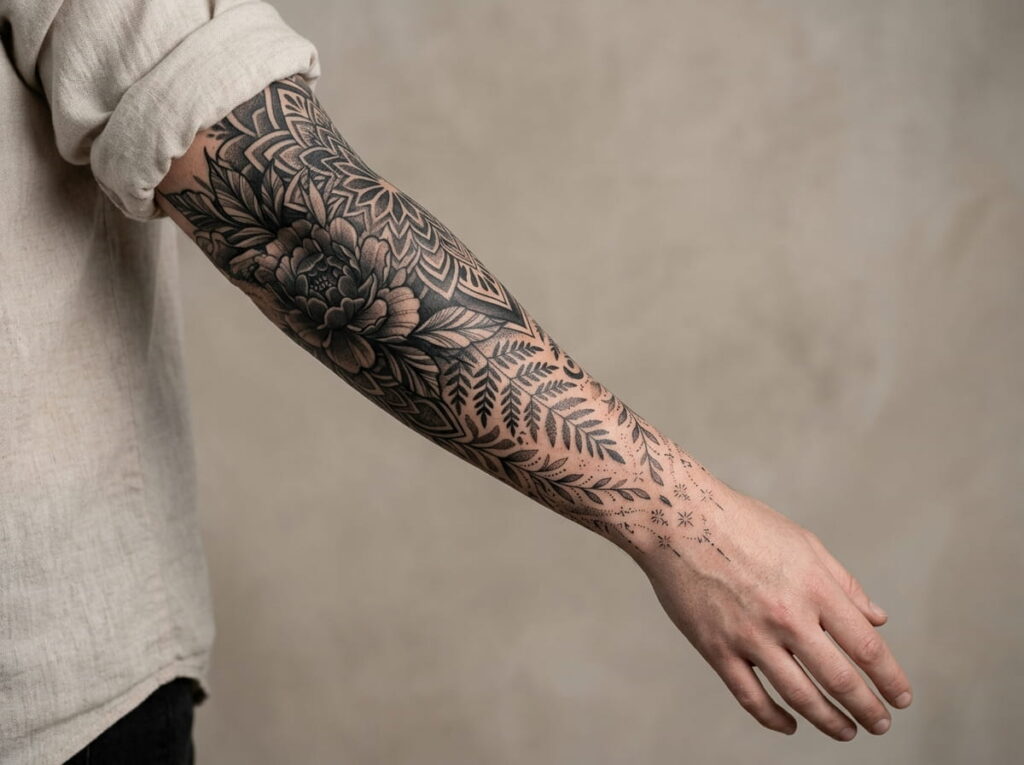
Your forearm isn’t a cylinder of even width. It’s wider near the elbow and narrows toward the wrist, sometimes by a noticeable margin. A design scaled evenly from end to end will look proportional at one point and cramped or oversized at the other.
The fix is to scale individual elements to match the taper, not the whole design as a single block. A leaf near the elbow can sit larger than the matching leaf near the wrist, and that’s correct, not inconsistent.
| Near Elbow | Near Wrist |
|---|---|
| Wider surface, can hold larger elements | Narrower surface, needs finer, smaller detail |
| More room for bold linework | Best for tapering tips, not thick blocks |
12. Choosing Line Weight That Still Holds Up From Across the Room
Fine, delicate lines look striking up close in a reference photo, but they fade fastest as a tattoo ages, especially on a part of the arm that gets constant sun and friction. A wrap tattoo built entirely from thin linework can start to look faint and blurry within a few years.
Mixing in some bolder lines, even just for the outer edges of each motif, keeps the whole piece legible at a distance long after the fine details soften.
Bold outer lines for structure and long-term legibility.
Medium weight for the main shapes of each motif.
Fine lines reserved only for small interior detail.
13. Sequencing a Multi-Session Wrap So the Sections Actually Connect
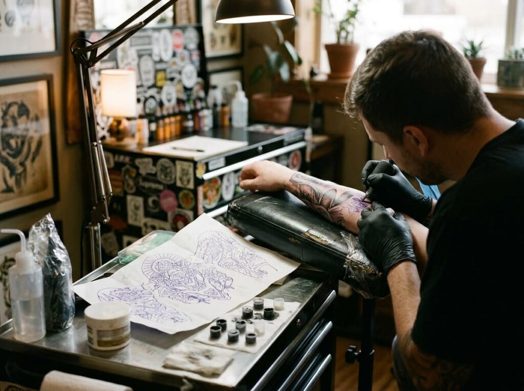
Large wraps often take more than one sitting, and that’s where misalignment tends to creep in. If each session is planned separately without reference to the last, the transition points between sections can shift just enough to throw off the whole flow.
Keeping the full design visible throughout every session, not just the section being worked on, is what keeps the connections seamless.
Finalize the full wrap design before the first session, not section by section.
Keep the full stencil visible at each sitting, even while working on one part.
Check alignment where sections meet before moving to the next sitting.
14. Vetting an Artist: Portfolio Red Flags for Wrap-Around Work
Not every skilled tattoo artist has real experience with wraps specifically. A portfolio full of flat, front-facing pieces doesn’t tell you how someone handles a curve. Look for photos taken from multiple angles of the same arm piece, since that’s the only way to judge whether their past wraps actually held together.
Checking this before booking saves you from being someone’s first attempt at a technique they haven’t practiced.
What to check in a portfolio
15. Why Swelling Makes a Fresh Wrap Tattoo Look Temporarily “Off”
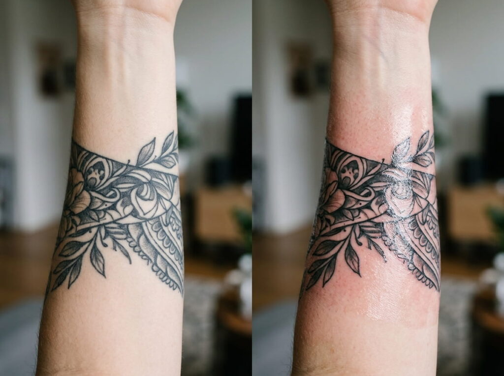
Right after a session, it’s common to panic a little. Swelling and redness can make spacing look uneven and lines look thicker than planned, especially on a wrap where the curve already makes judging proportion harder.
Give it the full healing window, usually a few weeks, before deciding whether the alignment is actually correct. Most of what looks “off” on day two settles completely once the swelling goes down.
Wait for full healing before judging proportions.
Compare against the original stencil photos, not memory.
Panicking over spacing while the skin is still swollen.
Asking for touch ups before the healing window ends.
Conclusion
A wrap around arm tattoo only looks seamless when the curve gets planned for from the very first sketch, not corrected after the fact. Tracing your arm’s real shape, choosing a flow direction that matches your muscle line, and checking the design flexed as well as relaxed all do more to prevent distortion than any single motif choice.
Give the healing process time before judging the result, and don’t settle for a flat reference stretched onto curved skin. The small extra steps, like a wrap stencil or a multi-angle portfolio check, are what separate a design that reads clean from across the room from one that quietly fights your arm every time you move it.







Leave a Reply