
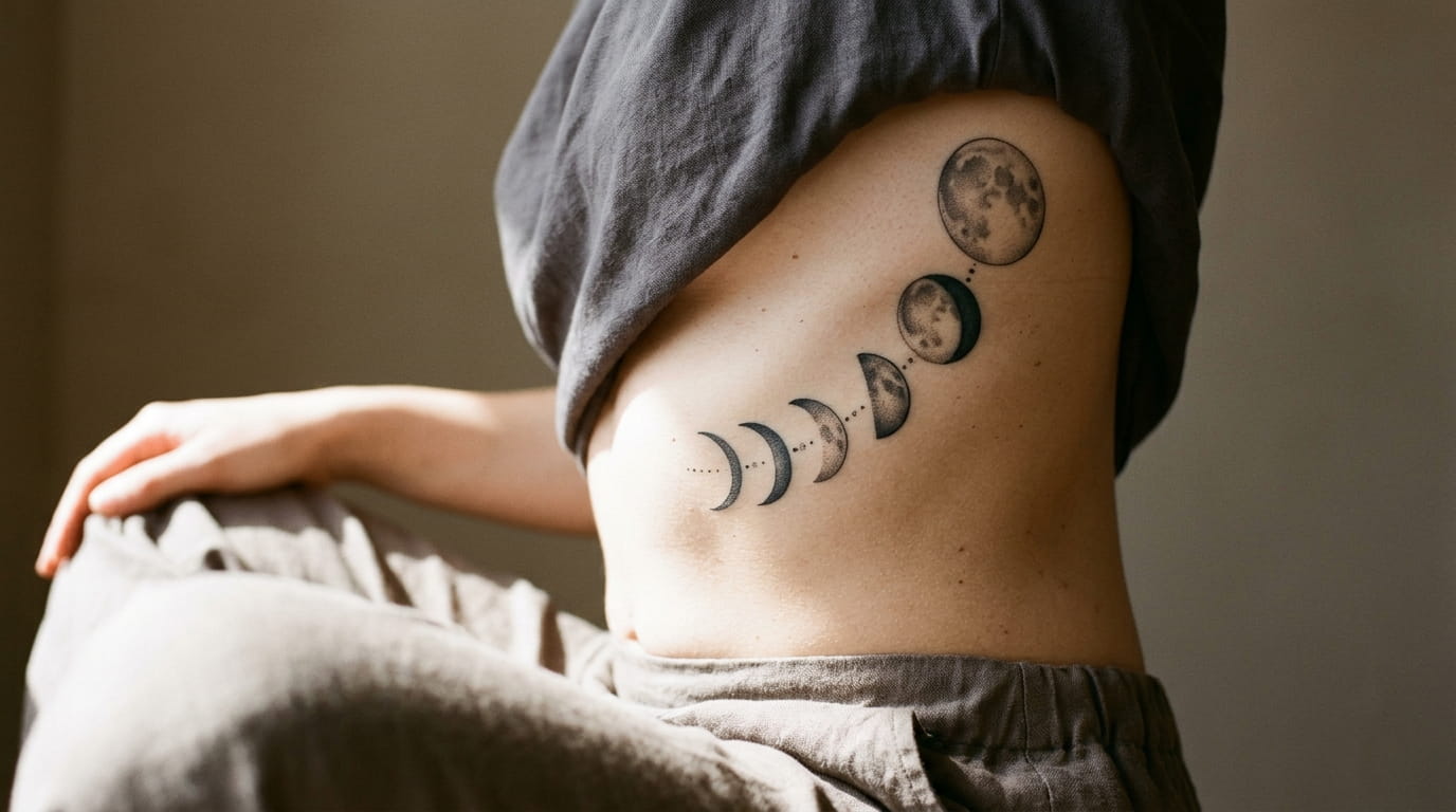
Most moon phase tattoos look great in the reference photo and muddy within two years. That’s not bad linework. It’s bad planning. The phases get crammed too close, the shading weight doesn’t match across the arc, and the gaps meant to separate each moon disappear under ink bleed.
If you’re working out how to design a moon phase tattoo that still reads clearly at year five, the planning happens before you ever sit in the chair. Layout decides whether the eye can follow the cycle. Spacing decides whether each phase keeps its own shape. Shading decides whether the whole thing looks intentional or like eight circles stacked in a row.
None of this requires a tattoo background. It takes a few decisions made in the right order, and a reference sheet you bring to your artist instead of a single screenshot. The fifteen moves below cover placement, spacing math, shading choices, and the small details that keep a lunar cycle looking like one design instead of a pile of separate moons.
1. How Many Moon Phases Actually Fit Your Skin
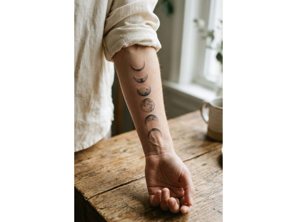
A single moon phase needs more room than it looks like on paper once shading goes in. A thin crescent can sit close to its neighbor, but a shaded full moon needs breathing space on both sides or it reads as one blob once it’s healed.
Count your realistic phases before you count your ideal ones. A forearm from wrist to elbow crease comfortably holds five to six phases with shading. A rib run or spine piece can stretch to eight or nine because the canvas is longer and less likely to warp with movement.
2. The Arc Layout: Curving Phases Along the Body’s Line
Straight lines look clean in a sketch and strange on a ribcage. Skin isn’t flat, so a phase sequence drawn as a rigid row often twists oddly once it’s actually sitting along a curve.
An arc layout follows the body instead of fighting it. It’s the better call for ribs, the outer forearm, or a spine run, anywhere the surface naturally bends.
Three things make the arc work:
Trace the curve on skin first, using a landmark like the rib line or spine, before placing a single moon.
Keep each moon’s flat edge perpendicular to the arc line, not the floor, so none of them look tilted.
Check the full layout standing up, since gravity shifts the curve more than it does lying on a table.
3. The Straight Line Layout: When It Beats a Curve
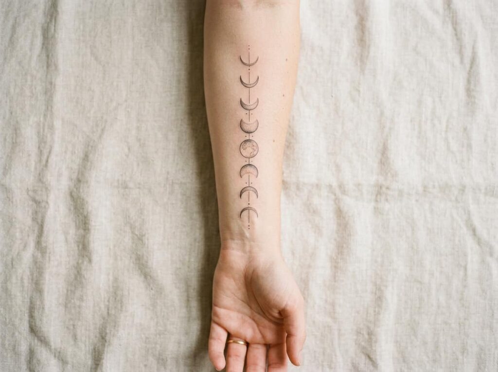
A straight line layout reads instantly and feels deliberate, which suits a forearm, a collarbone, or a tight ankle run. It also makes the phase order easiest to follow at a glance, since nothing competes with the eye tracking a curve.
The trade off is forgiveness. A straight layout shows uneven spacing immediately, so it needs more precise measuring before the needle touches skin. This layout works best for anyone who wants their moons read at a glance, no squinting, no tracing a curve first.
4. Spacing Math: The Gap That Keeps Each Phase Readable
Equal spacing is not the same as good spacing, and that’s where most moon phase designs start to drift. People space every moon the exact same distance apart, then wonder why the full moon looks cramped against its own shading while the new moon has awkward empty skin around it.
Gap size should scale with ink density instead. A heavily shaded phase needs more clearance than a simple crescent outline, or the shading creeps into the blank skin meant to separate it from the next moon. Measure from the edge of the shading, not the center of the moon.
| Placement | Suggested Gap |
|---|---|
| Wrist or finger | 0.25 to 0.4 inch |
| Forearm | 0.5 to 0.75 inch |
| Rib or spine | 0.75 to 1 inch |
5. Full Moon Placement: The Anchor Point of the Design
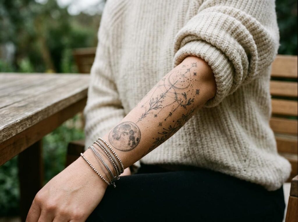
The full moon carries the most ink, the most shading, and the most visual weight of any phase in the set, so it usually needs to anchor the design rather than float in the middle of the sequence.
Most layouts work better with the full moon at one end, near the wrist, the top of the spine, or the start of a rib run, so the eye has a clear starting or ending point. Centering it instead can make the whole piece feel like it’s missing a direction.
Place your full moon at an end point, not the middle, so the cycle has a direction the eye can follow.
6. New Moon Placement: The Gap People Forget to Plan
People spend hours deciding where the full moon goes and forget the new moon needs its own plan too. A new moon is usually just a thin outlined circle or left as implied negative space, so it can vanish next to a heavily shaded phase if it’s placed carelessly.
Give the new moon its own clear zone, usually at the opposite end from the full moon. That keeps the cycle feeling complete instead of lopsided toward one side of the design.
📌 Good To Know
A new moon with no outline at all can read as a gap in healed skin instead of a phase. Ask your artist for a faint ring so it still reads as intentional five years from now.
7. Crescent Orientation: Left Curve vs. Right Curve
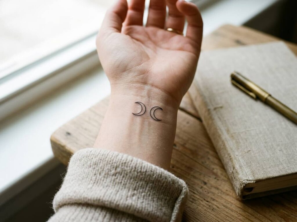
A waxing crescent and a waning crescent are not interchangeable, even though they look like mirror images in a reference photo. Flip one the wrong way and the whole cycle reads backward to anyone who actually knows moon phases.
Waxing moons curve light on the right side, building toward full. Waning moons curve light on the left, shrinking toward new. Mixing them up is the single most common error in moon phase tattoos, and it’s an easy one to catch before the stencil goes on.
Check your sequence against a real moon calendar before approving the stencil.
Keep the lit side consistent with whether the cycle is waxing or waning.
Flipping reference images for symmetry without checking the lit side.
Assuming crescents are interchangeable because they look similar.
8. Spine Runs vs. Rib Wraps: Picking the Placement
Spine and ribs ask for different things from a moon phase design, even though both are popular for a full cycle piece. A spine run gets more length but less width, which favors a tighter, narrower moon shape. A rib wrap curves around the body instead of down it, which suits an arc layout better than a straight one.
Before committing to either, walk through this short list with your artist:
Before you pick a placement
9. Shading Style: Dotwork, Fine Line, or Blackwork
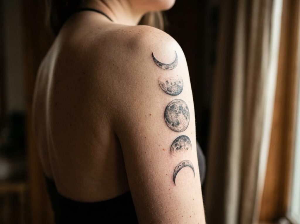
The shading style is the first thing anyone notices from across a room, long before they count the individual phases. Dotwork gives a soft, almost photographic gradient that ages the slowest. Fine line keeps things minimal but can lose definition on darker phases within a few years. Blackwork holds its contrast the longest but reads heavier on the skin.
Pick based on how the piece needs to look in a decade, not just on day one.
10. Size Tapering: Why Phases Shouldn’t Match
Every phase being the exact same size is a reference photo habit that rarely survives real skin. A set of identically sized circles can start to blur into a repeating pattern instead of reading as a progression, especially once a little swelling or stretch comes into play.
A slight taper fixes this fast:
Make the full moon your largest phase, since it already carries the most shading weight.
Taper each phase down by roughly 10 to 15 percent as you move toward the new moon.
Keep the smallest crescent large enough to still hold a clean line once it’s healed.
11. Negative Space: Letting the Skin Be Part of the Moon
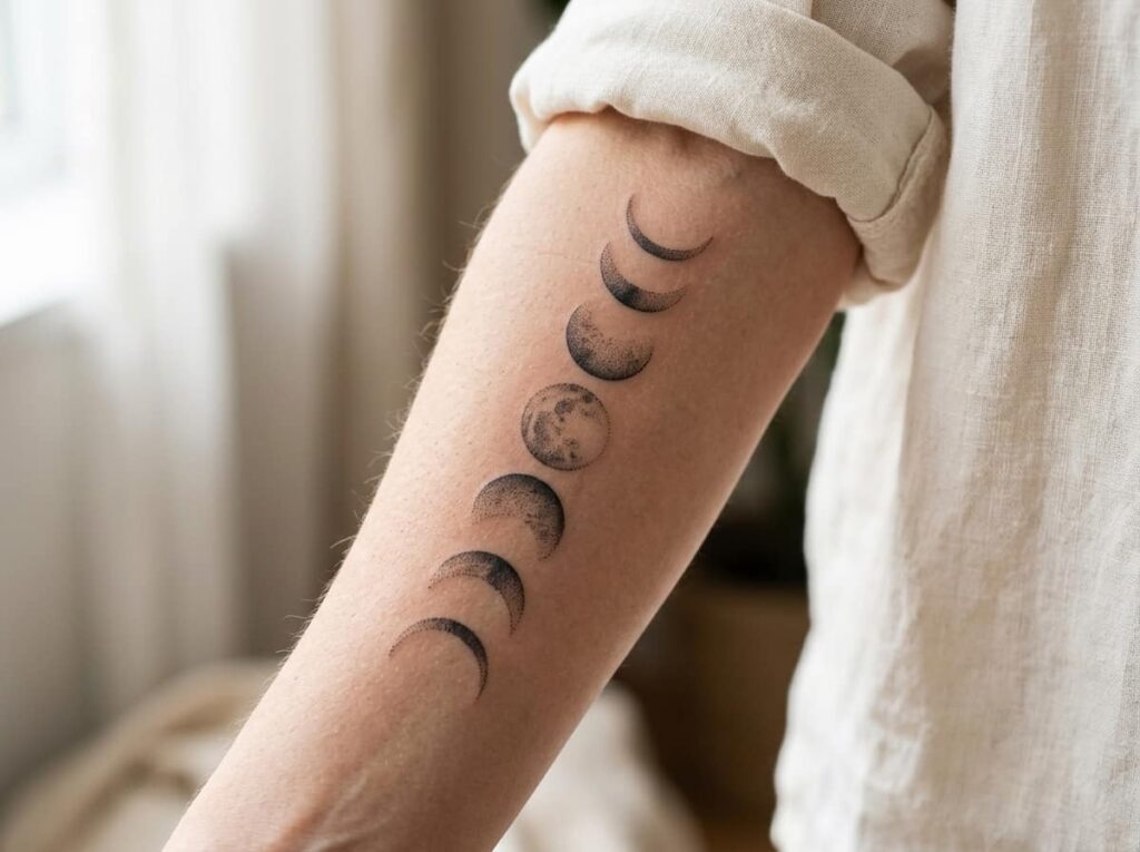
A moon phase design doesn’t need ink everywhere to read clearly. The dark side of the moon, the part not illuminated, can be left as bare skin instead of shaded, which keeps the whole piece lighter and lets each phase breathe.
This works especially well on a waning sequence, where several phases in a row would otherwise stack dark shading right next to each other.
Every phase fully shaded, including the dark portion, so the sequence looks heavy and crowded.
Dark portions left as bare skin, so the eye has room to rest between phases.
12. Stars and Constellations Without Crowding the Phases
Adding stars around a moon cycle is one of the fastest ways to make the main design harder to read instead of better. Small dots scattered near the shading blend into the ink once healed, especially with dotwork, and the constellation ends up fighting the moons for attention.
⚠️ Watch Out
Keep stars outside the direct spacing gap between phases, not inside it. Scattered dots too close to a moon’s edge will blur into its shading within a couple of years.
If you want stars, place them along the outer edge of the whole sequence, not threaded between individual phases. A few well-placed points read cleaner than a dense cluster.
13. Placement by Body Part: Forearm, Ribs, Spine, Behind the Ear
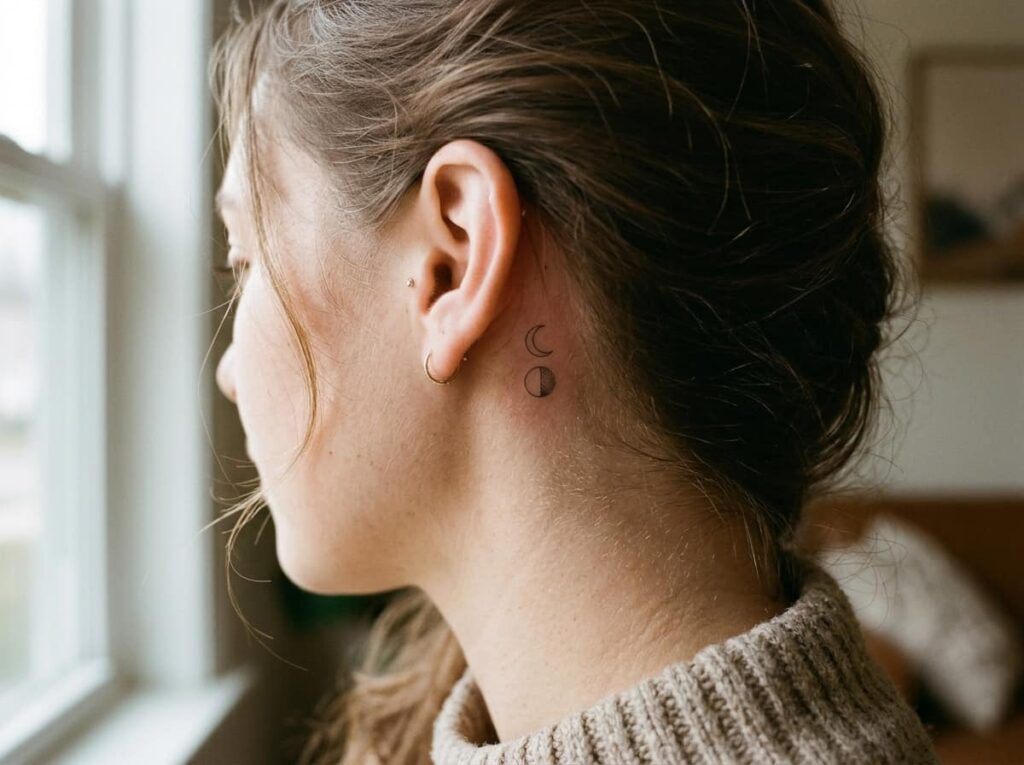
Where a moon phase cycle goes on the body changes almost every other decision on this list, from layout shape to how many phases actually fit. Behind the ear fits a tiny two or three phase cycle at most. A forearm handles a full sequence with room for shading. Ribs and spine can take the longest, most detailed version.
14. Spacing Mistakes That Blur Together After Healing
A few spacing errors show up again and again once pieces finish healing, and almost all of them trace back to planning the design on paper without accounting for how skin actually settles.
- Placing two heavily shaded phases directly next to each other with no lighter phase between them to break up the weight
- Measuring gaps from the center of each moon instead of the outer edge of its shading
- Ignoring how a joint like the wrist or elbow will stretch the spacing when bent
- Skipping a healed-skin mockup and approving the stencil straight off a flat drawing
- ▸Ask your artist for a stencil fitting on the actual placement, not just a flat paper sketch.
- ▸Bend the joint during the fitting if the design crosses one.
- ▸Walk around the studio before the needle starts, not just stand in front of a mirror.
15. Mapping a Real Moon Cycle to an Actual Date Range
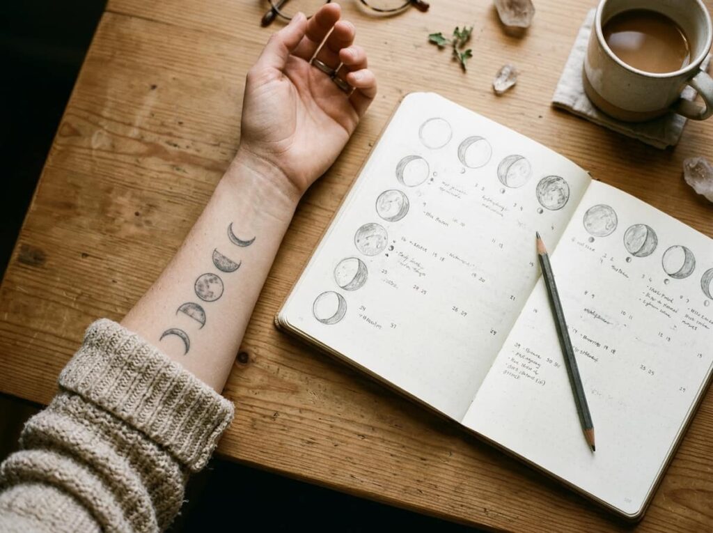
Some people want their moon phases to mean something specific, like a birth date or a meaningful event, rather than just a generic illustrated cycle. If that’s the goal, the sequence needs to match an actual lunar calendar instead of an evenly spaced artistic guess.
A free moon phase calendar for any date will tell you the exact phase to start from, so the final piece holds that personal meaning even if nobody else ever notices it.
Conclusion
A moon phase tattoo holds up when the planning happens before the outline does. Get the phase count right for your placement, give the full moon and new moon their own anchor points, taper the sizes instead of matching them, and pick shading that still looks good in ten years, not just in the first photo.
None of this is about perfection. It’s about bringing your artist a layout that already accounts for how skin moves, heals, and ages, instead of handing over a single flat reference image and hoping the spacing works itself out. Once you know how to design a moon phase tattoo with real spacing and shading logic behind it, the rest of the process is just picking the details that feel like you.







Leave a Reply