
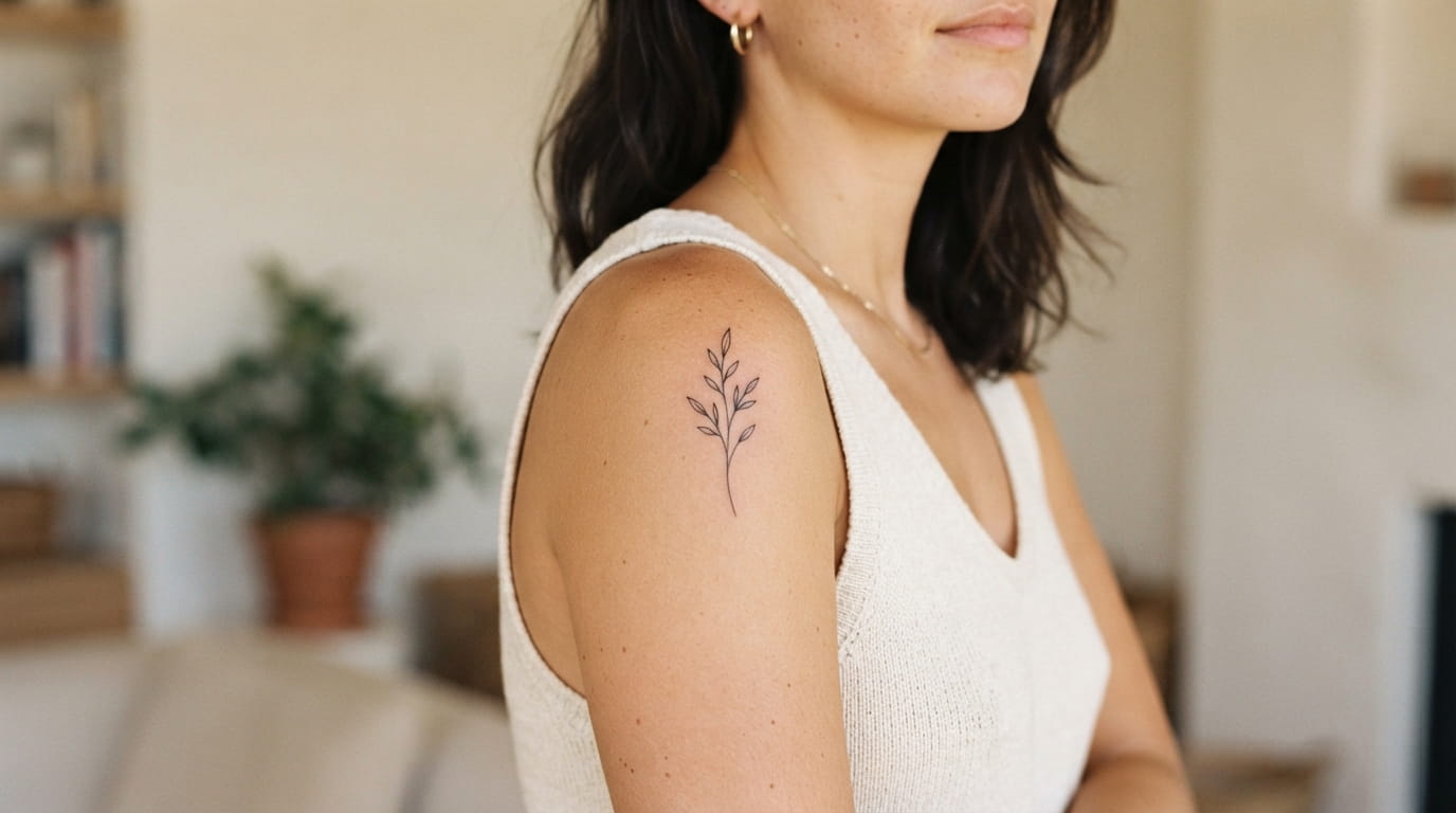
A small tattoo can say a lot without taking over your skin. The trick is choosing a design that has enough character to feel personal while keeping the lines clean and the overall shape uncluttered. That is where minimalist tattoo ideas work especially well. They leave breathing room around the design, which can make even a tiny piece feel intentional.
Simple tattoos also give you plenty of freedom. You can choose a delicate botanical, a meaningful symbol, a tiny word, or a shape that simply looks good to you. Placement matters too. A design that feels understated on the collarbone may look completely different on the ankle or upper arm.
The best minimalist tattoos are not necessarily the tiniest ones. They are the designs that remove everything unnecessary and keep the detail that actually matters. If you love the “less is more” approach, these ideas can help you find a style that feels simple without feeling boring.
- 1. Choose a Single-Line Botanical for a Soft, Natural Look
- 2. Try a Tiny Geometric Shape When You Want Clean Lines
- 3. Use a Small Crescent Moon for Quiet Symbolism
- 4. Pick a Fine-Line Heart That Feels Personal, Not Overdone
- 5. Keep a Meaningful Word Tiny With Minimal Script
- 6. Turn a Favorite Star or Constellation Into Simple Ink
- 7. Choose a Tiny Sun Design for a Bright Everyday Reminder
- 8. Use a Small Wave for a Calm, Understated Tattoo
- 9. Try a Minimalist Animal Outline With One Continuous Line
- 10. Add a Tiny Initial for a Tattoo That Means Something to You
- 11. Pick a Delicate Flower Outline Instead of a Detailed Bloom
- 12. Use a Small Abstract Line Design for a More Artistic Feel
- 13. Choose a Tiny Symbol That Represents a Personal Memory
- 14. Keep Matching Tattoos Simple With Two Small Coordinated Designs
- 15. Place a Minimalist Tattoo Somewhere Subtle and Easy to Cover
- Conclusion
1. Choose a Single-Line Botanical for a Soft, Natural Look
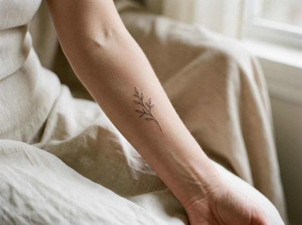
A single-line botanical keeps the beauty of a flower or leaf while removing most of the visual clutter. A tiny olive branch, sprig, or curved leaf can work beautifully when the line stays delicate and the shape has room to breathe.
Think about the outline first rather than adding lots of tiny details.
- Pick one recognizable plant.
- Keep the stem and leaves visually connected.
- Avoid packing several flowers into one tiny space.
For placement, the collarbone, inner forearm, shoulder, or side of the ribcage can give a fine-line botanical enough room to read clearly.
2. Try a Tiny Geometric Shape When You Want Clean Lines
Geometric tattoos suit the “less is more” mindset because the design can be built from just a few precise lines. A small circle, triangle, square, or combination of simple shapes can feel modern without needing shading or elaborate detail.
Keep the design readable: choose one main shape and let the negative space do some of the work.
A tiny geometric tattoo can look especially neat on the upper arm, ankle, forearm, or back of the shoulder. If the design uses very fine lines, give it enough space so nearby details do not visually merge over time.
Note: A minimalist shape does not need to have a complicated meaning. Sometimes the clean form itself is what makes the tattoo appealing.
3. Use a Small Crescent Moon for Quiet Symbolism
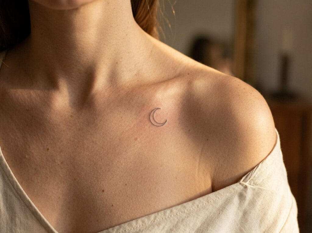
A crescent moon is an easy way to bring symbolism into a simple tattoo without filling the design with detail. Its curved silhouette is recognizable even at a small size, and you can keep the interior completely open.
For a softer look, choose a fine outline with plenty of skin showing inside the crescent. A slightly thicker line can create a bolder minimalist version.
Quick reference
- Look: delicate and understated
- Detail: low
- Best feature: recognizable silhouette
- Placement: ankle, shoulder, collarbone, or upper arm
The key is restraint. Adding stars, dots, shading, and decorative elements can quickly move the design away from the clean simplicity that makes a tiny moon work.
4. Pick a Fine-Line Heart That Feels Personal, Not Overdone
A heart does not have to be large, shaded, or surrounded by decorative details to feel meaningful. A simple outline can be enough, especially when you choose a placement connected to the reason behind the tattoo.
Before settling on the final version:
- Decide whether you want a classic or slightly abstract heart.
- Keep the outline open and uncluttered.
- Choose a size that lets the curves remain distinct.
The upper arm, ankle, shoulder, or rib area can all work for a small heart. If you want the meaning to stay private, choose a placement that is normally covered by clothing.
Before the appointment
5. Keep a Meaningful Word Tiny With Minimal Script
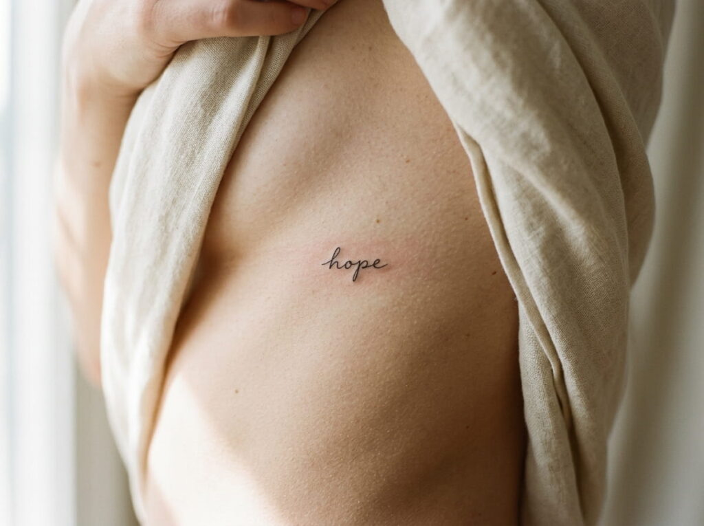
A single word can make a minimalist tattoo feel much more personal. Think of a short word that has meaning to you, then let the lettering stay small and uncomplicated rather than adding flourishes around it.
The simpler the lettering, the more important readability becomes.
Ask your tattoo artist to show the chosen word at the actual intended size. Tiny script can look beautifully delicate in a reference image but become harder to read when reduced too far.
For placement, consider the collarbone, rib area, upper arm, inner forearm, or back of the shoulder. Keep enough spacing between letters so the word remains clear as the tattoo ages.
Short wording with clear letter spacing.
A size that keeps every letter readable.
Very long phrases squeezed into tiny lettering.
Extra flourishes that make the word harder to read.
6. Turn a Favorite Star or Constellation Into Simple Ink
A tiny star can stand alone, but a small constellation gives you a little more personality without becoming busy. Pick a constellation that has personal meaning, or simply choose a pattern you like visually.
Keep the dots and connecting lines sparse.
- Use only the stars needed to recognize the shape.
- Keep connecting lines thin and clean.
- Leave plenty of skin showing between each detail.
The back of the shoulder, collarbone, upper arm, or ankle can give this design a nice amount of breathing room. A constellation works especially well when you want something symbolic that does not immediately look like a traditional tattoo.
Choose a star pattern that has meaning or simply catches your eye.
Remove extra stars until the main shape is easy to read.
Check the design at its real tattoo size before committing.
7. Choose a Tiny Sun Design for a Bright Everyday Reminder
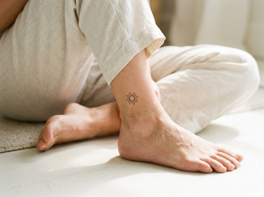
A small sun can bring warmth and meaning into a minimalist tattoo without requiring a detailed illustration. The simplest version might be a clean circle with a few short rays around it.
The beauty is in the spacing.
A design with evenly placed rays usually reads more clearly than one packed with decorative details. The upper arm or shoulder gives the circular shape room to breathe, while an ankle placement can make it feel more discreet.
Before finalizing the stencil, check the circle and rays together at the actual tattoo size. Fine details that look separated on a large screen can feel crowded once reduced.
A tiny sun with too many rays, dots, and decorative details competing for space.
A clear circle with a restrained number of rays that stays readable at a small size.
8. Use a Small Wave for a Calm, Understated Tattoo
A single flowing line can say more than a detailed ocean scene. A minimalist wave uses the natural curve of the line to create movement while keeping the tattoo visually light.
There are two easy directions to consider:
| Simple wave | Double-line wave |
|---|---|
| One clean curve | Two coordinated curves |
| Very minimal look | Slightly more visual detail |
| Works well at tiny sizes | Needs a little more breathing room |
The side of the forearm, ankle, rib area, or back of the upper arm can work well for a wave. Keep the line smooth and avoid squeezing several wave shapes into one small area.
| Simple wave | Double-line wave |
|---|---|
| One clean curve | Two coordinated curves |
| Very minimal look | Slightly more visual detail |
| Works well at tiny sizes | Needs more breathing room |
9. Try a Minimalist Animal Outline With One Continuous Line
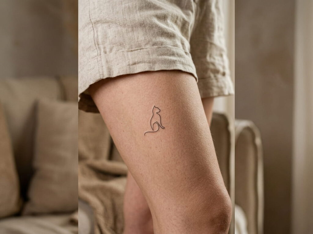
Animal tattoos can become detailed very quickly, but a continuous-line outline keeps the idea recognizable without filling the skin with shading. A cat profile, small bird, butterfly, or other favorite animal can work well in this style.
The outline should do most of the work.
Choose an animal with a distinctive silhouette rather than one that needs lots of internal details to be recognizable. The shoulder blade, upper arm, thigh, or calf can provide enough surface area for the line to remain clear.
If you want the tattoo to feel especially delicate, skip eyes, fur texture, and heavy shading. One confident line often has more impact than several tiny details competing for attention.
Choose an animal whose silhouette is recognizable without extra shading or tiny interior details.
10. Add a Tiny Initial for a Tattoo That Means Something to You
An initial can be one of the simplest ways to make a small tattoo personal. It might represent your own name, someone important to you, a family connection, or a private reminder that only you understand.
Keep the letter style clean and give it enough space to remain distinct. A single initial does not need decoration around it.
Good placement choices include:
- Behind the ear for a discreet detail
- Inner forearm for easy visibility
- Upper arm for a more private option
- Collarbone for a delicate, visible placement
If you are considering a very fine letter, ask to see the exact character at the intended tattoo size. The goal is a letter that still looks intentional rather than cramped.
📌 Good To Know
For tiny lettering, seeing the initial at its actual intended size is more useful than judging it from a large reference image.
11. Pick a Delicate Flower Outline Instead of a Detailed Bloom
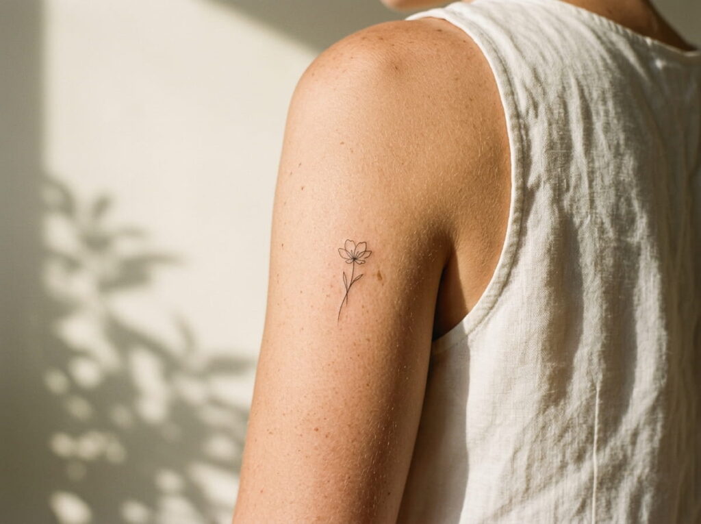
A flower does not need petals, shading, and layers of detail to feel feminine. A simple outline can keep the shape airy while still making the flower recognizable.
Choose a bloom with a clear silhouette, such as a small daisy, poppy, or wildflower. Keep the petals open rather than stacking tiny details into the center.
For a cleaner result:
- Let the outline carry the design.
- Keep the flower small but readable.
- Leave decorative dots and heavy shading out.
The ankle, collarbone, shoulder, or back of the upper arm can give a delicate flower enough space without making it feel oversized.
12. Use a Small Abstract Line Design for a More Artistic Feel
Not every minimalist tattoo needs to represent a specific object. A few carefully placed curves can create an abstract design that feels more like a tiny piece of line art.
Start with the movement of the line rather than trying to fill a particular shape. A looping curve, uneven contour, or simple intersecting line can work well when the composition stays open.
Before choosing the final design, check three things:
- Does the line look balanced from a normal viewing distance?
- Is there enough empty skin between crossings?
- Will the design still make sense without adding more detail?
The forearm, shoulder, thigh, or rib area can give an abstract piece enough room to show its shape.
Check the design first
13. Choose a Tiny Symbol That Represents a Personal Memory
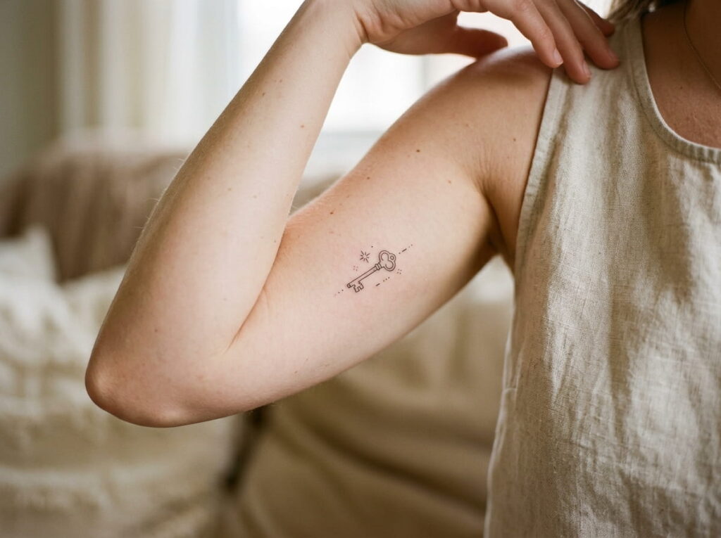
Sometimes the strongest minimalist tattoo is a symbol that only needs to make sense to you. A tiny object, mark, or shape can stand in for a place, person, moment, or memory without spelling out the whole story.
Think about the memory first, then reduce it to one visual detail.
For example, a meaningful memory might translate into a small outline of an object, a simple shape, or a tiny symbol connected to that moment. The design does not have to explain itself to everyone who sees it.
Keep the final symbol visually simple. The more personal the meaning, the less the tattoo needs extra decoration to make it feel important.
14. Keep Matching Tattoos Simple With Two Small Coordinated Designs
Matching tattoos do not have to be identical. Two people can choose designs that share a shape, theme, or visual detail while still feeling individual.
The easiest approach is to agree on one connection and keep everything else simple.
- Pick a shared theme or symbol.
- Decide whether the tattoos should match exactly or complement each other.
- Choose placements that make sense for each person.
- Keep the line weight and overall scale visually compatible.
Small stars, initials, symbols, or paired line-art shapes can work well. If the tattoos are meant to feel connected rather than identical, small differences can make each one more personal.
Choose one visual connection, such as the same symbol or line style.
Let each person choose a placement that suits them.
Compare the final designs together before the appointment.
15. Place a Minimalist Tattoo Somewhere Subtle and Easy to Cover
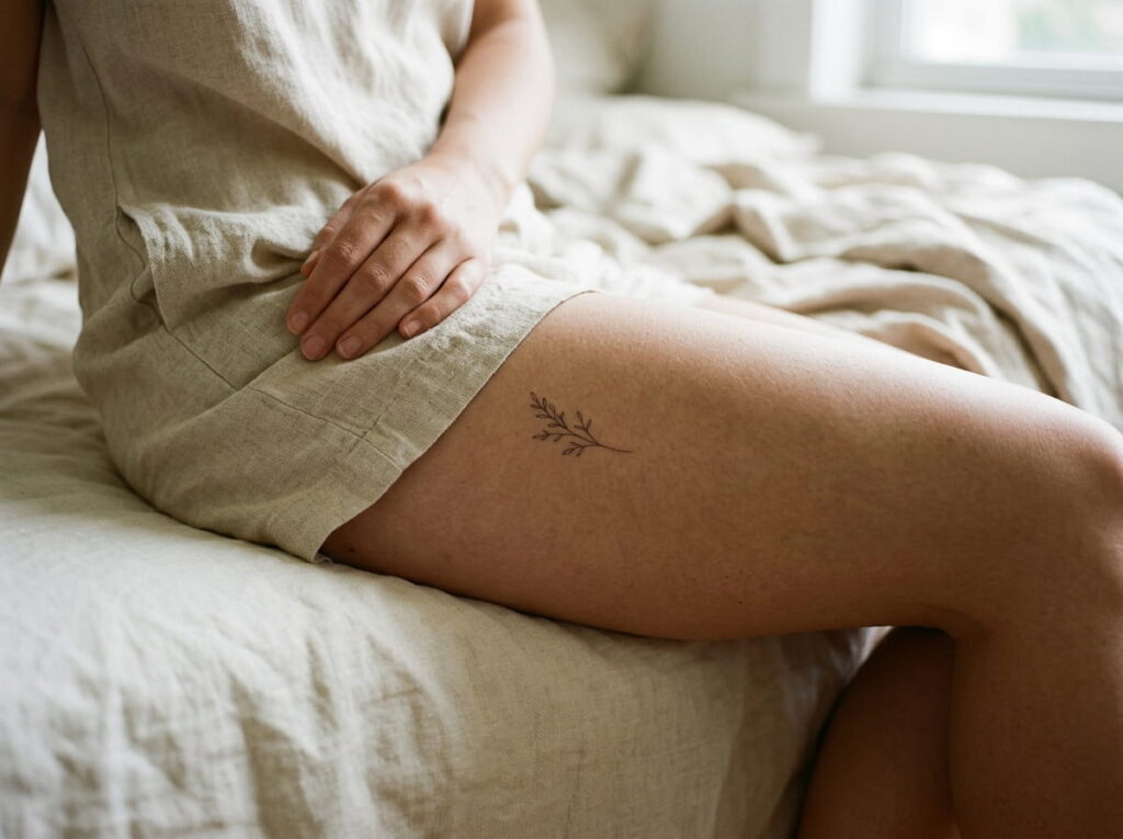
A simple tattoo can feel even more understated when the placement is naturally discreet. This is useful if you want to enjoy the design yourself while keeping it easy to cover with everyday clothing.
Think about how the area looks when your arms are relaxed, when you sit, and when you wear the clothes you normally choose. A tattoo that is easy to hide should still be placed where the design has enough room to remain clear.
Good subtle areas can include the upper back, rib area, upper thigh, inner upper arm, or behind the ear.
Before committing, test the approximate placement with a temporary skin-safe marker or stencil. Move normally and check whether the position still feels right from different angles.
Check the placement with your usual clothing.
Move around before approving the final stencil.
Choosing a spot only because it looks good in one posed photo.
Ignoring how the tattoo will sit when your body moves.
Conclusion
Minimalist tattoos prove that a design does not need lots of detail to feel personal. A clean botanical, tiny symbol, simple word, or fine-line shape can carry plenty of meaning while keeping the overall look understated. The best minimalist tattoo ideas are the ones that fit your personality, placement, and reason for getting inked rather than simply following a trend.
Before booking, look at your favorite designs at their actual size and think about how the placement will work with your everyday life. Give simple lines enough breathing room, too. That little bit of restraint is often what makes minimalist ink look so intentional.







Leave a Reply