
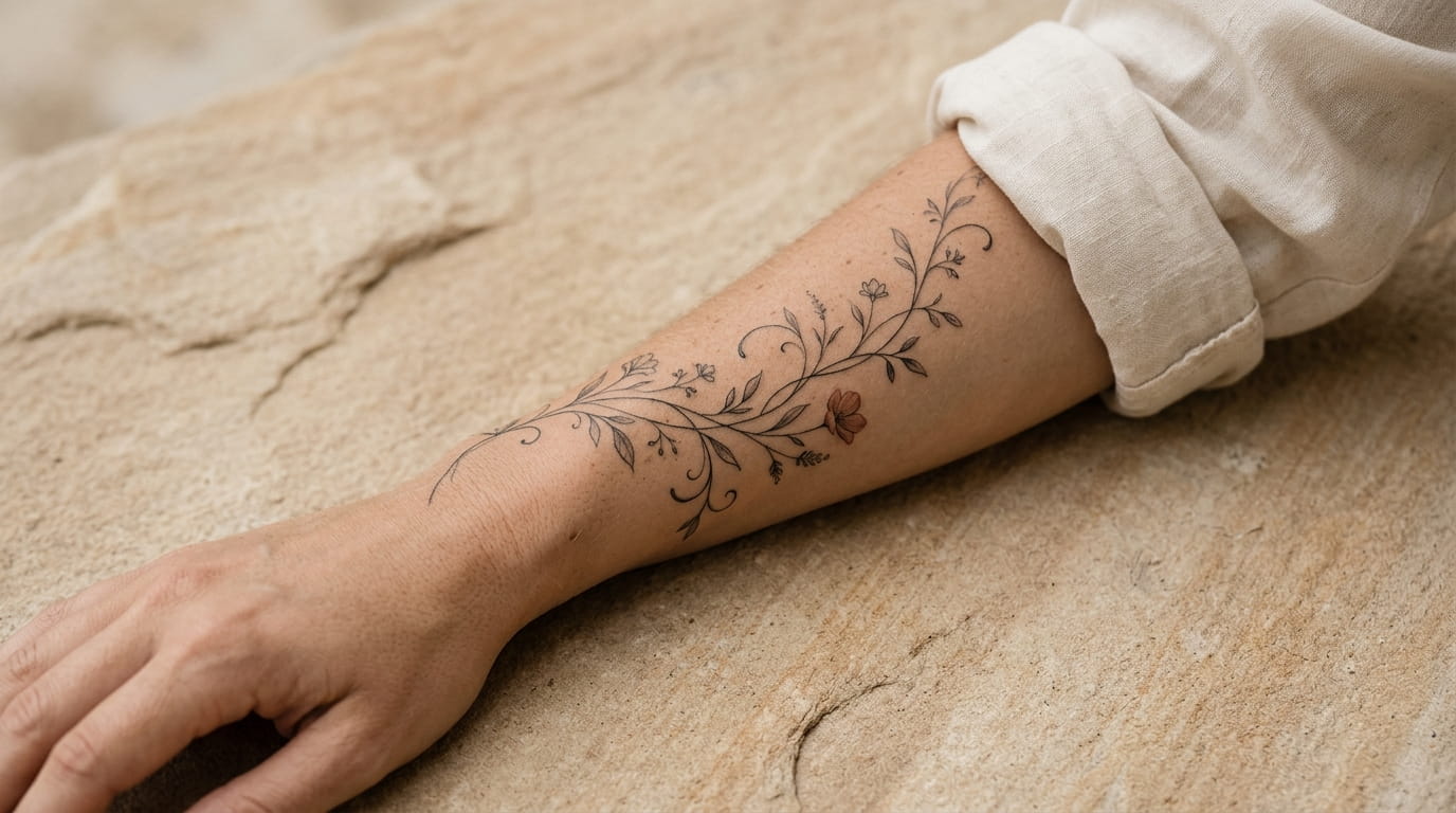
Most “best tattoo ideas” roundups pull photos from a dozen different arms, shot at a dozen different angles, so you end up guessing how a design will actually sit on your own forearm. That guesswork is the real reason so many people end up with regret, not the design itself. A piece that looks perfect cropped tight on Pinterest can read completely differently once it’s stretched along the curve of a real arm.
This list splits forearm tattoo ideas for women into two groups: pieces built for the softer inner arm, where skin is thinner and designs read more private, and pieces built for the outer arm, where the canvas is flatter and the ink stays visible. Knowing which side you’re working with before you walk into a shop changes which style actually works.
Fifteen ideas follow, grouped by placement, each with a note on what the design needs to look right and age well. Save the ones that fit your arm, not just the ones that caught your eye.
1. A Single Word or Date Written in Fine Cursive Up the Inner Forearm
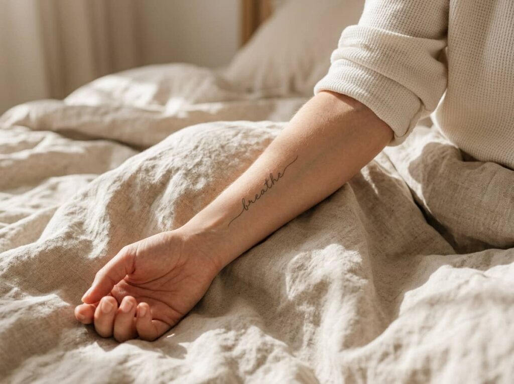
A thin script running from the wrist toward the elbow catches light differently than the same word printed straight across the wrist. The letters stretch and lean with the curve of the arm, so even a short word reads longer and more deliberate.
Pick something with meaning you won’t second guess in five years. A birth year, a single name, or three words that mean something only to you tend to age better than a quote pulled from social media.
2. A Strand of Tiny Stars Trailing From Wrist to Elbow Crease
Space matters more than the stars themselves. Five stars crammed into two inches read as a cluster, not a trail. Give each one enough room that the eye travels along the arm instead of jumping between dots.
Most artists freehand the spacing once you’ve picked a rough path, since a stencil locks every star into a straight line that looks stiff once it’s healed. Ask for slightly uneven sizing too, since uniform stars can look more like flash sheet filler than something scattered by hand.
💡 Quick Tip
Keep it to five or seven stars at most, and let the sizes vary slightly so the trail looks hand placed instead of stamped.
3. A Hidden Symbol Tucked Just Above the Inner Elbow Fold
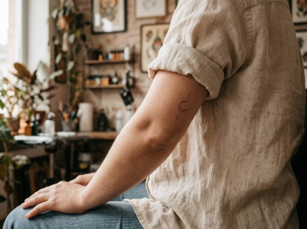
Some women want ink they can talk about on their own terms, not something a stranger comments on in line at the grocery store. The elbow fold solves that. A short sleeve covers it most of the day, and it only shows when an arm bends or reaches.
The trade off is healing. Skin folds move constantly, so plan on a slower recovery and loose clothing for the first week.
4. A Vertical Line of Stacked Symbols Running Down the Inner Forearm
Stacked symbols sit directly on top of each other in a single column, while a scattered layout lets each one drift slightly left or right. Stacked reads cleaner and more graphic. Scattered feels looser, like a collection built up over time rather than planned in one sitting.
Three to five small symbols is the sweet spot. Much past that and the column starts to look crowded instead of intentional, especially on a narrower forearm.
| Stacked Layout | Scattered Layout |
|---|---|
| Reads clean and graphic | Reads loose and collected over time |
| Needs precise spacing | Forgives uneven spacing |
5. A Soft Watercolor Wash Behind a Fine-Line Inner Forearm Design

A friend gets a plain line drawing healed first, then comes back months later to add a wash of color behind it once she’s sure she still likes the placement. That two step approach is common with this style, and it gives you a real test run before committing to color.
Watercolor fades faster than solid black work, so budget for a touch up around the two year mark if you want the wash to stay vivid.
A plain fine-line outline, healed and settled on its own.
The same outline with a soft watercolor wash layered in behind it.
6. A Set of Matching Dotted Shapes Spaced Along the Inner Wrist
Dot work forgives almost nothing on sizing. One dot even slightly bigger than the rest pulls the eye straight to it, and the whole set stops looking matched the moment that happens.
Three or four dots spaced evenly along the wrist line is usually enough. Push past that and the design starts to read like a bracelet instead of a deliberate pattern.
Grab these before your appointment:
What to bring to your appointment
7. A Bold Geometric Band Wrapping the Outer Forearm
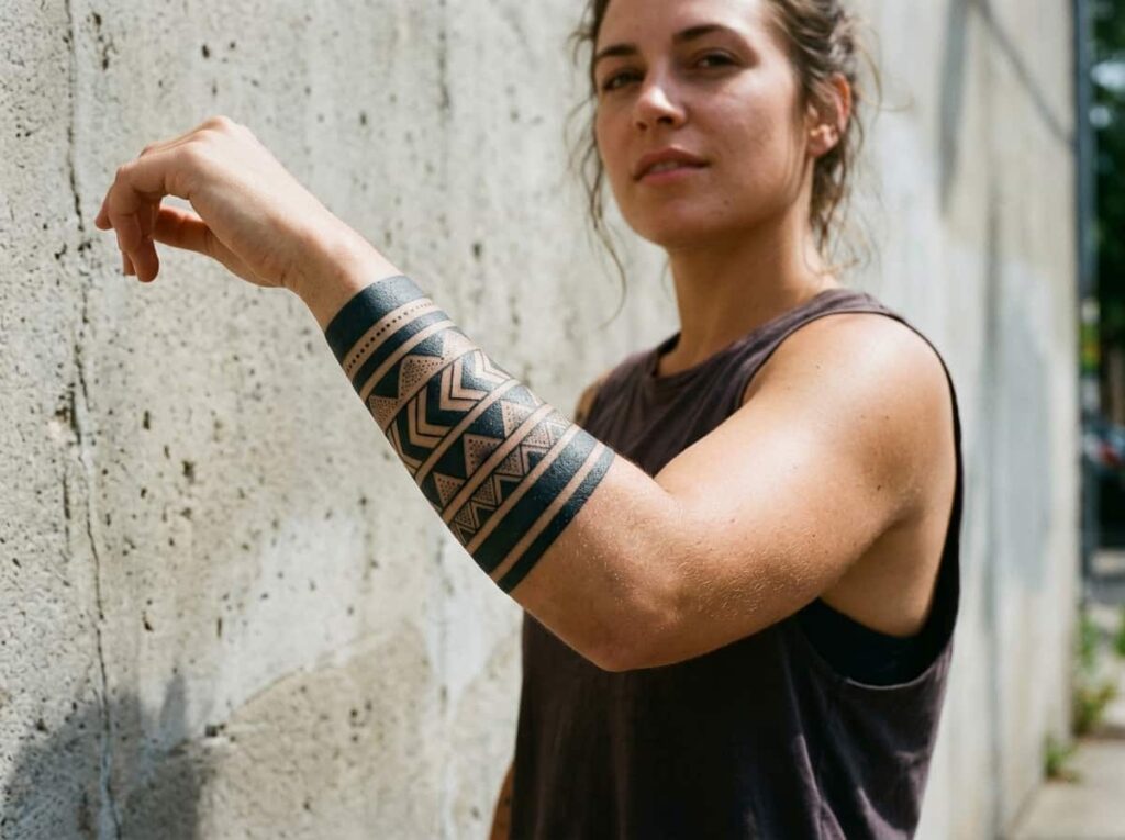
A lot of people assume a wrap-around band needs a full sleeve planned underneath it before it looks finished. It doesn’t. A single clean band, a few inches wide, can stand completely on its own and still read as intentional.
What trips people up is symmetry. A band that doesn’t line up evenly when the arm is viewed from the front and the side looks unfinished no matter how sharp the linework is.
Ask the artist to wrap the stencil around your actual arm before tattooing, not just hold it flat against the skin.
Check the band from the front, side, and back in a mirror before you commit.
Approving a stencil you only saw flat on paper.
Going wider than four inches on a first geometric piece.
8. A Trailing Vine of Botanicals Climbing From Wrist to Elbow
Start with the vine’s path, not the leaves. The route it takes up the arm determines whether the finished piece looks like it’s growing naturally or just floating on the skin.
Most artists build this one in a specific order during the session.
The stem path gets drawn directly on your arm with a marker so it follows your actual shape.
Leaves and small flowers get spaced along that path, alternating sides so it doesn’t look stiff.
Fine shading gets added last, once the full vine is outlined and you’ve both confirmed the flow.
9. A Wildflower Sprig Placed Just Below the Outer Elbow
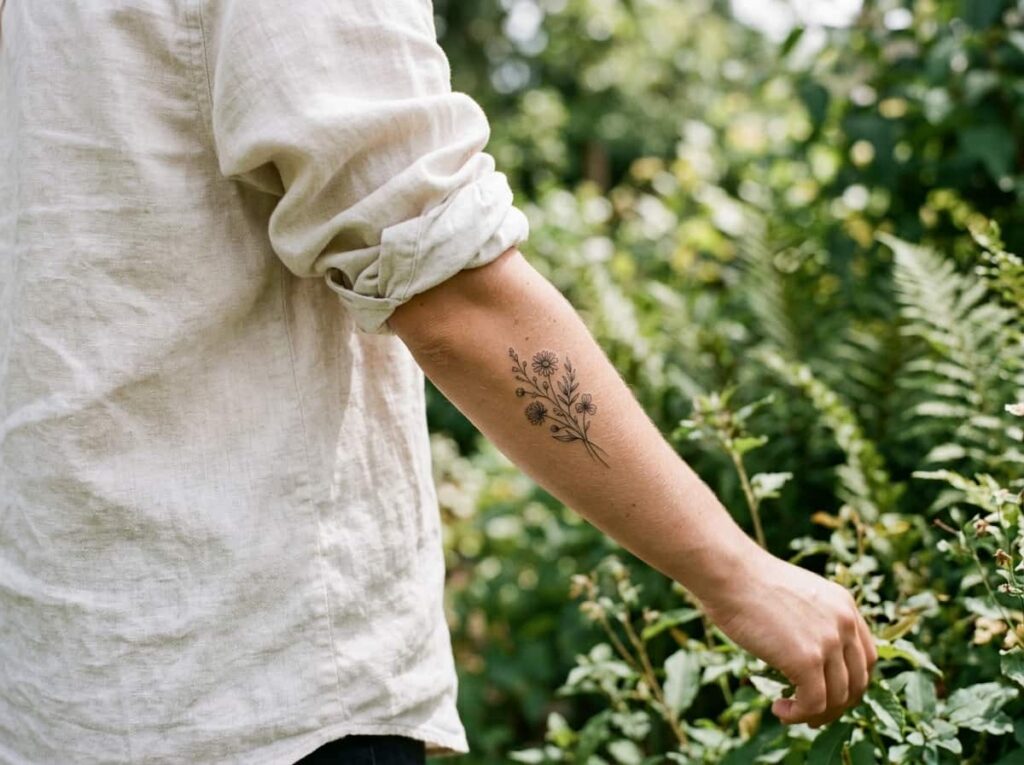
Three small blooms, a few thin stems, angled slightly toward the elbow crease instead of standing straight up. That small angle is what separates a sprig that looks hand gathered from one that looks like a sticker.
The placement works especially well for anyone who wants ink that reads clearly with a short sleeve but still disappears under long sleeves for work.
A slight downward angle on the stems is what makes a sprig look gathered instead of pasted on.
10. A Blackwork Sleeve-Starter Piece Covering the Outer Forearm
People treat a sleeve starter piece like it has to map out the entire sleeve on day one. It doesn’t. Most artists start with one strong focal design and leave room to build around it over future sessions.
That flexibility is the whole point of starting on the outer forearm specifically, since it’s the most visible stretch of skin an artist will plan future pieces around.
📌 Good To Know
Ask your artist to sketch roughly where future pieces might connect, even if you’re not booking them yet. It keeps the spacing from boxing you in later.
11. A Realistic Single Flower Centered on the Outer Forearm
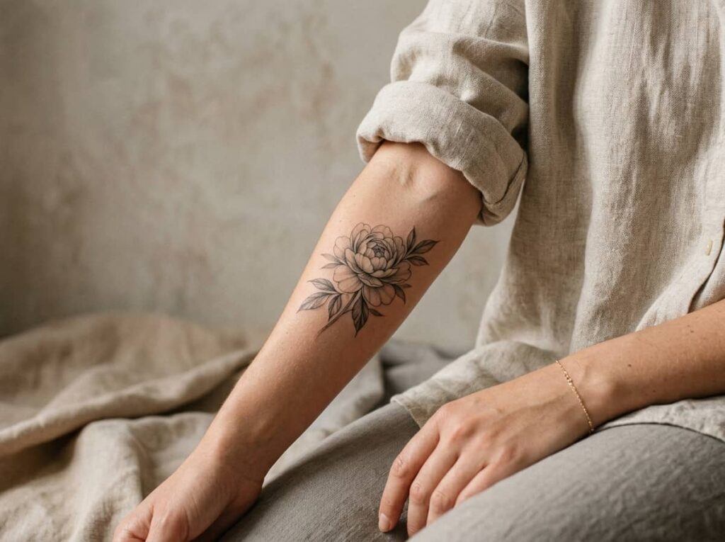
One flower, rendered with real shading and petal detail instead of a flat outline, anchors the whole piece without needing anything else around it. A rose, peony, or lotus each carry their own meaning, so pick the flower before you pick the artist.
Realism work takes longer in the chair than linework does, and it holds color better long term if you go that route instead of staying black and grey.
12. An Animal Silhouette Positioned on the Outer Wrist
Skip anything with fine detail here. The wrist is a small canvas, and a silhouette-style animal, just a solid shape with a clean outline, reads clearly at a glance in a way a detailed portrait can’t at that size.
A few shapes that hold up well this small:
- ▸A fox or wolf profile, which keeps its shape even under an inch wide.
- ▸A bird mid-flight, wings simplified into two or three clean curves.
- ▸A cat or rabbit sitting in profile, which reads well even in solid black.
13. A Thin Linework Mountain or Wave Outline Along the Outer Forearm
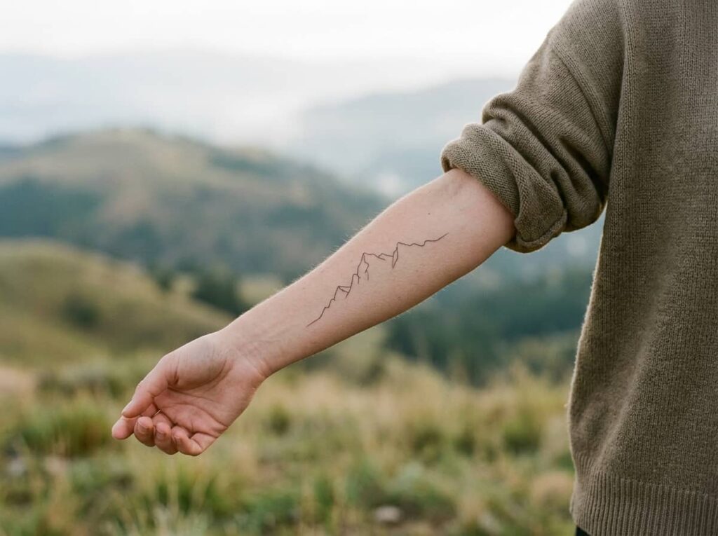
Single-line landscape work only works if the line weight stays completely consistent from start to finish. The moment it thickens or thins in one spot, the whole outline looks shaky instead of deliberate.
This is one to research the artist for specifically, since not every tattooer specializes in fine, continuous linework.
14. A Tiny Cluster of Symbols Grouped Near the Wrist Bone
A cluster sits close together in one small area instead of spreading along the arm. It reads as a single design at a glance rather than a sequence of separate ones, which changes how it photographs and how it ages.
| A cluster works when | A single symbol works better when |
| A Cluster Works When | A Single Symbol Works Better When |
|---|---|
| You want to represent a few different things at once | One meaning matters more than the rest |
| You have under an inch of space near the wrist bone | You want the design easy to add onto later |
15. A Color Accent Added to One Element of an Otherwise Black Design

Most of the piece stays black and grey, and one single element, a flower center, a small gem, a single petal, carries color. It’s a smaller commitment than a fully colored piece, and it ages more evenly since black work fades slower than color does on its own.
A fully black and grey design, finished and healed on its own.
The same design with one small element reworked in a single saturated color.
Conclusion
Choosing a forearm tattoo ideas for women design really comes down to one decision before any other: inner arm or outer arm, soft and private or bold and visible. Everything else, from script to florals to blackwork, works better once that call is made first.
Bring a few of these to your consultation instead of one. A good artist will tell you honestly which placement and style actually fit the shape of your arm, not just the picture you liked best. The ones that hold up years from now are usually the ones built around that conversation, not around a trend.







Leave a Reply