
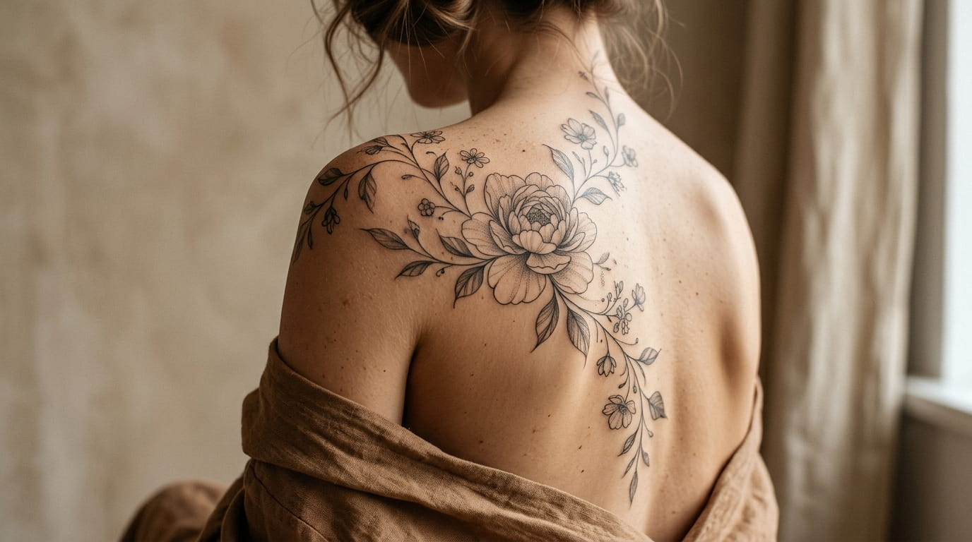
Most floral tattoos look stunning in the reference photo and strange six weeks later, stretched or sitting crooked because nobody thought about the body underneath the flowers. A vine drawn as a straight line fights your spine every time you bend. A bouquet centered on your hip looks lopsided the second you shift your weight. That gap between the flat design and the body wearing it is where most floral tattoos go wrong.
These floral tattoo placement ideas work because they start with the curve, not the flower. Instead of picking a pretty botanical design and squeezing it onto your arm or ribs, you let the collarbone, the spine, the taper of a wrist decide where the stem bends and where a bloom sits heaviest. The result moves with you instead of looking pasted on.
Below are fifteen spots on the body and the specific way to shape a floral piece for each one, from a single stem tracing your spine to a cluster tucked into the curve of your hip. Pick the one that matches the part of your body you already love, or use a few together for something bigger.
1. Follow Your Spine With One Continuous Stem
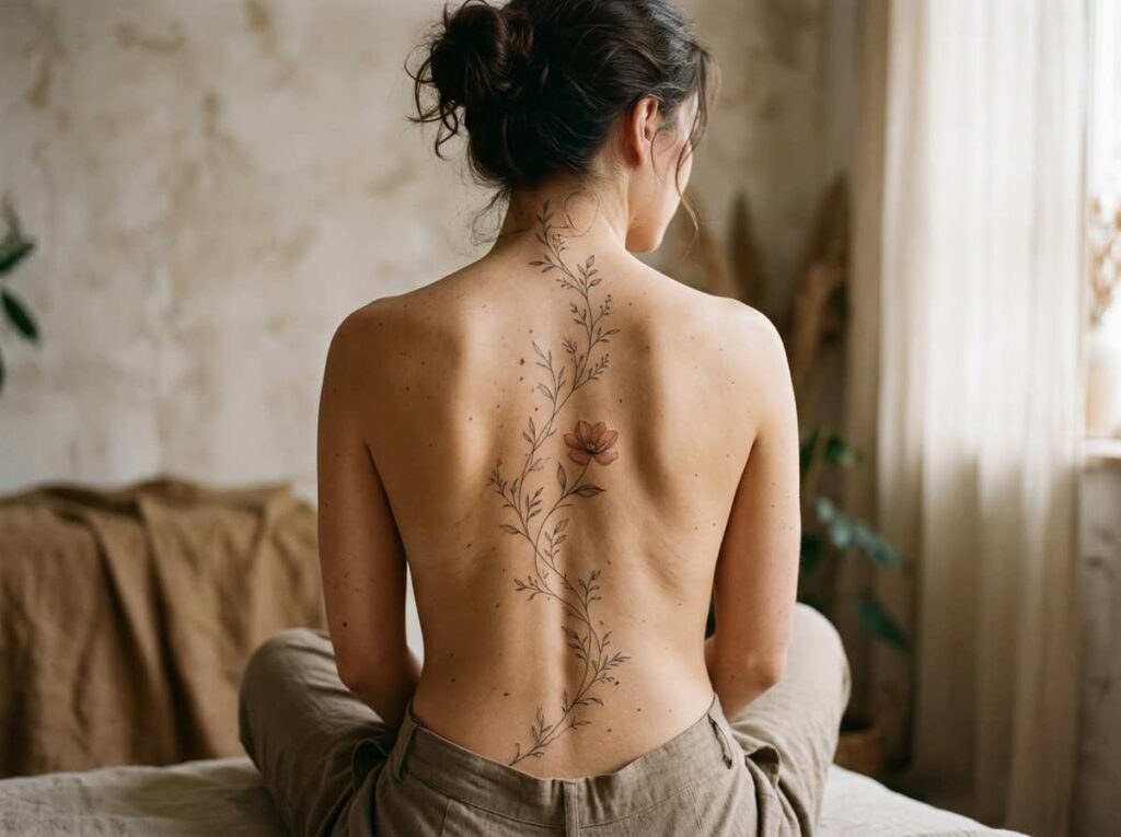
Your spine already curves in before you add anything to it.
A straight floral strip ignores that shape and starts looking stiff within weeks, especially when you lean forward and the design folds in the middle. A single stem that bends with the small of your back, then narrows again between the shoulder blades, reads as part of your body instead of something laid on top of it.
Keep the leaves sparse near the waist where the curve is sharpest, and let one or two blooms rest where your back naturally flattens out.
A straight vine laid flat across the lower back, crumpling the moment you bend forward.
One stem that bends with the small of the back and narrows between the shoulder blades.
2. Wrap a Rib Curve With a Trailing Vine Instead of a Straight Line
A lot of rib tattoos get placed like a ruler took the measurements. The artist draws a vine in a flat horizontal row, and it looks fine standing straight but shifts the moment you twist or lie on your side.
Ribs flare out and curve under the arm, so a vine that follows that same arc holds its shape no matter how you move. Let it start thin near the underarm, widen slightly where the ribs curve outward, then taper again toward the waist.
💡 Quick Tip
Rib skin shifts more than most spots, so leave extra space between leaves instead of packing them tight.
3. Frame Your Collarbone With a Low Horizontal Branch
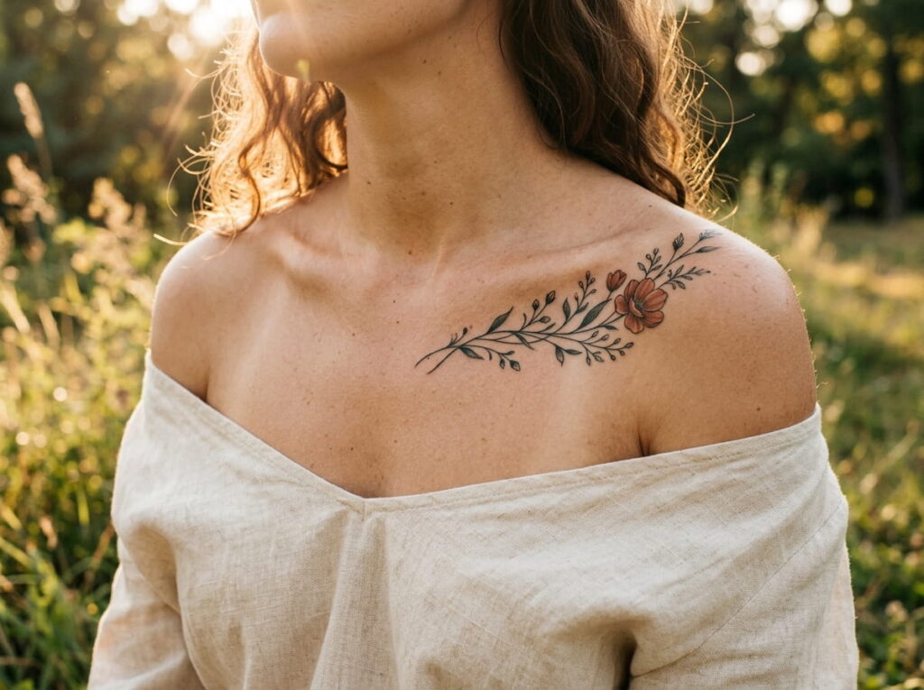
Most people picture collarbone tattoos as a straight line of flowers sitting right on the bone. That placement actually fights the body, since the collarbone has a gentle dip toward the center of the chest that a rigid row covers up instead of following.
A branch set just below the bone, dipping where your collarbone dips and rising slightly near the shoulder, reads as if it is resting in a natural groove. Keep the blooms smaller near the center and let one larger flower anchor the outer edge, close to the shoulder. It settles into the collarbone instead of sitting on top of it.
Let the branch dip where your collarbone dips.
Place the larger bloom near the shoulder, smaller ones toward the center.
A rigid straight row sitting right on the bone.
Even spacing with no change in bloom size.
4. Let Blooms Cluster Where Your Hip Curves Out
Blooms clustered right where the hip curves outward hold their shape the longest, more than a design set higher on the waist where skin shifts more with weight changes.
Build from that curve outward. Start with two or three larger blooms right at the widest point, add a few smaller buds trailing up toward the waist, and let a single thin stem continue down toward the thigh if you want the piece to feel longer.
This shape works especially well if you carry weight in your hips, since the design moves the same way your body does.
Before you plan your hip piece
5. Spiral a Vine Around the Forearm’s Natural Taper
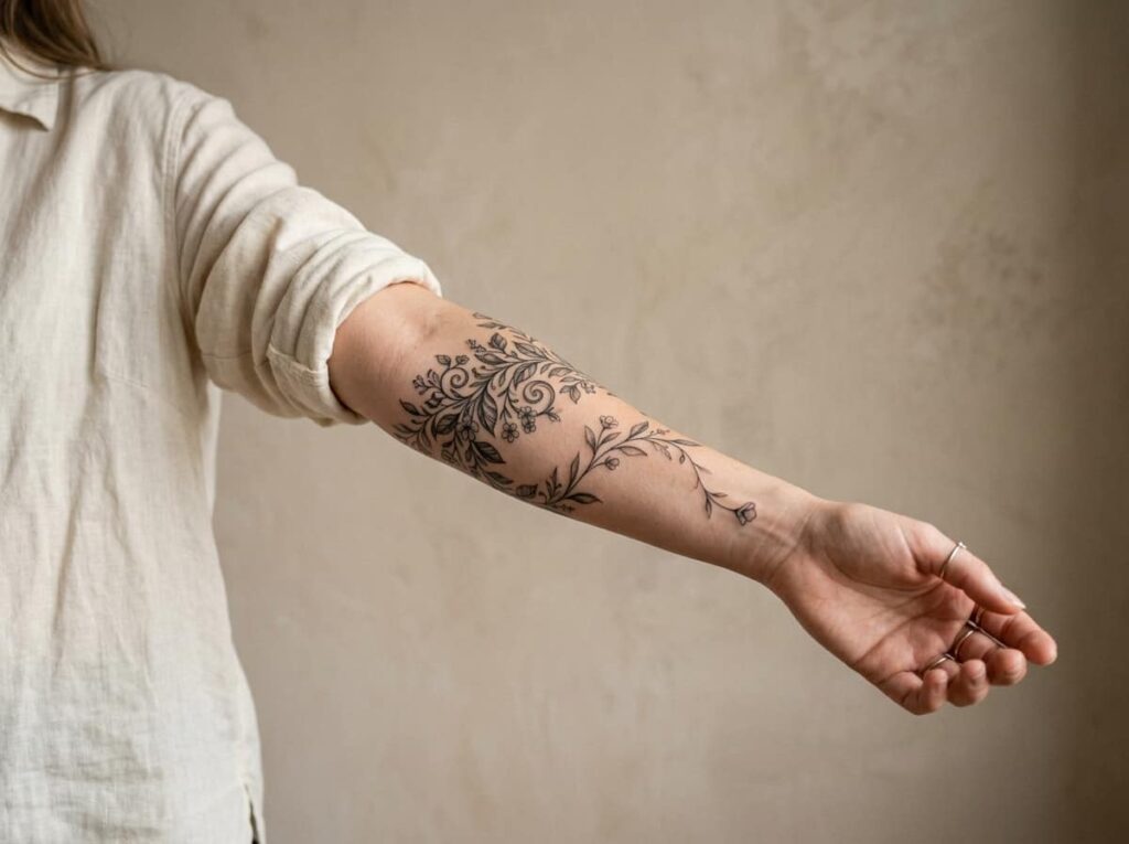
Forearms taper. Wider near the elbow, narrower at the wrist. A vine that stays one thickness the whole way down looks printed flat and wrapped on after the fact.
Start the vine thicker near the elbow, with two or three fuller leaves, then thin it gradually as it spirals toward the wrist, ending in a single small bud instead of a full bloom. Keep the spiral to one and a half turns around the arm at most, or it starts to look busy instead of natural.
6. Build a Thigh Piece That Thickens at the Hip and Tapers at the Knee
Most thigh florals get drawn as one even spread, the same size and spacing from hip to knee. It looks balanced on paper but flattens out once it’s on a leg that’s naturally wider at the top and narrower down near the knee.
A piece that thickens at the hip and tapers as it goes reads as if it belongs on the leg instead of laid over it. Keep two or three large blooms near the top, thin the stems and leaves as you move down, and finish with one small flower just above the knee.
| Even Spread | Weighted Thickening |
|---|---|
| Same bloom size top to bottom. | Larger blooms at the hip, smaller near the knee. |
| Looks flat once the design sits on the leg. | Follows the leg’s own taper from hip to knee. |
7. Circle the Ankle With One Thin Stem
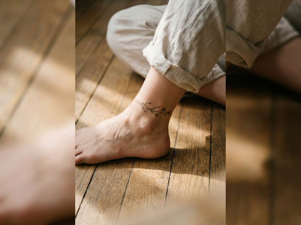
One stem is almost always enough at the ankle. Bone sits close to the skin here, so busy florals with multiple layers tend to blur within a year as the skin moves over such a small, active joint.
Choose a single thin vine with two or three leaves, circling the ankle just above the bone rather than directly over it. This spot tends to hurt more than fleshier areas, and it brushes against shoes and socks daily, so a simple line holds up better than a crowded one.
8. Mirror Your Shoulder Blade’s Angle With a Single Bloom
The shoulder blade has its own diagonal, angled out from the spine toward the arm. A flower set straight up and down ignores that angle and ends up looking tacked on rather than fitted to the body.
Turn the main bloom to follow that same diagonal, with the stem trailing toward the spine and one or two leaves breaking off toward the arm.
It reads differently depending on whether your arm is relaxed or raised, which is part of what makes this placement interesting to live with day to day.
📌 Good To Know
Ask to see the stencil with your arm raised, not just hanging at your side. The angle shifts more than people expect.
9. Trail a Tiny Vine From Behind the Ear Down the Neck
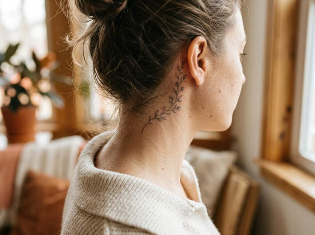
Pull your hair into a ponytail and the space behind your ear is suddenly on display, then it disappears again the moment your hair falls. That in-and-out visibility is exactly why a tiny trailing vine works so well there.
Start with one small bud tucked just behind the ear, then let a thin stem trail an inch or two down the side of the neck. Keep it short, or it starts competing with collars and necklaces instead of sitting quietly in a spot only certain moments reveal.
A longer vine running halfway down the neck, visible with every hairstyle.
One small bud and a short trailing stem, mostly hidden until your hair is up.
10. Tuck a Small Cluster Into the Wrist’s Inner Curve
Wrist tattoos distort fast when the design sits flat across the top, since that’s the skin that folds every time you bend your hand. A cluster tucked into the inner curve, closer to where the wrist meets the palm, avoids most of that stretching.
This is also one of the more painful spots on the list, so a smaller design works in your favor both ways.
Before you book this spot
11. Let a Vine Climb From Lower Back to Shoulder in One Piece
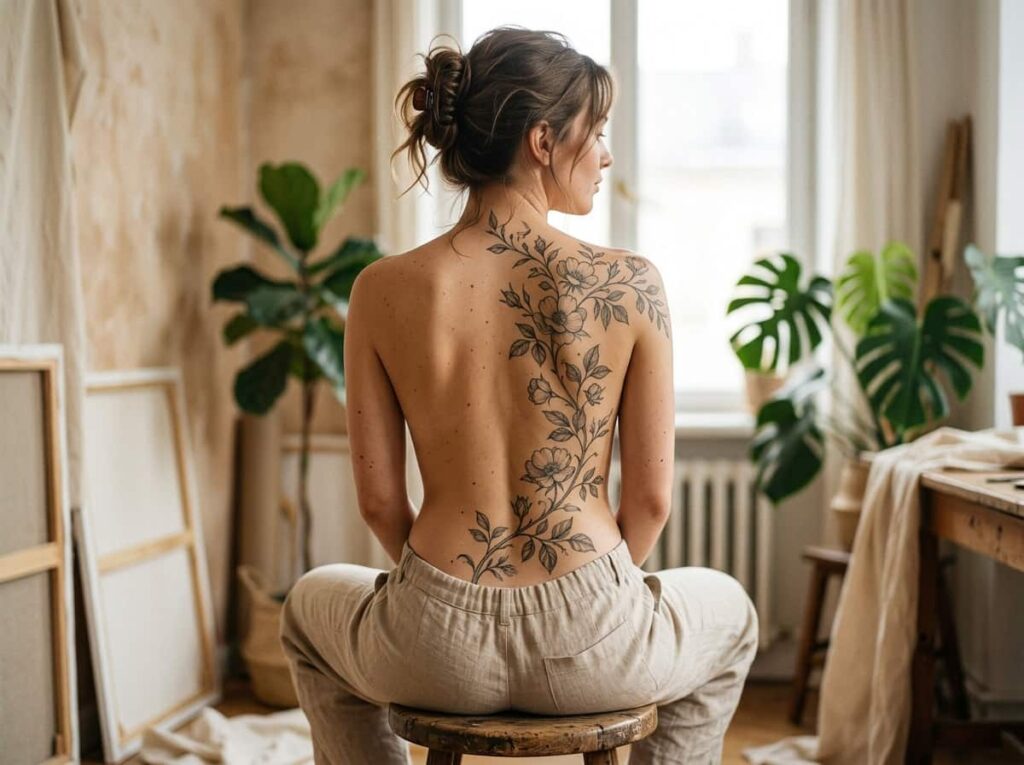
This is the biggest placement on the list, and it works because it treats the whole back as one continuous curve instead of several separate flat sections.
Start the vine at the small of the back where it’s narrow, let it widen slightly where the spine curves outward between the shoulder blades, then taper again as it climbs toward one shoulder. Resist the urge to make every section the same density. The piece should breathe in the middle and gather more detail near the top, where it will actually be visible in off-shoulder tops and swimsuits.
A back piece this size needs more than one sitting. Plan the full path before the first session, even if you’re starting small.
12. Arc a Floral Line Under the Bust Instead of Straight Across
A straight line under the bust almost never stays straight. The skin there shifts with breathing and posture more than most people expect, and a rigid row ends up looking crooked within a few months even with perfect healing.
An arc that follows the natural curve under the bust settles into place instead of fighting it. Keep the center lower and let the ends lift slightly toward the ribs on each side, mirroring the shape your body already has.
| Straight Line | Natural Arc |
|---|---|
| Fights the curve, looks crooked over time. | Follows the curve, holds its shape. |
| Even spacing end to end. | Lower in the center, lifting slightly at the ends. |
13. Wrap the Calf With a Design That Follows the Muscle, Not the Bone
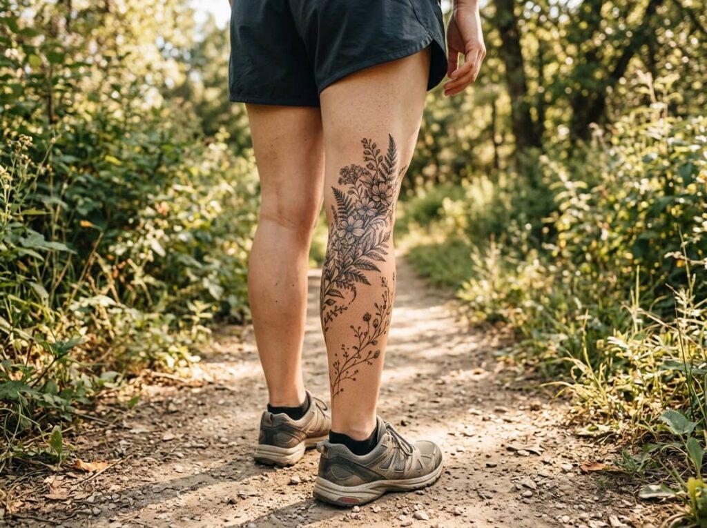
The calf is mostly muscle, and that muscle has its own curve that shifts depending on whether you’re standing, sitting, or walking. A design planned flat, as if the calf were a smooth cylinder, warps every time you move.
Place the fuller part of the design where the muscle bulges most, usually the upper half, and let the vine thin out as it wraps toward the ankle. Stand up during your consultation so the artist can see the shape you’re actually working with, not just the leg resting on a table.
Place fuller detail where the muscle bulges.
Check the design standing, not just seated.
Treating the calf as one flat surface.
Approving the stencil only while seated.
14. Line Finger Curves With Tiny Buds Instead of Full Flowers
Fingers don’t have room for a full bloom, and trying to fit one usually means the petals blur together within a year or two. Small, simple shapes hold their lines far longer in a spot this tight.
Place one tiny bud along the side of the finger, following its natural curve rather than wrapping all the way around. Fingers also fade faster than almost anywhere else on the body, so go in expecting a touch-up down the line.
⚠️ Watch Out
Finger tattoos fade and blur faster than other spots. Budget for a touch-up within the first year or two.
15. Run a Vertical Stem Down the Sternum’s Natural Dip
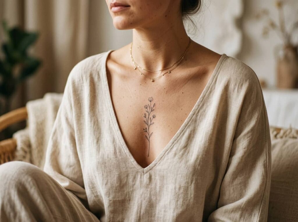
The sternum has a slight inward dip running down the center of the chest, and a vertical stem placed right in that groove looks almost like it grew there rather than sitting on flat skin.
Keep the stem simple, with one or two small leaves and a single bloom near the top or bottom rather than several scattered along the length. This is a sensitive spot to tattoo, so simplicity also means a shorter, more manageable sitting.
Conclusion
The difference between a floral tattoo that still looks good in five years and one that stretches out of shape usually comes down to this: did the design follow the body, or did the body have to adjust to the design. A stem that bends with your spine, a cluster that sits in the curve of your hip, a vine that tapers the way your own arm tapers, all of it ages better because it was never fighting your shape in the first place.
You don’t need all fifteen placements to get this right. Pick the one spot on your body you already love the shape of, and bring your artist a reference that shows the curve, not just the flowers. Save this list for your next consultation so you remember which floral tattoo placement ideas actually matched the part of you they were meant for.







Leave a Reply