
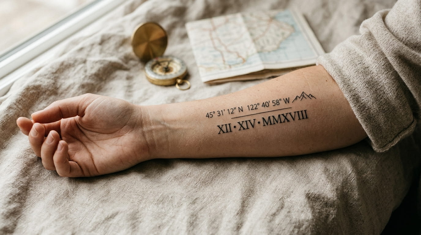
A string of numbers looks simple until it’s permanent. A date that’s one digit off, a font that blurs by year three, a set of coordinates copied from the wrong map pin. These are the quiet mistakes that turn a meaningful tattoo into one you keep covering with a watch band.
Most advice stops at “get the numbers right,” as if the hard part is just double checking a calculator. The real work happens before you sit down: picking a format your artist can actually place well, choosing a Roman numeral style that won’t collapse into a smudge, deciding whether a date belongs in numbers or your own handwriting.
That’s where most lists of coordinates tattoo ideas fall short. They show pretty photos without explaining why one layout held up and another didn’t.
Below are 15 ways to turn a date, a set of coordinates, or a Roman numeral into something that still reads clearly, and still means something, ten years from now.
1. Convert Any Date Into Roman Numerals Without Getting It Wrong
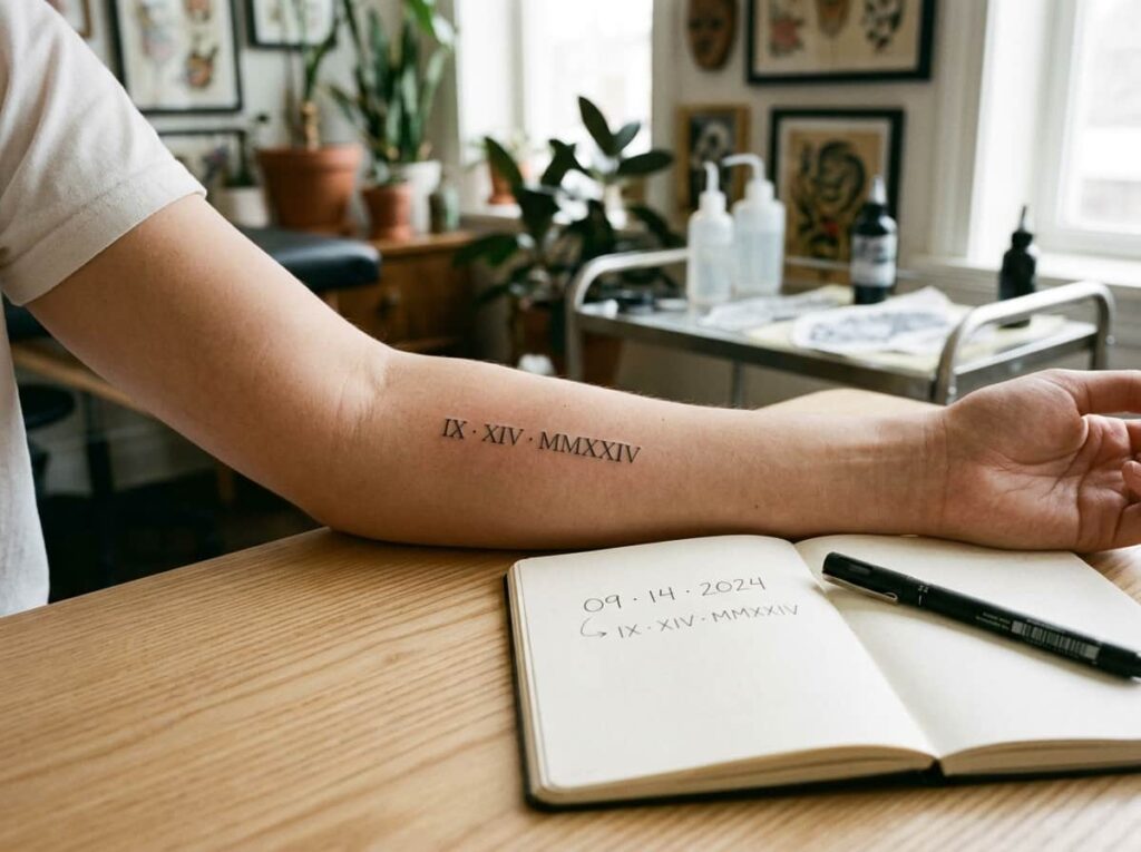
Convert the full date first, then check it twice before anyone touches a stencil to your skin. Roman numerals don’t have a symbol for zero, so dates with a zero in them get misread more than people expect.
A few spots trip people up almost every time:
- Reading the year as one block instead of converting each place value on its own
- Leaving out a digit when the year has a repeating number in it
- Mixing uppercase and lowercase letters in the same line
Write the full date out longhand before your appointment, then have your artist check it against a numeral chart instead of typing it from memory.
Write the date out numerically first, including the full year.
Convert the year, month, and day into Roman numerals separately.
Read the finished sequence out loud before it goes on skin.
2. Decimal Coordinates vs Degrees-Minutes-Seconds: Which One to Ask For
Coordinates don’t only come in one style, and most references online only show the short decimal version. A place can be written as 41.8902 or as 41°53’36” N, and the two look nothing alike once they’re inked.
Decimal format reads cleaner on small areas like a wrist or collarbone. The degrees, minutes, seconds version carries more detail and fits better on a longer placement like a forearm or ribs.
Pull the exact coordinates for your spot from a map app before your consultation. Skip handing over just a screenshot, formats get mixed up more often than people expect when nothing is written down clearly.
| Decimal Format | Degrees, Minutes, Seconds |
|---|---|
| Shorter string, fits small spots like a wrist or finger | Longer string, needs a bigger placement like a forearm |
| Easiest to read at a glance | Closer to how coordinates look on an old map or compass |
3. Pick a Font That Keeps Tiny Numbers From Blurring Into a Smudge
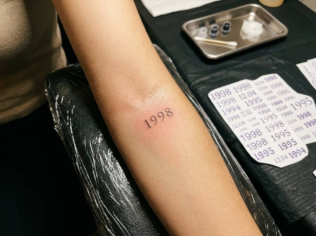
Thin script numbers look elegant on the consultation table and turn into a faint gray smear five years later. Fine lines spread the most on areas that get a lot of sun or friction, like hands and feet.
A font with any weight to it holds its shape longer:
- Look for numerals with slightly thicker strokes, not hairline serifs
- Ask about spacing between characters, tight numbers blur into each other first
- Request a size test on paper before the needle touches skin
Save photos of tattoos that are at least three years old, not fresh ones, so you can see how the font actually ages.
4. Place a Coordinate Tattoo Where It Still Reads Clearly After Movement
A coordinate tattoo on the inner wrist looks sharp on day one and starts to warp the moment that skin creases from everyday movement. Joints, knuckles, and the inner elbow stretch and fold constantly, which pulls tiny text out of alignment.
Flatter, less mobile areas hold a long string of numbers better. Think the outer forearm, upper back, or the side of the ribcage, where the skin stays smoother over time.
A placement that looks still in a mirror rarely stays still in real life.
⚠️ Watch Out
Test the placement while moving, not just standing still in the mirror. Reach, bend, and sit the way you normally would before the stencil goes on.
5. Turn a Birth Date Into a Line of Script Instead of a Block of Numbers
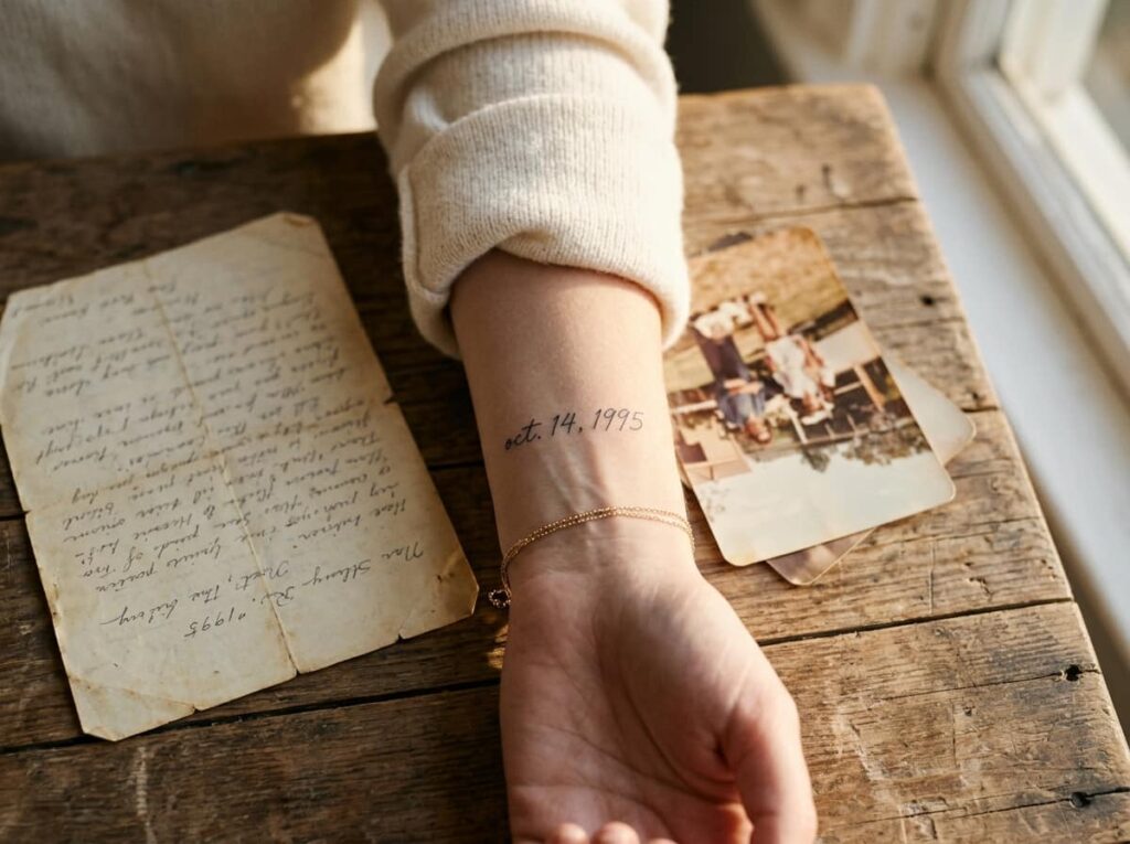
A folded hospital bracelet in a drawer, a date circled on an old calendar, a line scrawled on the back of a photograph. Numbers carry the memory, but handwriting carries the person.
Instead of a plain numeral date, some people convert the day into their own cursive, or a parent’s actual signature pulled from a card or letter. A tattoo artist can trace real handwriting directly, keeping the shape and slant intact instead of redrawing it in a generic script font.
This works best with a date tied to one specific memory, not a general timeline, since the personal handwriting is what makes it land.
A typed out birthdate in a standard tattoo font.
The same date traced from an actual handwritten note, keeping the real slant and pressure.
6. Handle the Missing Zero Problem in Roman Numeral Dates
Most people assume Roman numerals swap in for regular digits one for one. They don’t. There’s no symbol for zero, so a date like 2007 or 1908 needs the zero handled differently than the rest of the year, and that’s where a lot of custom tattoos go wrong before they’re even inked.
The fix isn’t complicated once you know it. Your artist should convert the year as a whole number, not digit by digit, so the zero disappears into the math instead of needing its own symbol.
Convert the full year as one number, not each digit on its own.
Have your artist check the result against a numeral chart.
Typing each digit of the year into a converter separately.
Trusting a stencil without reading the numerals aloud first.
7. Pair a Date With One Symbol Instead of Stacking Several
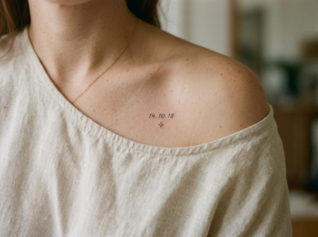
A date rarely needs company to feel complete, but a single small symbol next to it can carry extra weight without crowding the design. The trick is choosing one and stopping there.
A few pairings that tend to hold up visually over time:
- A single star or dot placed just after the final numeral
- A thin line underneath the date instead of a border around it
- One small outline icon tied directly to the memory, nothing decorative
Resist the pull to add a second symbol once the first one looks good on paper. Two small elements almost always compete for space meant for one.
Symbols worth considering
8. Find the Exact Coordinates of a Meaningful Spot Before Your Appointment
Pulling coordinates off a quick search is where most errors start. A location name can return the center of a whole town instead of the actual house, hospital wing, or trailhead that matters.
A more reliable way to get it right:
Drop a pin on the exact spot in a map app, not just the street address.
Screenshot the coordinates shown, then write them out separately in text.
Bring both the screenshot and the typed version to your appointment.
Having two versions on hand catches typos before they become permanent.
9. Vertical or Horizontal: Laying Out a Roman Numeral Date

The direction a date runs changes more than the look of it. It changes where it fits on your body and how much space it actually needs.
Vertical layouts tend to suit longer dates with more numerals, since the body offers more length than width in most placements. Horizontal works better for short dates on a narrow strip of skin like the wrist.
10. Keep a Memorial Date Tattoo From Reading Like a Headstone
There’s a difference between marking a loss and designing something that looks carved from stone. A plain date in a heavy serif font, boxed in by a border, tends to land closer to the second one.
Softer touches shift the feeling without softening the meaning: a lighter font weight, a bit of extra spacing between numerals, a placement somewhere the date feels worn rather than displayed.
A memorial date can honor someone without looking like it was chiseled onto a monument.
11. Size a Coordinate Tattoo So It Stays Legible as It Ages
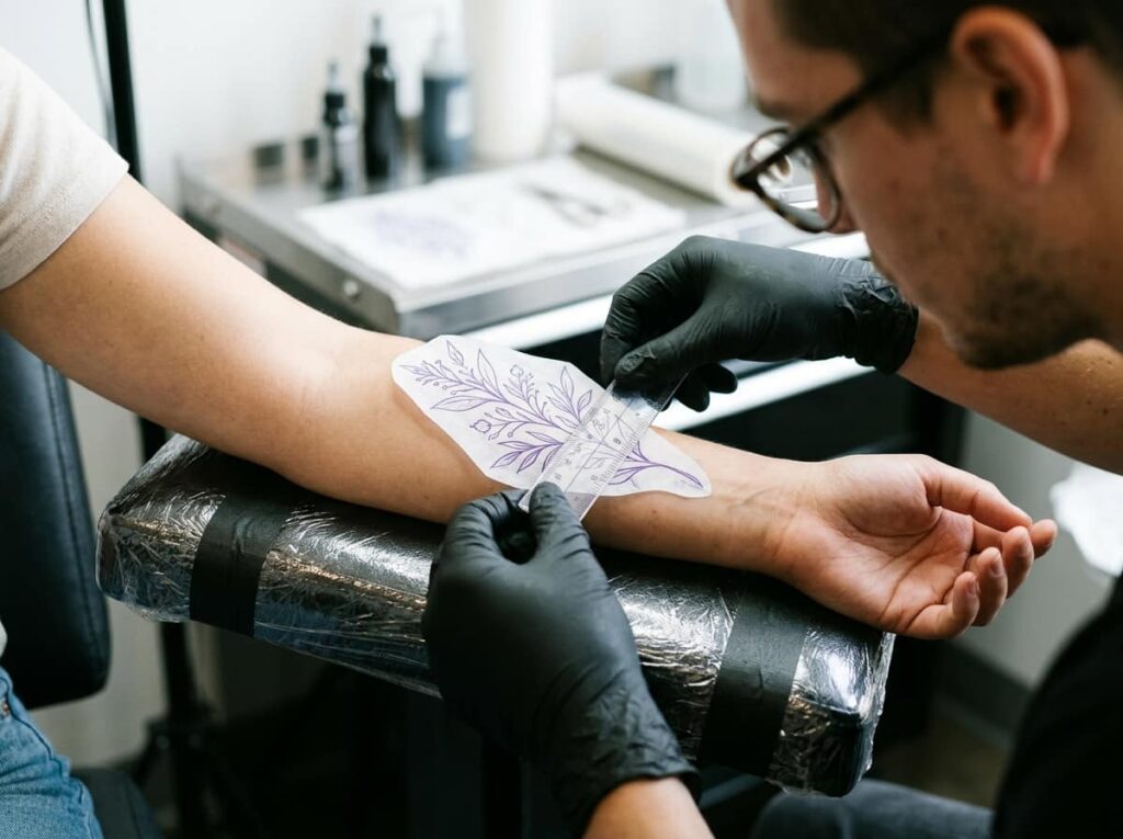
A string of coordinates can run eight or nine characters long, and shrinking all of it to fit a small space is where most of these tattoos run into trouble later. Tiny gaps between numbers close up as skin ages, turning a decimal point into a smudge and a period into nothing at all.
A good rule of thumb: if you can’t read the whole sequence clearly from arm’s length on the stencil, it’s too small to hold up for the long run.
html
⚠️ Watch Out
Anything smaller than a thumbnail width tends to blur within a few years. Size up before you shrink the design down.
12. Combine a Date and Coordinates in One Piece Without Crowding It
Putting a date and a set of coordinates in the same tattoo sounds simple until both end up fighting for the same inch of skin. The fix is giving each element its own line and its own job, instead of blending them into a single dense block.
Before you sit down for this combo, have a plan for:
html
Before combining them
13. Fine Line or Solid Black: What Holds Up Better on Tiny Text
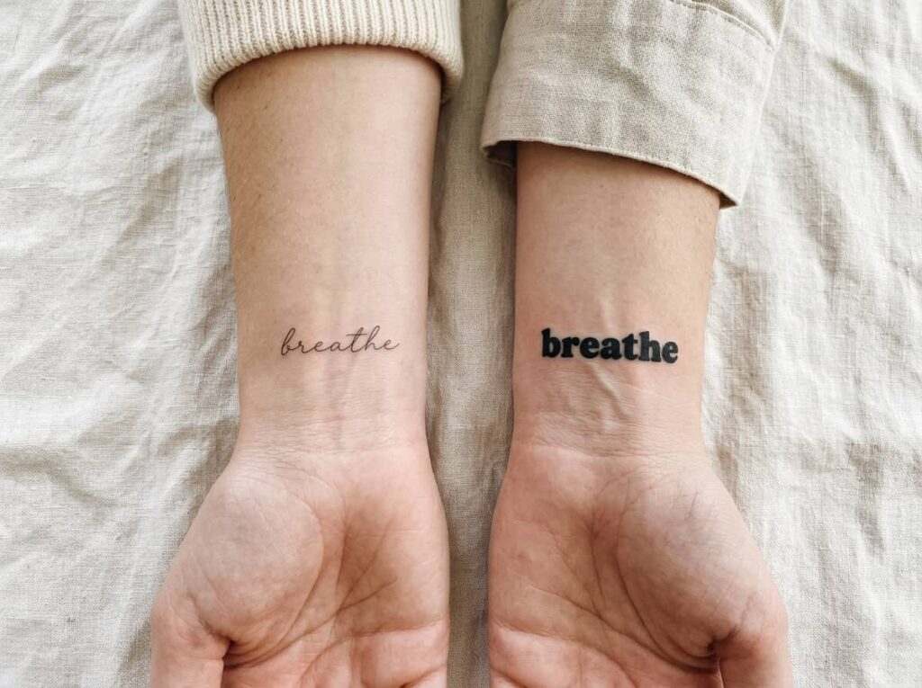
Fine line work looks delicate on a fresh tattoo and that’s exactly the problem. Thin strokes have less ink to hold their shape, so tiny numbers and letters are the first thing to fade or blur as the tattoo settles and ages.
| Fine Line | Solid Black |
|---|---|
| Looks more delicate, fades faster on small text | Holds shape longer, reads clearer at a distance |
| Needs more frequent touch ups over time | Needs touch ups less often |
Solid black tends to be the safer pick for anything under an inch, even if fine line was the original plan.
14. Hide a Meaningful Date Tattoo in a Low-Visibility Spot
Behind the ear, along the ribs, tucked inside the upper arm where a sleeve normally covers it. These are the spots people choose when a date feels personal enough to keep for themselves rather than for conversation with strangers.
Ribs tend to hurt more during the session, so plan for a longer, slower sitting if that’s the spot you land on.
15. Add a Tiny Landmark Icon Next to a Coordinate Tattoo
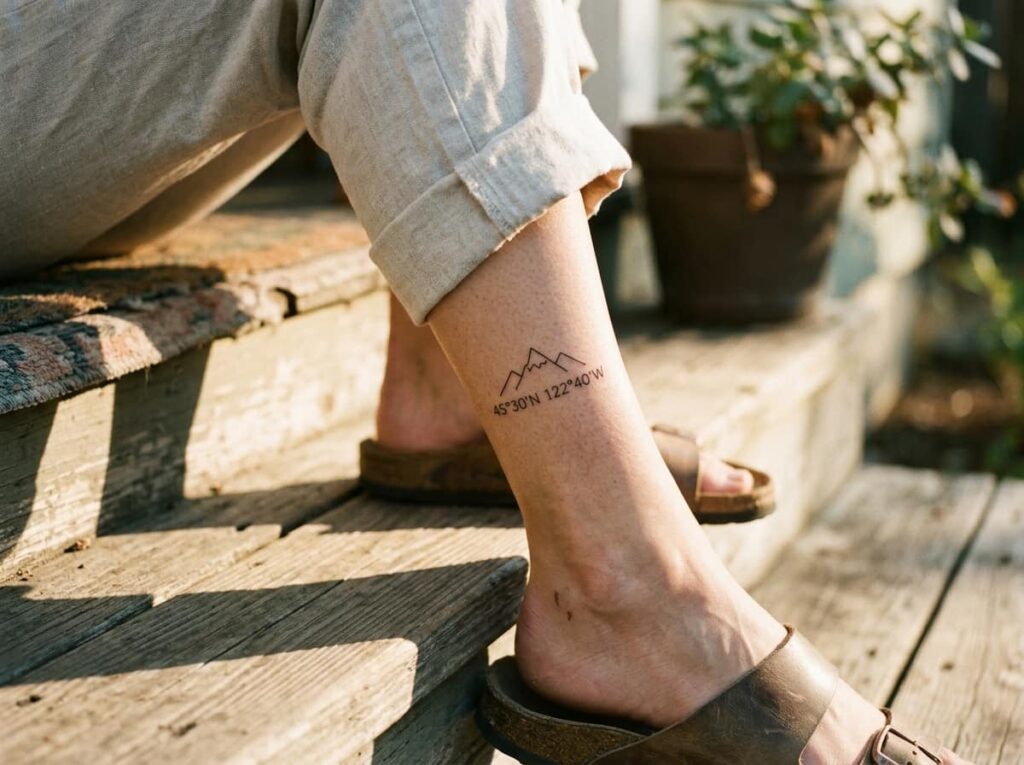
A set of numbers means little to anyone who doesn’t already know the story behind them, and that’s usually the point. A small icon next to the coordinates can hint at the place without spelling it out, a mountain outline, a wave, a tiny house shape, whatever matches the actual spot.
One small, specific icon tied to the real place says more than a generic symbol ever could.
Keep the icon under a quarter inch so it reads as a detail, not a second tattoo competing with the coordinates for attention.
Conclusion
The difference between a coordinate tattoo you love for decades and one you quietly cover up usually comes down to choices made before the needle ever touches skin. The right format, a font with enough weight to age well, a placement that won’t fold or stretch the text out of shape.
None of that takes away from the meaning. If anything, getting the details right is what protects it. A date or a set of coordinates done carefully stays legible and personal for years, not just for the first photo after your session.
If any of these coordinates tattoo ideas fit the place or person you’re thinking of, save this list before your next consultation so you have it on hand.
Before your appointment







Leave a Reply