
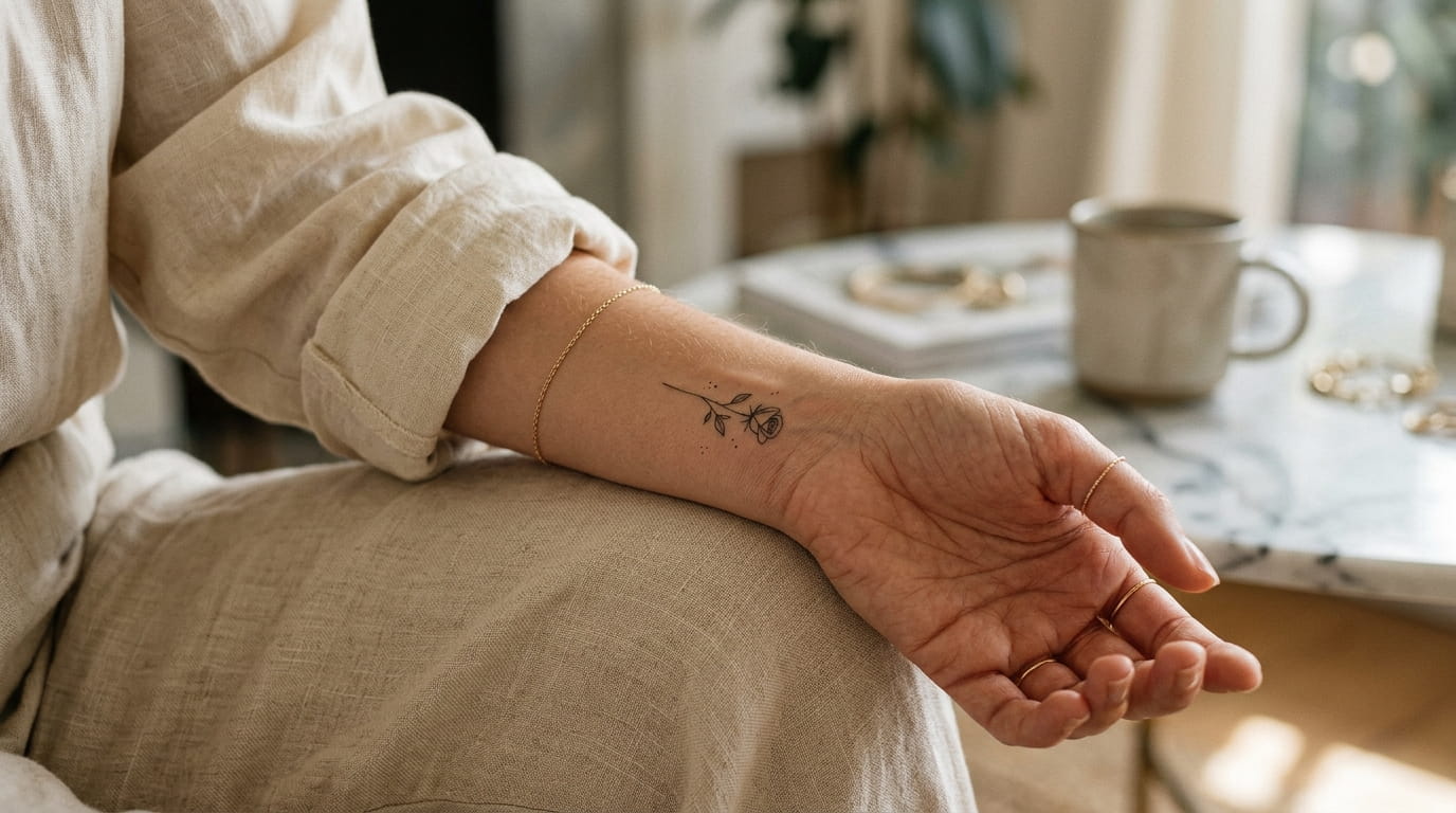
A good wrist tattoo looks like it was always part of your hand. That is the whole appeal of small wrist tattoos for women right now: something fine enough to sit under a watch strap, specific enough to mean something, and simple enough to still read clearly from across a coffee shop table years from now.
The problem is that most inspiration boards push you toward the opposite. Full florals, stacked lettering and wrap-around designs look gorgeous in a photo, but a wrist is a narrow, constantly moving canvas. It bends every time you check your phone or reach for a cup, and it is exposed to sun, friction and handwashing all day.
This list sticks to designs that suit that small space: single lines, deliberate gaps and shapes you could trace with one finger. Each idea is explained with the reasoning behind it, so you can decide what fits your own wrist and take specific questions to your artist.
About This Guide
This guide combines general tattoo design principles with health and aftercare guidance from the American Academy of Dermatology (AAD) and the Mayo Clinic, plus comments from tattoo artists and dermatologists quoted in published articles. The design suggestions are editorial recommendations, and every artist works differently. Nothing here is medical advice. Sources are linked at the end.
What to Know About Wrist Tattoos Before You Book
The wrist is a higher-wear area. Business Insider interviewed a tattoo artist and a dermatologist, who both pointed to wrists, hands and feet as areas where tattoos are more likely to fade, because of friction and frequent sun exposure (Business Insider). That does not rule the wrist out. It means simple designs and good aftercare matter more here than on a covered area of the body.
Sun protection matters. The AAD says ultraviolet light can fade some tattoo inks. For tattooed skin exposed to the sun, it recommends a broad-spectrum, water-resistant sunscreen of SPF 30 or higher, applied 15 minutes before going outside and reapplied at least every two hours. It also says tanning beds and sunlamps can fade ink (AAD). Wrists are usually uncovered, so this applies to you.
Friction counts too. A tattoo artist quoted by Bustle says that cutting back on sun exposure, using sunscreen and avoiding clothing that causes friction all help a tattoo look good for longer (Bustle).
Healing takes about two weeks. The Mayo Clinic says most tattoos take about two weeks to heal (Mayo Clinic). Ask your artist what to avoid wearing on your wrist during that time, including watches, bracelets and cuffs.
Pain varies, and wrists are not ranked. Removery’s informal survey of tattoo artists and enthusiasts did not rank the wrist. It reported that bonier areas with less padding tend to hurt more, and that a heavily filled piece with thick lines is likely to hurt more than delicate line work (Removery). Pain is personal, so treat that as a rough guide.
The Mayo Clinic also advises checking that your artist washes their hands, wears fresh disposable gloves for each tattoo and uses sanitary equipment (Mayo Clinic).
- About This Guide
- What to Know About Wrist Tattoos Before You Book
- 1. The Single-Stroke Rose That Looks Hand-Drawn
- 2. A Tiny Constellation Only You Can Point Out
- 3. Inner Wrist or Outer Wrist: Where Fine Lines Actually Last Longer
- 4. A Thread-Thin Infinity Loop With One Birthstone Dot
- 5. A Single Botanical Sprig Instead of a Full Bouquet
- 6. The Butterfly Silhouette That Skips the Busy Wings
- 7. Three Dots Instead of One: The Minimalist’s Secret Code
- 8. A Crescent Moon That Doubles as a Bracelet Line
- 9. One Word in Your Own Handwriting, Not a Font
- 10. Hidden Under a Watch, Visible When You Want It
- 11. A Pulse Line With One Deliberate Break
- 12. A Tiny Sun With Three Rays, Not Eight
- 13. A Feather That Fades at the Tip Instead of a Full Outline
- 14. A Mountain Range No Taller Than Your Fingernail
1. The Single-Stroke Rose That Looks Hand-Drawn
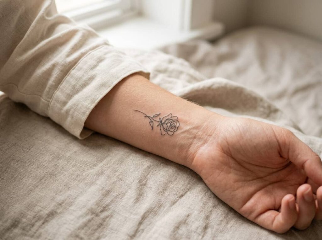
A single continuous line forms the whole flower. No shading, no filled petals, just an outline that curls in on itself until it reads as a rose.
Ask your artist for a simple line-art rose rather than a photo reference of a full bloom. Shading and layered petals need space, and a wrist offers very little. Keep the stem short or skip it entirely, since a rose that stops at the bud reads cleaner on a narrow wrist than one trailing toward your palm.
Ask your artist: “Can you simplify this rose into one even-weight outline that works at this size?”
2. A Tiny Constellation Only You Can Point Out
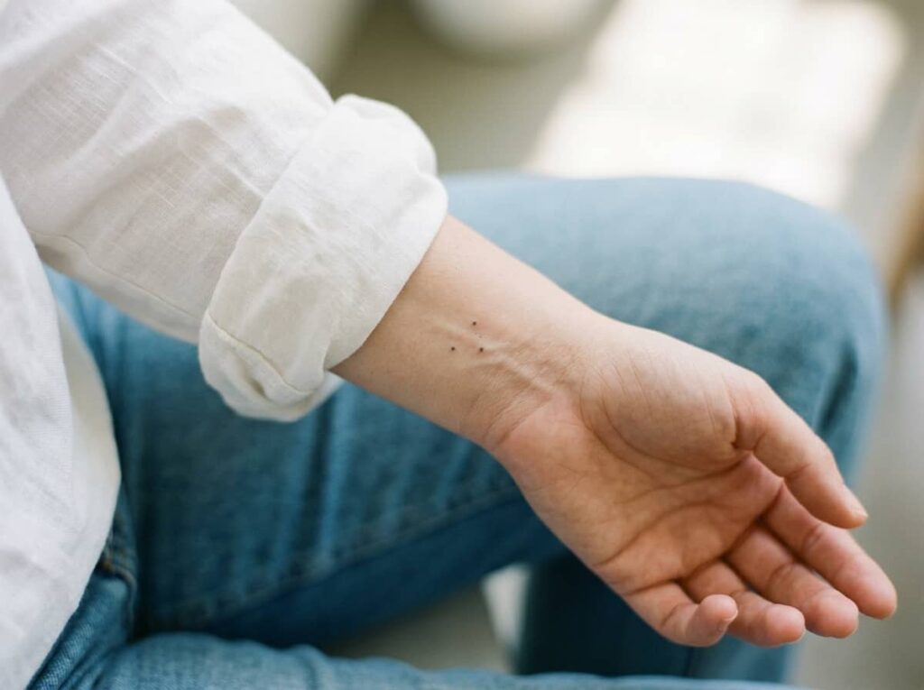
The best constellation tattoos on the wrist are often not real constellations. They are three or four dots arranged in a pattern that means something to you: a birthday, a flight path, the shape of a place you love.
Leave uneven space between the points, since perfectly even spacing reads as a pattern rather than a scattering of stars. Keep dots small but clearly separate, and ask your artist what dot size will stay distinct on your skin.
Ask your artist: “Can you stencil the dots so I can check the spacing with my wrist bent?”
3. Inner Wrist or Outer Wrist: Where Fine Lines Actually Last Longer
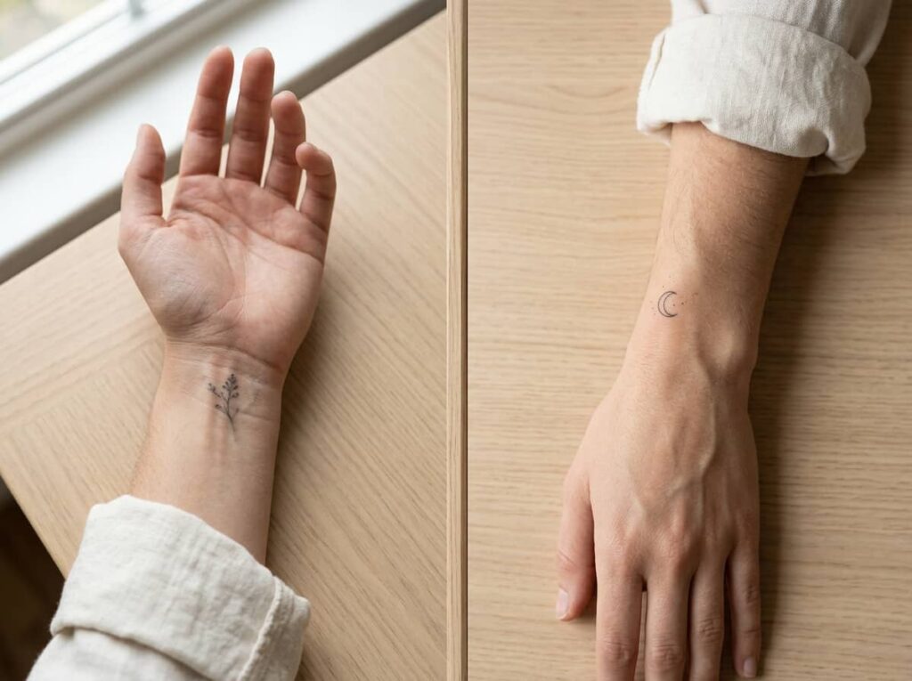
The two sides of the wrist suit different designs, and the right one depends on how you want the tattoo to be seen.
| Inner wrist | Outer wrist | |
|---|---|---|
| Where it sits | Where the wrist bends, facing you when your palm is up | Facing outward, visible to others when your arm hangs down |
| Design fit | Short, simple shapes that can handle bending | A little flatter, so it suits slim lines and small botanicals |
| Worth asking | To see healed photos of the artist’s inner wrist work | To see healed photos of the artist’s outer wrist work |
No source reviewed for this guide shows that one side of the wrist keeps fine lines better than the other. That makes your artist’s healed work the best evidence you can get, so ask to see it. Whichever side you choose, the wear and sun points above apply.
4. A Thread-Thin Infinity Loop With One Birthstone Dot
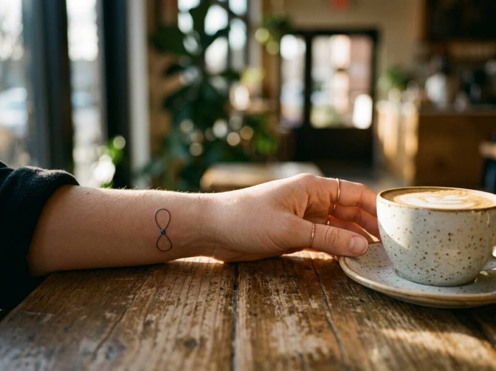
One loop, one dot, one color is the whole rule here. The infinity symbol stays very fine, and a single small dot sits at the center crossing point in a shade that matches your birthstone.
Skip adding a name wrapped around the loop or a second color. The more you stack onto a design this small, the less it reads as infinity. If you are choosing a color for the dot, keep in mind that a tattoo artist quoted by Business Insider says colors closer to your skin tone appear to fade faster because there is less contrast (Business Insider). A deeper shade may stay visible longer than a very pale one.
Do: keep the loop fine and simple, and use one small dot of color at the center cross.
Skip: wrapping a name or date around the loop, or adding a second color.
5. A Single Botanical Sprig Instead of a Full Bouquet
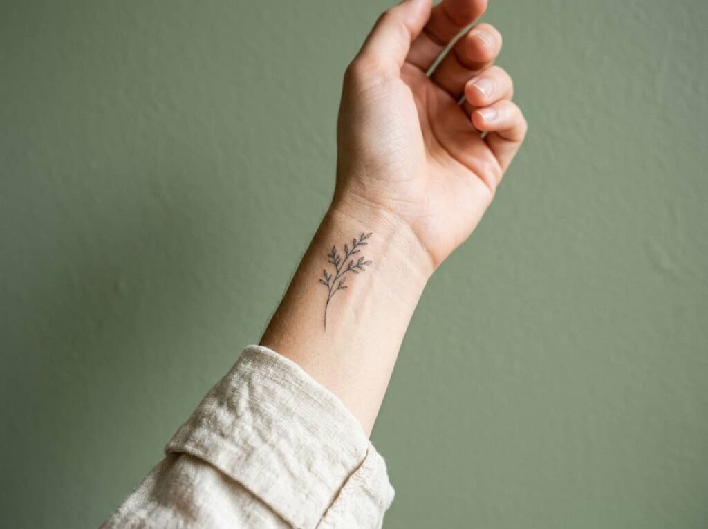
Full bouquets look lovely on an inspiration board, but they need room that a wrist does not have. A single sprig, one stem with two or three leaves or a few small buds, keeps every line visible at a wrist-friendly size.
Eucalyptus, lavender and olive branches all have shapes that stay recognizable when drawn thin. Before your appointment, ask your artist to sketch the sprig at the actual size you want on your skin, not a scaled-down version of a larger reference.
Before you book the sprig:
- Ask for the sketch sized to your actual wrist.
- Pick one plant with meaning, not three mixed together.
- Decide stem direction, toward the hand or toward the elbow, before the needle starts.
6. The Butterfly Silhouette That Skips the Busy Wings

Busy butterfly designs, with veins, patterns and shading, need more space than a wrist offers. A plain outline is more practical: two wing shapes and a slim body, with no interior lines at all.
A simple outline also fits what Removery’s survey describes, which is that delicate line work is likely to hurt less than a heavily filled piece with thick lines (Removery). Your own experience will vary, so ask your artist how long they expect the session to take.
- Ask your artist: “Can you keep this to a clean outline with no interior detail?”
7. Three Dots Instead of One: The Minimalist’s Secret Code

Three small dots in a straight or slightly curved line can stand in for anything: three people, three places, three milestones. Nobody reading your wrist knows what it means unless you tell them, which is exactly the point for people who want ink that feels personal rather than public.
- Keep the dots evenly sized, not graduated from large to small.
- Space them close enough to read as one mark, but with a clear gap between each.
- Ask for a stencil so you can see how the dots sit on your wrist when your hand moves.
It is also an easy design to scale up or down later, and it pairs well with a thin bracelet.
8. A Crescent Moon That Doubles as a Bracelet Line
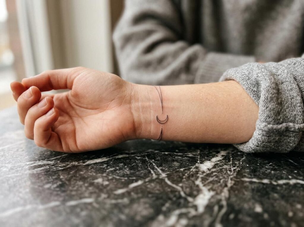
Tilt a thin crescent moon on its side and it stops reading as a nighttime symbol and starts reading as part of a bracelet, a small curved accent sitting right where a chain link would fall. That dual identity is what makes it such a strong wrist choice: it works alone, and it also works layered with real jewelry without competing for attention.
Thickness is the detail to get right here. A crescent drawn too thick reads as a comma. A true hairline curve, tapered at both tips, is what gives it that bracelet-charm look.
A crescent moon only reads as delicate when both tips taper to a true point. Ask your artist to thin the ends, not just the middle.
9. One Word in Your Own Handwriting, Not a Font
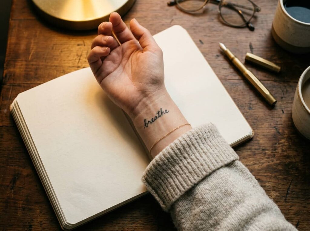
Script tattoos usually get pulled from a font menu, which is exactly why so many of them look identical. Handing your artist a photo of your own handwriting, a word you’ve actually written on paper, gives them something to trace instead of a generic cursive font nobody can tell apart from the next person’s.
Short words hold up best. Anything past six or seven letters starts to curve awkwardly around the wrist and loses legibility within a couple of years.
⚠️ Watch Out
Photograph your handwriting in black ink on plain paper before the appointment. A photo of handwriting on lined or colored paper is harder for the artist to trace accurately.
10. Hidden Under a Watch, Visible When You Want It
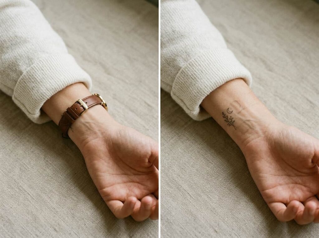
Placement right where a watch band sits gives you control that most tattoo spots don’t: covered for work, visible the second you take the watch off. It’s a popular choice for anyone who wants the design but isn’t ready for it to be part of every first impression.
The tradeoff is pressure. A watch band resting directly over fresh linework daily can blur edges faster than skin that goes uncovered, so most artists recommend waiting a few weeks before wearing a watch over the spot again.
Fully private, reads as a plain wrist from a distance.
Full design visible, a small reveal rather than constant display.
11. A Pulse Line With One Deliberate Break
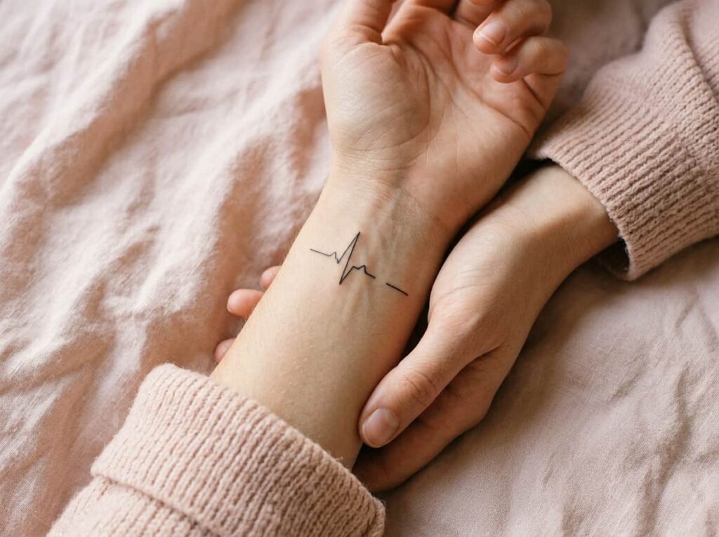
A heartbeat line is one of the easiest wrist tattoo ideas to get wrong, since a shaky or overly long line reads as a graph line, not a pulse. The fix is a single interruption. One small gap or dip breaks the rhythm just enough to make it unmistakably a heartbeat rather than a flat squiggle.
- Keep the line short, no more than an inch across
- Place the one irregular beat near the center, not at either end
- Avoid adding a heart icon at the tip, which crowds the simplicity that makes this design work
What makes it read as intentional
12. A Tiny Sun With Three Rays, Not Eight
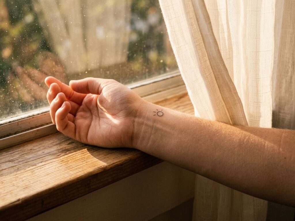
Sun tattoos almost always arrive as a reference photo with eight or twelve rays radiating out, which looks bold on a shoulder and looks like a smudged asterisk on a wrist. Dropping the ray count to three, spaced unevenly, keeps every line distinct even at the smallest size this list covers.
Three rays also reads faster to the eye than a full sunburst, since there’s less for the eye to untangle in that first glance, which matters more than people think for a tattoo this size.
13. A Feather That Fades at the Tip Instead of a Full Outline
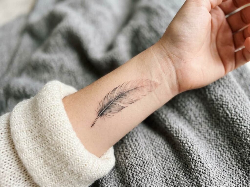
A fully outlined feather, every barb drawn in, is one of the hardest small designs to keep crisp past the first year, since all those thin parallel lines are exactly where ink tends to bleed together first. Letting the feather fade out toward the tip, instead of closing the outline completely, actually looks more intentional and ages better than the complete version.
Have your artist stop the linework gradually rather than cutting it off sharply, so the fade looks designed rather than unfinished.
💡 Quick Tip
Ask for a “dissolving tip,” a few short broken lines instead of a hard stop. It’s the detail that keeps a fading feather from looking like it was cut off mid-design.
14. A Mountain Range No Taller Than Your Fingernail
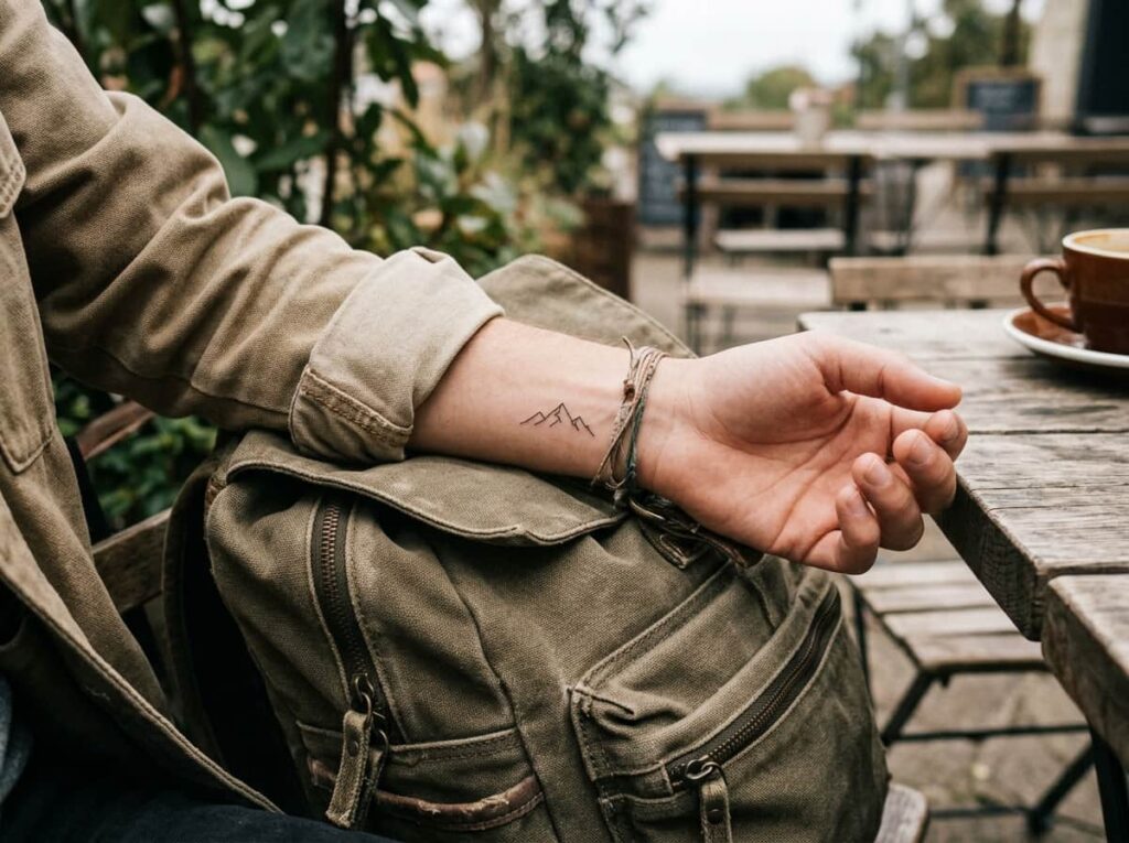
A thin horizontal row of two or three peaks, no shading, no snowcaps, just the outline, sits naturally along the wrist the way a bracelet would. It works especially well for anyone who wants a symbol tied to a specific place or trip rather than a generic nature image.
Keep the tallest peak under half an inch. Anything taller starts to look like a chart line rather than a landscape once it’s compressed into wrist-sized space.
Three peaks is the ceiling. A fourth peak this small almost always collapses into one dark smudge within a few years.
Conclusion
The common thread across all fourteen of these: restraint. Every design that actually holds up on a wrist started as a simpler shape than the reference photo most people walk in with, one line instead of three, three rays instead of eight, a fade instead of a hard edge. Small wrist tattoos for women work precisely because they trade detail for clarity, and that trade is what keeps a tiny piece looking sharp for years instead of blurring into a smudge after one.
If any of these caught your eye, save this list before your next appointment so you’ve got the exact detail to show your artist, not just the general idea.







Leave a Reply