
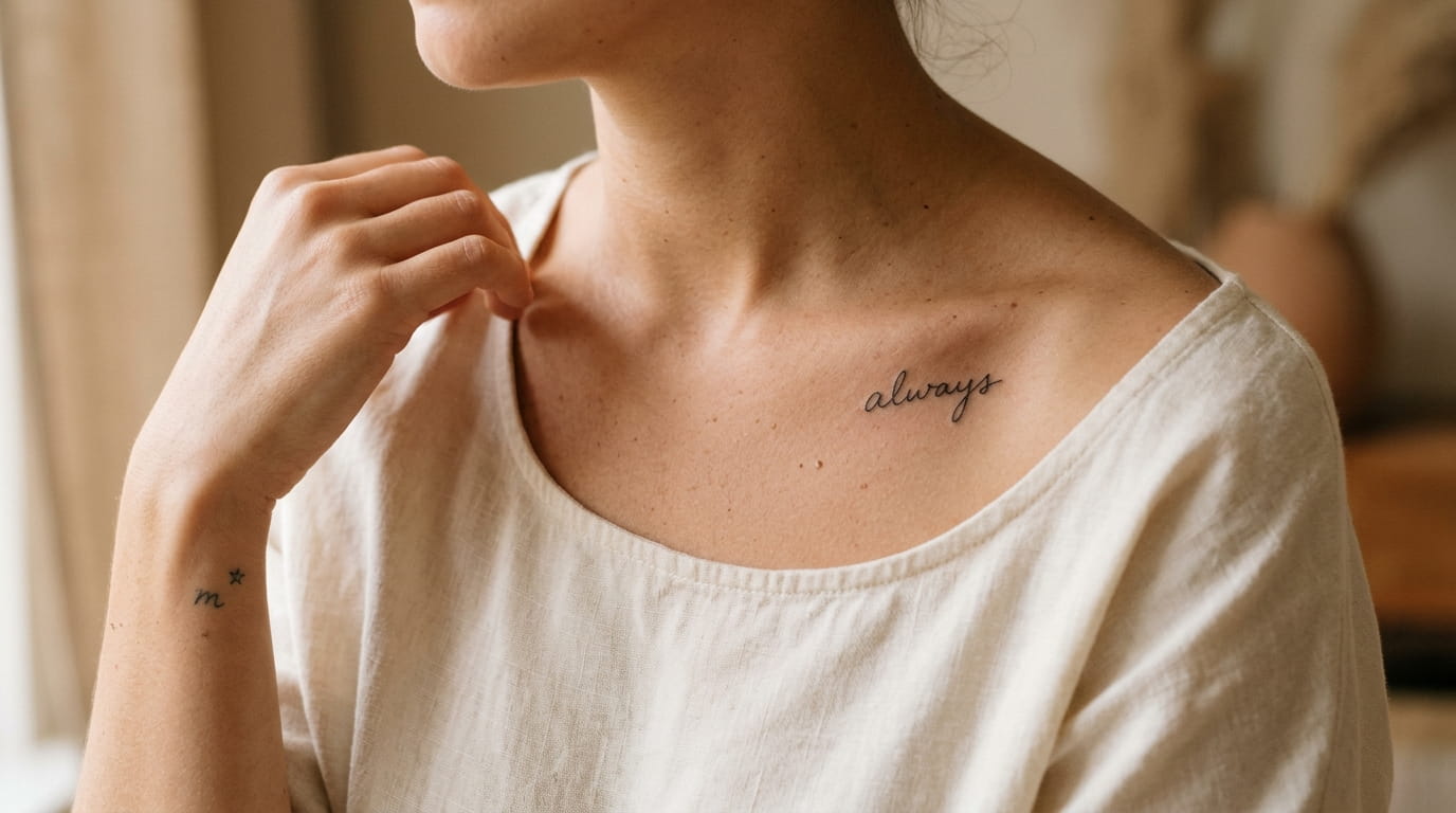
A single letter on your wrist says something a full sleeve never could. That’s the pull behind small word tattoos for women right now: less ink, more restraint, and a design that still means something the moment someone asks about it. The hard part isn’t finding inspiration. It’s choosing a word, a letter, or a phrase small enough to stay subtle but sharp enough to still read clearly years from now.
Most lists just show pretty photos and skip the part that actually matters, like placement, font weight, and how a design ages on skin. This one doesn’t.
Here are fourteen ideas built around letters, initials, and short phrases, each chosen for a different reason: a person you carry with you, a date that mattered, a word you want to see every morning. Some are loud in meaning and quiet in size. That contrast is the whole point.
1. The One Letter Wrist Tattoo That Looks Intentional, Not Accidental
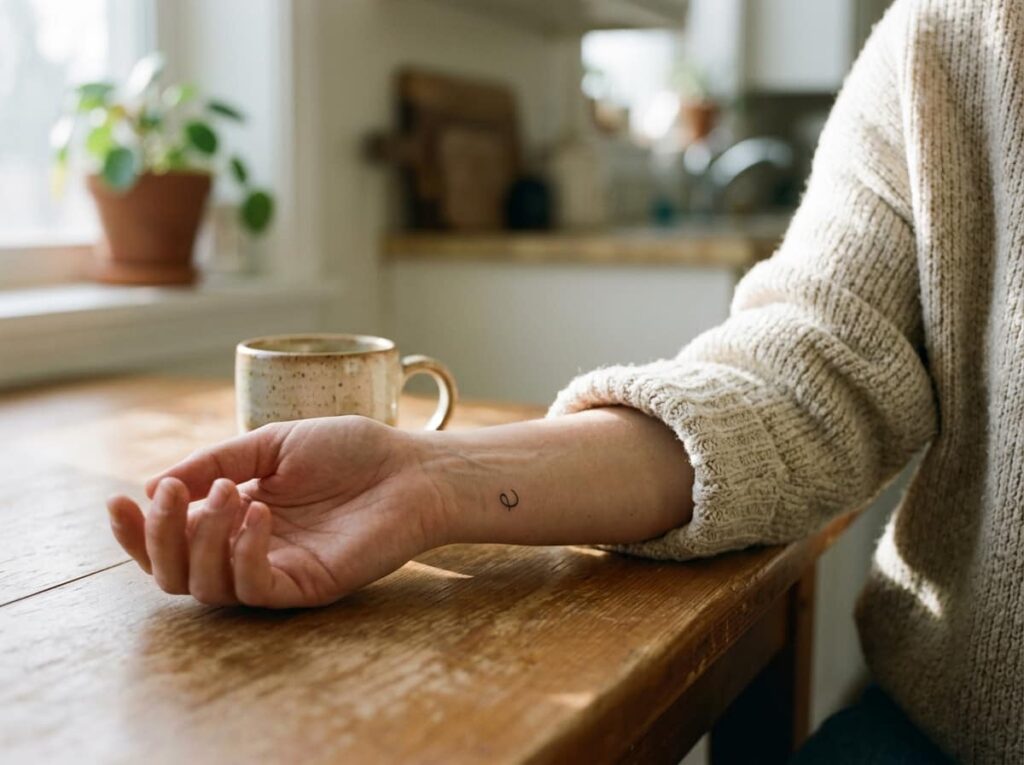
Single letter tattoos go wrong more often than people expect, usually because the artist free-hands the weight instead of testing it first. A stroke that’s too thick looks like a smudge by year three. A lowercase letter on the inner wrist reads as deliberate when the stroke stays thin and the size stays small enough that it doesn’t warp when your wrist bends.
Ask to see two or three font weights on paper before the needle touches skin.
2. Turning a Loved One’s Actual Signature Into Permanent Ink
My aunt has her mother’s handwritten “love” from the bottom of old birthday cards tattooed along her collarbone, and the slight shake in the letters is what makes it hers instead of a font. A real signature or handwritten note can be traced almost exactly, pressure changes and all, instead of redrawn in a cursive font that mimics handwriting but misses the quirks.
Here’s what makes the result worth it:
- Bring the original paper, not a photo of a photo
- Ask for tracing, not a font substitute
- Pick a word short enough to stay crisp under an inch
💡 Quick Tip
A high resolution scan works almost as well as the original paper. A screenshot of a screenshot does not.
3. A Single Word Tucked Behind the Ear, Chosen For What No One Else Sees
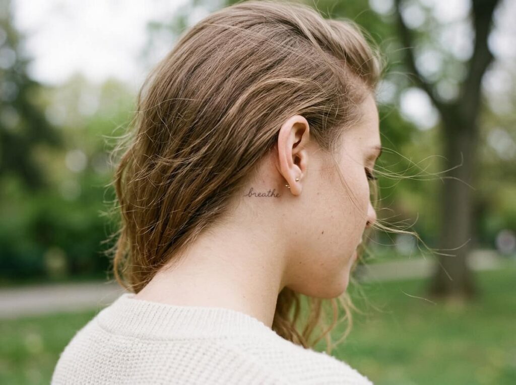
Hair falls over this spot all day, which is exactly why it works. A word placed behind the ear stays hidden in a ponytail and shows up the second your hair gets tucked back, so it reads as something private rather than something performed.
Skin here is thin and close to bone, so this placement hurts more than a forearm piece. Expect quicker surface healing since there’s less friction from clothing, but keep sunglasses and hair ties away from it the first week.
4. Marking a Date in Roman Numerals Instead of Plain Digits
Roman numerals turn a date into something closer to a pattern than a number, which is why they read as more design forward along the ribcage or spine. The conversion is simple enough to check yourself before your appointment, so you’re not relying on your artist to get the math right.
Here’s the quick method:
- Break the date into day, month, and year
- Convert each part separately using standard numeral values (I, V, X, L, C)
- Separate the three groups with a small dot or line so the date stays readable, not jumbled into one long string
Write out the full date, then split it into day, month, year.
Convert each number into roman numerals on paper first.
Separate the groups with a dot so the date reads clearly.
5. Two Initials Linked Into One Small Monogram on the Ankle

Two initials placed side by side can look like a typo if the letters are too similar in height or width. Linking them into a single monogram, with one letter slightly smaller or nested into the curve of the other, solves that and keeps the whole design under an inch wide.
What separates a monogram that ages well from one that doesn’t:
Choose letters with different heights so they interlock naturally.
Keep the line weight even across both letters.
Pairing two round letters with no visual contrast.
Cramming a flourish between letters at this size.
6. A Word From Another Language, Chosen Only After You Know Exactly What It Means
A quick translation app search is not enough. Words carry context, gender, and regional meaning that a single app result can completely miss, and a mistranslated word on skin is far harder to fix than a mistranslated caption.
Before booking, confirm the word with a native speaker or a translator who works professionally, not casually. Ask about connotation too, since some words sound poetic in one context and strange or even rude in another.
⚠️ Watch Out
Translation apps often return the literal word, not the natural one a native speaker would actually use. Confirm with a real person before you commit.
7. One Word Running Down the Spine as a Daily Reminder
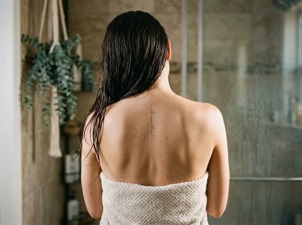
The spine placement works because you see it only when you choose to, in a mirror, after a shower, somewhere private. That makes it the right spot for a word meant purely for you rather than for anyone else’s reaction.
Vertical script down the spine also elongates naturally with the body’s shape, so even a longer word can stay narrow and readable instead of spreading out awkwardly.
A vertical word down the spine stays narrow and legible even at a longer length, because the curve of the body does the elongating for you.
8. Matching Letters a Mother and Daughter Can Each Wear Differently
My cousin and her mom got the same letter last spring, one in script on the wrist, one in block print on the ankle, so the match reads as connection rather than a costume. Same letter, different font and different spot, keeps each tattoo feeling like it belongs to the person wearing it.
A few things worth settling before you go in together:
Agree on this first
9. A Line From a Song, Small Enough to Fit Along the Forearm
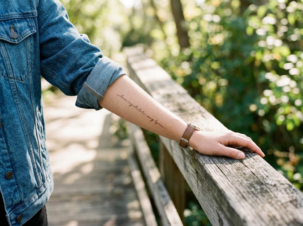
Picture the words small and tight along the forearm, running with the arm’s natural line instead of across it. A lyric fragment works best here when it’s short, five or six words at most, since longer lines either curve awkwardly or shrink below readable size.
Font choice carries most of the emotional weight at this scale, so it’s worth testing a few before deciding.
10. Pairing a Tiny Symbol With a Single Initial Instead of a Whole Word
A symbol next to an initial carries more weight than either piece alone, since the symbol narrows the meaning without needing a full word to explain it. The pairing stays small, usually under an inch total, and reads as considered rather than decorative.
Not every symbol fits every story, so it helps to know roughly what each one tends to signal before picking.
| Symbol | Common meaning |
|---|---|
| Arrow | Moving forward, a path chosen |
| Small star | Guidance, a person or memory you follow |
| Dot or period | Closure, a chapter fully ended |
11. A Word Written Vertically Down the Side of a Finger
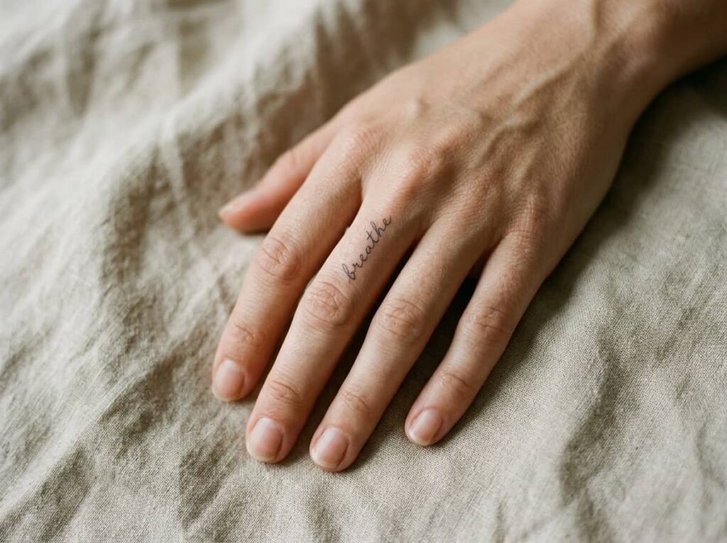
Finger placement doesn’t leave much room, so a word here has to run vertically along one side rather than across the top, letter stacked under letter like a thin column. It’s one of the most visible spots on the body, which makes it a fast way to start a conversation whether you want that or not.
This placement also fades faster than almost anywhere else because of how often hands are washed, gripped, and exposed to sun.
12. A Single Word Whispered at the Nape of the Neck
This spot sits right where a low bun or an updo splits open, so the word only shows when your hair moves a certain way. It suits a word you want close to you but not necessarily on display at every meeting or photo.
The nape also hides touch-up sessions well, since collars and hair naturally cover the area while it heals.
💡 Quick Tip
Pull your hair into the style you wear most before your appointment, so your artist can place the word where it actually shows.
13. The Birth Year That Turns Into a Delicate Hip Tattoo
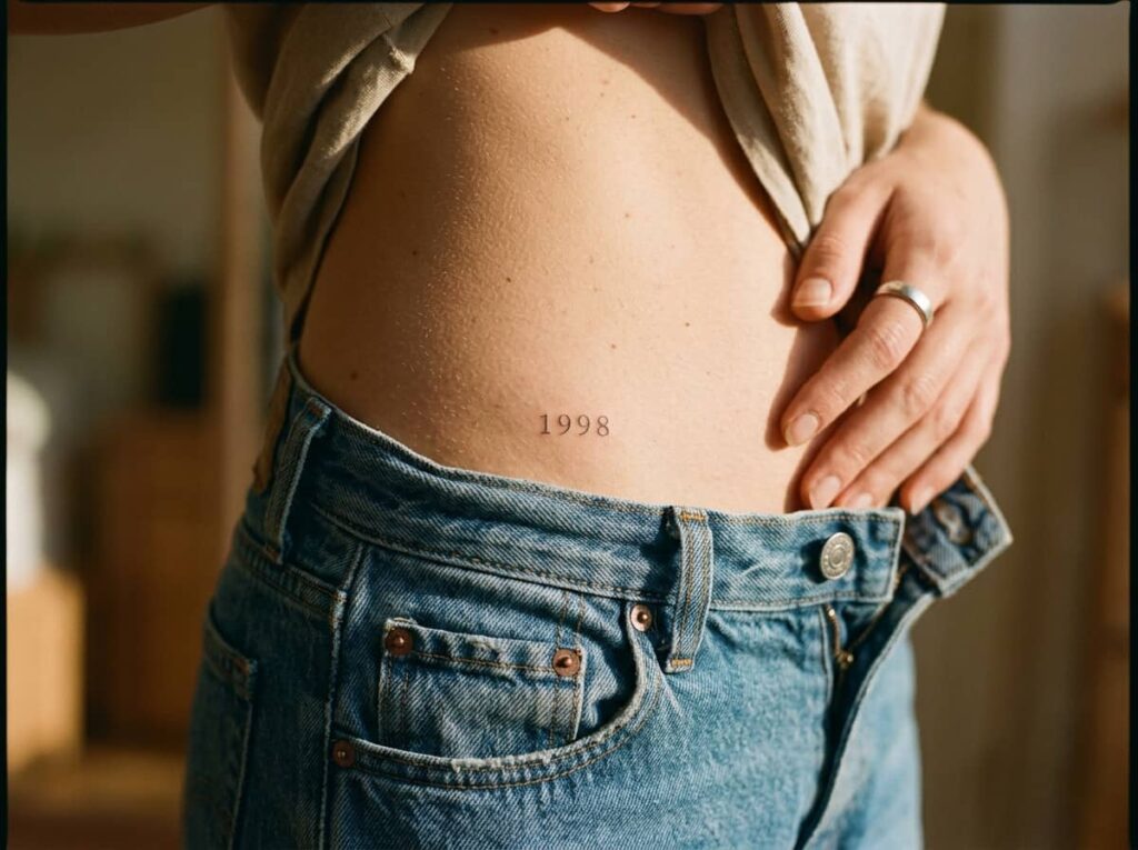
A birth year written out in plain digits can look flat on its own. Shrinking it down, adding a thin serif font, and placing it along the hip bone turns the same four numbers into something that reads as a quiet detail instead of a label.
The hip also hides the piece under most clothing, which matters if you’d rather keep it private.
Plain block numbers, evenly spaced, no real design thought behind the layout.
Thin serif numerals following the curve of the hip, small enough to stay personal.
14. A Short Love Note in Cursive Across the Shoulder Blade
The shoulder blade gives a longer phrase more room to breathe than almost any other small-tattoo spot, but legibility still drops fast once a note runs past six or seven words. Keeping the line short and the cursive consistent in slant is what keeps it readable from across a room instead of turning into a smudge.
A few steps that keep a longer phrase from losing shape over time:
Keep the phrase under seven words so the cursive doesn’t shrink past readable.
Pick one consistent slant across every letter, not a mixed script font.
Ask your artist to size-test the full phrase on paper before tattooing.
Conclusion
Small word tattoos for women work because they hold back just enough. A single letter, a short phrase, a word only you can see from certain angles, each one says something specific without asking for a whole paragraph of explanation. What makes any of these fourteen ideas age well isn’t the concept alone. It’s the placement, the font weight, and whether you gave the word enough thought before it became permanent.
If one of these caught your eye, take a screenshot of the font style and placement before your appointment so you and your artist are working from the same picture. Small tattoos leave little room for guessing.







Leave a Reply