
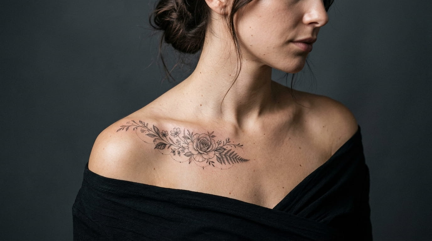
Most collarbone tattoo advice tells you to “go delicate” and stops there, which is not much help when you are staring at a blank neckline trying to picture anything specific. The truth is that collarbone placement is unforgiving. It stretches when you move your arm, it shows through most necklines, and a design that looked great on paper can sit oddly once it follows the bone’s actual curve.
That is the gap this list is trying to close. These are fourteen collarbone tattoo ideas for women that account for how this spot actually behaves, not just how it photographs in a single still pose. Some lean into fine-line script, some lean into florals, and a few use symbols that carry real meaning instead of filler shapes.
You do not need to pick a favorite right away. Read through a few, notice which ones you keep scrolling back to, and bring that one to a consultation so your artist can adjust it to your exact collarbone shape and skin tone.
1. Let a Single Line of Script Follow the Bone, Not Fight It
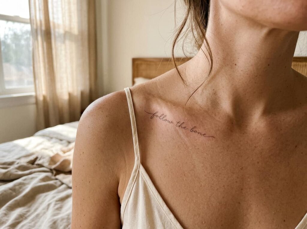
The collarbone already has a natural dip and rise, so a word or short phrase placed to follow that line reads cleaner than text stamped in a straight row. Most artists will trace the line with a marker first so you can see the path before the needle touches skin.
This style works best with five words or fewer. Longer phrases start to curve awkwardly past the shoulder joint and lose legibility when the skin stretches.
💡 Quick Tip
Ask your artist to write the phrase on paper first in your handwriting style preference, then trace it onto your actual collarbone curve before tattooing, not a flat surface.
2. Scatter Tiny Wildflowers Along the Bone’s Edge
A loose trail of small wildflowers, no two exactly alike, gives you movement without turning the whole area into one dense floral block. The irregular spacing is what sells it. Perfectly even flowers tend to look printed rather than drawn.
Mix two or three flower types so the trail has rhythm instead of repetition, and keep the stems thin so they do not compete with the blooms.
3. Center a Minimalist Sun or Moon in the Sternum Dip
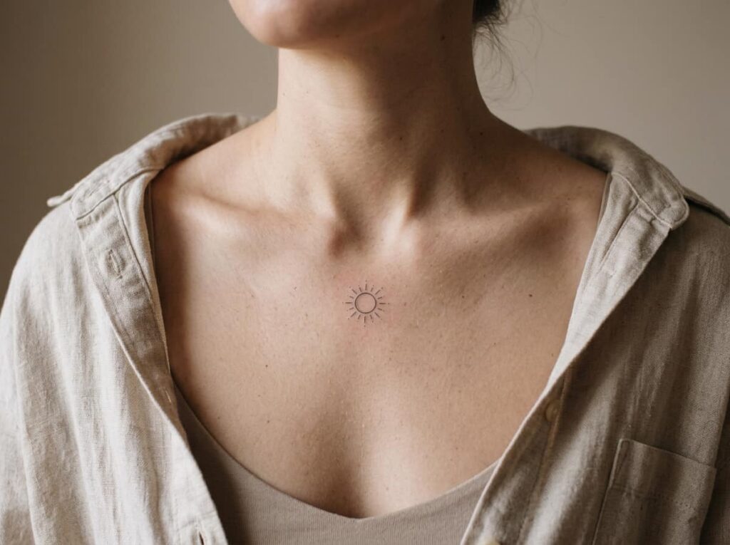
Place a small sun or crescent moon right in the hollow where both collarbones meet, and it becomes a natural focal point without needing any extra detail around it. Thin lines keep it from reading as heavy against such a small space.
Here is roughly how that first session tends to go:
Your artist marks the exact center point between both collarbones while you stand naturally, not with your shoulders pulled back.
You check the stencil sitting down and standing up, since this spot shifts more than most people expect.
The linework goes in thin and single pass, since this is a low pain tolerance area for most people and heavy shading adds unneeded time.
4. Map a Birthday Constellation Behind the Ear
A friend of mine sat for twenty minutes with her phone open to a star chart app, double checking that the dots behind her ear actually matched her birth month’s constellation instead of a generic star cluster. That kind of accuracy is what makes this idea feel personal instead of decorative.
Keep the dots small and the connecting lines barely there, since this spot sits close to hair and needs to stay readable even when partly covered.
5. One Feather, Drifting Toward the Shoulder
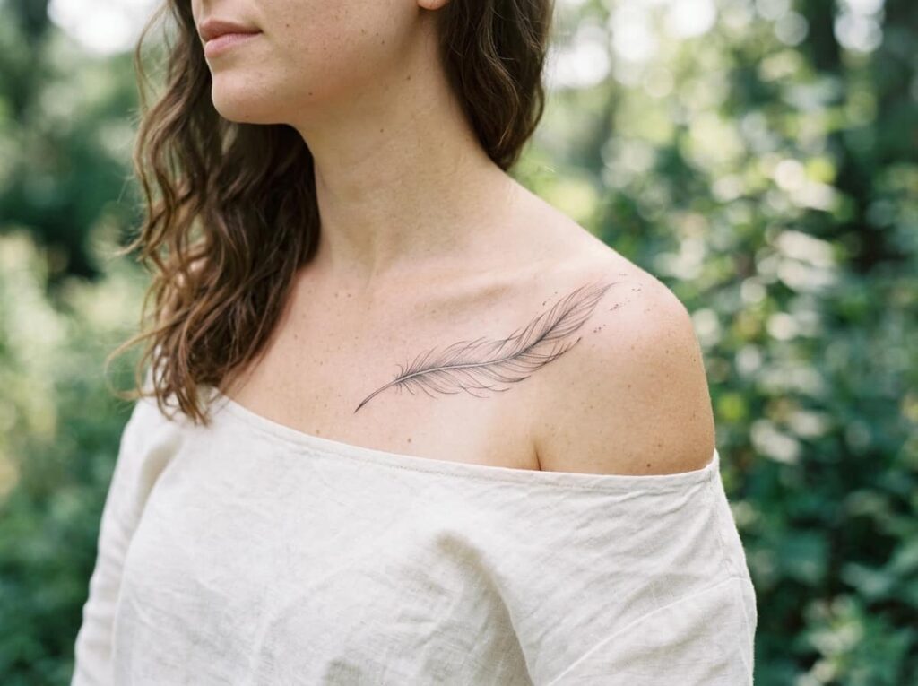
A single feather works best when it looks mid fall rather than pinned in place. A slight tilt and one or two loose lines trailing off the tip suggest motion without needing extra elements around it.
Before your appointment, it helps to have a few specifics ready so the consultation moves faster:
Before your consultation
6. Trace a Fine-Line Vine From the Neck Down to the Collarbone’s Tip
A vine that starts thin near the neck and gains a few more leaves as it travels outward creates a sense of growth instead of a static pattern. The key is restraint: three or four small leaves total, not a dense tangle.
This is one of the few ideas on this list that genuinely changes how it reads depending on scale.
A thick, evenly spaced vine that reads as one solid shape from across the room.
A tapered vine, thin at the neck and slightly fuller near the shoulder, that reads as one continuous gesture.
7. Mirror a Tiny Symbol on Both Collarbones
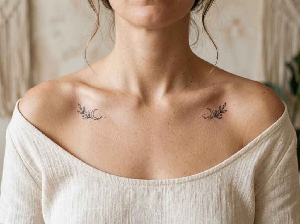
Two matching small symbols, one on each side, give the design a sense of balance that a single piece on one collarbone cannot. Arrows, small moons, and simple geometric shapes tend to hold up best in pairs.
The tradeoff is mostly about commitment and cost, since you are essentially booking two placements in one session.
| Single Symbol | Mirrored Pair |
|---|---|
| Lower cost, shorter session. | Roughly double the time and price. |
| Easier to resize or cover later. | Harder to adjust without redoing both. |
8. Go Outline-Free With a Soft Watercolor Floral Burst
Skipping the black outline and letting color blend directly into the skin gives a floral burst a softer, almost painted look. It photographs beautifully against the collarbone’s natural shadow.
It is worth knowing upfront that this style fades differently than linework, so the maintenance conversation matters here.
Outline-free watercolor work fades faster than linework, so plan on a touch up within two to three years to keep the colors from going muddy.
9. Tuck a Small Symbol Just Behind the Earlobe
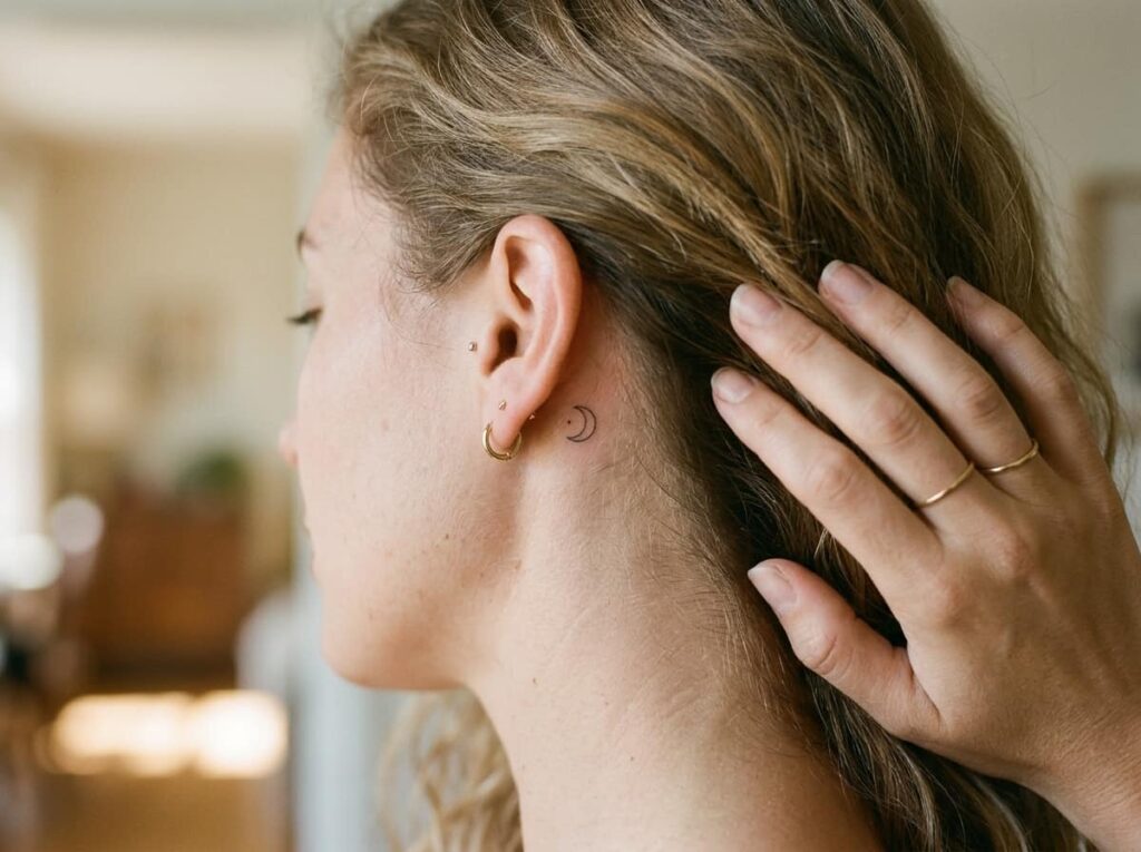
People assume this spot is too small for anything meaningful, but a symbol under half an inch, like a tiny star or a single line, still reads clearly up close and stays hidden under most hairstyles.
The real limiting factor is not size. It is pain tolerance, since skin here sits close to cartilage.
📌 Good To Know
Ask your artist to test a few dots with the machine before committing, since this spot’s sensitivity varies a lot more between people than most other placements.
10. Let a Flock of Birds Trace the Collarbone’s Natural Slope
Three or four small birds in flight, sized smaller as they move farther from the center, follow the downward slope of the collarbone in a way that feels deliberate rather than random. Keep every bird facing the same direction.
Size the birds smaller as they trail farther from center.
Keep all wings angled the same way for a sense of flight.
Making all birds the same size, which flattens the sense of distance.
Spacing them in a perfectly straight row instead of a natural scatter.
11. Write a Word or Date in Your Own Handwriting
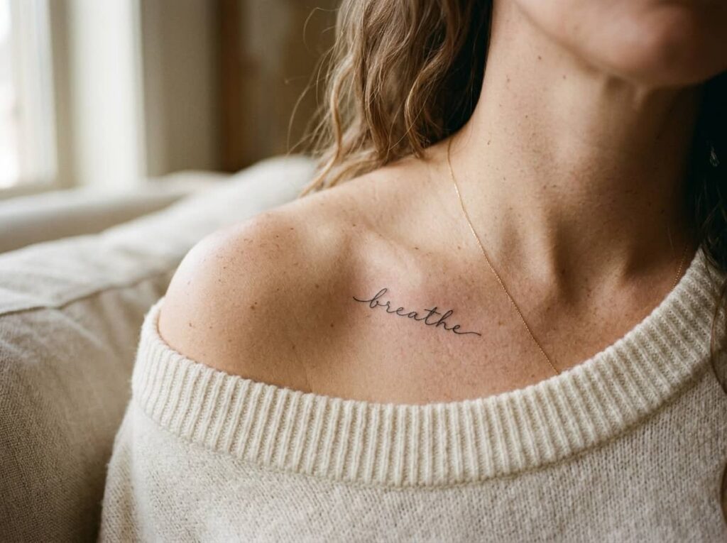
A signature, a single word, or a short date rendered in your actual handwriting carries weight that a standard tattoo font cannot fake. Artists can trace a scanned sample almost exactly, down to the slight wobble in your letters.
Getting it right takes a bit of prep on your end before the appointment.
Write the word several times on paper with a fine pen, then pick the version with the cleanest, most natural stroke.
Scan or photograph it in good lighting so your artist can trace the exact strokes, not just the general shape.
Confirm the placement curve with a stencil before tattooing, since handwriting distorts more than printed script when it bends.
12. Link a Dotted Chain of Triangles or Diamonds
A row of small geometric shapes connected by fine dotted lines gives a modern, almost jewelry-like effect across the collarbone. Unlike florals, this style depends entirely on even spacing, so a steady hand matters more here than artistic flourish.
13. Keep It to One Fine-Line Rose or Peony
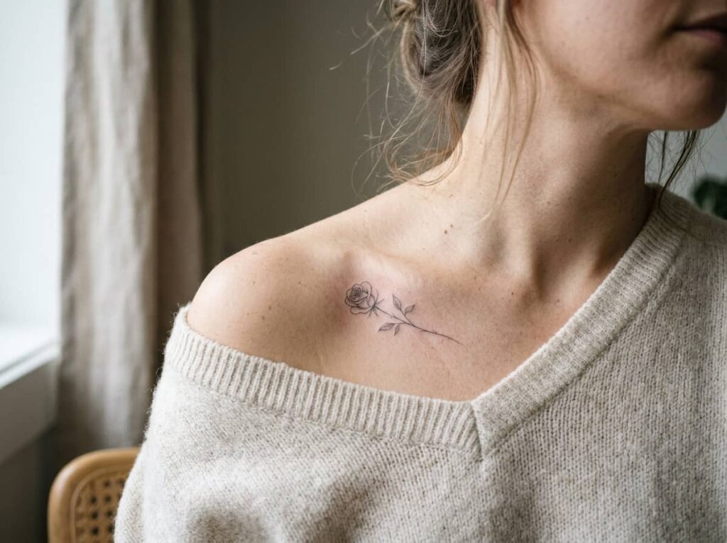
A single flower, rendered small and detailed rather than large and simplified, often holds up better over time than a bigger piece with less linework. The fine lines inside the petals are what give it depth, so this is not a design to rush.
A few things are worth gathering before you sit down for it.
What to bring to your appointment
14. Connect Both Collarbones With a Thin “Necklace” Chain
A delicate line running collarbone to collarbone, dipping slightly at the sternum like a real chain would sit, reads as jewelry rather than a traditional tattoo motif. Small charms, a star, a heart, a single bead, can hang off the center point if you want a focal detail.
A bare collarbone with no sense of connection between the two sides.
A thin line that dips at the center like a necklace sitting naturally against the skin.
Conclusion
A good collarbone tattoo idea comes down to matching the design to how that spot actually moves and shows, not just how it looks in a single photo. Whether you lean toward fine-line script, a scattered floral trail, or a symbol with real meaning behind it, the ideas that hold up longest are the ones sized and placed with the bone’s natural curve in mind, not against it.
Bring your favorite collarbone tattoo ideas into a consultation, ask your artist how the design will sit as skin moves, and let them adjust the fine details to your frame.
Save this list for the next time you are planning your next piece.
📌 Before You Go
Save your top three favorites, note the placement curve on your own collarbone, and bring both to your consultation.







Leave a Reply