
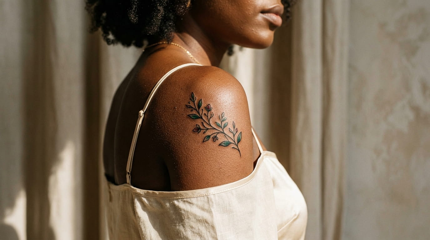
Scroll through any small tattoo roundup and you hit the same wall fast. Thin single needle lines, pastel washes, tiny stars that look stunning in the reference photo and vanish the moment you picture them on deeper skin. That’s not your imagination. Ink saturation, needle weight, and line thickness all read differently depending on your skin, and most generic galleries are built around one skin tone only.
This list skips that problem. Every idea here is chosen because it holds up in dark skin specifically: bold outlines, solid fill, warm or jewel-tone color instead of pastel, and placements where the design stays crisp instead of blurring into a smudge a year later. These are small tattoos black women can actually bring to a consultation and expect to look like the stencil, not a faded version of it.
Some of these lean personal, some lean decorative, but all thirteen follow one rule. They show up clearly, heal well, and still look sharp from across the room.
- 1. A Thick-Lined Crescent Moon That Won’t Fade Into Your Skin
- 2. Jewel-Tone Florals That Read Clearly Instead of Pastels That Wash Out
- 3. A Solid Black Adinkra Symbol With Real Cultural Meaning
- 4. Bold Dotwork Constellation Instead of Fine-Line Stars
- 5. A Chunky Script Word in a Font Weight That Actually Shows
- 6. Negative-Space Sun With a Thick Black Halo
- 7. A Mini Elephant Silhouette in Solid Fill
- 8. Geometric Mountain Line With Extra Weight for Contrast
- 9. A Two-Tone Butterfly Mixing Black Outline and Saturated Color
- 10. Thick-Banded Wave Design for Ankle or Wrist
- 11. A Zodiac Glyph Rendered as Solid Fill, Not Thin Outline
- 12. Heart Outline With Dotwork Shading for Texture
- 13. A Branch-and-Leaf Line That Wraps the Forearm
1. A Thick-Lined Crescent Moon That Won’t Fade Into Your Skin
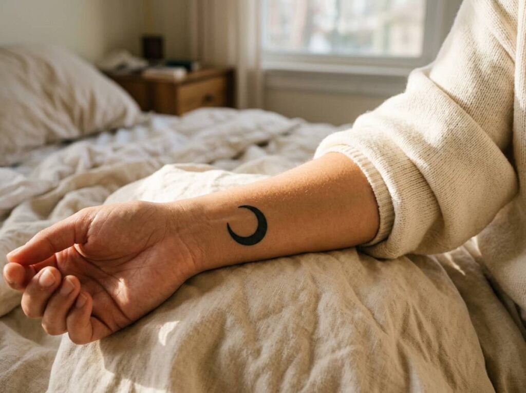
Thin crescent moons are everywhere on Pinterest, and almost all of them are drawn for pale skin. On deeper tones, a hairline moon tends to soften within a few years and can start looking more like a smudge than a shape. Ask your artist to bump the line weight up, even slightly. A thicker outline holds contrast far longer and keeps the moon looking deliberate instead of accidental.
Wrist and collarbone are the two spots where this design ages best, since the skin stays relatively flat and doesn’t stretch the line out of shape.
2. Jewel-Tone Florals That Read Clearly Instead of Pastels That Wash Out
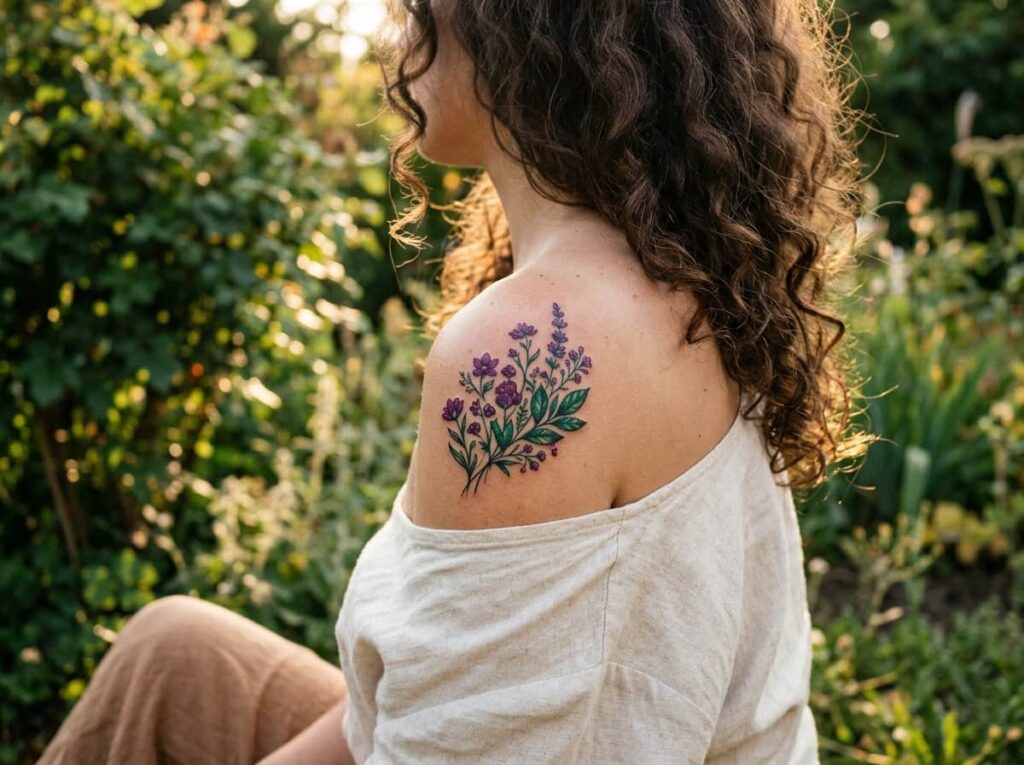
A single flower in blush pink or baby blue can disappear into deeper skin within the first few months, long before the tattoo has even finished healing. Jewel tones behave differently. Emerald, sapphire, deep amethyst, and burgundy all carry enough pigment density to stay saturated instead of fading into a pale shadow of the original design.
Keep the flower small and ask for solid color fill rather than a light wash, especially on the petals. A wash looks lovely on paper and nearly invisible in person.
💡 Quick Tip
Bring color swatches to your consultation and ask your artist which saturations hold up best on your undertone, not just which ones look good in the stencil.
3. A Solid Black Adinkra Symbol With Real Cultural Meaning
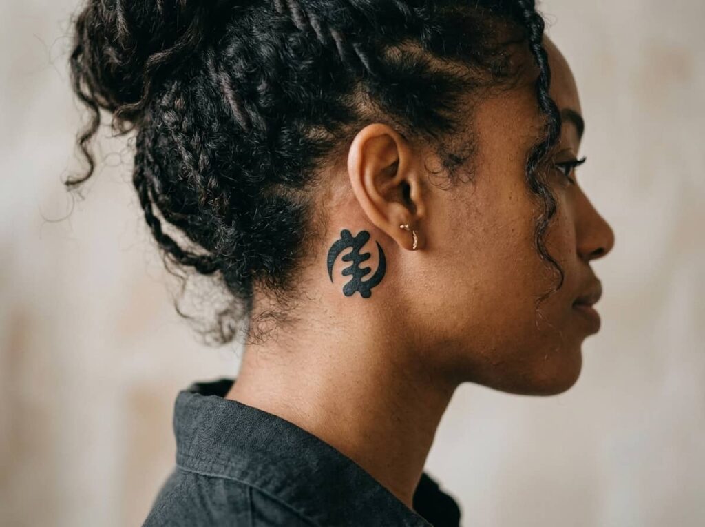
Adinkra symbols carry specific meanings rooted in Akan tradition, and getting one accurate matters as much as how it heals. Look up the symbol’s real origin and meaning before you commit, not just the version floating around tattoo mood boards. Once you’ve chosen one, solid black fill is the move. These symbols were designed as bold marks, and keeping that same weight in ink is what lets the shape stay sharp at the wrist, ankle, or behind the ear for years.
Before you book this one
4. Bold Dotwork Constellation Instead of Fine-Line Stars
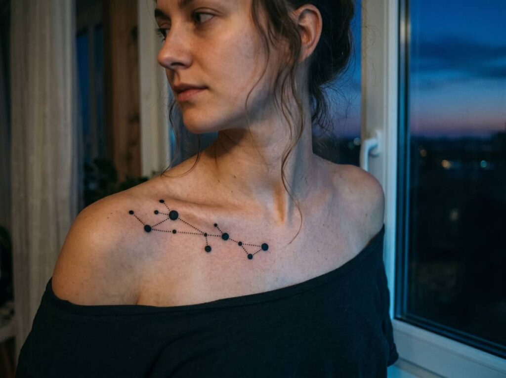
The idea that constellations only work as delicate connect-the-dot lines isn’t really true, it’s just the version that photographs best on fair skin. Swap the thin connecting lines for dotwork stars of varying sizes, close enough together that the pattern reads as a constellation without needing a line to spell it out. The dots carry more ink individually than a hairline does, so the whole design stays visible instead of thinning out over time.
Use dots of different sizes for depth.
Keep the stars grouped close together.
Relying on one thin connecting line.
Spacing the stars too far apart.
5. A Chunky Script Word in a Font Weight That Actually Shows
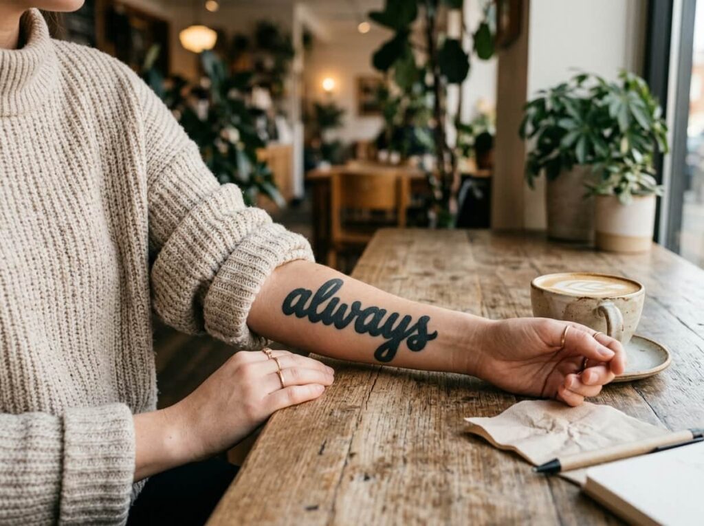
Here’s the simple rule with script tattoos: if you can’t picture the letters getting slightly thicker ten years from now, the font is too thin to start with. Delicate, swirly cursive is the single most common small tattoo regret, since it blurs first and fastest. A heavier script, closer to hand-lettered marker style, keeps individual letters distinct even as the ink naturally softens with age.
Write your word out in three font weights, thin, medium, and bold.
Print each one at the actual size you’ll get tattooed and hold it at arm’s length.
Pick the weight that’s still easy to read, not just the one you like best on screen.
6. Negative-Space Sun With a Thick Black Halo
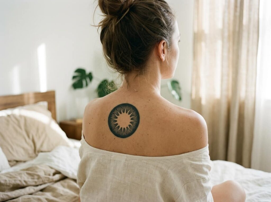
There’s a specific moment that ruins most negative space tattoos. Around six months in, the thin black outline circling the empty space has worn down just enough that the whole design starts reading as fuzzy instead of sharp. A thick black halo solves that before it starts. The sun itself stays empty, just your natural skin tone, while the ring around it carries enough ink weight to hold its edge for years.
This one works best somewhere flat, like the inner forearm or upper back, where the ring won’t stretch or curve out of shape.
A thin halo that softens into a blur after a year or two.
A bold halo that still reads crisp years later.
7. A Mini Elephant Silhouette in Solid Fill
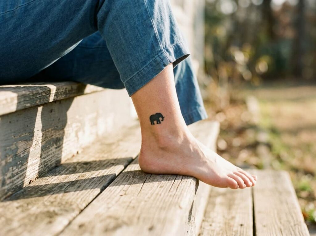
Two versions of this design get requested constantly, and only one of them ages well. An outline-only elephant, just the trunk and ears traced in thin line, tends to lose its shape as the lines soften over time. A solid black silhouette does the opposite. Because the whole body holds ink instead of just the edges, the shape stays recognizable even after a decade, and it still reads clearly from a few feet away, which matters more than people expect from a tiny tattoo.
| Outline Only | Solid Silhouette |
|---|---|
| Loses shape as lines soften. | Holds shape for a decade or more. |
| Harder to see from a distance. | Reads clearly even from a few feet away. |
8. Geometric Mountain Line With Extra Weight for Contrast
A row of sharp triangular peaks, stacked tight with no gap between them, is the detail that makes this design work on dark skin where thinner geometric tattoos tend to fall flat. The trick is weight. A mountain range drawn with the same thin line as a typical minimalist tattoo loses its individual peaks within a couple of years, blurring into a single wavy smear. Thicken the line, even just slightly, and each point stays distinct.
Geometric line work needs real weight to survive on deeper skin. Thin minimalist lines are the first thing to blur.
9. A Two-Tone Butterfly Mixing Black Outline and Saturated Color
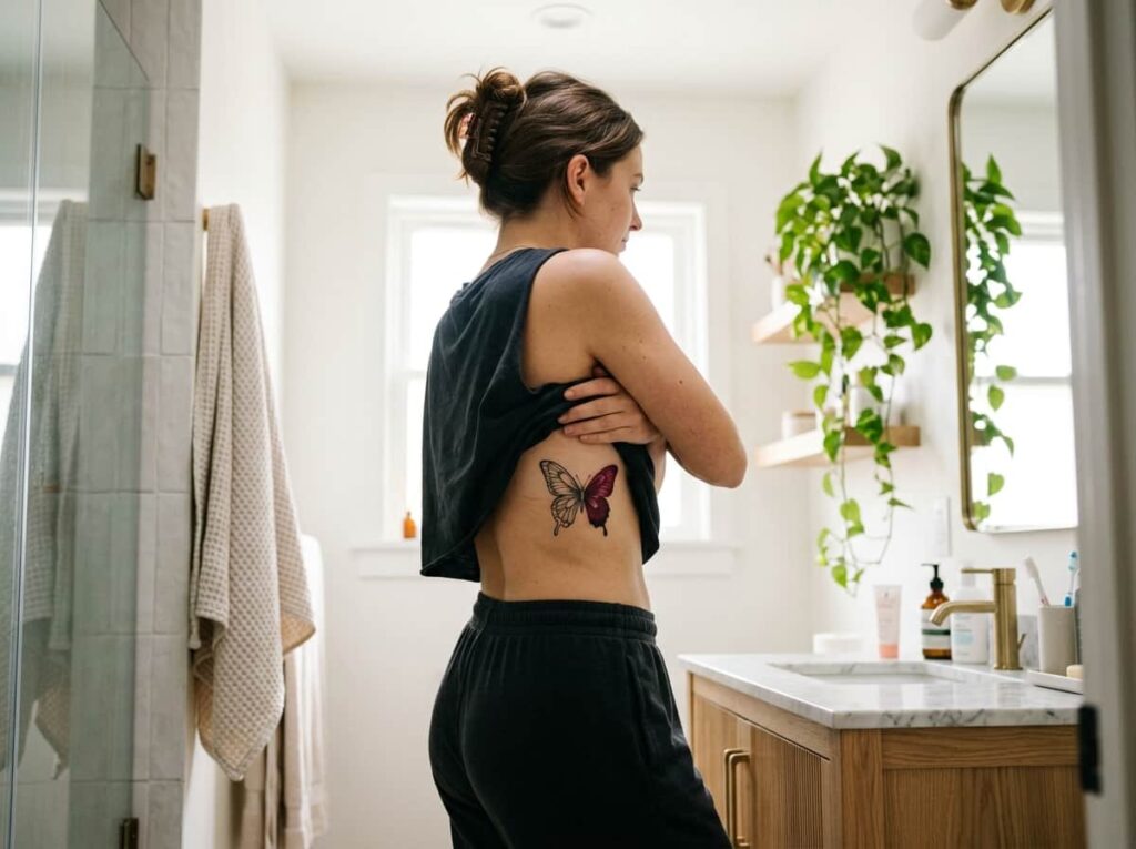
The most common mistake with a color butterfly is treating the black outline as an afterthought. Artists often save their attention for the colored wing fill and sketch the outline in thin, quick lines, which is exactly the part that needs the most weight to survive. Ask for a bold black outline first, then saturated color fill inside it. Burgundy, deep teal, and amber all hold up well on dark skin. The black does the structural work and the color adds the personality.
💡 Quick Tip
Ask your artist to do the outline in a slightly heavier needle grouping than they’d normally use for a small tattoo. It’s the difference between a crisp wing shape in five years and a soft smudge.
10. Thick-Banded Wave Design for Ankle or Wrist
Ankle tattoos take more day to day wear than almost any other placement. Socks, shoe straps, even bumping the ankle bone against furniture all work against a design that’s drawn too thin from the start. A wave with real band width, more like a ribbon than a line, holds up to that friction far better than a hairline curve does.
The same shape also reads cleanly on the wrist, if you’d rather skip footwear rubbing against it entirely.
11. A Zodiac Glyph Rendered as Solid Fill, Not Thin Outline
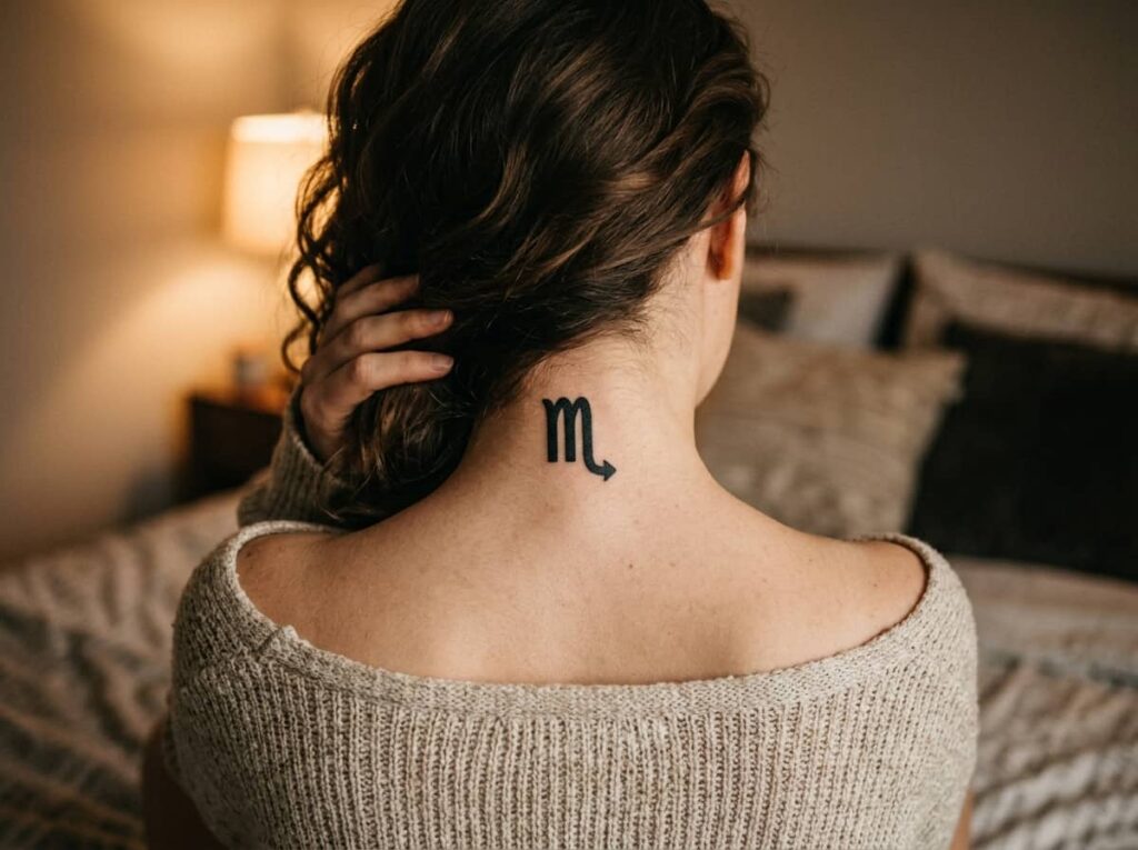
Most zodiac tattoos get drawn as a thin line glyph, the same style you’d see etched into a necklace charm. That works on metal. On skin, especially deeper tones, the fine curves of most glyphs, Scorpio’s tail or Pisces’ loops, soften into a blur within a couple of years. Solid fill changes that. The whole glyph holds its shape because there’s no thin line to fade, just one consistent black shape your eye reads instantly, even healed and from across a room.
What to bring to your appointment
12. Heart Outline With Dotwork Shading for Texture
A plain heart outline is fine, but it reads a little flat on its own, especially once it’s fully healed and the line has settled into the skin. Dotwork shading solves that without adding real complexity. A scatter of dots along one edge, or filling part of the inside, gives the heart dimension, almost like a shadow, and it holds up visually a lot longer than a single thin line by itself.
13. A Branch-and-Leaf Line That Wraps the Forearm
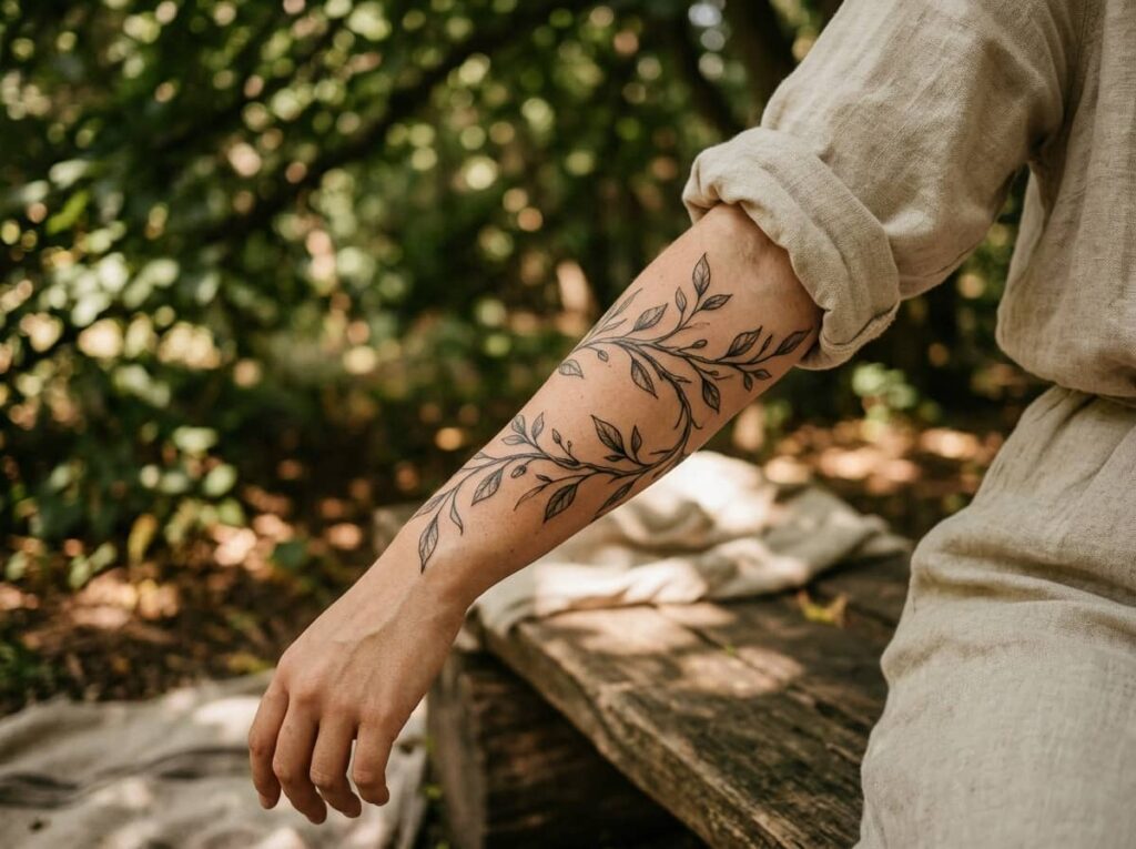
Pull a sleeve up past the elbow and most forearms have a long stretch of mostly empty skin between the wrist and the crook of the arm. A single branch line, with two or three leaves breaking off at different points, is one of the few small designs actually built to use that length instead of getting lost in it. Keep the line thin to medium weight, since this one relies on open space around it rather than heavy fill, and let the leaves carry the visual interest.
It works especially well for anyone who wants something that reads as delicate up close but still has presence at a normal conversational distance.
- ▸Six to eight inches gives the branch room to curve naturally.
- ▸Keep leaves asymmetrical, evenly spaced ones read as a stamp rather than a plant.
- ▸This placement stretches less than wrist or ankle, so detail holds longer.
Conclusion
Small tattoos don’t have to mean settling for a design that was really made with someone else’s skin tone in mind. Every idea on this list was chosen with the same question in mind: will this still look sharp in five years, not just in the stencil photo.
Bold lines, solid fill, and jewel-tone color aren’t just style choices here, they’re what keeps small tattoos black women actually bring to consultations looking crisp instead of faded. Whichever one you bring to your artist, ask about line weight and fill before you ask about placement. That’s the detail that decides how it ages.
Save this list for the next time you’re planning your next piece.
Before your appointment, remember







Leave a Reply