
Most half sleeves don’t fail because of bad tattoos. They fail because the pieces never talk to each other. A rose gets added at twenty two, a quote at twenty five, a small animal a few years after that, and by the time the arm fills in it reads like a scrapbook instead of one design. A sleeve that actually looks finished gets planned before the first session, not stitched together after the fact.
That’s the gap these sleeve tattoo ideas for women are built to close. Each concept works as one whole piece from the start, with room to add panels later without losing the thread that holds it together. Some wrap the arm with constant movement. Some leave bare skin on purpose. A few lean hard into color, and a few stay strict black and grey.
If you tend to map things out before committing to anything permanent, this list is for you. Thirteen directions you can build from wrist to shoulder, each one chosen to look like it was always meant to be one arm instead of thirteen separate ideas squeezed together.
1. A Climbing Floral Vine That Wraps From Wrist to Shoulder
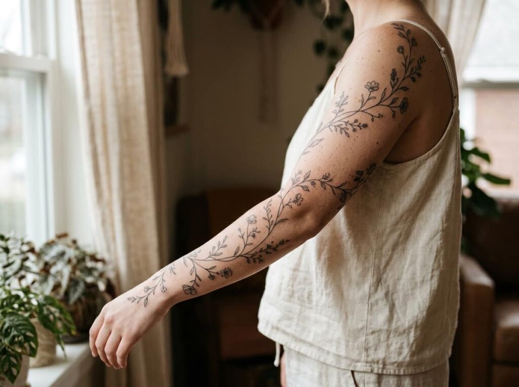
A single vine with small leaves and a few flowers, climbing in one continuous unbroken line from the inside of the wrist all the way up to the shoulder.
That single line is what makes it read as one sleeve instead of three separate pieces stacked together. Vary the blooms instead of repeating the same flower: one or two larger open blooms as anchor points, smaller buds filling the gaps between them, a bare stem here and there where the vine just curves.
Leave the spacing uneven on purpose. A vine that’s perfectly even looks printed instead of grown.
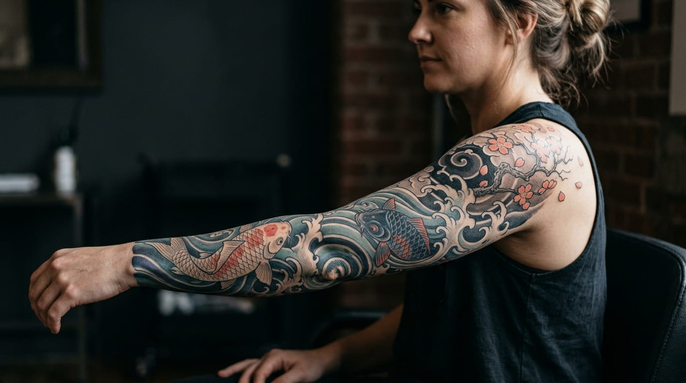
2. A Japanese-Inspired Koi and Wave Sleeve Built in Panels
People think koi sleeves need to be covered edge to edge. They don’t. Three or four koi, a stretch of wave, and enough negative space to let the water breathe reads just as strong as a packed design.
The arm works better when it’s split into panels: the lower arm often carries one or two fish moving against the current, the upper arm carries the larger wave crest, and the shoulder cap closes the scene with a cloud or a single blossom branch.
Keep the water direction consistent across every panel. Fish swimming one way and waves breaking the other is the fastest way to make a sleeve look unplanned.
Lower arm: one or two koi moving against the current.
Upper arm: the larger wave crest carrying the motion up.
Shoulder cap: a cloud or blossom branch to close the scene.
3. A Soft Watercolor Sleeve With No Hard Outlines
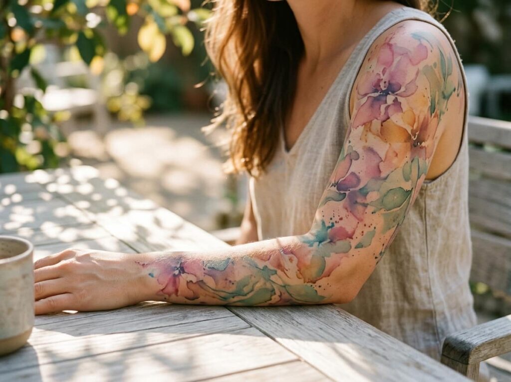
A traditional sleeve leans on bold linework to hold everything together. A watercolor sleeve leans on color bleed instead, with soft edges that fade into the skin rather than stopping at a hard line.
That softness is the whole appeal, but it also means a few choices matter more here than they would in a linework piece. Pick colors that naturally blend instead of clashing, blues into purples or pinks into oranges, and keep text or fine detail to a minimum since watercolor shading doesn’t hold tiny lines well over the years.
Artists who specialize in this style usually tattoo a faint grey or black guide beneath the color. Ask to see it before the color goes in.
Choose colors that bleed into each other naturally.
Ask to see the grey guide before color goes in.
Packing in fine detail or small lettering.
Mixing colors that fight each other on the color wheel.
4. A Geometric Mandala Sleeve Built From One Repeating Shape
One shape, repeated and resized, does more for a geometric sleeve than five different patterns competing for attention.
A mandala-based sleeve uses circular panels stacked down the arm, each one built from the same base shape rotated or scaled differently. It reads as organized from across a room, which is part of why it photographs so well.
The alternative is a free-flow geometric sleeve, where triangles, lines, and dot work move more like a current than a stack of medallions. Neither is better. One suits a reader who wants structure, the other suits someone who wants movement.
| Mandala Panels | Free-Flow Geometric |
|---|---|
| Circular, stacked structure | Flowing, continuous structure |
| Best for symmetry lovers | Best for movement lovers |
5. A Forest and Wildlife Sleeve That Tells One Continuous Scene
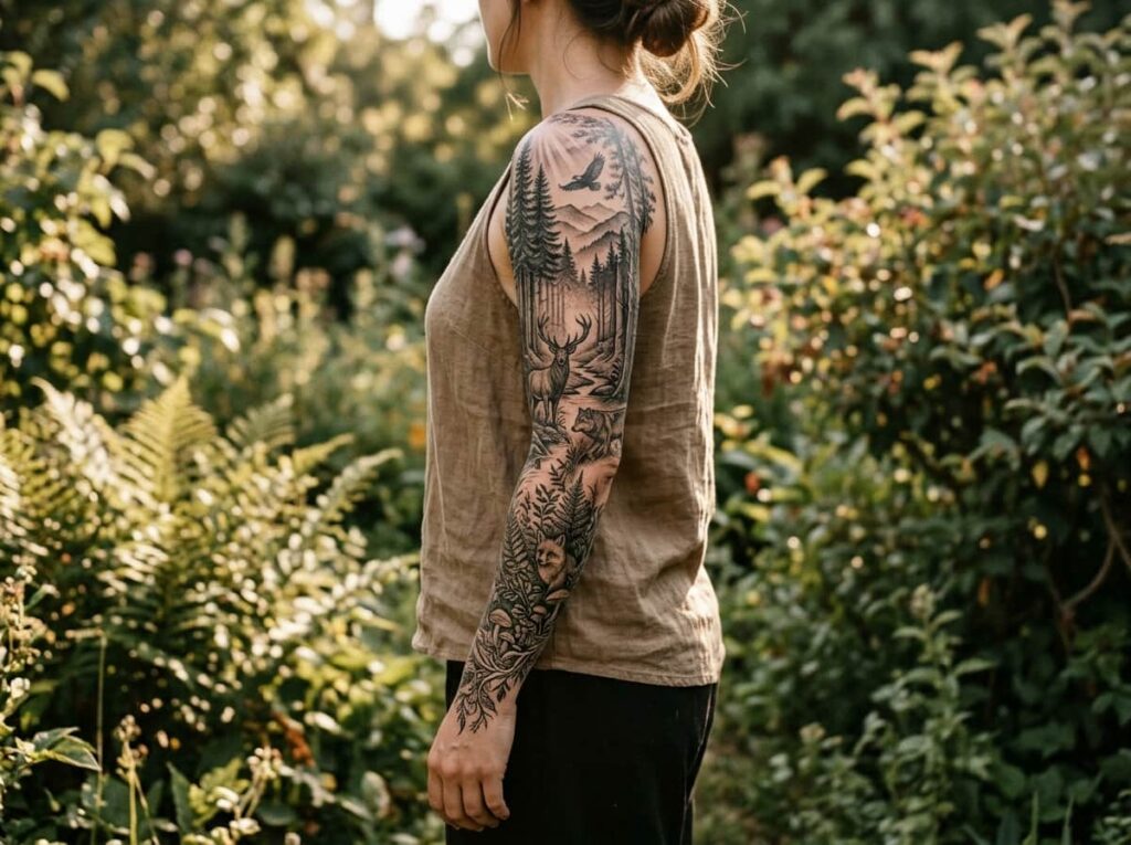
A forest sleeve done as one scene, instead of separate animals scattered up the arm, turns into something you can actually read from a distance.
Think of the lower arm as the forest floor, with ferns, roots, or small animals low to the ground, and the upper arm as the canopy, where birds, taller branches, and open sky take over. The eye follows the arm the same way it would follow a path through actual trees.
This works especially well for readers who already have one or two animal tattoos they don’t want to cover. A good artist can often fold existing pieces into the tree line or the undergrowth instead of starting over.
Separate animal tattoos added over different years, with no visual link between them.
One continuous forest scene, floor to canopy, with the old pieces folded into the tree line.
6. A Moon Phase Sleeve That Moves From Shoulder to Wrist
Moon phase sleeves usually go wrong at the spacing stage. A full moon lands at the shoulder, a sliver crescent gets squeezed in near the wrist, and the gaps in between feel random instead of deliberate.
Lay all eight phases out on paper first, spaced evenly down the arm’s natural curve, before any ink goes down. Small stars or thin clouds between phases fill the dead space without crowding the moons themselves.
Keep the moons close to the same size throughout. A moon that shrinks as it nears the wrist reads as an afterthought, not a design choice.
💡 Quick Tip
Map all eight phases on paper first with equal spacing before the first session, so the full arc works as one line instead of a patchwork added over time.
7. A Negative Space Sleeve Where the Skin Does Half the Work
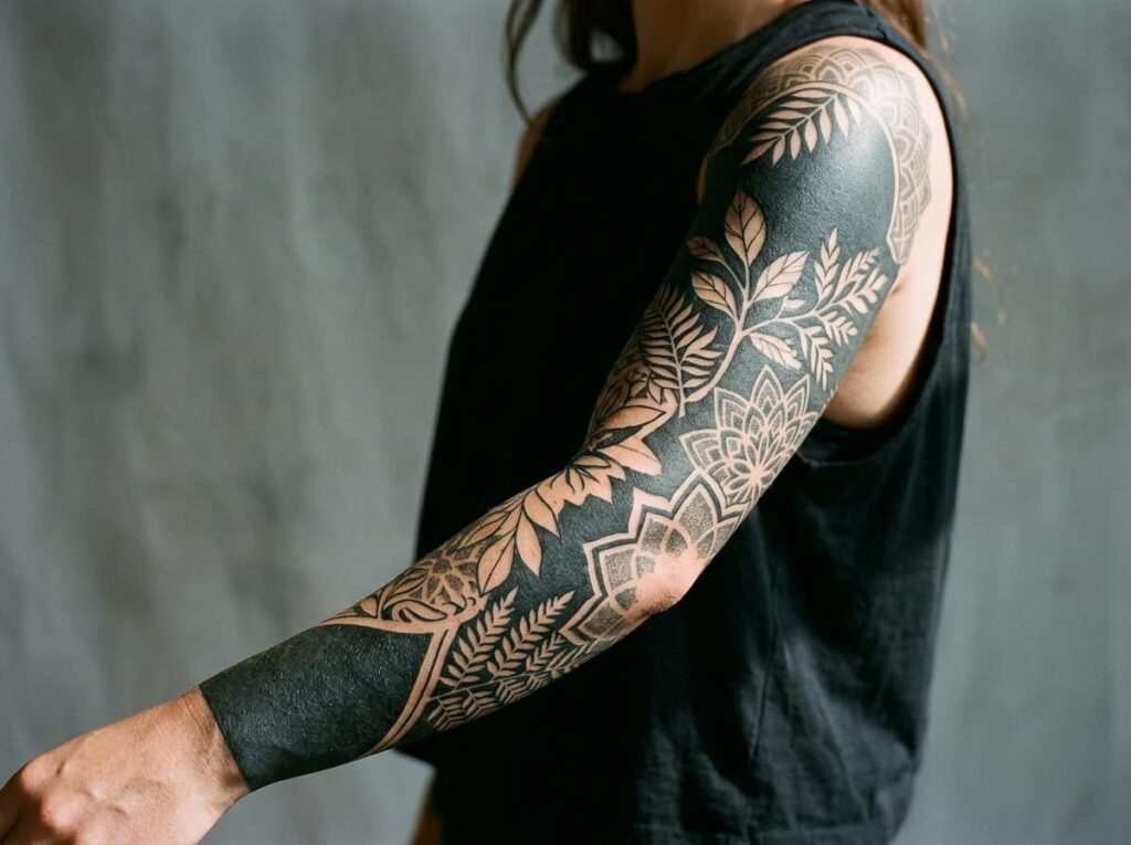
The easiest mistake with negative space work is treating bare skin as empty space instead of part of the design. This style uses untouched skin as the lightest element in the piece, the same way white space works in a printed layout.
Thin white line work over solid black sections tends to hold up best, since the contrast stays sharp as the tattoo ages. Dense dot work next to open skin creates a similar effect with a softer edge.
This technique asks more of an artist than most sleeves do. Look specifically for negative space pieces in their portfolio before booking, not just bold linework.
8. An Ocean Sleeve With Waves That Wrap Around the Arm
Start with the wave line before adding any creatures to the design. The wave should wrap the arm the way water actually moves, curving with the muscle instead of sitting flat against it. A straight wave on a curved arm looks stiff once it’s healed.
Once the water line is set, sea life gets layered in along that curve: a stingray gliding through the lower arm, jellyfish drifting near the elbow, a whale shape breaking the surface near the shoulder.
Bring reference photos of real wave shapes to the consultation, not just other people’s tattoos.
What to bring to the consultation
9. A Script and Symbol Sleeve Built Around One Personal Story

The sleeves that still make sense ten years later usually share one thing: every symbol points back to the same chapter of someone’s life, not five unrelated memories stitched together.
Pick one story, a move, a loss, a decade spent somewhere specific, and build each symbol as a piece of that same thread. A compass only earns its place next to a map line if they’re telling the same chapter. Script works best kept small, threaded between the larger symbols rather than standing as the main event.
Resist adding a new symbol just because space opened up on the arm.
Every symbol should trace back to the same story, not a different memory each time.
10. A Fine Line Illustrative Sleeve That Reads Like a Storyboard
A storyboard sleeve lives or dies by one rule: pick a single reading direction and stick to it. Most artists build these bottom to top, so the story opens at the wrist and resolves near the shoulder.
Each scene stays small and uncluttered, closer to a comic panel than a full illustration, which keeps the fine line work from blurring together as it ages. Thin borders or subtle breaks between scenes help the eye separate one moment from the next.
This style holds detail well short term but needs more frequent touch ups than bold linework.
- ▸Split scenes by life stage, like childhood, a big move, where you are now.
- ▸Split by setting, moving from one place to the next up the arm.
- ▸Split by a single recurring object that appears, changed, in every scene.
11. A Dotwork Sleeve With No Black Fill at All
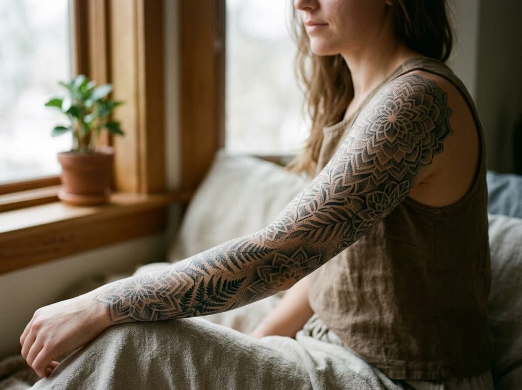
Dotwork reads heavier than regular linework because of density, not black fill. Thousands of small dots, packed tighter in shadowed areas and looser in highlighted ones, build depth without a single solid black section anywhere on the arm.
This technique takes longer per session than most sleeve styles, since an artist is placing each dot by hand rather than filling in a shape. It also ages differently: dotwork tends to hold its texture well, but very light dot patterns can soften faster than bold linework under years of sun.
Ask your artist how many sessions a full sleeve in this style usually takes before booking, since estimates vary more here than with other techniques.
12. A Four Seasons Sleeve Split Into Quarters Down the Arm
Four quarters, one arm, one continuous idea. Split the sleeve into seasonal bands, winter near the wrist moving up through spring, summer, and autumn at the shoulder, or reverse the order if autumn or winter means more to you personally.
Build it in this sequence so each quarter sets up the next one visually.
Wrist quarter: bare branches, frost, or a single winter bloom.
Lower arm: the first buds and new leaves of spring breaking through.
Upper arm: full bloom and dense summer growth at its heaviest.
Shoulder cap: falling leaves and the season turning back toward winter.
13. A Color Gradient Sleeve That Shifts From Deep to Pale
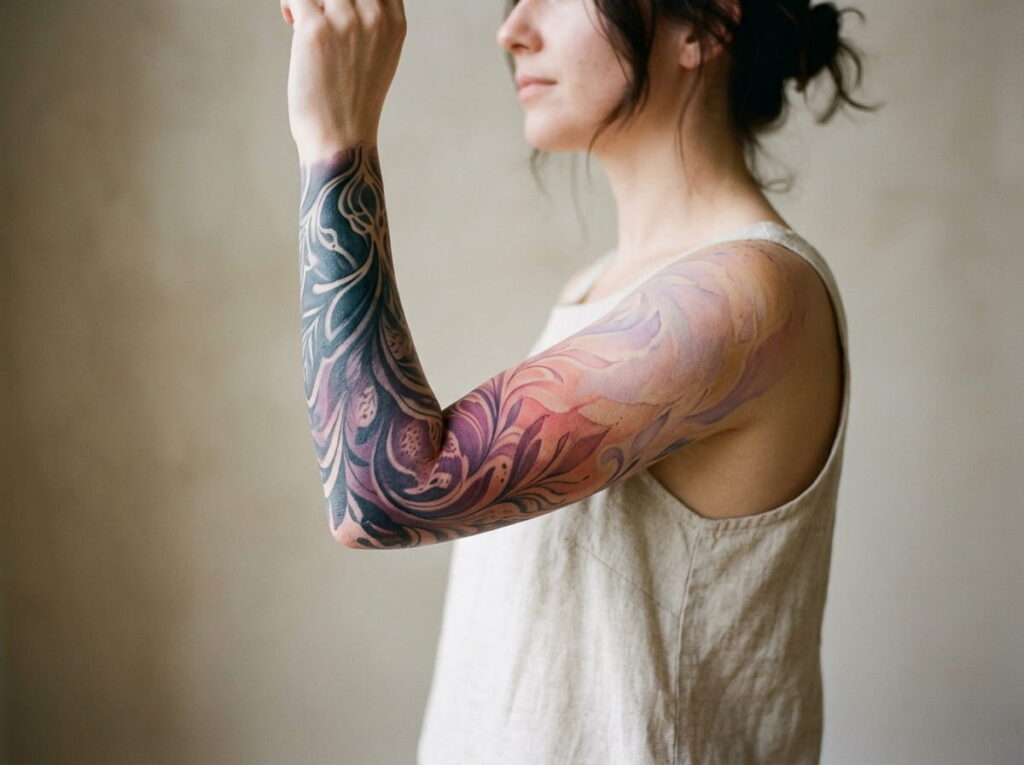
Forget rainbow sleeves for a second. A single color family, running from a deep saturated shade near the shoulder down to a barely-there wash near the wrist, holds together in a way that mixed palettes often don’t.
Deep teal fading to seafoam. Burgundy fading to blush. The shift should happen gradually across the whole arm so no single point marks an obvious break between dark and light.
Gradient work asks a lot of healing. Expect more aftercare attention in the lightest sections, where faded ink shows wear first.
Conclusion
A sleeve only looks finished when every piece was chosen with the whole arm in mind, not added one appointment at a time. Whichever direction pulls you, a climbing vine, a storyboard of fine lines, a slow color fade, the real work happens before the first session, in the planning.
Start with one of these sleeve tattoo ideas for women as your anchor, then let the rest of the arm grow from that same idea instead of competing with it. Sketch the full arm on paper first, even roughly, before booking anything.







Leave a Reply