
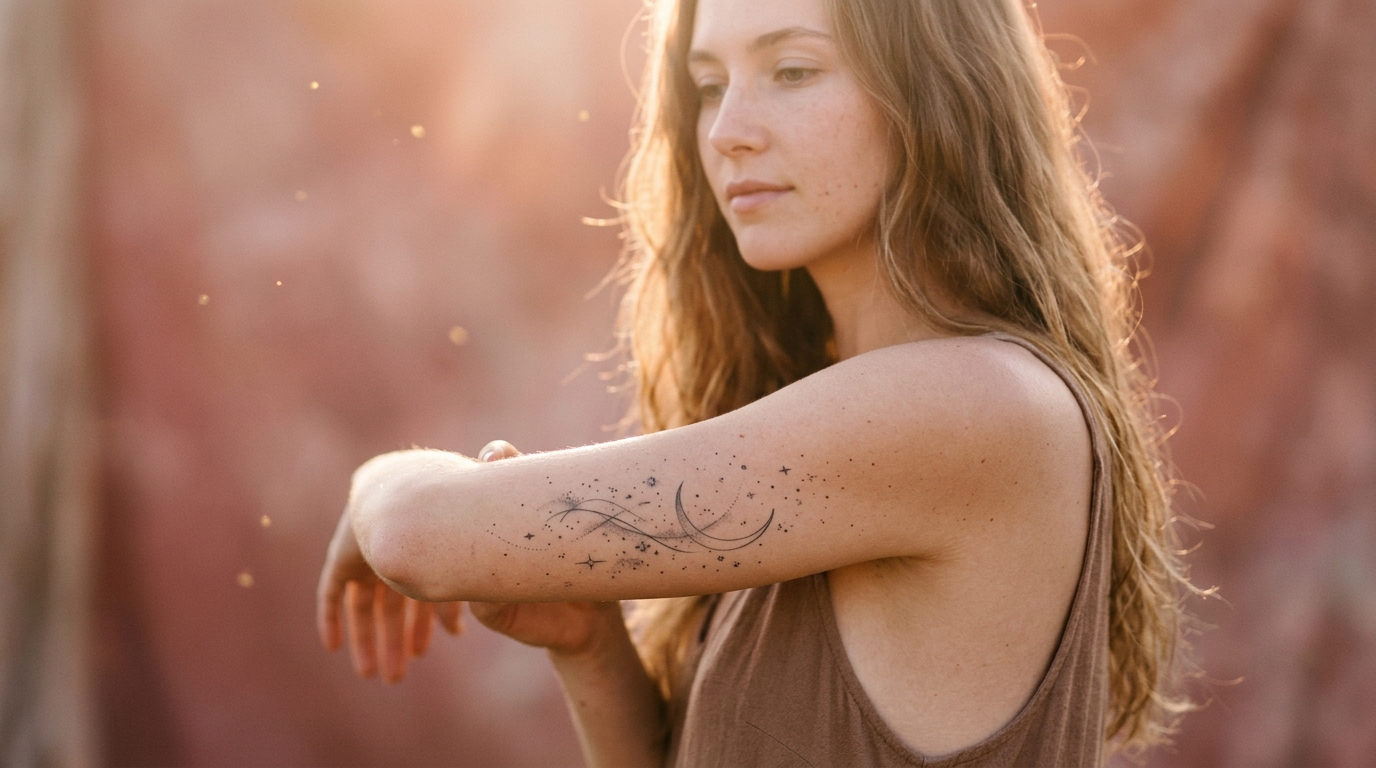
Most tattoo mood boards end up looking like the same five designs copied from different accounts. A tiny rose. A basic script quote. A line drawing that could belong to anyone. If you want something that actually feels like you, soft, otherworldly, a little bit magical, you need ideas with more texture than that.
That is where ethereal tattoos come in. They are not about going bigger or bolder. They are about movement, light, and a sense that the design could float right off your skin. Think moon phases that fade instead of stopping hard, watercolor blooms that bleed at the edges, or a scatter of stardust that looks almost accidental.
This list pulls together thirteen ideas that lean into that dreamy, fantasy inspired look without losing the details a good tattoo artist needs to actually execute. Some are tiny and delicate. Others take up real space. Each one comes with placement notes, honest tradeoffs, and small details you can bring straight into your consultation.
Scroll through and save whichever ones make you want to book an appointment.
1. A Thin-Line Moon Phase Trail Down Your Spine
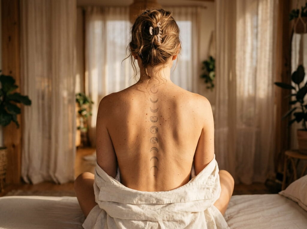
Eight slim crescents trace the curve of your spine, shrinking as they move toward the small of your back.
Before you book, make sure your artist can handle:
- Fine, consistent linework with no wobble
- Shading that fades rather than stops hard
- Spacing that follows your spine’s natural curve, not a straight ruler line
Ask to see spine specific pieces in their portfolio, not just moon phases done elsewhere on the body.
2. Soft Cloud Wisps Resting Along Your Collarbone
Collarbones are forgiving real estate for a tattoo that needs to look light. The curve of the bone gives cloud wisps somewhere natural to drift, so the design follows your body instead of sitting flat on top of it.
Keep the clouds asymmetrical. Three small wisps of different sizes read as more natural than one big cloud centered in the middle. Light gray or soft white ink shows up best on most skin tones, though your artist can walk you through options during your consult.
💡 Quick Tip
Ask for the clouds in a slightly uneven cluster. Perfectly matched sizes tend to look stamped on rather than drifting.
3. Scattered Stardust Freckles Across the Forearm
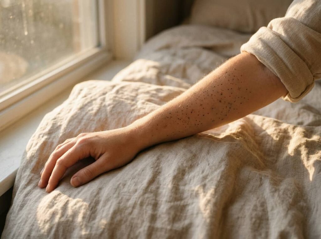
A few small rules make stardust freckles look intentional instead of random. Keep every dot a different size. Space them with more room than you think you need. And skip perfectly straight lines between dots, since stardust should wander a little, not march in formation.
Three layout styles tend to work best on the forearm, and each gives a different feel.
4. A Constellation Mapped to the Night You Were Born
Finding the real constellations from your birth night turns this into something only you have, not a generic star pattern pulled from a tattoo flash sheet. It also gives you a much better story to tell than “I just liked how it looked.”
The process takes a little homework before your appointment, but it is simple enough to do from your phone. Here is the basic path to get there.
Look up the exact date, time, and location of your birth.
Use a free star map app or website to pull up that exact sky.
Screenshot the constellation and bring it in so your artist can simplify it into clean linework.
5. A Watercolor Wildflower Bouquet With a Soft Bleed Edge

A lot of people assume watercolor style tattoos fade faster than traditional ones. That is not really true. What matters more is ink quality, sun exposure, and how well you follow aftercare, not the style itself.
The real risk with watercolor work is the artist. Bleed edges and color blending take a specific skill set, so this is not the place to save money on someone still building their portfolio.
Look specifically for watercolor work in your artist’s portfolio.
Ask how they handle color fading over time.
Booking with someone whose portfolio is mostly linework or lettering.
Skipping aftercare questions because the design looks soft.
6. A Butterfly Caught Mid-Transformation
The tricky part with transformation tattoos is deciding how literal to get. Some women want a realistic butterfly emerging from a chrysalis. Others want something more abstract, where one wing is fully formed and the other dissolves into linework or dots.
Either direction works, but it helps to walk into your consult already knowing which one you want, since it changes the whole composition. Bring reference images that show both styles so your artist can see the range you’re drawn to.
- Photos of realistic butterflies in the color or species you like
- Examples of dot work or linework dissolve effects
- Your preferred placement, since wing span changes a lot between forearm and ribs
What to bring to your consult
7. A Delicate Dreamcatcher With Feathers Trailing Down the Ribs
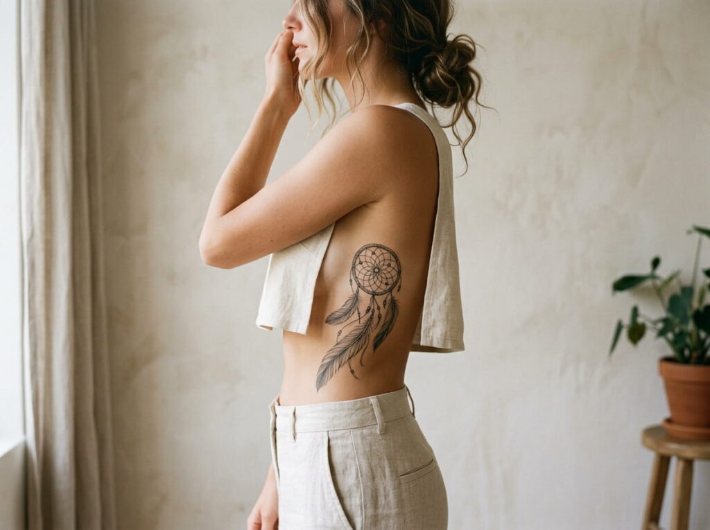
Rib placement lets the feathers follow your body’s natural line as it curves inward, so the whole piece looks like it’s draping rather than sitting flat. The tradeoff is that ribs are one of the more sensitive spots to get tattooed, so this isn’t the easiest first design to pick.
Feather count changes the feel more than people expect. Fewer feathers reads as delicate and minimal. More feathers creates a fuller, more dramatic trail down the side.
8. Mermaid Scale Shimmer Wrapped Around the Ankle
Not every placement shows off scale detail the same way. The ankle wraps naturally, which helps the shimmer effect look continuous instead of cut off at the edges, but it also means more exposure to socks and shoes rubbing during healing.
Here’s how the three most common spots stack up against each other.
| Placement | Tradeoff |
|---|---|
| Ankle | Wraps well, but rubs against shoes while healing |
| Wrist | Highly visible, smaller canvas for detail |
| Collarbone | Easy to show off or cover, flatter surface for shimmer effect |
9. Asymmetric Angel Wings Across the Shoulder Blades
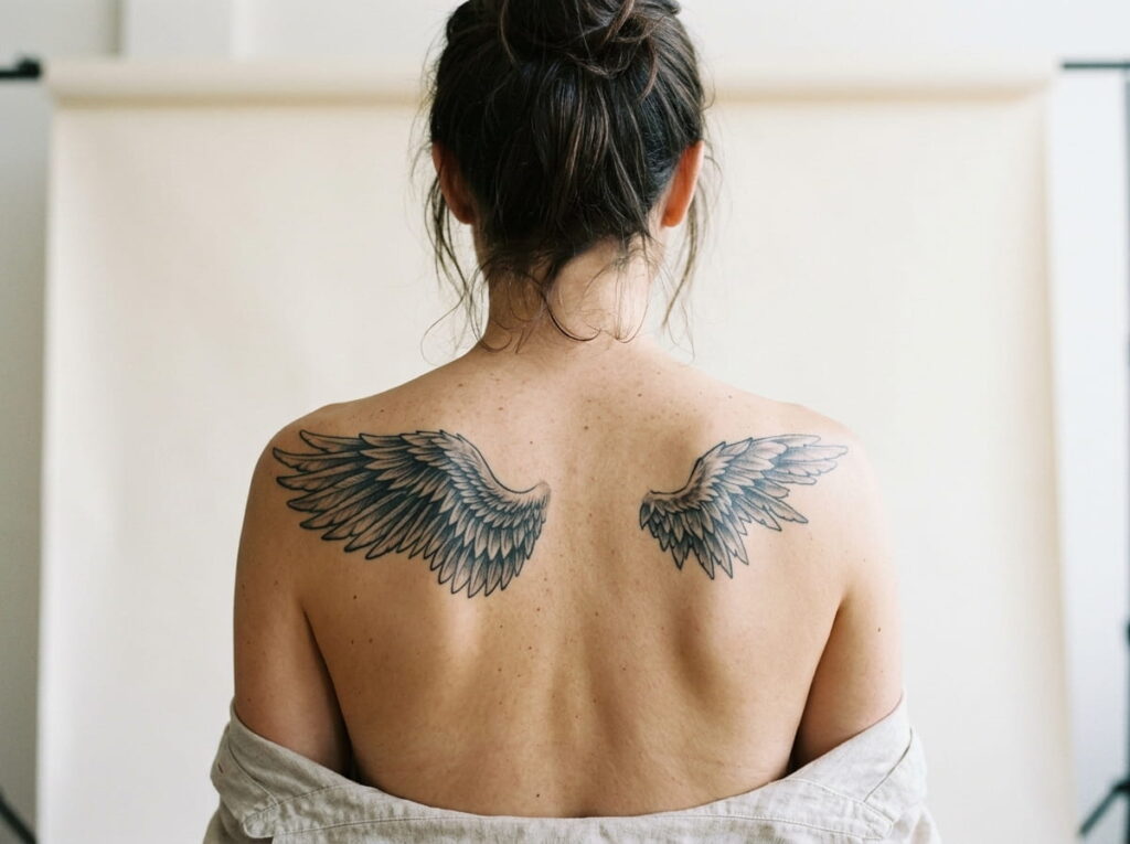
The appeal of uneven wings is that they avoid the stiff, symmetrical look that makes a lot of wing tattoos feel dated. One wing can be fuller and more detailed while the other fades into a few simple lines, which gives the whole piece a sense of motion instead of looking posed.
This design needs an artist comfortable with large scale composition, since shoulder blade tattoos have to read well from a distance and up close.
Uneven wings read as more natural and alive than a perfectly mirrored pair.
10. A Fine-Line Crystal Cluster With Subtle Shading
Pick a stone that actually means something to you rather than whatever looks best in a flash sheet. Amethyst, rose quartz, and citrine each carry different associations, and knowing yours gives your artist something to work with beyond “make it pretty.”
Subtle gray shading along the facets is what separates this from a flat outline. Ask for soft gradient shading rather than heavy black fill, since that’s what keeps the crystal looking light instead of harsh.
📌 Good To Know
Facet lines need steady precision. Check your artist’s portfolio specifically for geometric or crystal work before booking.
11. An Enchanted Doe With Antler Vines Along the Thigh
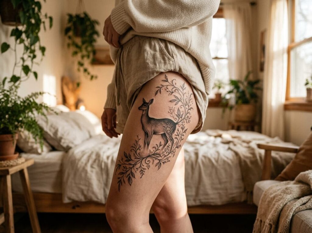
Picture the shape before you picture the detail: a deer’s profile, antlers that stop being antlers halfway up and turn into trailing vines and small leaves instead.
This one takes real thigh space to breathe, so it’s not a great pick if you’re working with a small budget or a tight timeline. The upside is that the thigh gives your artist room to blend the transition from antler to vine smoothly, without cramming detail into a space too small to hold it.
12. Sunburst Rays Radiating From the Chest
A lot of people skip chest placement because they assume it only works for bold, graphic designs. Rays can go the other direction entirely. Thin, uneven lines radiating outward from a small center point read as soft and almost glowing rather than bold or heavy.
A few things keep this design from looking stiff:
- Vary the length of each ray instead of making them identical
- Keep the center small, since a large starting point tends to flatten the effect
- Leave gaps between some rays rather than spacing them perfectly even
Healing on the chest can take a little longer than other spots, so plan for that if you’re tattooing close to a big event.
- ▸Uneven ray lengths look more natural than a symmetrical burst.
- ▸A small center point keeps the design feeling light.
- ▸Gaps between rays add movement instead of a solid shape.
13. A Fairy Silhouette, From a Single Line to Full Shading
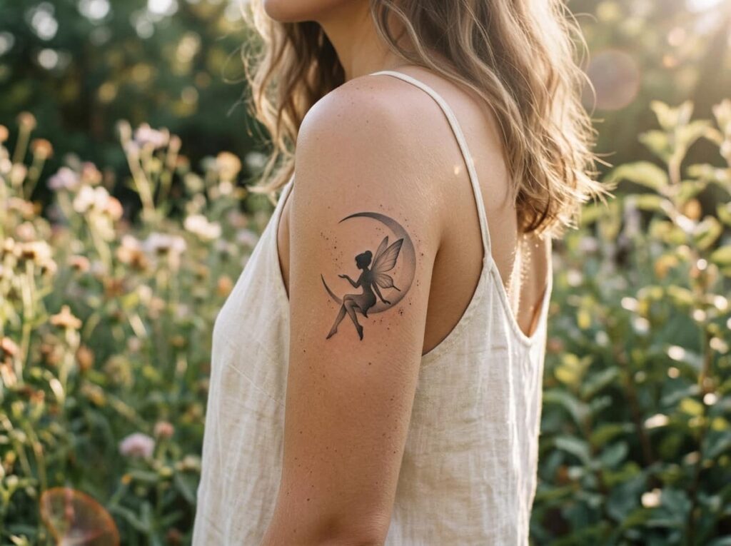
How much detail you want changes everything about this design, and it’s worth deciding before your appointment rather than during it.
A single continuous line keeps the fairy minimal and almost invisible until someone looks closely. Full shading turns the same silhouette into something with real depth, wing texture, and dimension. Neither is better. It depends on whether you want something quiet or something that holds attention.
One continuous outline, no shading. Quiet and nearly invisible from a distance.
Soft gray gradient through the wings and hair gives real depth and dimension.
Conclusion
Ethereal tattoos work because they leave room for imagination instead of spelling everything out. A moon phase trail, a scatter of stardust, a fairy that’s barely there until you look twice, each one gives you something soft and personal rather than another design copied straight off a flash sheet.
Before you book anything, bring reference photos, ask about healing time for your chosen placement, and make sure your artist’s portfolio actually shows the style you’re after. The right details turn a pretty idea into a tattoo you’ll still love in ten years.







Leave a Reply