
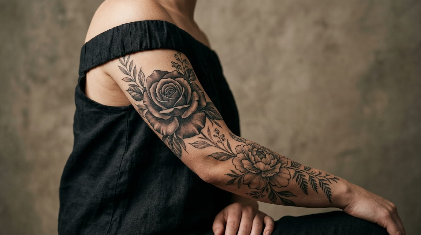
Floral tattoos fade fast when color carries the whole design. Bright pigment goes dull, outlines soften, and in a few years that sharp little rose can turn into a blurry shape on your skin.
Black and grey floral tattoos solve that differently. Instead of leaning on color, they use shading, contrast, and fine linework to make a flower look dimensional and almost real. Done well, they age slower, read as more refined, and work on nearly any skin tone.
The hard part is knowing which flower, placement, and shading style actually suit you. A peony shoulder piece reads nothing like a single rose on the wrist, and a heavily shaded sleeve is a different commitment than a small ankle bloom.
This list walks through thirteen ideas, each with a different flower, placement, or technique, so you can see what actually fits before you sit down with an artist.
1. A Single Rose Stem Traced in Soft Grey Wash Along the Forearm
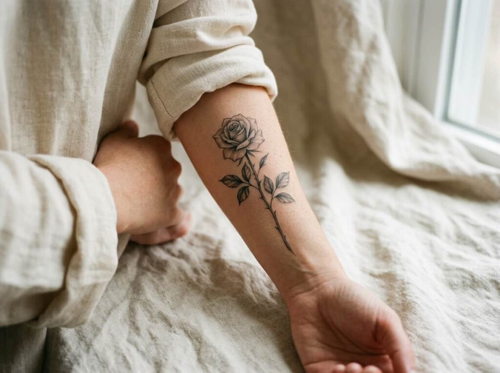
A single rose on the forearm reads completely different in black and grey than in color. The petals come from shadow and highlight instead of a hard outline, so the bloom looks almost photographic from a few feet away.
A few details decide whether this ages well:
- Let the stem curve with your arm instead of running straight up it
- Keep leaves and thorns small so the rose stays the focal point
- Ask for gradual shading at the petal edges, not a flat grey fill
💡 Quick Tip
Ask for a thin, tapered stem and gradual shading at the petal edges. A flat grey fill on a single rose tends to look muddy within a few years.
2. A Peony Bloom Shoulder Piece Built From Layered Shading Instead of Outlines
Peonies carry a lot of overlapping petals, which makes them better suited to layered black and grey shading than a flat outline. Build the darkest value in the center of the bloom first, then work outward in lighter grey.
This design needs room to work:
- A peony loses its layered detail at small sizes
- The shoulder gives the shading space to build gradually
- A single bloom reads cleaner than a tight cluster at this scale
3. Fine Line Botanical Sketch vs. Soft Shaded Realism: Choosing Your Floral Style
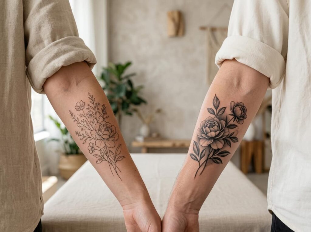
These two styles get mixed up a lot, but they age and read completely differently.
- Fine line botanical work uses thin, even strokes with almost no shading, closer to scientific illustration
- Soft shaded realism leans on grey values to build depth, closer to a charcoal drawing
Neither is better. One suits a minimal, quiet look. The other suits a flower that looks like it could be photographed.
| Fine Line Botanical | Soft Shaded Realism |
|---|---|
| Thin, even strokes, almost no shading | Heavy grey shading, soft gradients |
| Reads like a botanical sketch | Reads like a charcoal drawing |
| Ages cleanly even on smaller areas | Needs more space to hold detail |
4. A Trailing Vine of Wildflowers Following the Curve of Your Spine
A spine tattoo has to work with the body’s actual shape, not fight it. Small wildflowers scattered along a thin vine follow that curve naturally, getting smaller as they move down toward the lower back.
A few things keep this from looking busy:
- Vary the flower types along the vine instead of repeating one bloom
- Mix open flowers with a few closed buds
- Keep the vine thin so it reads as a line, not a stem
Let the vine follow your spine’s natural curve.
Mix flower sizes so the design tapers naturally.
Forcing a perfectly straight vine down the spine.
Repeating the same flower shape the whole way down.
5. Monochrome Lotus With Negative Space Petals on the Collarbone
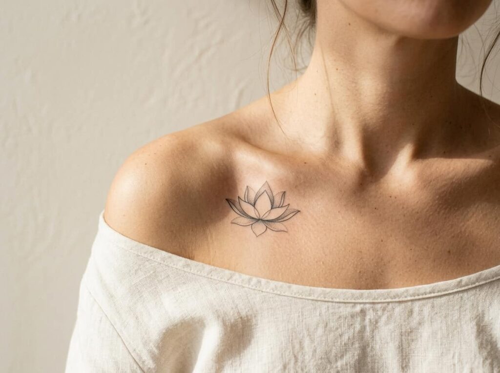
Negative space means letting bare skin act as part of the design, not filling every petal with ink. For a lotus, that usually means fine-line outlines on some petals while others stay unshaded, bordered only by shadow.
This only works with careful placement:
- The collarbone’s curve gives the bare space somewhere natural to sit
- Too many negative petals and the flower stops reading as a lotus
- A thin shadow line around each bare petal keeps the shape clear
Before you book this one
6. A Cherry Blossom Branch Fading Into Grey Mist on the Ribcage
Rib tattoos move with you, so a branch that tapers naturally down the side reads better than anything boxy or symmetrical. The blossoms furthest from the stem get the lightest shading, almost dissolving into bare skin, which gives the whole piece a sense of motion.
This placement comes with real trade offs. Ribs are closer to bone, sessions tend to run longer, and the skin there stretches and shifts more over the years than a forearm or shoulder would. Talk to your artist about how the design will hold up if your body changes shape.
Let the blossoms get lighter as they trail away from the branch. That fade is what makes a rib piece look like mist instead of a sticker.
7. Orchid Portrait With Deep Shadow Work for a Moody Forearm Sleeve
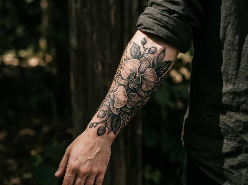
An orchid has deep folds and ruffled petal edges that only read correctly with real contrast between dark shadow and bare highlight. That makes it a strong anchor piece for a forearm sleeve, but it is not a one session tattoo.
Most artists build a piece like this in stages:
Outline session to lock in the orchid’s shape and petal placement.
First shading pass to establish the darkest shadow areas.
Final pass to soften gradients and sharpen highlight areas.
Expect a healing gap between sessions, since deep shadow work needs skin to fully settle before the artist layers more on top.
8. A Dandelion Caught Mid Scatter, Rendered in Soft Grey Dots
Most dandelion tattoos get drawn as clean outlines, with each seed as a tiny stick figure. Switching to dotwork for the floating seeds changes the whole feel, giving them a soft, almost powdery texture instead of a crisp cartoon look.
The two approaches sit next to each other pretty differently.
Clean outlined seeds, flat stem, reads more like a drawing than a flower caught in motion.
Soft, grainy seed texture that scatters naturally, with shading that mimics an actual puff of dandelion.
Small forearms, ankles, and the back of the shoulder all give the scattered seeds enough room to breathe without crowding the stem.
9. Anemone Cluster With a Butterfly Accent for the Upper Thigh
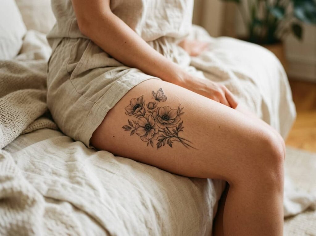
Anemones have a dark, almost black center ring around the stamen, which gives an artist a built in anchor point for contrast. A small cluster of two or three blooms, paired with one understated butterfly tucked between the petals, keeps the thigh piece from feeling like two separate designs stitched together.
📌 Good To Know
Anemones already read as dramatic on their own. Keep the butterfly small and tucked into the petals rather than hovering above the flowers, or it starts to compete for attention.
The upper thigh also heals more privately than visible placements, which matters if you want a bolder, more detailed cluster without it being on display daily.
10. A Fern Frond Wrapped Around the Wrist in Delicate Linework
A fern’s appeal is its repetition, dozens of tiny leaflets branching off one central stem in a pattern that almost looks mathematical. At wrist size, that repetition has to shrink down without turning into a blurry smudge, which makes this one of the more technically demanding small pieces on this list.
Ask to see an artist’s healed fine-line work specifically, since leaflets this small are where linework quality really shows.
Ready for items 11 through 13, or want me to fold in your feedback first?
11. Sunflower Head Turned Three-Quarters, Shaded Like a Charcoal Drawing
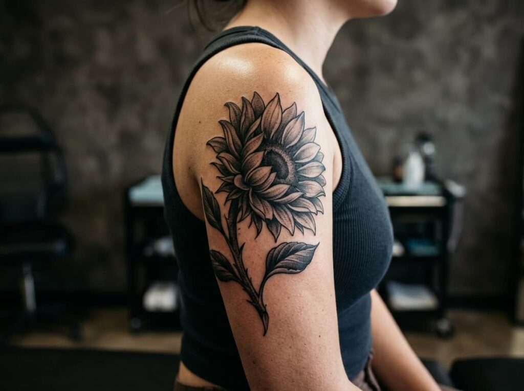
A sunflower drawn straight on tends to look flat and almost cartoonish, all circle and petals with nothing to anchor it. Turning the head three-quarters gives the artist room to work in real depth, with the back petals falling into shadow and the front ones catching the light.
A few things to bring to your consultation:
- A reference photo of the exact angle you want, not just “a sunflower”
- Notes on how large the center disk should be relative to the petals
- Whether you want a visible stem and leaves or just the bloom
Bring to your consultation
12. A Hibiscus and Moon Combo for a Small Ankle Placement
Pairing a hibiscus with a slim crescent moon gives a small piece two focal points instead of one, which helps it hold visual interest even at ankle size where detail has to be kept minimal. The trick is restraint. Both elements compete for attention, so one needs to clearly lead.
Let the hibiscus lead and keep the moon small and secondary.
Simplify the hibiscus petals so they hold up at ankle size.
Giving the moon equal size and detail to the flower.
Adding full petal shading that will blur at this scale.
Ankle skin also sees more friction from shoes and socks than most placements, so ask your artist about a slightly heavier outline to help the design hold its shape over time.
13. A Full Bouquet Tied With Ribbon, Shaded Soft Grey Across the Bicep
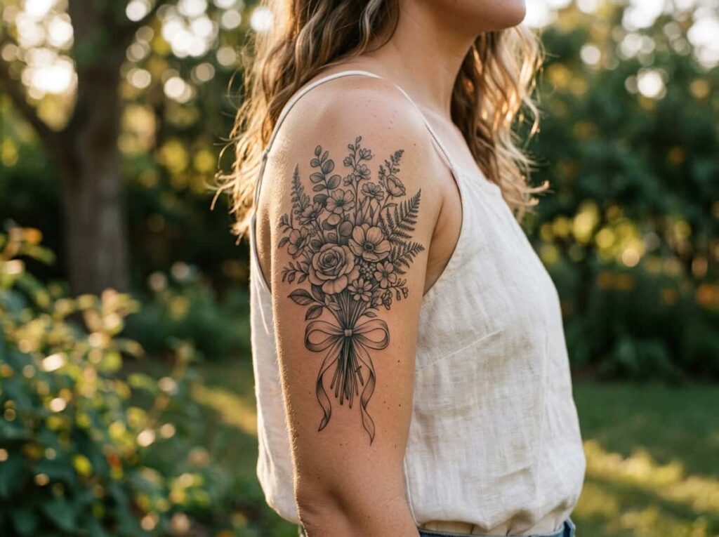
A tied bouquet is the most ambitious piece on this list, several flower types, layered stems, and a ribbon wrap all working together in one composition. The bicep gives it a naturally curved canvas, and the muscle’s shape actually helps the bouquet look like it is sitting against the arm rather than floating on top of it.
A bouquet this detailed needs a flower hierarchy. Pick one bloom to carry the darkest shading and let the rest stay a shade or two lighter, or the whole thing reads as a flat grey mass.
Conclusion
Black and grey floral tattoos hold up in a way color often doesn’t. The shading does the heavy lifting, so the design still looks intentional years later instead of fading into a smudge. What matters most is matching the flower and technique to where it’s going, a dandelion wrist piece asks for something completely different from a bouquet across the bicep.
Bring a few of these references to your consultation and talk through sizing and shading approach before you commit to one. A good artist will tell you honestly if a design needs more room than you’re picturing.







Leave a Reply