
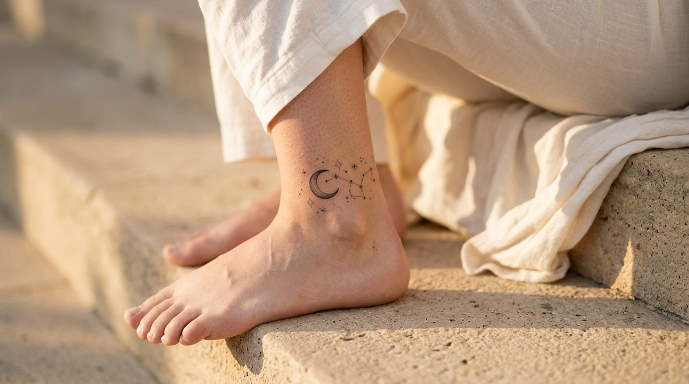
Scrolling through tattoo boards for your sign usually ends the same way: fifty photos of the exact same stick-and-poke ram or crab, roughly centered on someone’s forearm. That gets old fast if you want something that actually looks like you picked it instead of pulling it off a template.
Most zodiac sign tattoo ideas online stop at the symbol. They hand you the glyph, maybe a constellation, and call it done, without any thought for where it sits on your body, how small it can go before it blurs into a blob, or which version of your sign actually matches your personality instead of the generic astrology meme version.
This list treats each sign differently on purpose. Aries gets a different kind of attention than Pisces. Some signs work best as a single clean line. Others need more detail to read right at a small size. A few need a specific placement to avoid fading into a smudge within a few years.
Save this one under your sign, or send it to the five friends who keep asking what their zodiac tattoo should actually look like.
1.Aries: A Small Ram’s Horn That Says “I Move First”
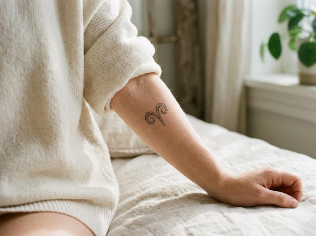
A ram’s horn curls into a tight spiral when you look at it up close, and that single curve usually reads as Aries without needing the whole animal inked in.
Three ways it shows up on skin:
- A single horn curling around the wrist bone
- Two horns mirrored along the spine
- One small horn tucked behind the ear
Linework stays sharp longest on flat, low-movement spots like the inner forearm or ribs. Curved horns on knuckles or fingers blur within a year or two as skin stretches with every fist you make.
2.Taurus: Why a Single Line Bull Works Better Than a Full Illustration
A full bull head looks impressive on paper, but at under two inches it fades into a dark smudge within a few years, since all that shading and detail needs more room than most small tattoos get.
A cleaner version keeps just the horns and a thin brow line, inked in one continuous stroke. It holds its shape longer, costs less time in the chair, and still reads clearly as Taurus to anyone who knows the symbol.
Ask for 0.5 to 1mm single-needle lines. Anything thicker starts to blur the same way the full illustration does.
💡 Quick Tip
Request fine single-needle line work, not shading, if you want the horns to stay crisp past year three.
3.Gemini: Twin Line Tattoos That Don’t Look Matchy
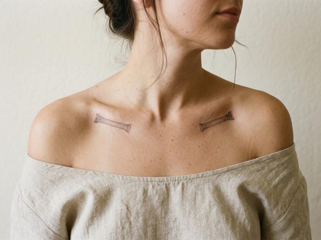
Matching twin tattoos sound sweet until two people end up with the exact same roman numeral II in the exact same font, and it starts looking less like a zodiac tattoo and more like a couples tattoo gone wrong.
The fix is asymmetry. Use two different line weights for the twin pillars, or angle one slightly off from the other so they read as a pair without being identical. A thin negative-space gap keeps them from blurring into one solid block at small sizes.
Skip the roman numeral font most shops default to. It is the fastest way to make your Gemini tattoo look identical to the last fifty.
Vary the line weight between the two pillars.
Angle one pillar slightly so they’re not perfect mirrors.
The default roman numeral II font.
Identical thickness on both pillars.
4.Cancer: Placement Ideas for a Moon and Crab Combo
Combine the crab glyph with a small crescent moon tucked above one claw, placed where both pieces have room to breathe instead of folding into a blob of linework.
Cancer symbols hold detail better than people expect, as long as the moon stays smaller than the crab instead of competing with it for attention. A quarter inch of bare skin between the two keeps healed ink reading as two separate shapes instead of one smudge.
No artist can freehand this combo well. Bring a reference photo.
Behind the shoulder, moon sitting higher than the crab’s back claw.
Along the collarbone, moon smaller and offset to one side.
Inner bicep, crab angled up toward the moon.
5.Leo: The Sun Symbol Placement That Doesn’t Fade Fast
Sun symbols lose their rays first. The thin lines radiating out from a small sun tattoo are usually the first part to blur, sometimes within two years on spots that get a lot of friction, like the inside of the wrist.
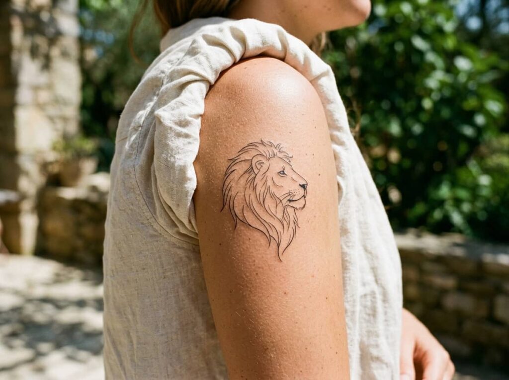
Lion profile line art holds up longer than the sun glyph alone, since the linework reads as intentional rather than faded detail. If you want both symbols together, scale the sun down and let the lion carry more of the visual weight.
Rib and upper arm placements see the least friction, which matters more for longevity than the design itself does.
6.Virgo: A Maiden Glyph Small Enough for a Finger
The maiden glyph gets drawn too literally more often than any other sign. A full standing figure, dress folds, and a face only holds up at two inches or bigger. Shrink it smaller and the detail turns into a shaded blur within a year.
Two versions worth asking for instead:
- The stylized “M with a twist” symbol, single line weight
- A small wheat sprig instead of the full figure
Ask to see a healed photo of your artist’s smallest glyph work before you commit to a size, not just fresh ink.
What to bring to your appointment
7.Libra: Scales Tattoos That Stay Balanced Even When Small
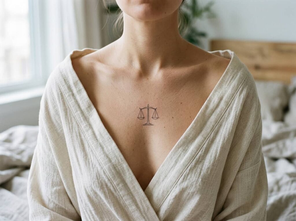
A traditional scale tattoo has two trays, a center post, and chains linking each side, four pieces that need to balance or the whole image tips over. Most of that detail disappears anyway once the tattoo heals below an inch.
A cleaner version swaps the chains for two straight connecting lines. Three placement notes:
- Collarbone keeps both trays level
- Forearm gives even horizontal space
- Ribs tilt one tray lower once skin curves
Ask to see the design flat before it goes under the needle. A scale drawn on paper looks balanced. A scale drawn on a curved rib might not.
Four separate pieces, chains included, drawn exactly like the symbol.
Two trays and straight connecting lines, simplified to hold its shape small.
8.Scorpio: Scorpion Versus Glyph, Which One Ages Better
Full scorpion, tail curled and ready to strike, photographs well fresh but loses the fine leg detail within a few years as the ink settles. The glyph version, essentially an M with an arrow tail, keeps its shape at nearly any size.
Neither one is wrong. The full scorpion works at three inches or larger, somewhere with flat skin like the thigh or upper back. The glyph fits almost anywhere, finger included, and needs far less upkeep over time.
Pick based on how often you want to think about touch-ups, not just which looks sharper in the consultation photo.
| Full Scorpion | Glyph Version |
|---|---|
| Needs 3 inches or more to hold detail. | Works at nearly any size, finger included. |
| Best on flat skin, like the thigh or back. | Fits almost anywhere, low upkeep. |
9.Sagittarius: One Arrow Line Placement That Reads Instantly
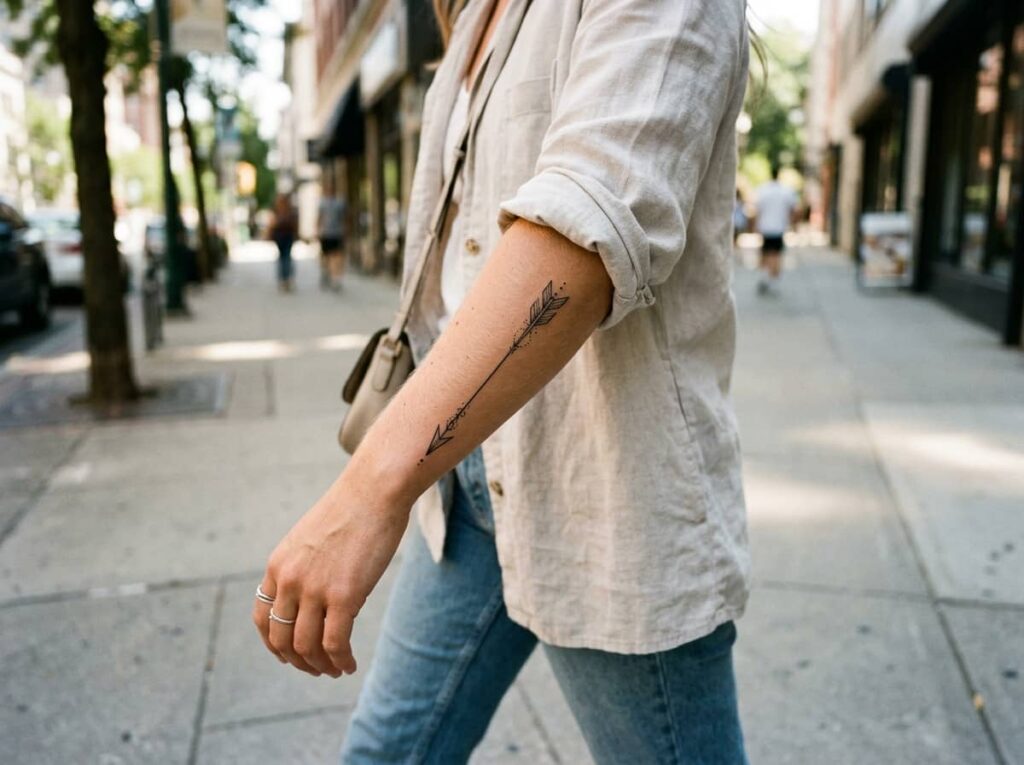
One rule keeps a Sagittarius arrow from reading as a random mark instead of a symbol: the arrowhead should point away from your body, not back toward it. Pointed inward, people mistake it for an accident or a different symbol entirely.
Forearm and ankle placements let the arrow follow the natural line of the limb. A single bent line through the shaft gives it motion instead of looking stiff and flat.
Skip the bow. Most small Sagittarius tattoos only need the arrow.
Point the arrowhead away from your body. Toward it, and people read the tattoo as backwards, not symbolic.
10.Capricorn: Why Sea Goat Tattoos Need More Planning Than You’d Think
The sea goat, goat up top, fish tail below, is the one zodiac design most people underestimate walking into their appointment. Two different textures, fur and scales, sitting in one small space means the artist needs real room to keep both readable.
Anything under an inch and a half tends to lose the fish tail entirely, leaving what looks like a plain goat head. Budget for at least two inches of length if you want the full creature.
A simplified version drops the fur texture and keeps clean outlines on both halves instead.
💡 Quick Tip
Ask for a minimum size of two inches if you want both the goat and fish detail to stay visible after healing.
11.Aquarius: Water Bearer Lines That Don’t Blur Into a Smudge
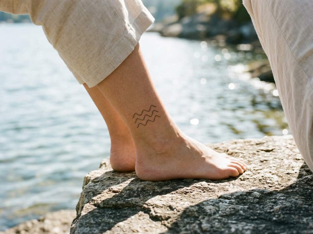
Aquarius tattoos live or die by the wave. Three flowing lines pouring from an urn is the standard version, but once those lines get too close together, healed skin blurs them into one thick smudge instead of three distinct curves.
Leave visible gaps between each wave line, roughly the width of the line itself. Wrist, ankle, and the side of the ribcage all give the waves enough length to actually curve instead of sitting flat and straight.
Drop the urn if the piece needs to go smaller than an inch. The wave lines alone still read as Aquarius on their own.
12.Pisces: Fish Tattoos That Avoid the Symmetry Trap
Two fish swimming in a circle sounds simple until you see how often the finished tattoo looks lopsided, one fish bigger than the other, or the circle squeezed into an oval because the artist ran out of room mid-design.
A few ways to sidestep it:
- Measure the full circle on paper before transferring it to skin
- Pick a placement with even curvature, like the upper arm, over something with uneven contours like the ankle
- Ask for a dot-work compass guide stenciled first, then the fish drawn over it
A single fish, rather than the paired circle, sidesteps the symmetry problem completely and still reads clearly as Pisces.
Measure the full circle on paper before transferring it to skin.
Choose a placement with even curvature, like the upper arm.
Ask for a dot-work guide stenciled first, then the fish drawn over it.
Conclusion
The best zodiac sign tattoo ideas aren’t the ones pulled straight off a reference sheet. They’re the ones that account for where the ink sits, how your skin moves there, and how much detail actually survives healing without turning into a blur.
Your sign still comes through whether you go with the full illustration or the simplest possible glyph. What matters more is picking the version suited to the spot you want it, not just the version that looks best in a flash sheet photo.
Save this list under your sign, or pass it along to whichever friend keeps changing their mind about which symbol to get.







Leave a Reply