
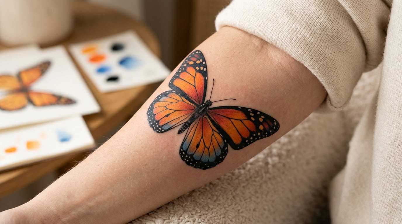
Most people pick a butterfly tattoo by shape and leave the color for later. That order is backwards, and it’s why so many first butterflies end up looking flat, muddy, or nothing like the one on the phone screen.
Color changes everything about the same design. A monarch wing in orange reads warm and bold. The same wing in blue morpho tones looks cool and a little dreamy. In plain black ink, it becomes a graphic mark where the pattern does all the talking. Same lines, three very different tattoos.
This list shows you how to choose butterfly tattoo colors by testing one design in several palettes. You’ll see where orange holds up, where blue needs care, when black alone is the smarter move, and what to tell your artist before the needle starts.
You don’t need art training. You just need a design you like and a little patience to compare.
1. Pick One Butterfly Design First, Then Test Every Palette on It
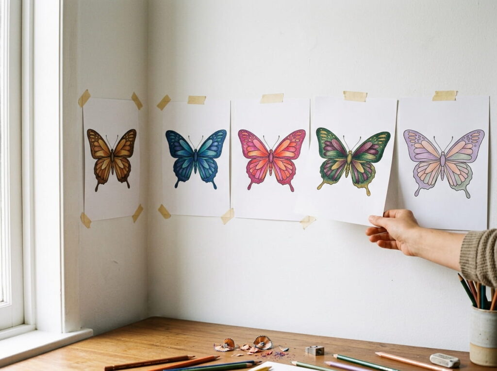
Start with the shape, not the color.
Choose one design and keep it fixed. A medium forearm butterfly with open wings works well, because it’s big enough to show color and simple enough to compare. Ask your artist for a clean outline, or find a line drawing you like.
- Print the same outline three or four times.
- Color each copy in one palette only.
- Tape them up side by side and live with them for a day.
The one you keep glancing back at is usually your answer.
2. Get Monarch Orange That Stays Warm Instead of Turning Yellow
Orange is the color most people want and the one they worry about most.
The risk is a wing that heals paler, closer to yellow than the warm orange on the stencil. A good monarch has depth. That comes from a deeper red orange near the body that lightens toward the wing edge.
- Ask to see your artist’s orange on a healed tattoo, not a fresh one.
- Keep the black veins bold, since they frame the orange and make it read warmer.
- Leave small gaps for the white spots in the black border.
Orange done well looks rich, not neon.
💡 Quick Tip
Fresh tattoo photos are shiny and swollen, so they flatter every color. Ask for a photo of a monarch your artist did at least a few months ago. That’s the orange you’ll actually live with.
3. Place Blue Morpho Blue Where Light Would Hit the Wing
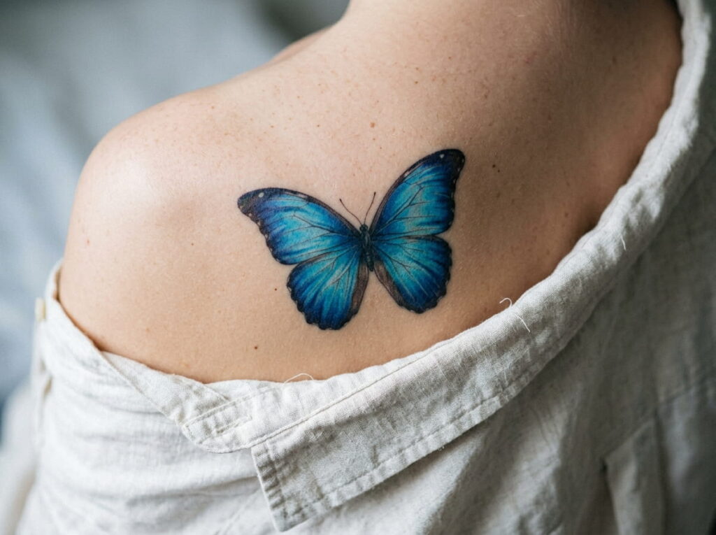
The real blue morpho flashes bright blue on top and shows plain brown underneath, and the shine flips with the angle. A tattoo can’t shimmer, so you fake it with placement.
Put the brightest blue in the center of each upper wing. Darken it toward the edges and the body. Then add a thin dark border, because the real wing has one and it keeps the blue from floating.
Shading does the shimmer. Flat blue just looks like a sticker.
One flat blue fill across the whole wing. Same shade from body to edge, no border, no depth.
Bright blue in the wing center, deeper navy near the edges, and a dark border that holds the shape.
4. Choose Black Ink Alone When the Shape Matters More Than the Color
Black ink gets treated like the budget option. It isn’t. Black and grey is often the smarter choice when the design is small, detailed, or placed where it gets a lot of sun.
Without color to lean on, the wing pattern has to carry the image. Pick a design with clear veins, strong edges, and some open skin between the shapes.
A black butterfly can still feel soft. Light shading gives it that.
| Black ink alone | With color added |
|---|---|
| Mood: graphic, calm, timeless | Mood: warmer, more playful |
| Fine lines stay easy to read | Color can crowd tiny details |
| Easier to touch up later | Bright shades may need refreshing |
| Suits wrists, ankles, behind the ear | Suits forearms, shoulders, thighs |
5. Use Black Linework to Hold Orange Wings Together
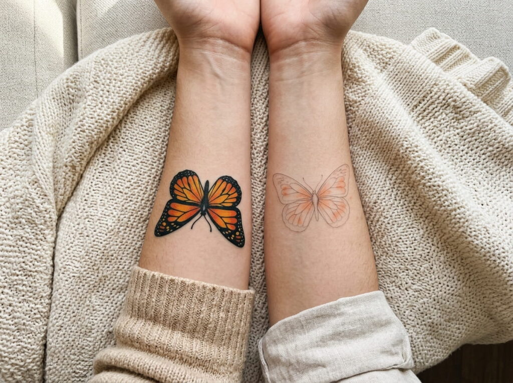
The most common mistake with orange is skipping the dark outline. Without it, soft color edges tend to blur into the skin as the years pass.
Monarchs are built for this. The black borders and veins are part of the real wing, so a bold outline looks natural, not heavy. Think of the black as the frame and the orange as the picture.
Keep the veins bold and unbroken.
Leave small skin gaps for the white border spots.
Thin, light grey outlines around bright orange.
A solid black border with no spots or breaks.
6. Match Your Skin Undertone to the Palette Before You Commit
Stand by a window in daylight and look at your inner wrist. Fluorescent bathroom light will lie to you.
Skin shows through every color in a tattoo, so the same orange can look rich on one person and muted on another. Strong contrast is what keeps color readable. Deep, saturated shades tend to hold their punch on darker skin, while very pale yellows can fade into it. On fair skin, softer blues and purples can look crisp, and warm oranges often glow.
None of this is a strict rule. Your artist has seen colors heal on many skin tones, so let them test.
Before you pick a palette
7. Size and Placement Decide How Much Color Makes Sense
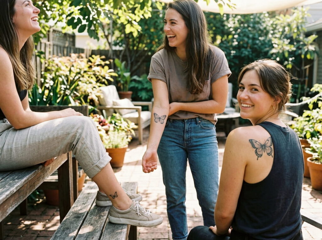
A butterfly on your ankle bone and one across your shoulder blade are different jobs, even with the same wings.
Small tattoos have little room, so color packs tightly and the details can blur together over time. Large ones can hold shading, gradients, and several shades without crowding. Placement matters too. A spot that stays covered gives bright colors an easier life than a wrist or hand.
Pick the palette last, after you know the size and the spot.
8. Test Your Colors in Daylight Before the Stencil Goes On
Colors on a phone screen look nothing like colors in skin. Screens glow, skin doesn’t, so the blue that looked electric online can arrive as a quiet navy.
Skip the full drawing for this one. Just make small color swatches and look at them next to your actual skin.
Dab small patches of each color on paper with colored pencils or markers.
Hold the paper against the exact spot where the tattoo will go, near a window.
Look again the next morning, then bring the swatches to your consultation.
9. Pair One Bold Wing Color With Black Shading, Not Three Colors
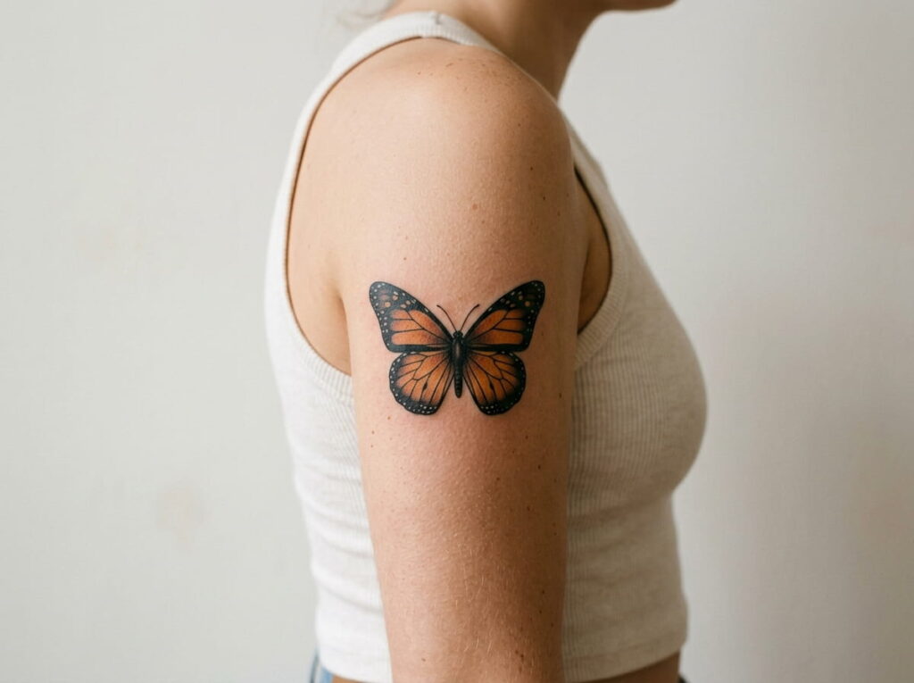
Keep it simple. One star color, then black.
A butterfly with orange, blue, purple, and green wings often looks busy and loses the shape that made you want it. Real butterflies work the same way. The monarch is famous for orange and black, and the blue morpho for blue and dark brown. Two tones are enough to be recognized.
Use the star color for the large wing areas. Let black handle the outline, veins, and shadow.
One bold wing color plus black is easier to read, easier to heal, and easier to fix later than a rainbow.
10. Plan for Sun and Healing So Bright Colors Stay Bright
Good aftercare protects your hours in the chair. Bright colors are the first to look tired when a tattoo is neglected.
Follow your artist’s healing instructions exactly, and don’t pick at flaking skin, since that can pull color out. Once it has healed, sunscreen becomes a long term habit for any tattoo that sees daylight. Light yellows and bright oranges tend to show fading sooner than black, so plan for the occasional touch up.
⚠️ Watch Out
Skip sun, pools, and hot tubs while your tattoo heals, and ask your artist how long that lasts for your piece. If anything looks unusual, talk to your artist or a doctor.
11. Try a Palette Beyond Orange and Blue: Swallowtail Yellow, Purple Emperor, Painted Lady
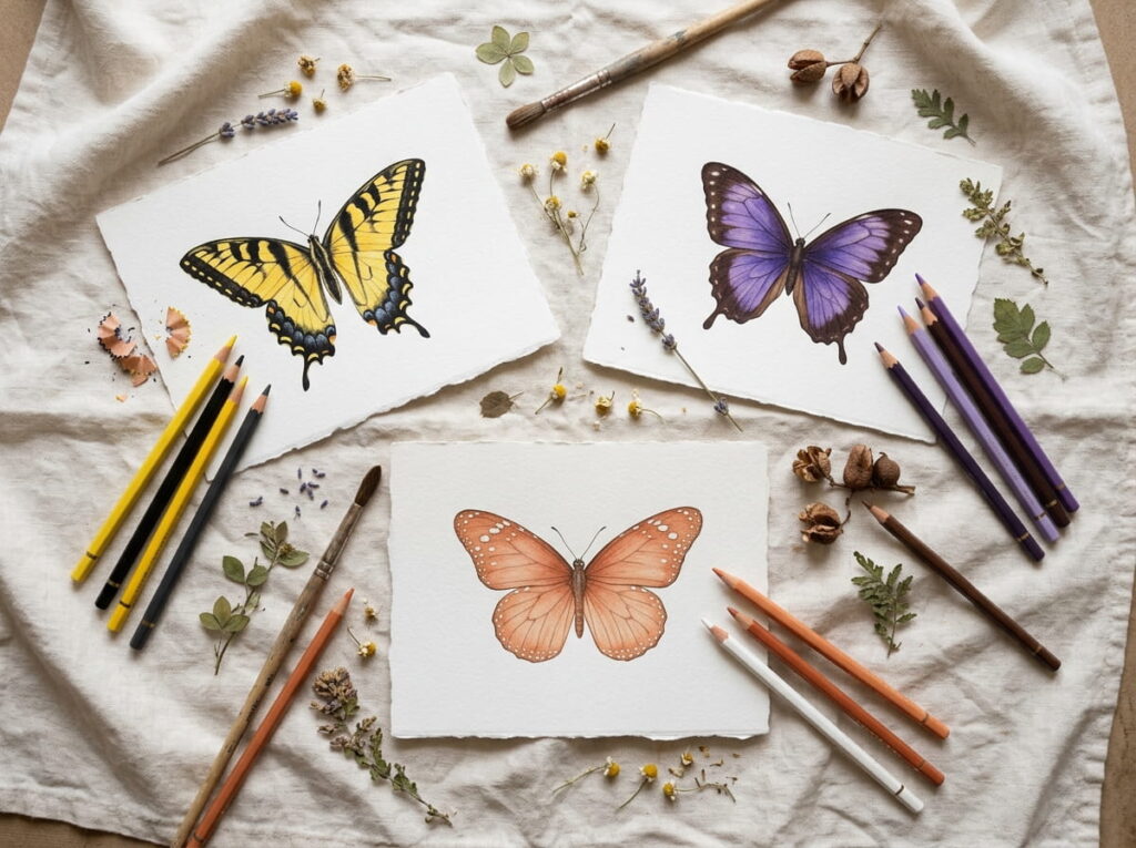
Orange and blue get the attention, but real butterflies offer plenty more.
A swallowtail wears yellow with black stripes and small flecks of blue and orange near the tail. A purple emperor looks dark brown until light catches it and a violet sheen shows up. A painted lady sits in the middle, with soft orange, black, and tiny white spots.
Use the same test as before. Keep your one fixed design and swap in each palette.
12. Bring a Reference Image and a Short Color Brief to Your Artist
“Something colorful” is hard to draw. “Warm orange fading to red near the body, bold black veins, no green” is easy.
Artists work best with a clear picture of what you like, and they’ll tell you what will and won’t hold up on skin. Show up with your printed swatches from earlier, a photo of a real butterfly or design you love, and a few firm opinions. Then listen when they suggest changes. They know how the ink heals.
A brief also saves you from the quiet regret of a butterfly that is almost right.
Your consultation color brief
The Conclusion
Choosing butterfly tattoo colors gets easier once you stop treating it as one big decision. Fix the design first. Then compare palettes on that same shape, in daylight, against your own skin.
Orange needs bold black framing to stay warm. Blue needs shading to feel alive. Black ink alone is a smart answer when the shape is small, fine, or often in the sun. And whichever palette you land on, a clear brief and a look at your artist’s healed work will save you from the almost-right butterfly.
Take your time with this one. A tattoo is easy to start and hard to undo, and the patient comparison is where the good choices happen.
html
Fix the design, test the palettes, pick one star color, and ask to see healed work.







Leave a Reply