
Most women who want a spine tattoo know the feeling before they know the design. They want something that sits quietly down the center of the back, visible when they choose and hidden when they do not. The spine is long, narrow, and honest about every curve, which makes it a flattering canvas and a tricky one to plan.
The trouble is that most spine tattoo ideas online look great on a model and confusing on a real back. Too wide, too busy, too locked into one size. A design that works here has to follow the line of your body instead of fighting it.
The twelve sections below group about thirty designs by feel: words, vines, symbols, and small starter pieces. Each one comes with a quick reference so you can compare placement, effort, and style before you book a consult. Save the ones that make you pause, then notice which shapes you keep coming back to.
- 1. One Line of Script That Follows Every Vertebra
- 2. A Single Fine Line Vine That Climbs Tailbone to Neck
- 3. Tiny Moon Phases Stacked Down the Center of Your Back
- 4. A Botanical Stem With Leaves That Alternate Sides
- 5. A Dotted Constellation That Connects Your Vertebrae
- 6. One Small Symbol Per Vertebra, Like a Quiet Charm Bracelet
- 7. A Delicate Bloom at the Nape That Fades Into a Stem
- 8. A Date or Set of Coordinates in Tiny Numerals
- 9. Feather Wings That Fan Out Over the Shoulder Blades
- 10. A Loved One’s Real Handwriting Along the Spine
- 11. Two Matching Designs That Meet at Mid Back
- 12. A Whisper Small Spine Tattoo for First Timers
- Conclusion
1. One Line of Script That Follows Every Vertebra
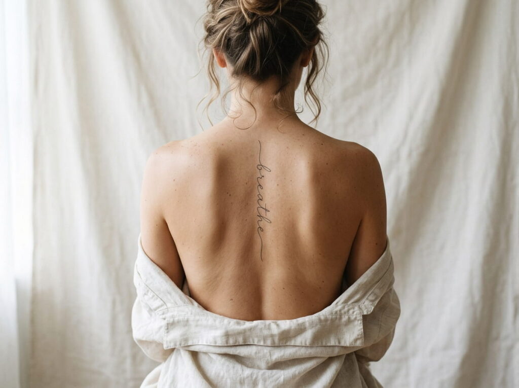
Short beats clever here.
A spine is a narrow strip, so every extra word either shrinks the lettering or stretches the line past what the eye can follow. A single word or a phrase under six words stays readable and keeps the spacing steady. Lowercase cursive tends to follow the curve of the back better than block capitals.
Three ways to place it:
- One word in cursive, each letter sitting near a vertebra
- A short phrase rotated to run top to bottom
- Two words split, one at the nape and one at the low back
Best for someone who wants a message that only she and her closest people read.
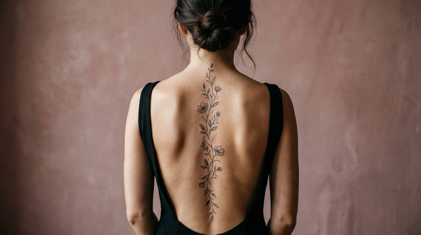
2. A Single Fine Line Vine That Climbs Tailbone to Neck
The curve is what sells a vine. A stem that shifts left and right every few inches looks grown, while a straight line with leaves stuck on looks drawn with a ruler.
Three versions worth asking about:
- One unbroken stem with tiny leaves
- A stem with a few buds or berries at the high points
- A vine that thins into a single dot near the tailbone
The tapering version is the most forgiving if your back has a slight natural curve, since the thin end does not need to line up with anything.
Bring to your consult
3. Tiny Moon Phases Stacked Down the Center of Your Back
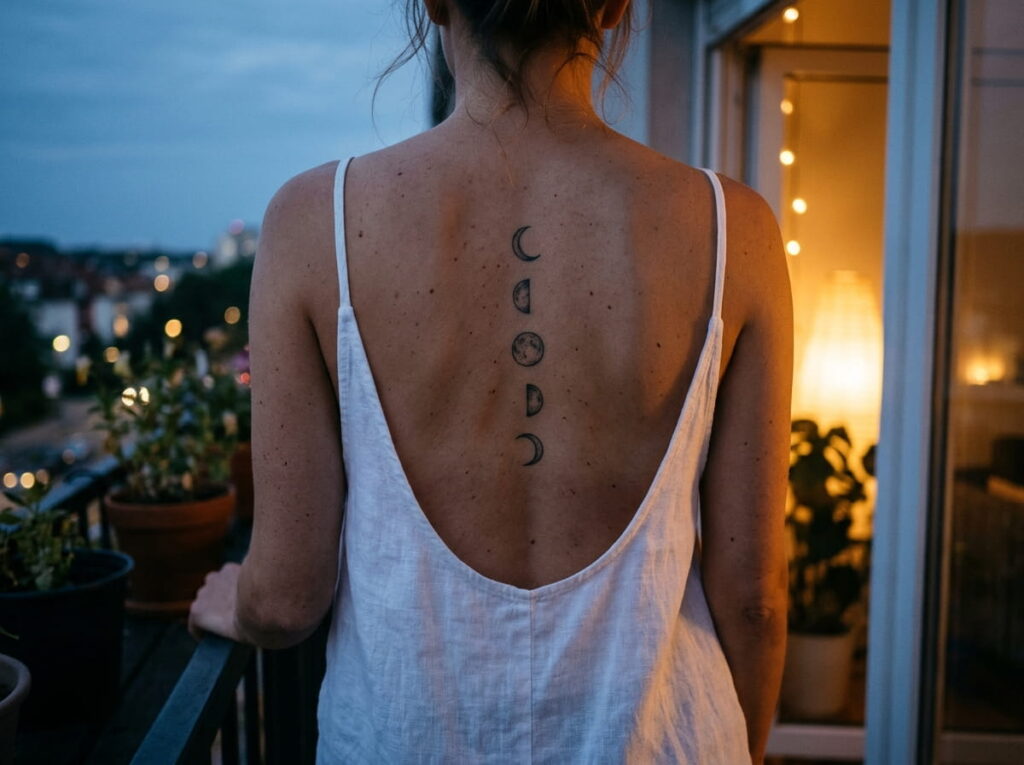
A white tank top, a low neckline, and a column of small moons peeking out above the fabric.
Moon phases suit a spine because they already come as a sequence, and a sequence gives the eye a path to follow. Three layouts to choose from:
- Five phases, crescent to full and back again, spaced evenly
- A full moon at the center with a crescent above and below
- One crescent near the nape with a few tiny stars trailing down
Keep every moon the same width so the column stays tidy.
4. A Botanical Stem With Leaves That Alternate Sides
Matching leaves on both sides make a stem look stiff.
Real stems offset their leaves, one on the left, then a little lower on the right, and that offset is what makes the line feel alive. Olive branches, ferns, and wildflower stems all do this well. Ask for leaves that shrink as they climb so the top of the design feels light. An uneven leaf count often looks more natural than a neat matched set.
Pick the plant first. Olive, fern, and wildflower each have a different leaf shape, and the leaf shape sets the whole mood.
Decide the spacing. Wider gaps between leaves at the low back and tighter ones near the nape keep the stem from looking crowded.
Check the stencil twice, once standing tall and once with a slight bend, so the stem still looks straight when you move.
5. A Dotted Constellation That Connects Your Vertebrae
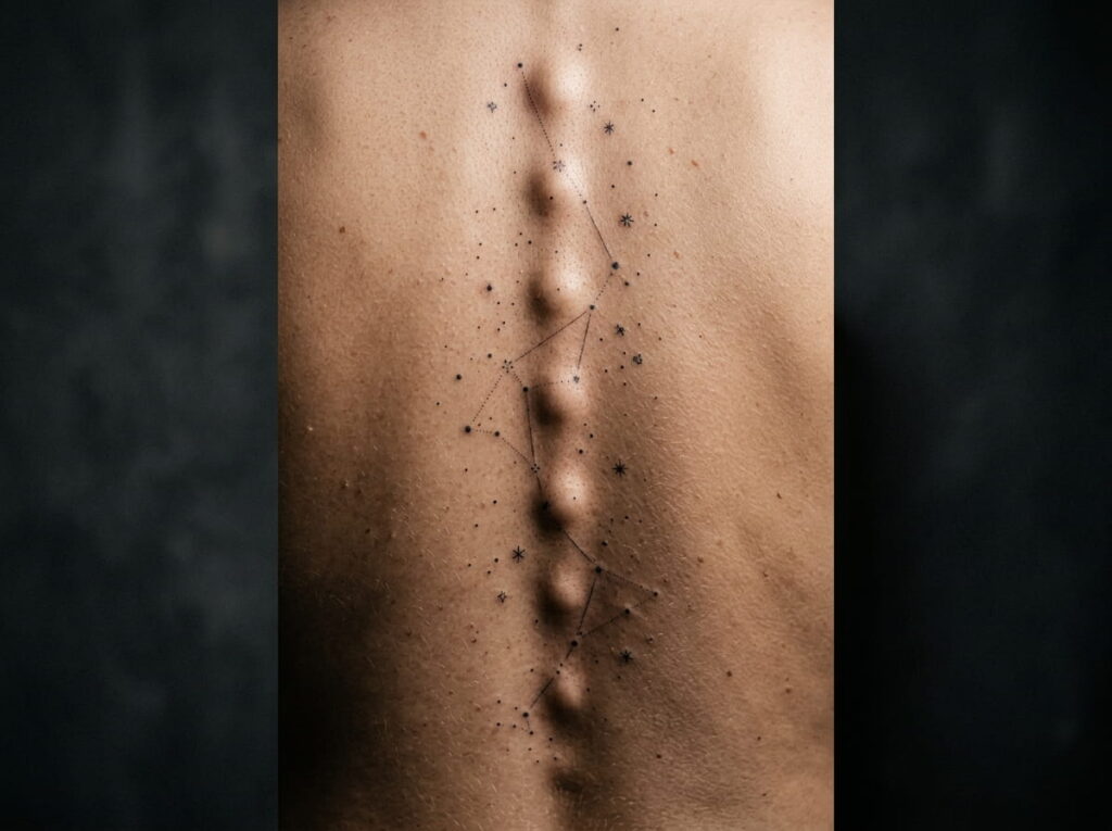
Dots look like the easy option, and that is the myth.
Tiny dots need exact spacing, because one off center dot gets noticed faster than a slightly wobbly line. Very small dots can also soften over the years, so ask your artist how close is too close. Three versions to consider:
- A real constellation tied to a birth month
- An invented pattern joined by hairline strokes
- Dots in three sizes with no lines at all
The artist’s steady hand matters more here than the design itself.
Vary the dot sizes so the pattern has a focal point.
Keep connecting lines at hairline thickness.
Choose a star pattern that means something to you.
Packing dots so tightly they can blur together later.
Drawing lines that cut straight across the spine ridge.
Adding every star in the sky just to fill the space.
6. One Small Symbol Per Vertebra, Like a Quiet Charm Bracelet
Matching symbols and mixed symbols read like two different tattoos, even on the same spine.
A row of identical tiny hearts feels calm and modern. A mix of a star, a leaf, a key, and a small wave feels like a story, with each symbol standing in for a person or a year. Whichever you pick, keep every symbol about the same height so the column stays even.
Symbols that stay clear at a small size:
- A crescent or a four point star
- A simple leaf with one center line
- A tiny key or anchor
Mixed sets work well if you plan to add one more symbol after each big life moment.
| Matching set | Mixed set |
|---|---|
| Looks calm and uniform | Looks like a personal story |
| Easy to space evenly | Needs a layout sketch first |
| Harder to extend later | Easy to add one more |
7. A Delicate Bloom at the Nape That Fades Into a Stem
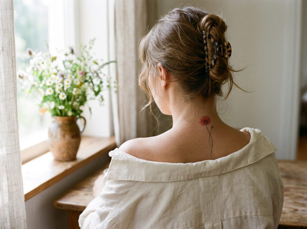
A flower no wider than a thumbnail, sitting right at the base of the neck, with one thin stem trailing down the spine.
Poppies, anemones, and small roses all work at that size because each can be drawn with only a few petal lines. The stem then thins as it runs down, so the ink fades out instead of ending at a hard edge. Hair worn up shows the bloom, and hair worn down hides it.
Blooms that stay readable when small:
- Poppy, with its simple cup shape
- Anemone, with a dark center dot
- Cosmos, with flat open petals
Ask for the bloom to sit just above your collar line so a tee never cuts it in half.
A bare upper back, and a long list of flower photos that all look too big for a narrow strip of skin.
One small bloom at the nape, a stem that thins as it falls, and plenty of bare skin left around it.
8. A Date or Set of Coordinates in Tiny Numerals
The most common mistake with date tattoos is choosing the numerals before choosing the size.
Tiny numbers look crisp on paper and crowded on skin. A date or a set of coordinates needs a little more room than a symbol does, since every digit has to stay readable without squinting. Roman numerals, a stacked layout with one number per line, and a thin serif font all hold up well on a narrow strip.
Layouts worth asking about:
- Roman numerals in a single column
- Coordinates split into two short lines
- Month and year only, with the day left out
Best for anyone who wants to mark a birth, a move, or a milestone without announcing it.
⚠️ Watch Out
Have a second person read every digit on the stencil out loud before the needle starts. A flipped number is easy to miss on your own back and very hard to fix later.
9. Feather Wings That Fan Out Over the Shoulder Blades
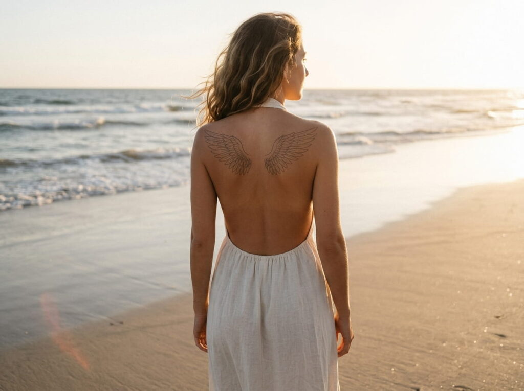
Feathers give a spine tattoo a wider, softer finish without covering the whole back.
Keep the center line clear and let the feathers fan outward across each shoulder blade, so the design moves when you do. Light outlines tend to age well, and a few loose feathers drifting down the spine tie the wings back to the center.
Three ways to shape them:
- Outline only feathers with no shading
- Wings with a narrow bare gap at the middle
- One single feather resting on each shoulder blade
A symmetrical stencil is worth the extra time, because one wing sitting higher than the other shows right away.
Leave a little bare skin down the middle so the wings frame your spine instead of hiding it.
10. A Loved One’s Real Handwriting Along the Spine
A grandmother’s recipe card, soft at the corners, with her slanted handwriting across the top line.
Real handwriting makes a spine tattoo feel more like a signature than a design. The artist traces a scan of the original, so the quirks stay, like the uneven loops and the lean to the right. A short word such as a nickname or a first name works best, since long phrases get cramped on a narrow strip.
Scan it at high resolution before your appointment, then keep the original safe at home.
Where to look for handwriting worth keeping
- ▸The signature at the bottom of a birthday card
- ▸A note on the back of an old photograph
- ▸A recipe card with their writing in the margin
- ▸A postcard or letter signed with a nickname
11. Two Matching Designs That Meet at Mid Back
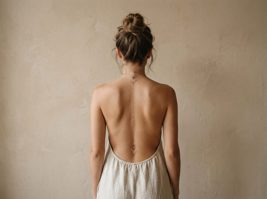
Two designs on one spine need a meeting point, and most people forget to plan it.
A top piece and a bottom piece can look like two separate tattoos unless something ties them together. The link can be as small as a shared line weight, a repeated leaf shape, or one dot where the two ends almost touch. Decide where they meet before either is drawn, because the middle of the back is where the spine curves the most.
Pairings that hold together:
- A bloom at the nape and a matching bud at the low back
- A crescent moon at the top and a small sun at the bottom
- A short word above and a symbol below that echoes its meaning
Good for anyone who wants to start with one half and add the other later.
12. A Whisper Small Spine Tattoo for First Timers
Starting small is not playing it safe. It is how you learn what you like.
A first tattoo teaches you things no photo can, like how the spine feels under the needle and how your skin heals. A piece about the size of a finger gives you that lesson without a big commitment.
Starter designs that look finished on their own:
- One tiny star at mid back
- A single lowercase word
- A sprig of three small leaves
Leave bare skin above and below, so you can extend it later if you want more. Book your appointment well before a beach trip or a big event, since healing takes a few weeks.
Before your first appointment
Conclusion
A spine tattoo works best when it respects the narrow strip of skin it lives on. Keep the design slim, give the lines room to breathe, and let one detail carry the meaning, like a word, a vine, or a single small star.
The best spine tattoo ideas are rarely the biggest ones. They are the ones you can explain in a sentence and still like years from now.
Take your time with the stencil. Ask your artist to place it on your back before any ink goes in, and start small if you feel unsure. You can always add more later.







Leave a Reply