
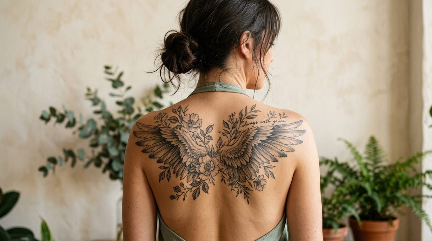
Most women who want a back tattoo can already see it in their head. A soft shape sitting right where the shoulder blade curves, something you catch in the mirror and nobody else notices until you pull your hair up.
Then the real questions start. Wings or flowers? One word or a whole line? Big enough to matter, small enough to stay graceful? The shoulder blade is a lovely spot, but it has a bend and a bone edge, and not every design sits well on it.
That is why these shoulder blade tattoo ideas are sorted by motif. You will find wings, florals and script, plus a few mixed designs and one practical section on sizing. Each idea comes with a quick reference box, so you know what to bring to your artist.
Save the ones that make you stop scrolling. Your shortlist will get clearer fast.
1. A Single Fine Line Wing Resting Along One Shoulder Blade
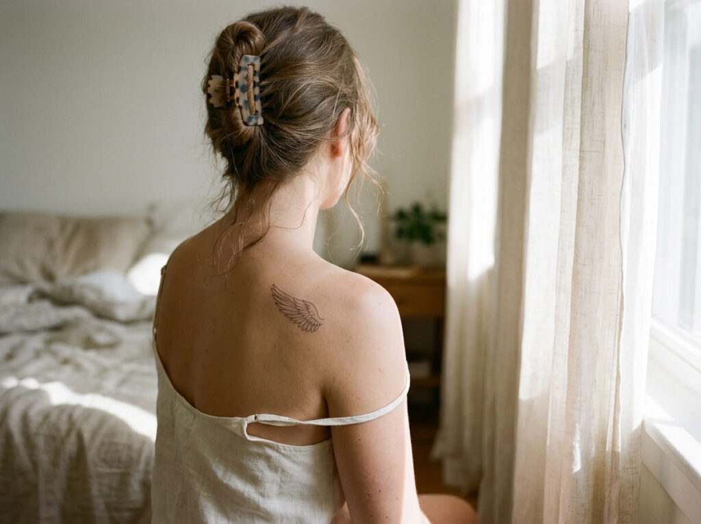
One wing, drawn with a thin line, can look like it landed there on its own.
Place it so the top of the wing starts near the upper edge of the blade and the feather tips fall toward the spine. The skin here is fairly flat, so thin lines stay clean and easy to read. Ask your artist to follow the natural slope instead of stamping the design on straight.
Details worth asking about:
- Feather count: fewer feathers keep a small wing from looking crowded
- Line weight: one thin needle gives the softest look
- Facing direction: left or right changes the whole feel
2. Mirrored Wings That Open Across Both Blades
The risk with two wings is that one ends up sitting a little higher than the other. Your spine is the guide, so everything gets measured from it.
Ask your artist to mark the center line first, then place each wing the same distance out. Stand straight when they stencil it, because slouching shifts the blade.
Mirrored wings suit anyone who likes a balanced look. They also leave room in the middle for a small spine piece later.
💡 Quick Tip
Take a photo of the stencil from behind before the needle starts. Check it in a mirror or with a friend, and speak up if one side sits higher.
3. Three Drifting Feathers That Follow the Curve of the Blade
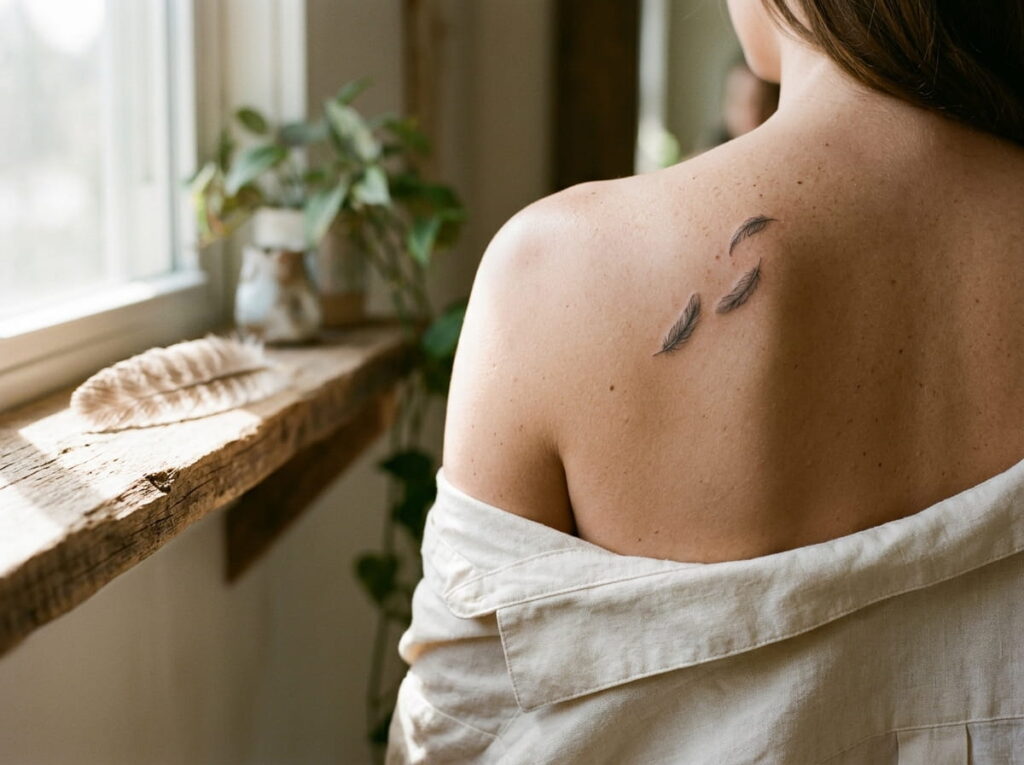
Feathers give you movement without taking much room.
Three is a good number because it makes a path. Place the largest feather near the top of the blade, then let the next two drift down and slightly inward, as if the wind caught them. Vary the angles a little so they do not look stamped in a row.
- Pick one style for all three feathers.
- Choose different lengths.
- Leave open skin between them.
That open space is what makes them look like they are floating.
4. A Peony and Rose Cluster Tucked Into the Blade Curve
The common mistake is choosing flowers with too many tiny petals. At a small size, those petals blur together over time.
Peonies and roses work because their layers are big and rounded. A cluster of two or three blooms with a few leaves fills the curve of the blade nicely, and the leaves can trail toward the shoulder to guide the eye.
Ask for a little more space between petals than looks necessary on paper. Skin softens lines as it heals and ages.
Flowers that stay clear over time
5. Wildflower Stems Growing Up From the Spine Toward the Shoulder
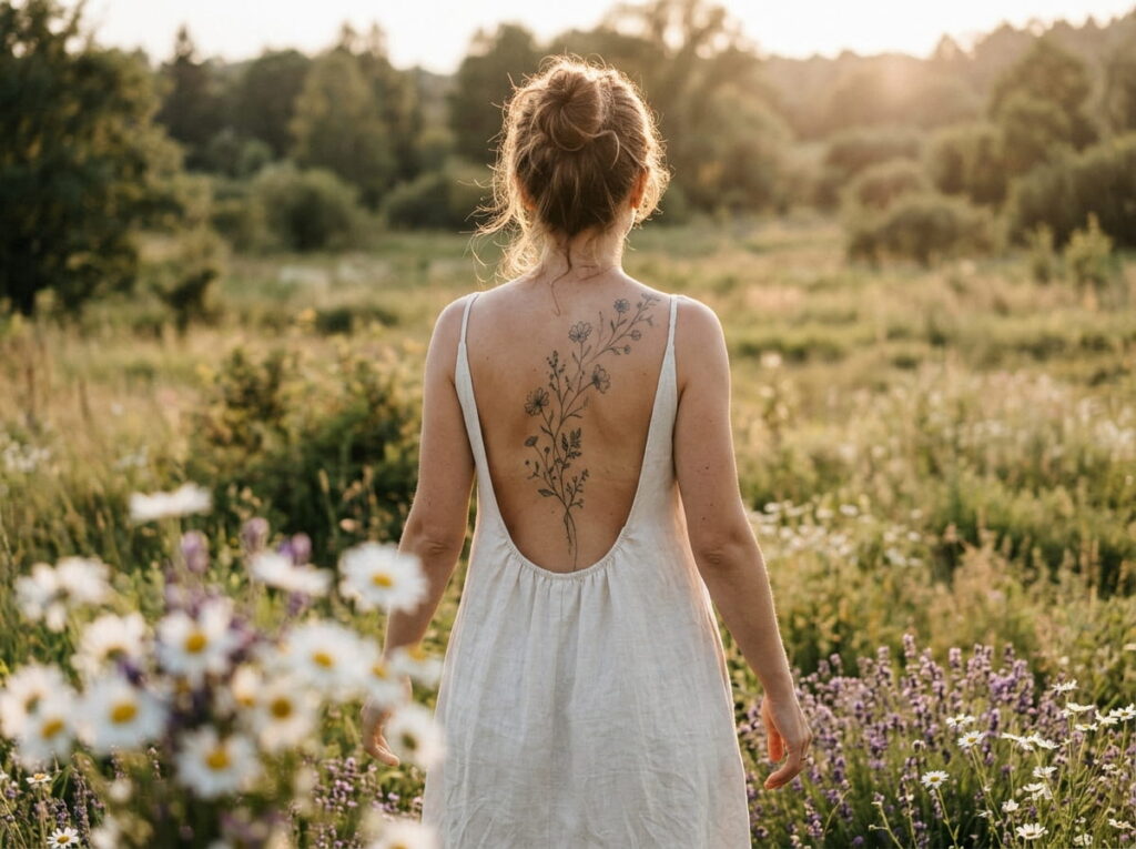
Wildflowers look best when they are a little uneven. Tall stems next to short ones, a bud here, a full bloom there.
Start the stems near the spine and let them lean outward over the blade. Daisies, lavender and poppies are easy to recognize even in fine line.
A few details to bring up:
- Stem height: vary it so the group looks natural
- Leaf count: keep it light
- Bloom mix: two or three types is plenty
This works best for anyone who likes a loose, natural look instead of a tidy bouquet.
A bare stretch of skin between the spine and the shoulder that feels empty from behind.
Thin stems at different heights with a few small blooms, leaning toward the shoulder like they grew there.
6. A Cherry Blossom Branch That Curls Over the Shoulder
Most flowers stay put. A cherry blossom branch travels.
Start the branch low on the blade, then let it curve up and over the top of the shoulder so a few blooms show from the front too. Cluster the blossoms near the bend and let two or three loose petals drift back down the back. Tell your artist where your bra straps and necklines sit, so the branch peeks out exactly where you want it.
How to brief your artist:
Bring two or three branch photos and point out the exact curve you like.
Stand at a mirror and mark where the branch should end on the shoulder.
Check the stencil for bloom spacing before any ink goes in.
7. One Word in Typewriter Script Below the Blade
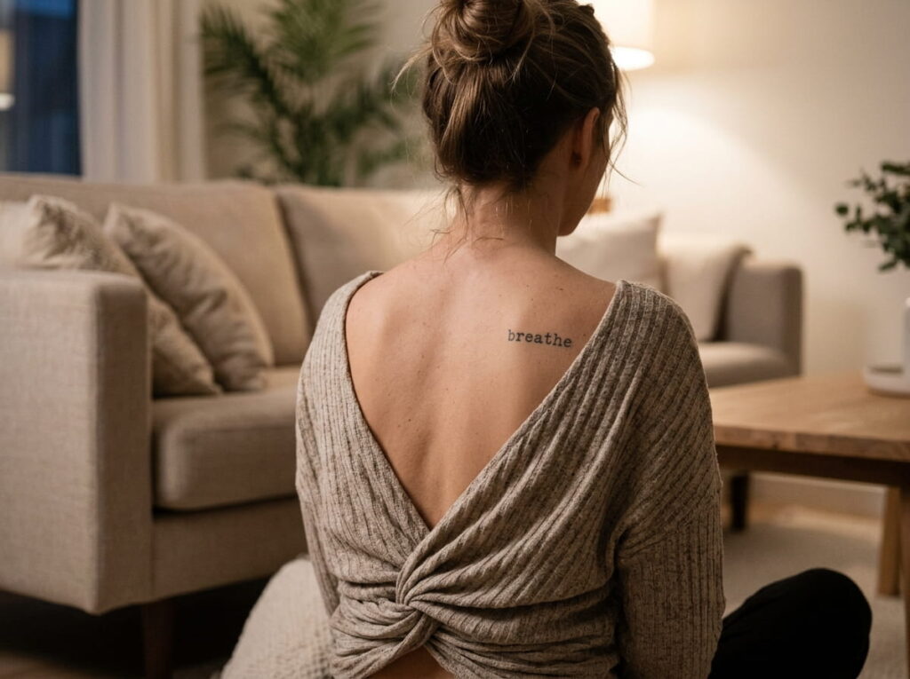
Short words rarely go wrong because of the word. They go wrong because of the spacing.
Typewriter lettering keeps each letter separate and upright, so it stays readable even when small. Place it below the blade, where the back is flatter, and keep it on a straight line instead of following the curve. A name, a place or a single word you say to yourself on hard days all work well here.
Pick something you will still want to read in ten years.
Choose a word with clear, simple letter shapes.
Leave open skin around it.
Ask for letters slightly bigger than feels necessary.
Long phrases squeezed into a small space.
Tight letter spacing.
Hairline strokes that can blur as skin ages.
8. A Cursive Line That Follows the Bone Edge
Cursive and the shoulder blade share one thing: a curve. That is why they pair so well.
Start the line just inside the upper edge of the blade and let it slope the way the bone does. A short phrase works better than a long sentence, because the curve only gives you so much room before the text runs onto flat skin.
Compare your lettering options first:
- Cursive flows with the bone but needs larger size
- Typewriter stays crisp but ignores the curve
- Handwriting feels personal, especially if it is a real note
| Cursive | Typewriter | Handwritten |
|---|---|---|
| Flowing, follows curves | Clean, even, upright | Personal, one of a kind |
| Needs more size to stay readable | Holds up well when small | Depends on how clear the original is |
9. A Date in Roman Numerals Placed Just Under the Shoulder
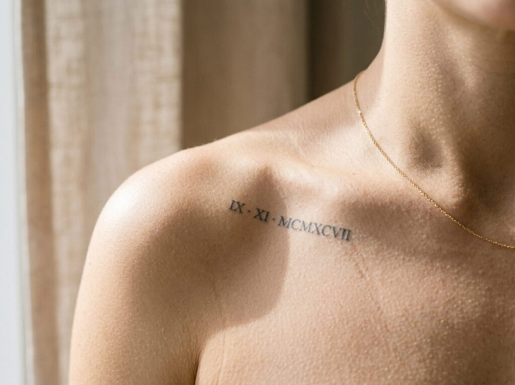
Keep a date to one line. Roman numerals are narrow and upright, so they line up neatly and take up very little skin.
Place them just under the curve of the shoulder, where the back starts to flatten. A birthday, a wedding date or the day something changed all read quietly this way. Most people will see a pattern of letters, and only you will know what it says.
Before you book, write the date out in numerals yourself and check it twice. Then ask your artist to check it again against the stencil.
Read every numeral out loud against your date before the stencil goes on. A swapped letter is much harder to fix than to catch.
10. A Small Wing With a Short Word Tucked Beneath It
A tiny wing with a word underneath looks a bit like a charm on a necklace. Small, deliberate and personal.
Let the wing sit on the blade and place the word just below it, centered on the same line. Keep the word short, one or two words at most, so it does not compete with the wing. This one works well for first tattoos, because the footprint is small and the meaning is easy to explain.
Make the lettering the hero of your planning. The wing is easy. The word is where the details matter.
⚠️ Watch Out
Tiny letters can soften and blur as skin ages. Ask your artist for slightly larger lettering than looks necessary, and avoid ultra thin strokes on anything you want to stay legible.
11. A Crescent Moon Wrapped in Tiny Florals

The open curve of a crescent is made for holding things. Small flowers can curl around the inside edge, and a few leaves can trail off the tip.
Place it high on the blade, where the bone gives the moon a natural slope. Keep the flowers tiny and few, so the moon stays the first thing you see. Two or three sprigs are plenty.
Pairings to ask about:
- Lavender sprigs along the inner curve
- Small daisies at the tips
- Jasmine buds trailing down the back
This one suits anyone who wants a design that feels calm and a little quiet.
12. How to Pick the Right Size and Style Before You Book
Decide the size before you decide the style. It sounds backward, but size is what limits everything else.
Hold a printed copy of the design against your back, or ask your artist for a paper stencil, and look at it from a distance. A shoulder blade tattoo is mostly seen from across a room or in a mirror, not up close. If the details disappear at that distance, make the design bigger or simpler.
Then pick the style that fits the size. Fine line suits small, open designs. Bolder shading holds up better on anything large or detailed.
Take these questions to your consultation:
Questions to ask your artist
Conclusion
A good shoulder blade tattoo starts with the curve of the bone. Wings follow it, flowers fill it, and script can trace its edge. Once you know which of those feels like you, the rest is details: how big, how fine, and how it will look after a few years.
Take your favorite two or three ideas to a consultation and ask to see healed work. Check the stencil in a mirror before anything permanent happens. Those small steps matter more than any single design choice.
If you are still deciding between shoulder blade tattoo ideas, sleep on your shortlist for a week. The one you keep coming back to is usually the right one.







Leave a Reply