
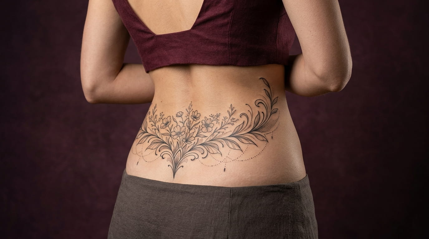
Lower back tattoos picked up a bad reputation about twenty years ago, and most of it had nothing to do with the placement. The real issue was the design. Wide, heavy, perfectly flat shapes were stamped onto the same spot again and again, and the spot took the blame.
The lower back is actually one of the most flattering places to get inked. It is long, curved, easy to cover with a waistband, and easy to show with a crop top. Today’s best lower back tattoo ideas use finer lines, softer shapes, and layouts that move with your spine instead of fighting it.
Below are 12 modern takes, from single stem florals to tiny private text. Each one comes with a quick reference you can screenshot and bring to a consult. Save the ones that make you pause, because those are usually the designs you will still like years from now.
1. Skip the Flat Banner Shape and Let the Design Follow Your Spine

The old design problem was shape, not placement.
A flat horizontal banner fights the natural curve of your lower back. A design that runs along the spine, or fans out from its center, moves with your body when you bend, sit, and walk. Ask your artist to place the stencil on you first, then stand, twist, and sit before any ink goes in.
Three shapes that follow the body:
- A vertical line that points toward the tailbone
- A teardrop or diamond outline centered on the spine
- A soft curve that widens at the hips and tapers at the ends
Check the stencil in a mirror and in a photo.
Leave open skin around every edge.
Wide banner shapes that run hip to hip.
Dense black fills that crowd the whole area.
2. A Single Fine Line Botanical Stem That Rises From the Waistband
One thin stem, a few leaves, and a lot of empty skin around it.
The spine gives a plant its stem line for free. Start the design just above the waistband and let it lift upward, so it shows with a short top and disappears under a tucked shirt. Good plants to ask about are eucalyptus, olive branch, wheat stalk, and lavender.
Fewer leaves read cleaner than many. If the stem starts to look crowded, take something away before you add anything.
Pick one plant that means something to you and save two or three photos of it.
Ask your artist to bend the stem with your spine instead of drawing it ruler straight.
Decide how high it should rise by checking where your usual waistbands and tops sit.
3. Sacral Dot and Line Geometry That Sits Right Above the Tailbone
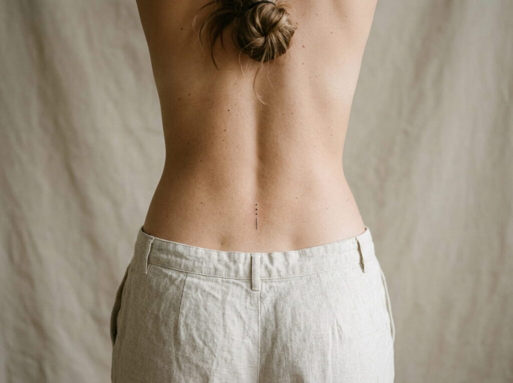
Pick two shapes and stop there.
Geometry is the quickest way to get a modern look. Dots, short lines, and small triangles sit well in the flat dip just above the tailbone, where the area is small and the skin is smooth. Try one of these:
- Three dots stacked in a vertical line
- A short line with a single dot floating above it
- A small open triangle with one dot at its center
Spacing matters more than size here. Ask your artist to measure the gaps with a ruler so everything looks even.
4. Two Small Moon Phases Placed Off Center Instead of Perfectly Mirrored
Most moon designs go wrong by centering everything.
Mirrored moons on a flat line look like a logo. Shift them instead. Put a crescent slightly left of the spine and a smaller full moon a little lower on the right. The uneven balance feels relaxed, and it suits a back that is never perfectly even anyway.
- Choose two phases, like a crescent and a full moon
- Make one clearly smaller than the other
- Leave a gap wider than either moon
💡 Quick Tip
Take one photo of the stencil from straight behind you and another from a slight angle. Off center layouts read differently from each side, so you want to like both views.
5. A Wide Wavy Script Word Tucked Under a Crop Top Hem
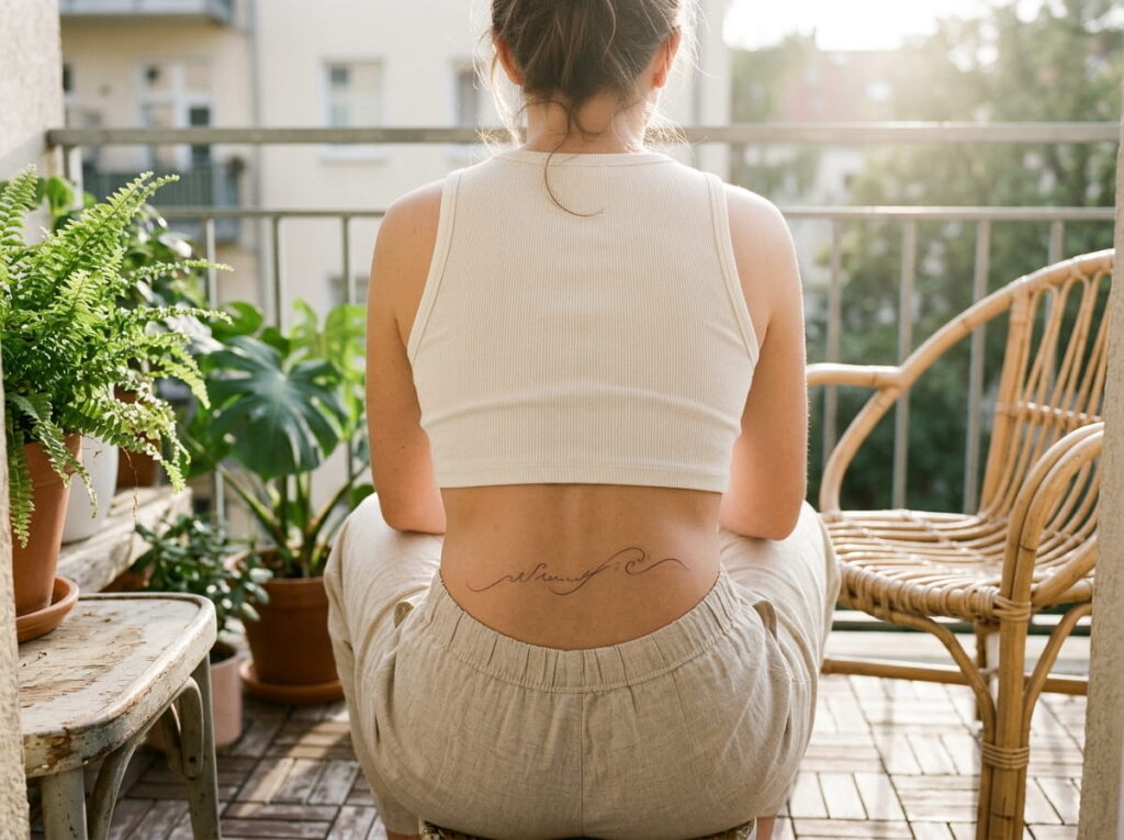
A single word in soft script gives the lower back a quiet message that shows only when you want it to.
The wave comes from letting the lettering follow the curve of your lower back instead of sitting on a straight guideline. Short words work best. Long ones get cramped and hard to read once the skin moves.
Good word types to consider: a family name, a word in another language, or a place you grew up. Ask to see the lettering in your artist’s own handwriting style first, because script varies a lot from one artist to the next.
6. Delicate Lace or Chain Patterns That Look Like Jewelry on Your Skin
Think of a thin chain draped low across the hips, or a strip of lace that stops just short of the spine.
These designs work because they copy things that already sit on the body. A waist chain, a belly chain, or a lace trim all follow the same line your skin does, so the tattoo looks like it belongs there. Look at real jewelry photos and point to the links or the lace edge you like.
Two small details change everything:
- Keep the pattern slightly slack, with a gentle sag in the middle
- Add one tiny charm or bead as the only focal point
Chain tattoos read best when the links are different sizes.
What to bring to the consult
7. Tiny Constellation Clusters Placed Over One Hip Dimple
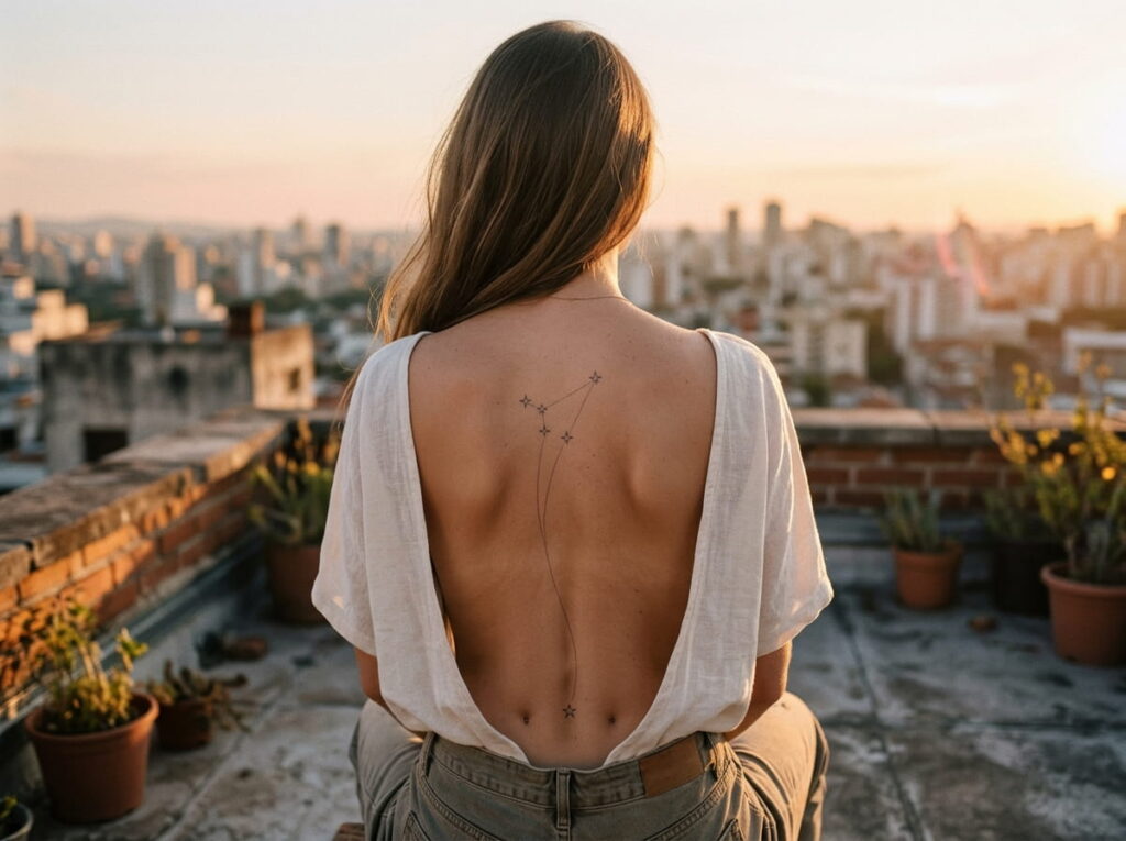
Copying a star chart dot for dot is the quickest way to end up with a tattoo that looks like random specks.
Real constellations have dozens of stars, and most of them are too small to hold up on skin. Trim yours down to the four to six brightest points and join them with hairline strokes. Then place the cluster so one star sits right over a back dimple, where it catches the eye without any extra detail.
Pick a constellation tied to a birth month or a person you love. The meaning does more work than the size.
Every star from the chart, all tiny, with no lines. From a few steps away it looks like freckles.
Five main stars, joined by hairlines, with one star on the dimple. The shape is clear from across a room.
8. A Soft Watercolor Wash Behind a Thin Outline Flower
Outline or wash? You can have both, but each one ages differently.
A thin outline gives the flower its shape, and a loose wash of color behind it adds softness without any hard edges. The wash should stay off center and spill past the lines a little, like paint that moved on its own. Ask your artist to show you healed examples of washes, not only fresh ones.
The lower back also gets rubbed by waistbands all day. That friction is worth bringing up when you pick your colors, because lighter shades can soften faster over time and may need a touch up.
| Outline only | Outline plus wash |
|---|---|
| Crisp, light, and graphic. | Soft, loose, and a bit dreamy. |
| Usually fewer touch ups. | May need touch ups sooner. |
| Easy to add to later. | Harder to change once colored. |
9. Ornamental Mandala Fragments That Fan Out Across the Hips

Half a circle does more than a whole one.
A full round mandala dropped in the middle of the lower back is the version most people remember from years ago. A fragment is different. Take just the top arc, or a wedge of petals, and let it fan out toward the hips so the pattern seems to continue under your clothes.
Ask for a design with plenty of breathing room in the pattern. Dense detail can blur together as the skin ages, while open petals and thin dotwork stay readable.
- Start from the spine and spread outward
- Use dots only at the outer edge
- Skip any border that closes the shape
An open, unfinished edge makes a design feel modern. A closed circle in the middle of the back looks dated.
10. Two Lines of Tiny Text Along the Waistline for a Private Meaning
Some tattoos are meant to be read only by you.
A coordinate, a date, a short line of lyrics, or two words in a language your family speaks can sit low and flat along the waistline. Most people will never read it, and that is the appeal. It feels private and still looks tidy.
The catch is size. Letters that are very small can blur and run together once the ink settles into the skin. Ask your artist what the smallest readable size is for your chosen font, and be ready to shorten your text to make it fit.
Keep it to one short line if you can.
⚠️ Watch Out
Skin around the hips stretches and shifts over the years. Skip very thin fonts and very tight letter spacing, and ask to see a healed example of the same font at the same size before you commit.
11. Matching Side by Side Symbols Placed on Either Side of the Spine
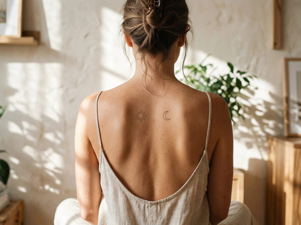
Symmetry is the one rule worth following here, but only loosely.
Two small symbols, one on each side of the spine, frame the lower back the way a pair of earrings frames a face. The pair does not have to be identical. A sun and a moon, two different leaves, or a small star and a small dot all work, as long as they sit at the same height and have similar weight.
Measure from the spine out to each symbol, not from the hips in. The spine is the center line, and skin on each side moves a little differently.
Pairs tend to fall into three groups, shown below. Pick one group, then choose your symbols from it.
12. A Small Cover Up Plan for an Old Lower Back Piece You Have Outgrown
Plenty of people reading about modern lower back tattoos already have an old one.
If yours is from the earlier era, you have options besides hiding it forever. A skilled artist can often work an older design into a new one, and the best cover ups start with a plan instead of a rush. Darker, bolder old work usually needs a larger or denser new design on top, so expect to go bigger than you first imagined.
Light, faded old tattoos are easier to work with.
The consult matters more here than anywhere else in this list, so choose an artist who shows healed cover up work in their portfolio.
Take a clear photo of the old tattoo in good light, from straight behind and from each side.
Book consults with two or three artists who show healed cover ups, not just fresh ones.
Ask whether fading the old ink first would give the new design more room. Your artist will tell you if it helps.
Choose a design from this list that suits the size and shape the artist recommends.
Conclusion
The lower back never needed saving. It just needed better designs. Finer lines, open space, and shapes that follow your spine turn a placement people used to joke about into one of the most flattering spots on the body.
If you are still deciding, pick the one idea from this list that you kept thinking about after you scrolled past it. That is usually the right one. Bring photos, ask to see healed work, and let the stencil sit on you for a while before anything is permanent.
Save this list of lower back tattoo ideas for your next consult, so the right design is easy to find.
Before you book







Leave a Reply