
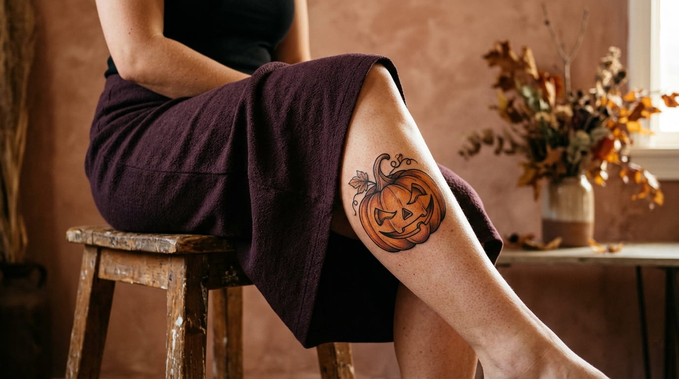
Every October your Pinterest feed fills up with grinning pumpkins, and by the time Halloween actually arrives you still haven’t picked one. That’s the trouble with jack o lantern tattoo ideas: there are hundreds of them, and most advice stops at “just pick one you like,” which doesn’t help once you’re staring at a wall of options in the shop.
A tattoo that’s funny in a photo might look sloppy on skin in five years if the lines are too thin, and a design that feels bold on your phone screen can turn out to be the wrong size for the spot you actually want it. The real decisions happen before you sit in the chair: face expression, style, placement, color, and how literal you want the pumpkin to look.
This list walks through those decisions one at a time, with the specific questions worth asking yourself before you commit. By the end you’ll have a much clearer sense of the exact jack o lantern that’s actually yours, not just the one that looked cute in someone else’s photo.
1. Decide Between a Cute, Funny, or Spooky Pumpkin Face First
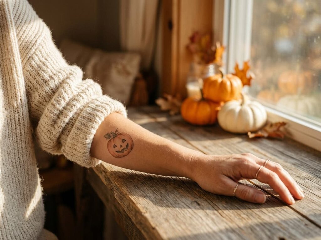
Most people scroll past a hundred pumpkin faces and pick one in under five seconds.
Before anything else, sort your options into one of three categories:
- Cute: round eyes, soft smile, small triangle nose
- Funny: crooked grin, one raised eyebrow, a missing tooth
- Spooky: jagged teeth, narrow glowing eyes, sharp angles
Pick the one that matches the reaction you actually want people to have, not the one with the most Pinterest saves.
2. Pick a Tattoo Style That Matches How Bold You Want It to Look
Bold traditional linework holds up best over the years, but it isn’t your only option.
Fine line pumpkins look delicate and modern right when they’re fresh, though the thin lines blur sooner and need more touch ups. Watercolor and illustrative styles exist too, each trading some crispness for a softer look.
The two most requested approaches come down to this:
| Bold Traditional | Fine Line |
|---|---|
| Thick black outlines, flat color fill | Thin lines, more detail in the face |
| Ages well, reads clearly from across a room | Needs touch ups sooner, softer look up close |
Whichever you choose, it should still read as a pumpkin at a glance, not only up close.
3. Choose a Placement That Fits the Size You Actually Want
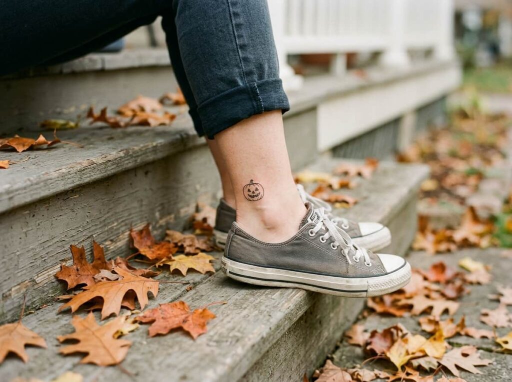
A tiny ankle pumpkin and a chest sized Halloween scene need completely different amounts of detail, and it’s an easy thing to get backwards.
Smaller spots like the wrist, behind the ear, or the inner ankle work best with a simple, bold face, since fine details blur fast on tiny tattoos. Bigger spots like the forearm, calf, or shoulder blade can handle a full carved pumpkin with stem texture, vine details, or a glow effect.
Before you pick a spot, check:
Before you commit to a spot
A spot that fits your style keeps the pumpkin looking sharp instead of smudged a year from now.
4. Decide if You Want a Solo Pumpkin or a Full Halloween Scene
A single jack o lantern makes a clean, confident statement on its own. Adding bats, a crescent moon, candy corn, or a spider web can build a fuller scene, but it only works if there’s enough room for everything to stay readable.
The mistake most people make is trying to fit too much into a small space, which turns crisp linework into a blurry mess within a few years.
Pick one or two extra elements at most.
Let the pumpkin keep the most visual weight.
Cramming bats, webs, moon, and candy corn in together.
Letting extra elements shrink the pumpkin too small.
A well balanced scene still lets the pumpkin be the first thing people notice.
5. Think Through Your Color Options Before You Commit
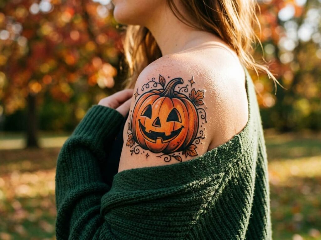
Classic orange and black is the obvious choice, and for good reason. It reads instantly as a jack o lantern, even from across a room.
Black and grey is the lower maintenance route, since there’s no color to fade or refresh. Soft pastel orange and lavender give a gentler, less literal take that some people prefer for a visible spot like the forearm or hand.
💡 Quick Tip
Saturated orange fades fastest in sun exposed spots. If you want color and visibility, plan on touch ups every few years.
Think about how often you’re willing to sit back in the chair before you pick the version with color.
6. Match the Carved Expression to Your Own Personality
The expression you choose says more than the shape of the pumpkin itself. A sly smirk and a gap toothed grin read as two completely different tattoos, even carved onto the same round outline.
If you tend toward playful energy, a lopsided grin or a winking eye fits better than a stern, symmetrical face. If you want something a little edgier, uneven teeth and a tilted eyebrow carry that tone without needing extra elements.
A symmetrical, even face reads calm. An uneven, lopsided one reads playful. Pick the version that actually matches your sense of humor.
Ask yourself which face you’d draw if no one was watching. That’s usually the right one.
7. Consider Pairing Your Jack O Lantern With Other Halloween Symbols
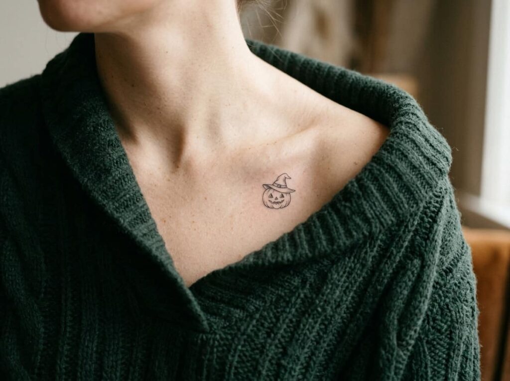
Start with the pumpkin as the anchor, then decide what, if anything, supports it.
Different symbols pull the design toward a different mood, so pick based on the feeling you want rather than grabbing whatever looks cute on its own:
Symbol pairings by mood
One small symbol usually says enough. You don’t need all four.
8. Decide if You Want the Glow and Flicker Effect
A jack o lantern lit from inside reads completely differently than a flat orange shape sitting on skin. The glow effect uses shading around the eyes and mouth to suggest light pushing out from the carved openings, almost like the candle is still burning.
It takes more skill from your artist and a bit more time in the chair, but it’s what gives a simple pumpkin outline real depth.
Solid orange fill, even black outline, no shading around the carved features.
Warm shading radiates from the eyes and mouth, suggesting a lit candle inside.
Worth asking for, even as a small upgrade to a simple design.
9. Figure Out Whether You Want a Small Accent or a Statement Piece
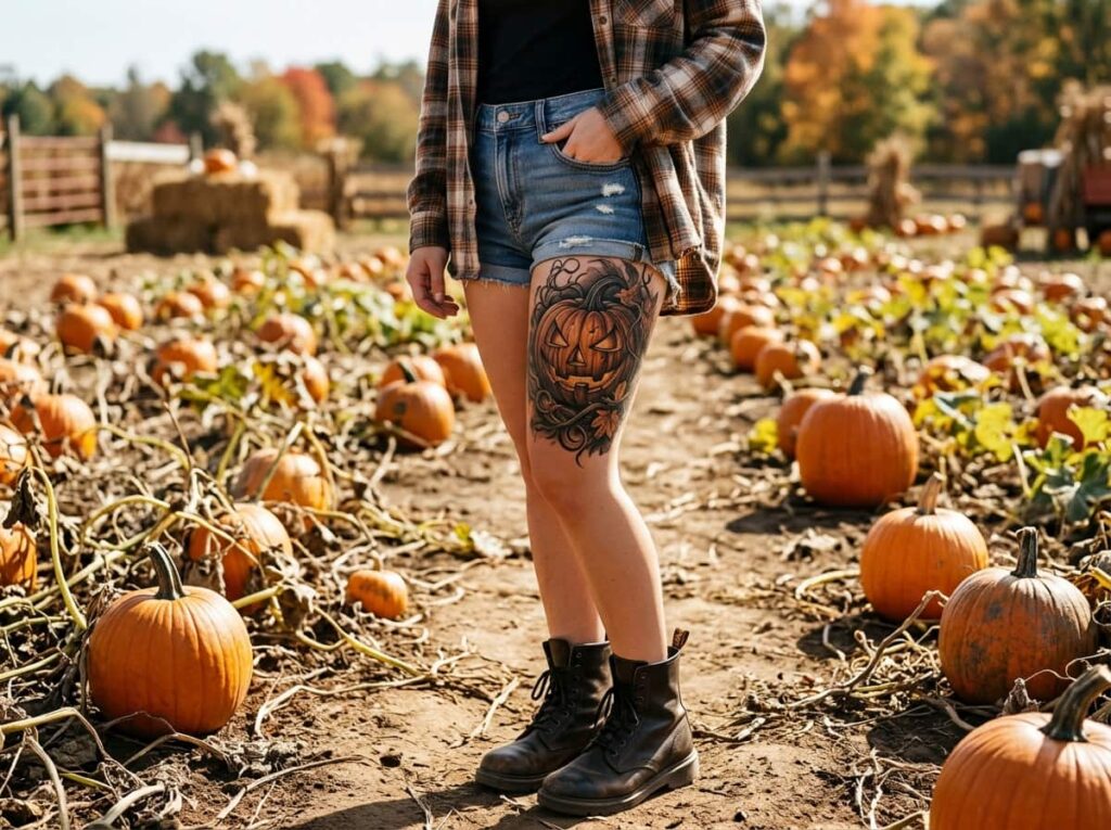
A small accent sits quietly on the wrist or behind the ear, more of a seasonal nod than a focal point. A statement piece takes up real space on the forearm or thigh and is meant to be the first thing someone notices.
| Small Accent | Statement Piece |
|---|---|
| Simple face, minimal shading | Room for glow, scene elements, and detail |
| Easy to keep hidden if needed | Always visible, so commit to loving it |
Neither one is the safer choice. It just depends on how loud you want this tattoo to be.
10. Choose Linework That Will Still Look Sharp in 10 Years
Thin lines look crisp the day you walk out of the shop and blurry by year five. That’s the trade most people don’t think about until it’s already happened to a tattoo they love.
If you’re torn between two line weights, pick the heavier one. You’ll thank yourself in a few years.
11. Decide How Realistic or Cartoon You Want the Pumpkin to Look
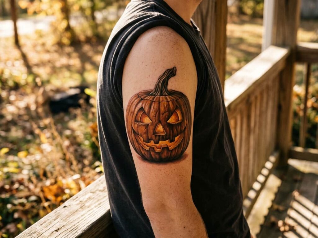
A photorealistic jack o lantern tries to look like an actual carved pumpkin, with shading on the ridges and natural warm color variation. A cartoon version simplifies everything into clean shapes and flat color, closer to a storybook illustration.
Realism asks more of your artist and more of your skin. Fine shading gradients are the first thing to blur as a tattoo ages, so a highly detailed realistic pumpkin needs a larger canvas and a skilled hand to hold up over time. A simplified cartoon version is lower risk and easier to keep crisp.
📌 Good To Know
If you’re set on realism, ask to see healed photos of your artist’s past pumpkin tattoos, not just fresh ones. That’s where shading detail actually gets tested.
Neither style is wrong, but one asks a lot more of the artist you choose.
12. Bring the Right References So Your Artist Nails the Face
A single blurry phone screenshot is the most common reason a finished tattoo doesn’t match what someone pictured. Your artist can only work from what you actually show them.
Walk in with a small, focused set of references instead of a folder of a hundred random pumpkins:
Bring 3 to 5 images that show the exact face and linework you want.
Point out specifically what you like about each one.
Showing a huge, unsorted folder with no clear favorite.
Assuming the artist will just know what you mean.
The clearer your references, the less guessing your artist has to do, and the closer the result lands to what you actually pictured.
Conclusion
A great jack o lantern tattoo comes down to a handful of small decisions, not one big one. Once you’ve settled on the expression, the style, the right size for your chosen spot, and how much extra detail you actually want, the design mostly picks itself. The pumpkins that still look sharp years later are the ones where someone thought through linework and placement before they thought about which face looked cutest on Pinterest.
Take your time with the choices above, bring clear references, and trust the artist you pick. Save this list of jack o lantern tattoo ideas for when you’re ready to book your appointment this Halloween season.







Leave a Reply