
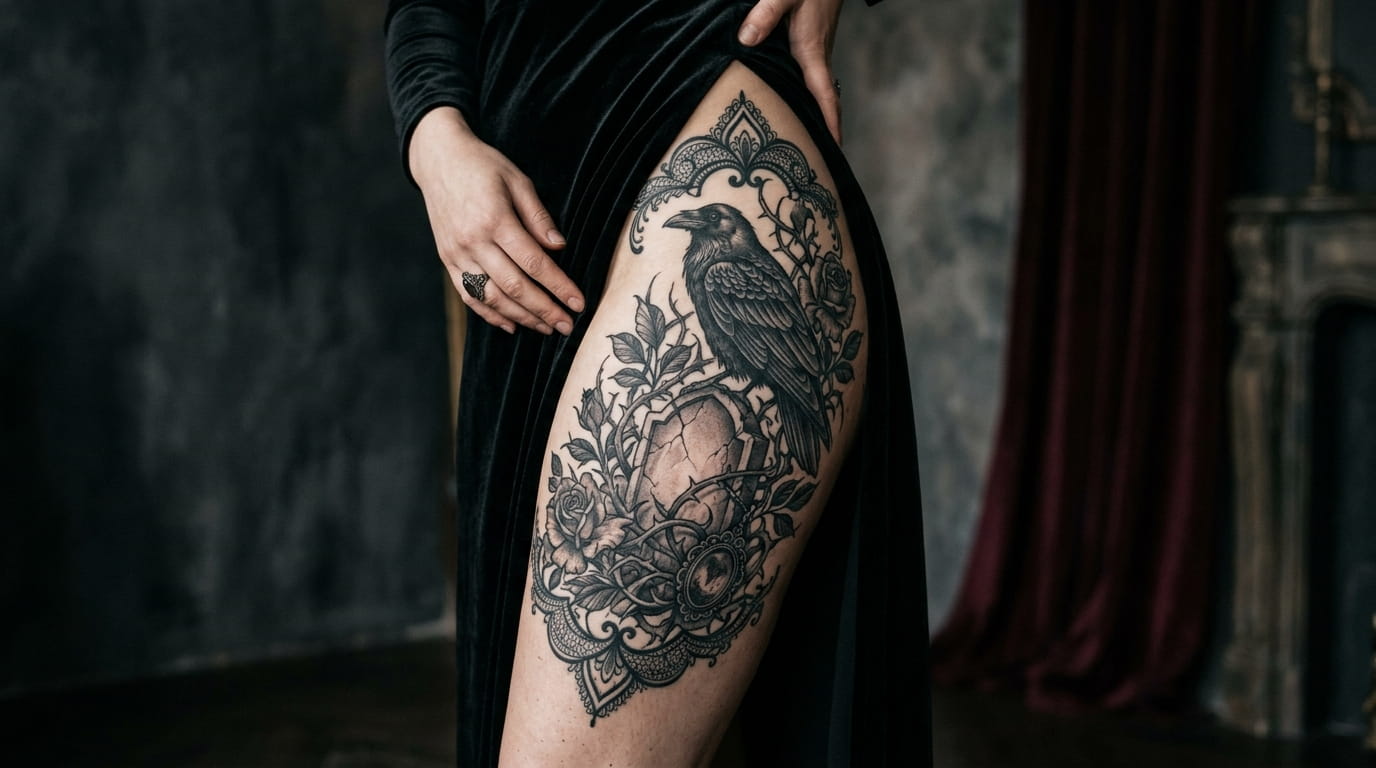
Most tattoo shops have a wall of the same five skulls and the same three roses, and none of them look like anyone meant something by getting them. That is the real problem with a lot of dark tattoo work. It leans on symbols without giving them any personality, so the finished piece looks borrowed instead of chosen.
Gothic tattoo ideas work differently when they are built around detail instead of just imagery. A raven is not interesting on its own. The way it is drawn, the shading, the object it is perched on, that is where the mood actually lives. The same goes for lace, thorns, blackletter script, and candlelight.
This list is for people who want something darker than the usual flash sheet options, but who also want ink that still holds up as real art ten years from now. Twelve ideas, each built around one specific concept instead of a vague dark aesthetic, so you can walk into a consultation already knowing what to ask for.
1. Skulls Wrapped in Lace: A Softer Take on Gothic Ink
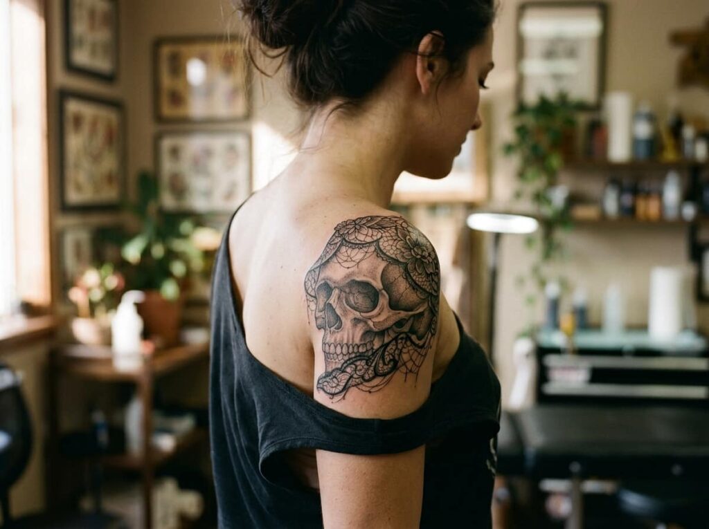
A skull on its own can look flat, almost cartoonish, if the artist does not add texture. Wrap it in lace and the whole piece changes. The hard lines soften against something delicate, and the contrast does the emotional work other gothic designs try to force with sheer size.
Ask for lace that drapes unevenly rather than a symmetrical doily pattern. Frayed edges and a couple of broken threads keep it from reading as decorative instead of gothic.
2. A Dagger Through a Wilting Rose for a Darker Kind of Romance
Roses get used so often in tattoo flash that on their own they barely register anymore. A wilting rose changes that automatically, and running a dagger through the stem pushes the whole piece from pretty into something with actual weight.
A few details decide whether this works:
- Let two or three petals curl or drop near the base
- Keep the blade thin so it reads as precision, not violence
- Angle the dagger through the stem, never straight through the center of the bloom
💡 Quick Tip
Ask for the rose in gray wash first, then decide later if you want a few petals brought back in deep red. Solid black holds its shape longest on inner forearm and ribs.
3. A Raven Perched on a Cracked Headstone
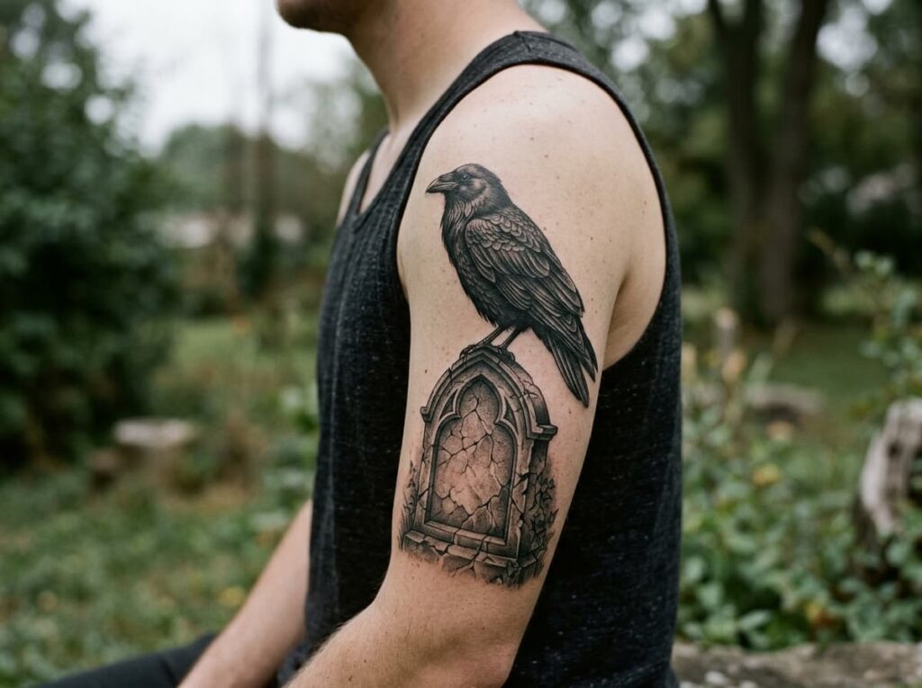
People assume a raven tattoo needs tons of fine feather detail to look good.
Overworking the feathers is actually what ages these designs the worst, since heavy linework packed close together can blur into a dark blob within a few years.
What actually holds up:
- Bold outlines around the wing shapes
- Shading saved for two or three key areas, not the whole bird
- A simple background element, like a cracked headstone, so the eye has somewhere to rest
Bold outlines on the wing shapes.
Shading limited to two or three spots.
Tiny feather lines packed edge to edge.
A cluttered background behind the bird.
4. A Gothic Blackletter Quote Done Right
Start by picking a phrase short enough to stay legible at a smaller size, five or six words at most. Blackletter script is beautiful but dense, and a long sentence crammed into a small ribcage spot turns into an unreadable smear within a couple of years.
Once the wording is locked in, the font weight and placement decide whether it reads as gothic or just looks aggressive. A heavier weight works well on the forearm or spine, where there is more length to work with.
Pick a phrase five to seven words long.
Choose a blackletter weight that matches the placement.
Size it up at full scale before you commit to it.
5. A Moth Drifting Toward a Candle Flame
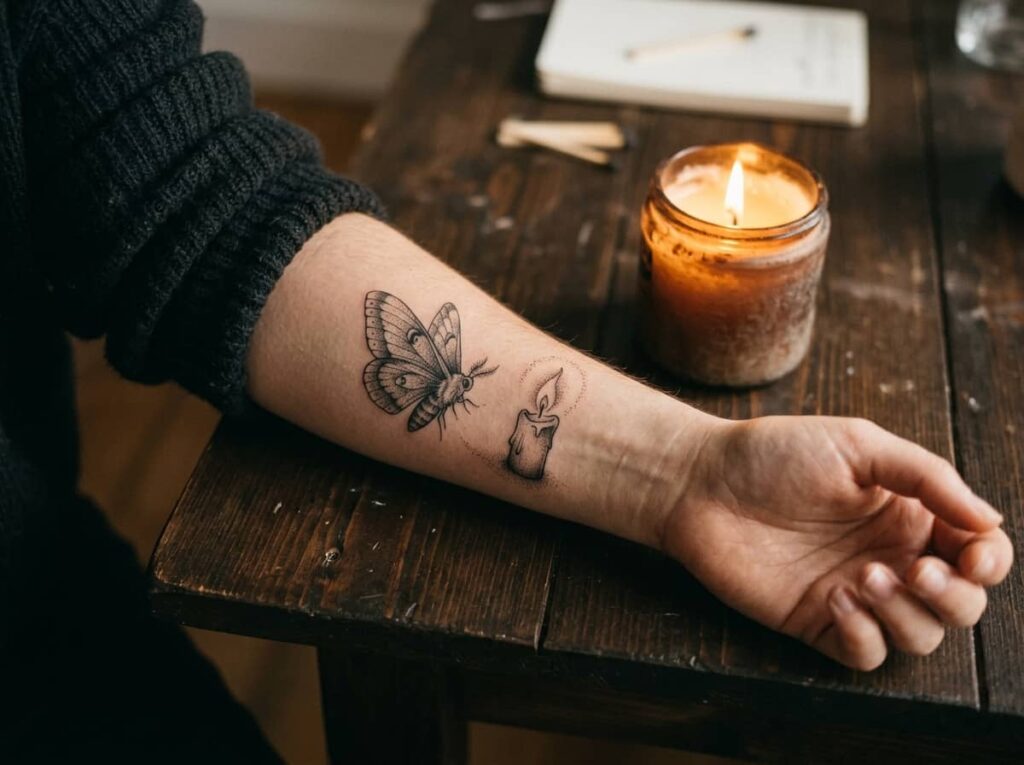
A moth near an open flame is one of those images everyone already understands without explanation, which is exactly why it works so well as a tattoo instead of needing extra symbols stacked around it.
Where this idea splits is in execution. A minimal version, just the moth’s silhouette with a few thin lines for the flame, reads subtle and almost delicate. A bolder version, with full wing texture and dramatic shadow, reads heavier and sits closer to true gothic.
Simple silhouette, a few thin lines for the flame. Quiet and subtle on smaller spots like the wrist.
Full wing texture, heavy shadow, dramatic flame. Reads stronger on forearm or calf, where it has room to breathe.
6. A Spiderweb Wrapped Around the Elbow
The elbow is an odd place to tattoo, and most artists will say so upfront. The skin there moves constantly, which affects how the lines stretch during the session and how they settle once healed. A spiderweb design actually works with that movement instead of against it, since the radiating lines can follow the joint’s natural creases rather than fight them.
Before booking, walk through a few things with your artist so there are no surprises halfway through healing.
Ask before you book
7. Victorian Mourning Jewelry Reimagined as Ink
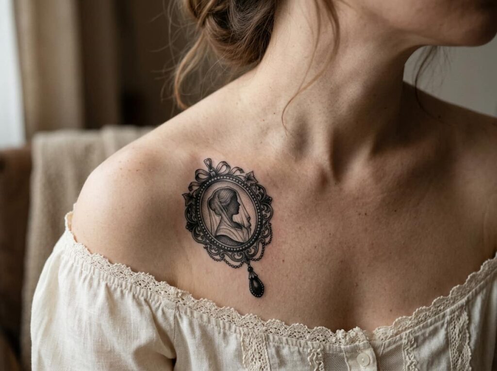
Victorian mourning rings and brooches were built around tiny portraits, woven hair, or carved jet stone, each piece meant to hold onto one specific person. That idea translates into tattoo work better than most people expect. A locket outline, a cameo shape, or a string of jet beads turns a design from decoration into something closer to a kept object.
The details carry the weight here. A cameo with a shadowed or blank face, rather than a specific likeness, keeps the piece feeling timeless instead of tied to one era.
The smaller and more specific the jewelry detail, the more personal the tattoo ends up feeling.
8. A Weeping Willow Draped Over a Grave
Most people reach straight for blackwork on a weeping willow because the image already feels heavy, but that is not always the stronger choice. The hanging branches have a lot of thin, overlapping lines, and solid blackwork can blur that detail into a dark mass sooner than you would expect.
Fine line work keeps each branch distinct for longer, though it asks more of your skin and your aftercare routine.
| Fine Line | Blackwork |
|---|---|
| Branches stay distinct longer | Branches can blur with age |
| Needs careful sun protection | More forgiving over time |
9. A Gargoyle Perched on the Forearm
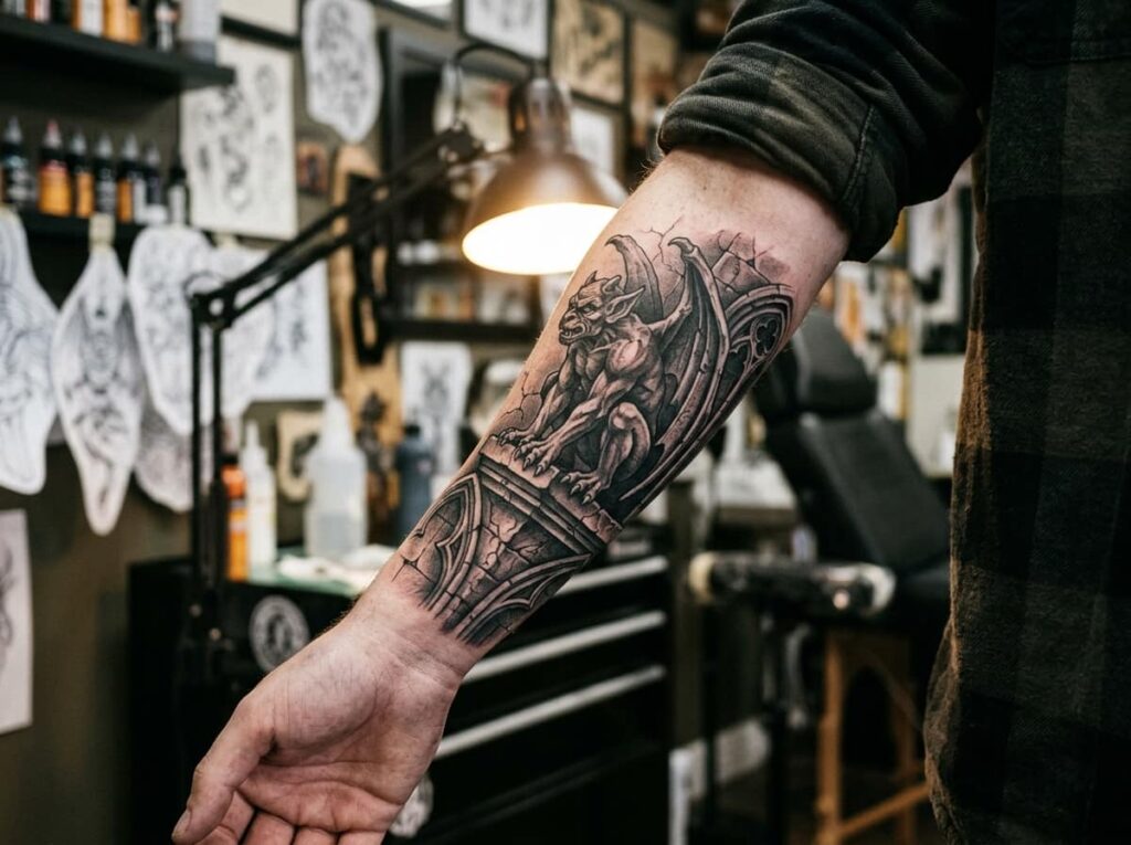
Keep the gargoyle’s expression slightly off, somewhere between watchful and amused, and the tattoo gains personality that a straightforward snarl never quite delivers. That small adjustment is the difference between a design that looks like clip art and one that looks considered.
The forearm gives a gargoyle room to include stone texture and wing detail without cramming everything into a tiny space, which matters since this design holds a lot of visual information.
10. Bats Spiraling Up the Wrist
A single bat on the wrist reads almost playful. A spiral of them climbing toward the elbow reads completely different, more like movement caught mid-flight than a static symbol sitting on skin.
Spacing is what makes or breaks this one. Too tight and the bats blur together within a few years. Too loose and the spiral loses its sense of motion entirely.
📌 Good To Know
Ask your artist to sketch the spiral directly on your arm before tattooing. Wrist to elbow spacing is hard to judge on paper and easy to get wrong without that step.
11. A Mandala Built Entirely from Thorn Vines
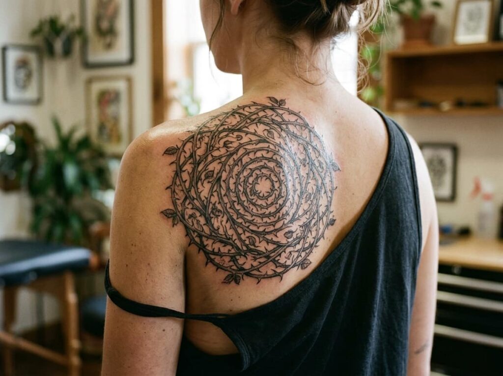
A standard mandala leans on flowers, dots, and geometric shapes. Swap all of that for thorn vines and the piece keeps its symmetry while losing every bit of softness, which is really the whole appeal of a gothic version.
This idea scales in a way a lot of designs cannot. A small version on the shoulder blade, just two or three rings of thorns, still reads clearly as a mandala. Push it into a full sleeve and the same pattern turns into something much more immersive, with room for shading depth that a smaller piece simply cannot hold.
Two or three rings, shoulder blade or upper arm. Quick to read, lower cost, shorter sessions.
Multiple rings with deep shading, built across several sessions. More immersive, more planning required.
12. An Hourglass with Wilting Flowers, a Memento Mori Piece
Memento mori tattoos only work if the symbolism is actually yours, not something copied straight off a reference board. An hourglass with wilting flowers wrapped around it is a classic starting point, but the version that ends up meaning something is the one where you have decided exactly what the sand, the flowers, and the glass itself represent to you.
A short conversation with your artist before the appointment makes a real difference here.
Before your consultation, decide
Conclusion
Gothic tattoos hold up best when they carry some kind of specific detail, not just a dark subject chosen for shock value. A raven with the right shading, a mandala built from thorns instead of flowers, a quote sized to actually stay legible in ten years. Those small choices are what separate a piece people are still proud of from one that just looked good on a reference board.
None of these twelve gothic tattoo ideas need to be copied exactly. Bring one to a consultation, talk through placement and style with your artist, and let it shift to fit your own skin and your own story. That conversation is usually where the best version of the design actually shows up.







Leave a Reply