
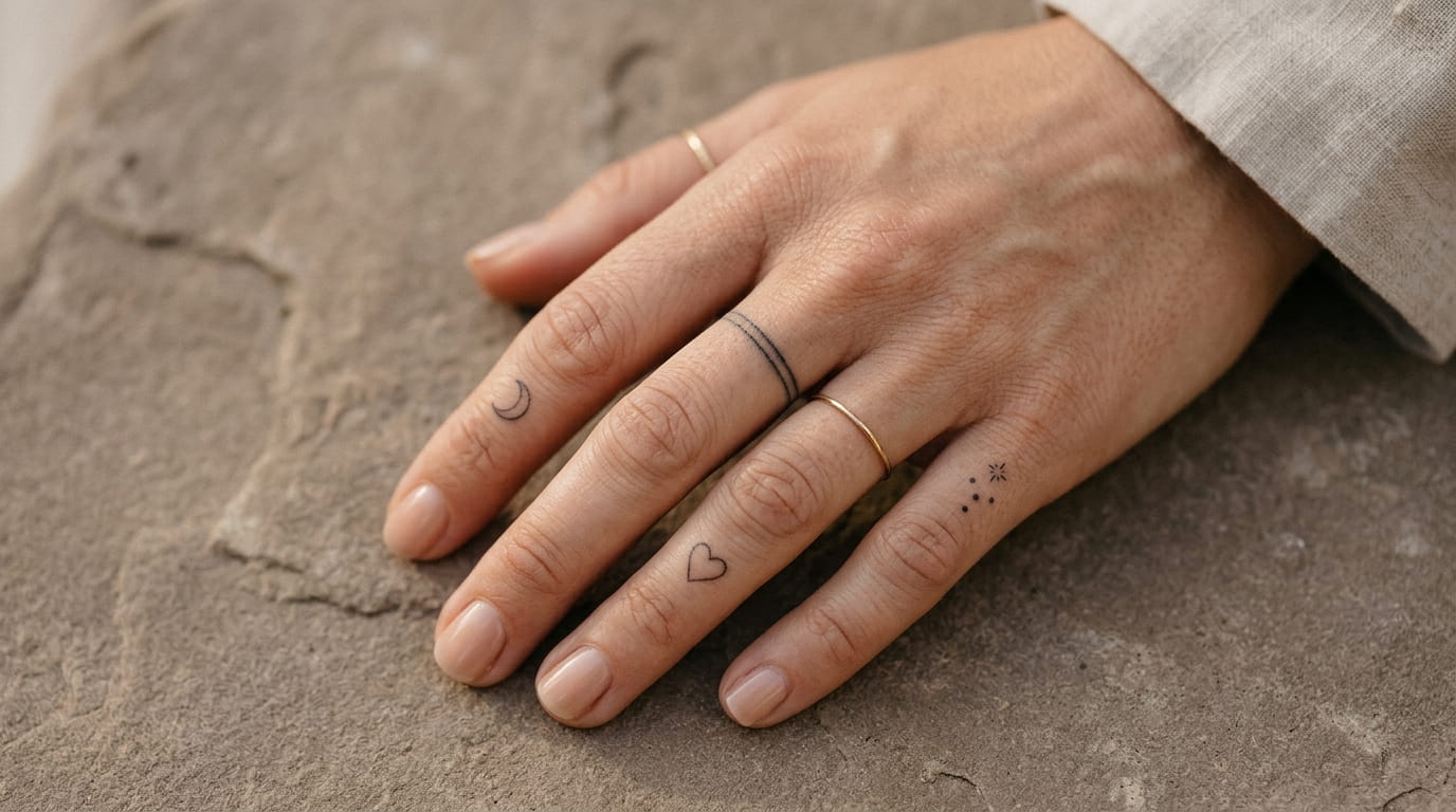
Most finger tattoo ideas you find online fall into two camps: tiny symbols that blur into a smudge within two years, or full coverage pieces that need a job where nobody looks closely at your hands. Neither fits the person who wants something small, visible, and still readable five years from now.
Fingers move more than almost any other part of the body, and that’s the real reason so many finger tattoos fade fast or blur by the second knuckle. The designs that actually hold up share a few things in common: thin but consistent lines, placement on the flatter stretches of skin, and a size that doesn’t rely on fine detail that disappears the moment there’s any swelling.
This list sticks to finger tattoo ideas that work with the finger instead of against it. Rings that read as rings, words you can still read in low light, and symbols small enough to stay sharp. Some are bold. A few barely show unless someone’s looking, and are easy to hide behind a real ring on days you need to.
1. The Thin Line Ring That Looks Tattooed On, Not Drawn
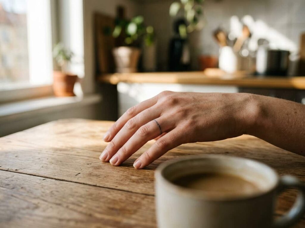
A single straight line wrapped around the base of the finger reads as a ring from across the room, but up close it’s just ink. That’s the whole appeal. It sits right where a real ring would, so it catches the eye the same way jewelry does, minus the upkeep.
Keep it between 1 and 2 millimeters wide. Thinner lines near the knuckle tend to blur sooner than the same line lower on the finger, where the skin moves less.
Best for: a first finger tattoo, stacking with real rings, days you’d rather wear nothing at all.
2. A Stacked Ring Set Across Two or Three Fingers
Finger tattoo ideas don’t have to stop at one ring. A set of three or four thin bands across different fingers looks intentional instead of random, as long as it follows a plan instead of landing wherever there happens to be room.
Space them out before committing. The pointer and middle finger crowd each other fast once any swelling goes down, so leave real room between each band.
Make one line a slightly different width than the rest. It’s a small detail, but it’s the difference between a set that looks chosen and one that looks stamped.
Before you stack rings
3. A Dotted Ring Instead of a Solid Band
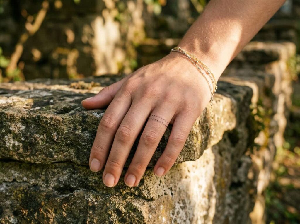
A lot of people assume a dotted ring fades faster than a solid one, since there’s less ink going into the skin. In practice, the dots hold up fine when they’re placed close together, and plenty of tattoo artists actually prefer them for finger work, since they move with the skin instead of cracking into one thick line over time.
Dots spaced more than 2mm apart stop reading as a design and start reading as unfinished once the swelling goes down.
Keep dots close enough to almost touch.
Keep each dot the same size.
Spacing dots more than 2mm apart.
Mixing dot sizes on the same line.
4. One Word Written Along the Side of the Finger
Write the word along the side of the finger, not across the top. The side holds a line of 4 to 6 small letters without the stretching that happens on top-of-knuckle skin every time a hand closes into a fist.
Keep letters under 4mm tall, or they crowd the next knuckle line.
Pick a word with short, plain letters. Something like “hope” or “calm” holds its shape far longer than a word full of loops and tails.
| Side | Top | Inner |
|---|---|---|
| Least stretching, easiest to read | Most visible, fades fastest | Private, hidden in a closed hand |
| Fits 4 to 6 letters | Fits 3 to 4 letters | Fits 4 to 5 letters |
5. A Roman Numeral Date Tucked Between the Knuckles

Between the first and second knuckle there’s a flat stretch of skin most people never think to use, and it happens to be the one spot on the finger where a short line of numerals won’t warp every time the finger bends.
A date written in roman numerals, like X.XI.XIX, reads cleanly there. Spell it out twice before the needle touches down. A wrong digit in a two-inch space is a specific kind of regret.
That flat stretch is shorter than it looks.
📌 Good To Know
The flat stretch between knuckles is shorter than it looks. Four digits is usually the real limit, not six.
6. A Tiny Star Resting Just Below the Nail Bed
The curve where the fingertip meets the nail barely moves when the hand is relaxed, which makes it one of the only spots on the finger immune to the stretching that blurs most small symbols within a year.
A five-point star no bigger than 5mm holds its shape there far longer than the same star placed over a knuckle. A few things make the spot work well:
- Minimal flexing compared to the rest of the finger
- Skin stays flatter even when the hand closes
- Small enough to layer with a ring tattoo lower down
It’s the closest thing to a tattoo nobody notices until they’re looking for it.
7. Matching Symbols for Two People on the Same Finger

Matching tattoos usually mean matching wrists or forearms, spots easy enough to show off and just as easy to line up side by side in a photo. The finger does something quieter. A tiny matching symbol there only shows up when hands happen to be close, which suits people who’d rather the connection stay between the two of them.
It only works if both symbols are simple enough to survive years of fading at a few millimeters wide.
- ▸A single shape split in half, one half per person.
- ▸The same small symbol on the same finger of each hand.
- ▸Two different symbols that only make sense placed together.
8. A Script Initial Small Enough to Hide With a Ring
Three letters is about the real ceiling for a legible finger script, and that drops to two once a first and last initial end up sharing a curve. Past that, the loops start overlapping and the letters stop reading as letters.
Placed just below where a ring sits, a single initial in a thin cursive stays private on days it needs to and visible the rest of the time. A couple of placement notes worth knowing before booking:
- Lowercase holds up better than capitals at this size
- Avoid fonts with connected loops between letters
One lowercase initial outlasts a full script name at this size, every time.
9. A Single Heart Outline on the Inner Finger
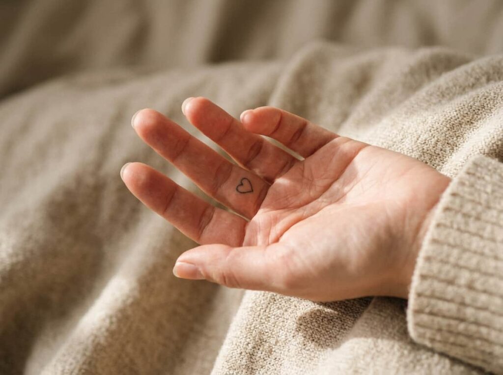
Turn the hand palm up and there’s a strip of skin along the inner first joint that almost never shows up in finger tattoo galleries, mostly because every reference photo defaults to the back of the hand.
A simple heart outline fits there without distortion, since the skin stays relatively flat even when the finger curls. Getting the placement right comes down to a short sequence most artists skip explaining:
Curl the finger halfway and mark the center of the flattest fold.
Keep the heart under 6mm so both lobes clear the joint crease.
Uncurl the finger fully before the artist checks the outline sits straight.
10. A Fine Line Wave for the Ocean Lover
A single wave rendered with too many lines turns into one blurred smudge within a year, which is the usual fate of ocean-themed finger tattoos that try to pack in whitecaps and motion lines at a tiny scale.
The version that actually lasts is one continuous curved line, nothing more. No crest, no spray, just the shape of a swell. It reads as a wave because the eye fills in the rest.
A detailed wave with foam lines and spray, crisp on day one.
One clean curved line, still sharp a year later.
11. Three Tiny Dots in a Row Instead of a Symbol
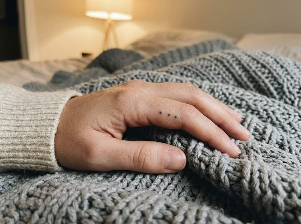
Not every finger tattoo idea needs to mean something specific. Three small dots in a straight line, spaced evenly along the side of a finger, read as deliberate without asking the wearer to explain anything.
The trick is restraint. Dots that aren’t identical in size look like a mistake rather than a design, and that’s the single most common fix tattoo artists end up making on this one.
💡 Quick Tip
Ask the artist to mark all three dots before inking any of them, so spacing stays even across the whole line.
12. A Barely There Moon Phase on the Side of the Finger
Pick one phase, not the full cycle. A single crescent or half moon at 4 to 5mm stays legible for years; the eight-phase sequence some galleries show looks striking in a photo and turns into a smear within eighteen months, since each phase needs its own few millimeters of space the finger doesn’t have.
Conclusion
The finger tattoo ideas that hold up share the same quiet logic: thin, consistent lines, placement that works with how the hand actually moves, and a size that doesn’t ask for detail the skin can’t keep. Rings, single words, tiny symbols below the nail or tucked between knuckles. None of it needs to be loud to last.
Bring a couple of these to your artist and talk through which finger handles your daily routine best before picking a final spot. Save this list for the next time you’re sketching out finger tattoo ideas and want something that still looks sharp a few years in, not just on the day you walk out of the shop.







Leave a Reply