
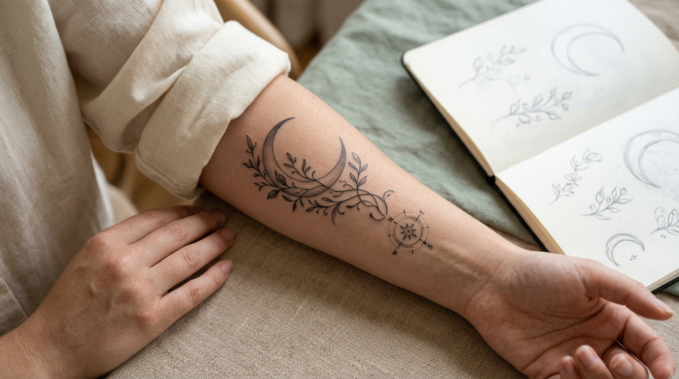
Most people who want a tattoo with two meanings start with the same mistake. They treat it like two separate tattoos pushed next to each other, and the result looks busy instead of intentional. A rose stacked on top of a compass. A name wrapped around a date. Nothing wrong with either symbol, but together they compete instead of working as one piece.
Learning how to combine symbols in a tattoo is really about hierarchy, not decoration. One element has to lead. The other has to support it. Once you understand that, a lot of the clutter problem solves itself before the needle even touches skin.
This list walks through the actual techniques tattoo artists use to merge two meanings into a single clean design. Some are about composition, some are about line work, and a couple are just honest advice about when two symbols should stay separate. By the end, you will know exactly what to bring into your consultation so your artist understands both meanings and can build them into one tattoo that actually reads as one tattoo.
1. Pick One Symbol to Lead and Let the Other Support It
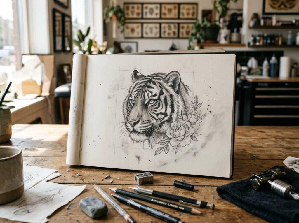
Most combination tattoos go wrong the same way. Both symbols get drawn at equal size, equal weight, equal attention, and the eye has nowhere to land first.
Before you sketch anything, decide which meaning matters more right now. That symbol becomes the lead. The second one gets smaller, simpler, or tucked into a corner of the design, like a small anchor worked into the base of a larger piece.
- Lead symbol: roughly 60 to 70 percent of the visual weight
- Support symbol: simplified, fewer details, smaller scale
- If you truly can’t choose a lead, that’s a sign to revisit item 11
A good artist will ask you this question in the consultation anyway, so having an answer ready saves you both time.
💡 Quick Tip
Ask yourself which symbol you’d still want if you could only have one. That’s your lead.
2. Why Two Equal-Sized Symbols Usually Fight Each Other
A lot of reference photos people bring in show two symbols stacked with no clear leader, and it’s one of the most common reasons a combo tattoo ends up looking cramped instead of meaningful.
The eye wants a focal point. Without one, it bounces between the two shapes and never settles, which reads as visual noise even when the linework itself is clean. This isn’t about one symbol being less important to you. It’s about how the design physically sits on skin.
Give one symbol more linework and detail.
Let the second symbol sit smaller and simpler.
Drawing both symbols at identical size.
Placing them with no shared anchor point.
3. Connect the Two Pieces With a Single Continuous Line
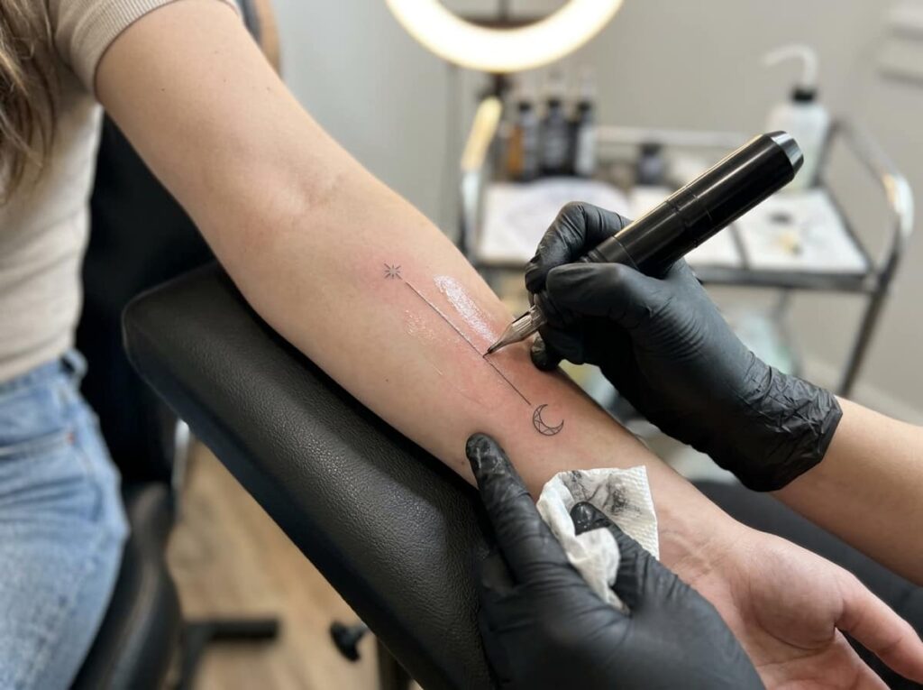
Draw one line that physically runs through both symbols, and the design stops looking like two separate stickers placed near each other. This is one of the oldest tricks in custom tattoo design because it works on almost any combination.
A vine, a thread, a crack of light, a single branch. The line does not need its own meaning. Its job is purely structural.
- Choose a simple line shape, like a curve or a thin branch
- Have your artist route it through the base of the first symbol
- Carry that same line into the second symbol so they share one path
This works especially well when the two symbols don’t naturally relate in style, like a geometric shape paired with something organic.
Pick one simple connecting line, like a vine, thread, or branch.
Route it through the base of your lead symbol first.
Carry the same line into the second symbol so both share one path.
4. Let One Symbol Gradually Morph Into the Other
Instead of placing two finished shapes side by side, the edge of one symbol slowly becomes the start of the next. A wing’s feather line turns into a wave. A root system turns into a river.
This takes more planning from your artist, so it’s worth bringing both reference images into your first consultation rather than asking for it on the spot. The transition point is where most of the design work actually happens.
- Works best with two symbols that share a similar flow or direction
- Harder to pull off with two very geometric, rigid shapes
- Usually needs a slightly larger canvas than a simple combo
Two separate symbols placed next to each other with a hard edge between them.
One shape’s edge dissolves directly into the next, so the eye reads a single flowing form.
5. Side by Side vs. Fully Merged: Which Fits Your Idea
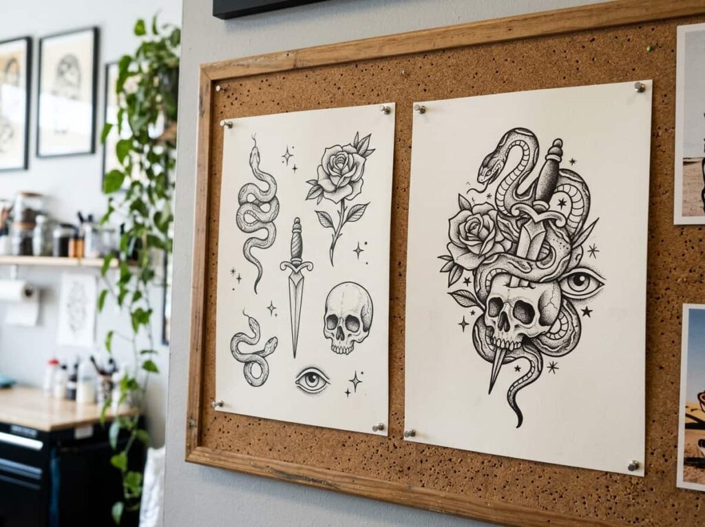
Not every pair of symbols should become one shape. Some meanings actually stay clearer when they’re placed close together but kept visually distinct, like two small symbols flanking a date.
Fully merged designs tend to suit abstract or nature based symbols. Side by side layouts tend to suit symbols that are already recognizable on their own, like initials or specific objects, where blending them would make both harder to identify.
| Side by Side | Fully Merged |
|---|---|
| Best for recognizable objects or initials | Best for nature, abstract, or flowing shapes |
| Each symbol stays easy to identify | Reads as one cohesive image from a distance |
| Simpler for most artists to execute | Takes more custom design time upfront |
6. Match the Shading and Line Weight So They Read as One Tattoo
Look closely at a combo tattoo that actually works, and you’ll notice the shading is consistent even when the subject matter isn’t. A bold linear symbol paired with a softer, shaded one often splits the piece in two, no matter how well placed they are.
Tell your artist upfront if you want everything in clean linework, everything with shading, or a blend. That decision shapes the whole design, not just the final pass.
Three things to check before your session:
7. What to Bring to Your Consultation So the Artist Gets Both Meanings
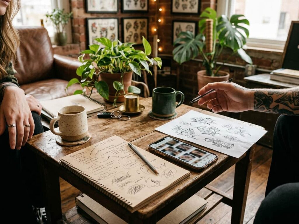
Walk into your consultation with more than a vague idea of two symbols, because the artist can only design around what you actually hand them. Bring reference images, even rough ones, for both symbols separately. Explain the story behind each in a sentence or two, not a paragraph.
Your artist isn’t just drawing shapes. They’re deciding how much weight each meaning gets, and that’s hard to guess without context.
What to bring in
8. The One Rule That Keeps a Combo Tattoo From Looking Busy
If you remember nothing else from this list, remember this. Every element in the design needs a reason to be there tied back to one of your two meanings. If a detail is only there because it looked nice in a reference photo, cut it.
Clutter in combo tattoos almost never comes from the two symbols themselves. It comes from extra flourishes added around them that don’t connect to either meaning.
If a detail doesn’t belong to one of your two meanings, it doesn’t belong in the tattoo.
9. The Sizing Mistake That Makes One Symbol Disappear
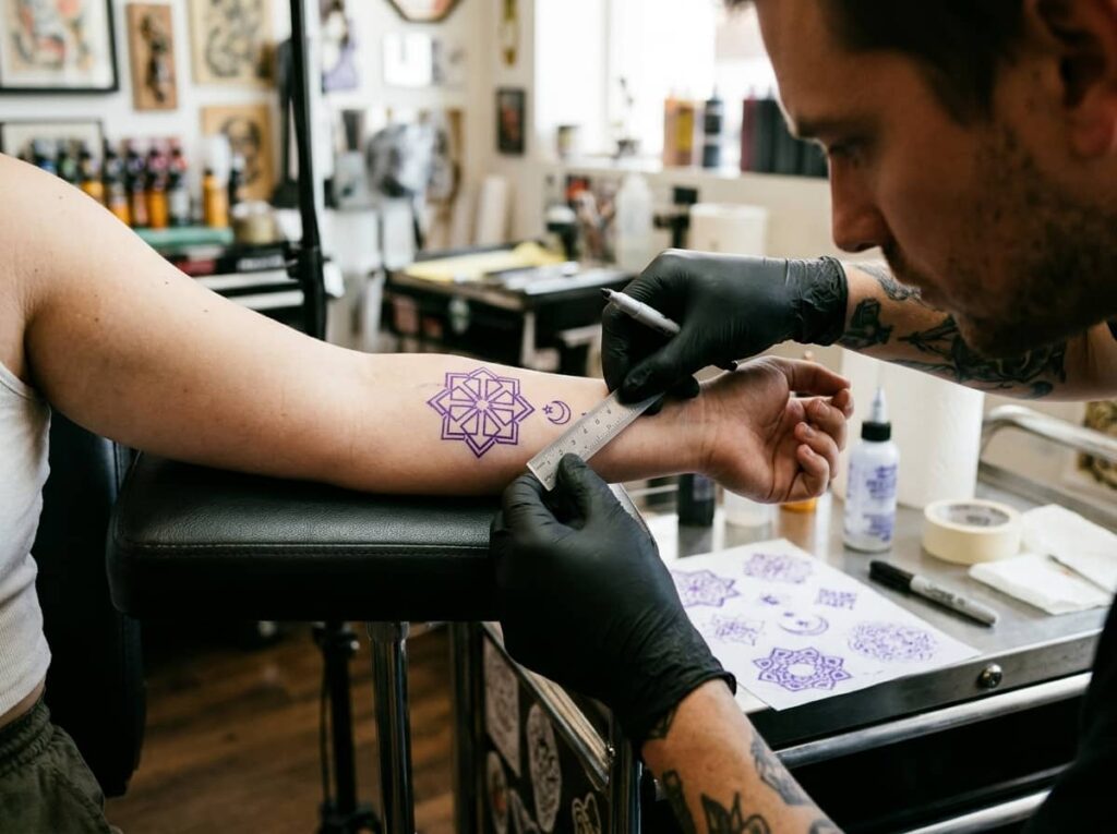
People shrink the second symbol down so small it loses its shape entirely once it’s healed. A tiny symbol tucked into a larger one might look fine in the stencil stage, then blur into a smudge a few years later, especially on areas like inner arms or ribs that shift with the body.
There’s a minimum size each symbol needs to hold its detail long term, and a good artist will tell you if your second symbol has dropped below it.
⚠️ Watch Out
If your artist says a symbol is “too small to hold detail,” trust them. It will only get smaller as the tattoo ages.
10. What a Redesigned Combo Session Actually Looks Like
A woman comes in with two symbols sketched on her phone, a design she found online, and an hour booked for consultation. By the end of that hour, the layout has changed twice, one symbol has been resized, and a connecting line has been added that wasn’t in the original reference at all. That’s a normal session, not a failed one.
Most combo tattoos go through at least one real redesign before the final stencil, and that’s part of getting it right.
11. When Two Meanings Are Better as Two Separate Tattoos
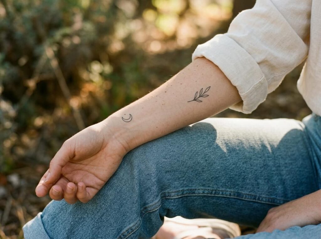
Not every pairing needs to live in one design. If the two symbols come from completely different chapters of your life, placing them close together can flatten both stories into one and lose the distinction that mattered to you in the first place.
Two smaller tattoos in different locations can hold two meanings with more clarity than one crowded piece ever could. There’s no rule that says combining is always the better choice.
- Different timelines or life chapters that don’t naturally connect
- Symbols with clashing styles that won’t blend without losing detail
- Meanings you want to keep visually and emotionally distinct
A good artist will tell you honestly if your idea works better as two pieces instead of pushing you into one.
- ▸Ask if the two meanings actually relate, or just happen to both matter to you.
- ▸Consider separate placements if the styles genuinely clash.
- ▸Trust an artist who suggests splitting the idea instead of forcing it together.
Conclusion
Combining two meanings into one tattoo comes down to a handful of real decisions, not luck. Pick a lead symbol, keep the shading consistent, connect the pieces with intention, and cut anything that doesn’t serve either meaning. Learning how to combine symbols in a tattoo is less about finding the perfect reference photo and more about giving your artist a clear sense of what each piece needs to carry.
Bring both stories into your consultation, stay open to a redesign, and remember that two separate tattoos are sometimes the more honest choice. However you land, the goal is a piece that reads as one design, not two ideas competing for space.







Leave a Reply