
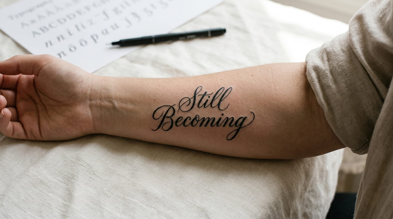
A lot of women pick their quote tattoo ideas for women first and the font last, then wonder why the finished piece doesn’t look like what they pictured. The words were never the hard part. The font is what decides whether that sentence reads clean on your skin or turns into a smudge by year three.
Most tattoo advice skips this completely. It tells you to find words that mean something, pick a placement, and book the appointment. Nobody mentions that a thin script that looks romantic on your phone screen can disappear into a blurry line once it’s wrapped around a moving wrist. Nobody tells you that the font you fall for in a Pinterest photo might be traced from a $40 font pack that fifty other people have also tattooed, word for word.
This list walks through how to actually choose, from counting letters before you commit to testing a font on your real arm instead of a screenshot. Some of it is practical. Some of it is the stuff artists usually only mention once you’re already in the chair. Either way, you’ll leave with a clearer sense of what font fits your specific arm, not just your taste.
1. Pick the quote by what it needs to survive, not how it reads today
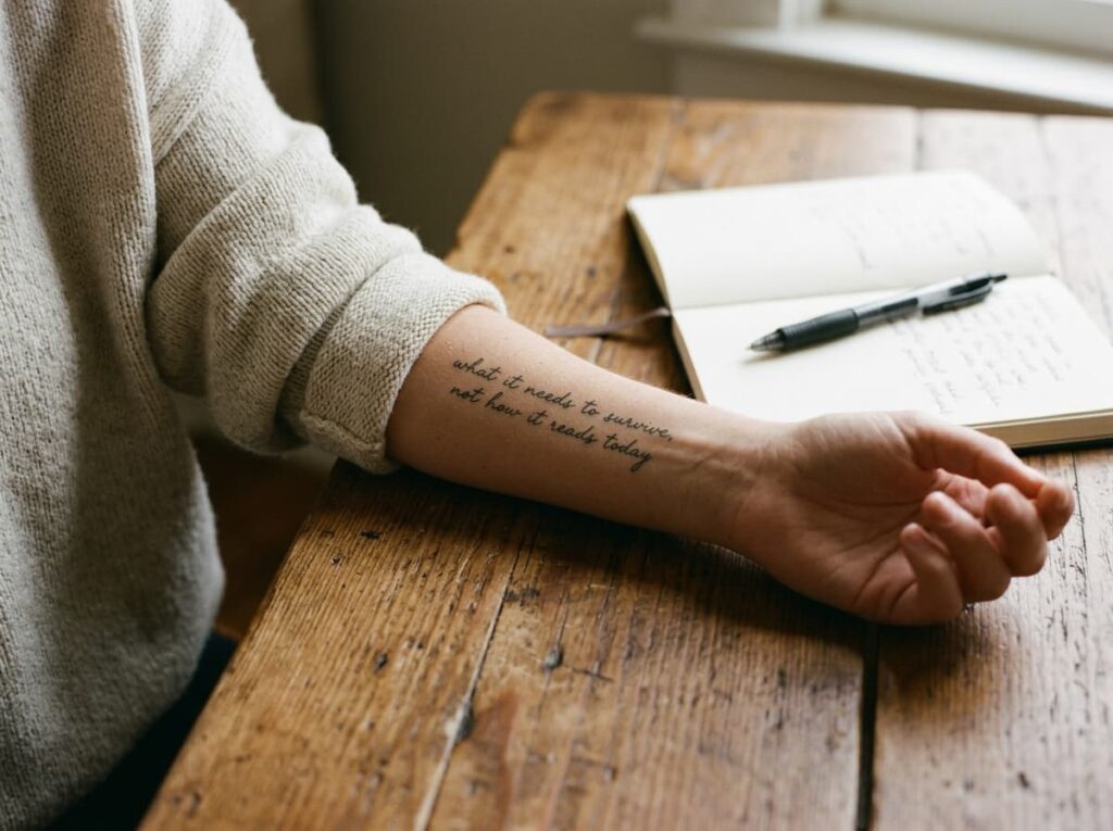
Most people choose a quote because it sounds good out loud, then hand it to an artist and hope the font sorts itself out. That order is backward. A tattoo has to survive sweat, sun, years of elbow bends, and the slow blur that ink does under skin, so the quote and the font need to get picked together.
Short, blunt sentences hold up better than long flowing ones. Three to six words gives a font room to breathe without the letters crowding each other or shrinking down to fit.
💡 Quick Tip
Say your quote out loud. If you run out of breath before the end, it’s probably too long for a forearm or wrist placement.
2. Count your letters before you fall for a quote
A quote that looks short in your notes app can turn into a wall of text once it’s actually lettered. Twenty two characters sits comfortably on most wrists. Push past forty and you’re either shrinking the font until it’s hard to read in five years or wrapping it in a way that fights the shape of your arm.
Here’s roughly what different lengths look like once they’re inked:
- Under 15 characters: fits almost any forearm font, even bold or wide styles
- 15 to 30 characters: works best in a slimmer serif or clean script
- Over 30 characters: usually needs to run in two lines or wrap around the wrist
3. Test the font wrapped around your actual arm first
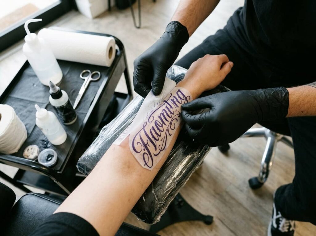
A font that looks balanced flat on a screen can tilt or stretch oddly once it’s curved around a forearm. Skin isn’t paper. Your artist should be able to print your quote in a few font options, sized correctly, and hold the actual stencil against your arm before any needle touches skin.
If your shop doesn’t offer this, ask directly. It’s a normal request, not a difficult one.
Bring two or three font options, not just the one you’re sure about.
Ask for each one printed at true size before the stencil goes on.
Check it in the mirror under real light, not just your phone camera.
4. Script fonts hide ink spread, block letters show it in five years
A common belief is that script always ages better because it looks soft and forgiving. That’s not quite right. Thin script lines are actually the first thing to blur, since fine strokes spread more under skin than thick ones do. Block or slab fonts with some weight to each letter hold their shape much longer.
Script still has its place. It just isn’t the automatic safe choice people assume it is, especially on a wrist that gets constant sun and motion.
Thin script lines look crisp and delicate, exactly as tattooed.
Thicker block letters have held their edges, while thin script has softened and spread.
5. Why the inside wrist asks for a different font than the outer forearm

The inside wrist has thin skin, more movement, and more sun exposure from driving and typing, so it’s rougher on delicate fonts. The outer forearm has thicker skin and holds detail far longer, which gives you more freedom with thin serifs or tight script.
Your artist has likely watched the same font age differently depending on where it sits, so it’s worth asking before you lock in a placement.
| Inside Wrist | Outer Forearm |
|---|---|
| Thin skin, fades faster | Thicker skin, holds detail longer |
| Best with bold, simple fonts | Room for thin serif or tight script |
6. The punctuation problem nobody warns you about
A missing comma or an extra apostrophe can change what a tattoo means, and it stays that way forever. This happens more than people think, especially with quotes that get copied from a graphic instead of checked against the original source.
Before anything gets stenciled, read the quote out loud slowly and check where the pauses actually belong.
Write the quote out yourself and read it back slowly.
Check the original source if the quote is attributed to someone.
Copying straight from a Pinterest graphic without double checking.
Letting the artist guess at punctuation on the fly.
7. Three places to actually see a font tattooed before you commit

A font preview on a screen never tells the full story. Pixels don’t sag, stretch, or catch light the way skin does, so the only real test is seeing that font on actual tattooed skin, ideally on an arm that’s had a few years to settle.
A few places make this easy:
- Your artist’s healed work portfolio, not just fresh photos
- Tattoo removal or touch up accounts, which show fonts at their worst case
- Friends or acquaintances with lettering in a similar spot, if you can ask
Where to look before you decide
8. Ask your artist to hand letter it instead of printing a font
Printed fonts can look flat once they’re on skin, since they were built for paper and screens, not curves and muscle movement. An artist who hand letters your quote can adjust the weight, spacing, and flow of each letter specifically for your arm.
This usually costs a bit more and takes longer to design. It’s worth asking about even if you end up going with a printed font instead.
A font built for your actual arm will almost always outlast one built for a screen.
9. The quote you love at 25 isn’t always the one you love at 45

Tastes shift. A quote that feels urgent and true right now might feel like a snapshot of a specific year later on, which isn’t necessarily a problem, but it’s worth being honest with yourself about.
Some quotes age better than others simply because they’re not tied to one feeling or one moment.
- Quotes about a general belief or value tend to hold up longer than quotes about a specific person or phase
- Quotes you’d still be comfortable explaining to a stranger in ten years are usually the safer bet
- If a quote only makes sense with context from right now, it may fade in meaning faster than the ink does
- ▸General values tend to age better than quotes tied to one specific moment.
- ▸Picture explaining it to a stranger ten years from now.
- ▸If it only makes sense right now, it may lose meaning before the ink fades.
10. Why the font matters as much as the words once it’s in photos
Most quote tattoos end up photographed more than they’re read in person, whether that’s a mirror selfie, a beach photo, or just a friend’s camera roll. A font that’s hard to make out in a quick photo loses a lot of what made the quote worth getting.
Bold, well spaced letters hold up in a photo from across a room. Delicate, tightly packed script often needs a close up shot just to be legible.
Conclusion
The right font doesn’t make a quote more meaningful, but it does decide whether that meaning still reads clearly five, ten, or twenty years from now. Letter count, placement, and how a font actually holds up on skin matter just as much as the words themselves. Good quote tattoo ideas for women start with words you’ll still stand behind, then get matched to a font built for the arm wearing them, not just a screen.
Take your time with this part. A stencil test, a healed photo, an honest conversation with your artist, all of it is worth the extra week before you commit.







Leave a Reply