
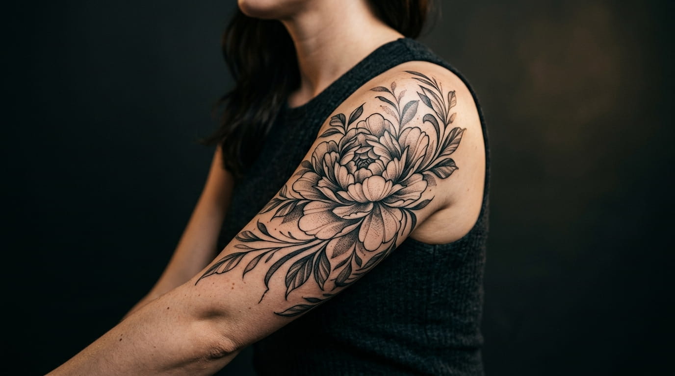
A small wrist tattoo disappears under a sleeve. A bicep tattoo doesn’t. That’s exactly why so many women are moving their next piece up to the upper arm: it’s one of the few spots on the body with enough real space to let a design actually breathe, and enough visibility to hold its own without needing an explanation.
The challenge is that most reference photos are shot flat, not on a curved, moving arm. A flower that looks balanced in a sketch can shift and warp the moment your bicep flexes. Good bicep tattoo ideas for women work with that movement instead of ignoring it.
This list covers ten directions for your next piece, each one picked because it actually fits the shape and function of the upper arm. Some are built for a single sitting. Others are long-term canvases you’ll add to for years. Either way, you’ll leave with a clearer sense of what to bring to your consult.
1. A Shoulder-to-Elbow Botanical Wrap That Follows Your Arm’s Natural Curve
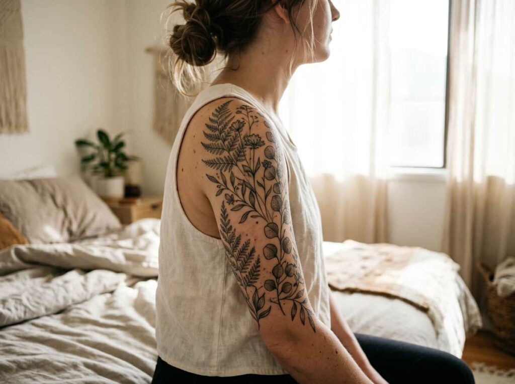
Most upper-arm florals end up looking stuck on instead of grown there. The fix starts with the shape of your arm, not the flowers themselves.
Ask your artist to map stems and petals along the natural swell of the muscle rather than down a straight vertical line. A good wrap uses three reference points:
- The widest part of the bicep for the main cluster
- The inner arm for smaller trailing buds
- The elbow crease as a natural stopping point
Works especially well for a first big piece, since the curve does a lot of the balancing work for you.
2. A Flowing Script Quote That Wraps Around the Bicep Like a Ribbon
Your bicep curls when you move, so a wrap-style script quote is one of the only lettering layouts that moves with you instead of against you. Straight-line text across a rounded muscle almost always looks tilted once your arm relaxes.
Before you commit to a design, check two things with your artist:
- Is the baseline curved to match your arm’s circumference, not the flat page it was sketched on?
- Is the phrase short enough that no word gets stretched at the widest point of the muscle?
💡 Quick Tip
Ask to see the lettering wrapped around a cylinder, not just flat on paper, before you approve the final placement.
3. A Bold Mandala Anchored at the Deltoid for Instant Symmetry
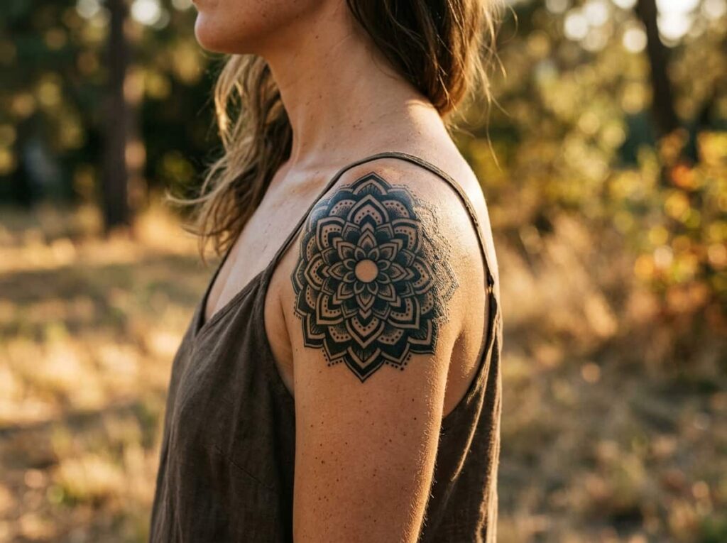
People assume symmetry is about a steady hand. It’s really about the center point. Even a couple millimeters off at the deltoid reads immediately, while a mandala’s own structure forces balance into the design from the start.
Two things make or break it: marking the exact center before the stencil goes anywhere near your skin, and checking the design with your arm both raised and relaxed.
Mark the exact center point before stenciling.
Check it with your arm raised and relaxed.
Letting the stencil sit off center “just slightly.”
Approving it while your arm is only relaxed.
4. An Asymmetric Floral Bouquet That Spills Toward the Inner Arm
Your arm already bends at the elbow before you ever lift it, and this layout uses that fold instead of fighting it. It’s a looser, more personal take on the wrap from idea one, built around one standout bloom rather than an even spread.
A simple planning order keeps it from feeling scattered:
Pick one large focal bloom for the outer bicep.
Let two or three smaller flowers trail toward the inner arm.
Add one or two loose stems to fill the gaps without crowding them.
The payoff is a piece that looks a little different depending on how you’re standing, which is part of what makes it feel personal rather than templated.
5. A Fine-Line Memorial Portrait Sized for the Full Bicep Canvas
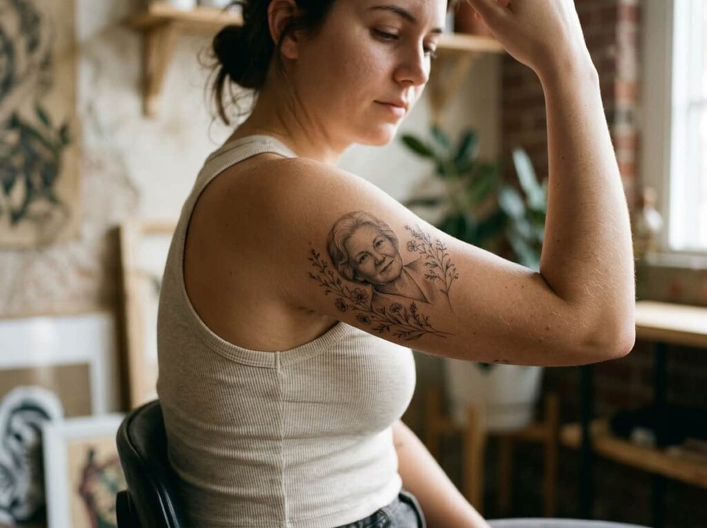
Plenty of people assume a portrait needs the whole bicep to read clearly. It doesn’t, but it does need something else: contrast. Without strong shading behind the face, even a well drawn portrait can go flat and lose detail within a few years.
This is one of the few ideas on this list worth sizing up for rather than down. Extra space gives your artist room to build the depth that keeps the likeness sharp.
A portrait lives or dies on shading, not just linework. Don’t shrink the piece until the shading has room to work.
6. A Watercolor-Style Splash Design That Uses Color as the Statement
Color fades faster than black ink, especially on a high-movement spot like the upper arm. A watercolor piece can still look incredible years in, but only if you go in prepared for that trade-off.
Bring these to your consult so the artist can plan pigment placement around it, not just the imagery:
What to bring to your consult
Best suited for readers who want a statement piece now and don’t mind a little upkeep later.
7. A Bold-Line Lioness or Wolf Totem for a Protective Statement Piece
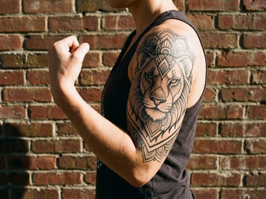
Heavy black fill holds up better on the bicep than fine detail does, which is exactly what makes a bold-line animal totem such a practical choice for this spot. The thick linework resists the blurring that fine lines can suffer over time.
Here’s roughly what you’re signing up for:
Ask to see healed photos of the artist’s bold-line work specifically, not just fresh ink. Heavy fill ages differently than it photographs on day one.
8. A Moon-Phase Band That Circles the Upper Arm Like a Bracelet
A moon-phase band sits differently than most of the ideas on this list because it’s meant to be read as a sequence, circling the arm like a bracelet instead of sitting flat on one side. That changes how you choose between a fine-line or bold-line version.
| Fine-Line Version | Bold-Line Version |
|---|---|
| Reads as delicate, jewelry-like. | Reads as a clear, graphic statement. |
| Needs touch-ups sooner, within a few years. | Holds its crispness much longer. |
If you’re torn, ask your artist to sketch both directly on your arm in marker before deciding. Seeing it wrap your actual bicep settles the choice faster than any reference photo.
9. A Japanese-Inspired Koi or Dragon Half-Sleeve With Deep Shading
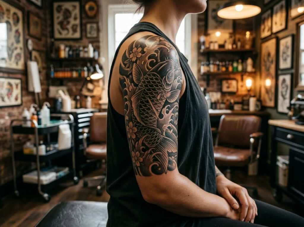
This is the biggest commitment on the list, and it looks nothing like itself on day one. A koi or dragon half-sleeve depends almost entirely on shading built up over multiple sessions, so the first sitting can feel underwhelming compared to what you’re working toward.
Mostly outline, flat and graphic, with little shading visible yet.
Deep gradients and movement that only show up once shading sessions are finished.
Plan for at least three sessions spaced weeks apart, and don’t judge the final look until the shading sessions are done.
10. A Blackwork Abstract Cuff That Reads as Modern Jewelry
No color, no imagery, just shape. A blackwork abstract cuff works because it borrows its logic from jewelry design rather than tattoo tradition, wrapping the upper arm the way a wide metal cuff would sit on a wrist.
A few quick notes before you sketch one out:
- ▸Geometric cuffs age the slowest of any style on this list.
- ▸Negative space does a lot of the design work, so less can read as more.
- ▸Pairs well with simple outfits since it doesn’t compete for attention.
Works best for someone who wants their arm to look intentional without a central image to point to.
Conclusion
Ten directions, one real takeaway: the upper arm rewards designs that work with its curve and movement, not against it. Whether you’re drawn to a soft botanical wrap or a bold blackwork cuff, the best bicep tattoo ideas for women all share that same starting point, built for the shape of the arm first and the image second.
Bring a few of these to your next consult, even if you only end up using one as a jumping-off point. Your artist can help narrow it down from there.
Save this list for when you’re ready to book that consult.
Before your consult, know your:







Leave a Reply